I just pushed a big update to SlideMagic (2.4) to the server and it contains a brand new 16:9 slide layout, the slide title. Most monitors today are widescreen, but unlike movies, I think 4:3 slides look much better. Text lines that run across the entire slide are hard to read, and wide screen slides always force you to make very “stretched” slide layouts.
The side title is the best of both worlds. The title of the slide is moved to the left, and the slide contain area is scaled up now that it has more space at the top. It stays in a 4:3 ratio though. The footer and logo is also moved to the left, creating even more space. The entire design shows up without black bars on a wide screen monitor. Below is an example.
It follows an approach I already blogged about in 2016
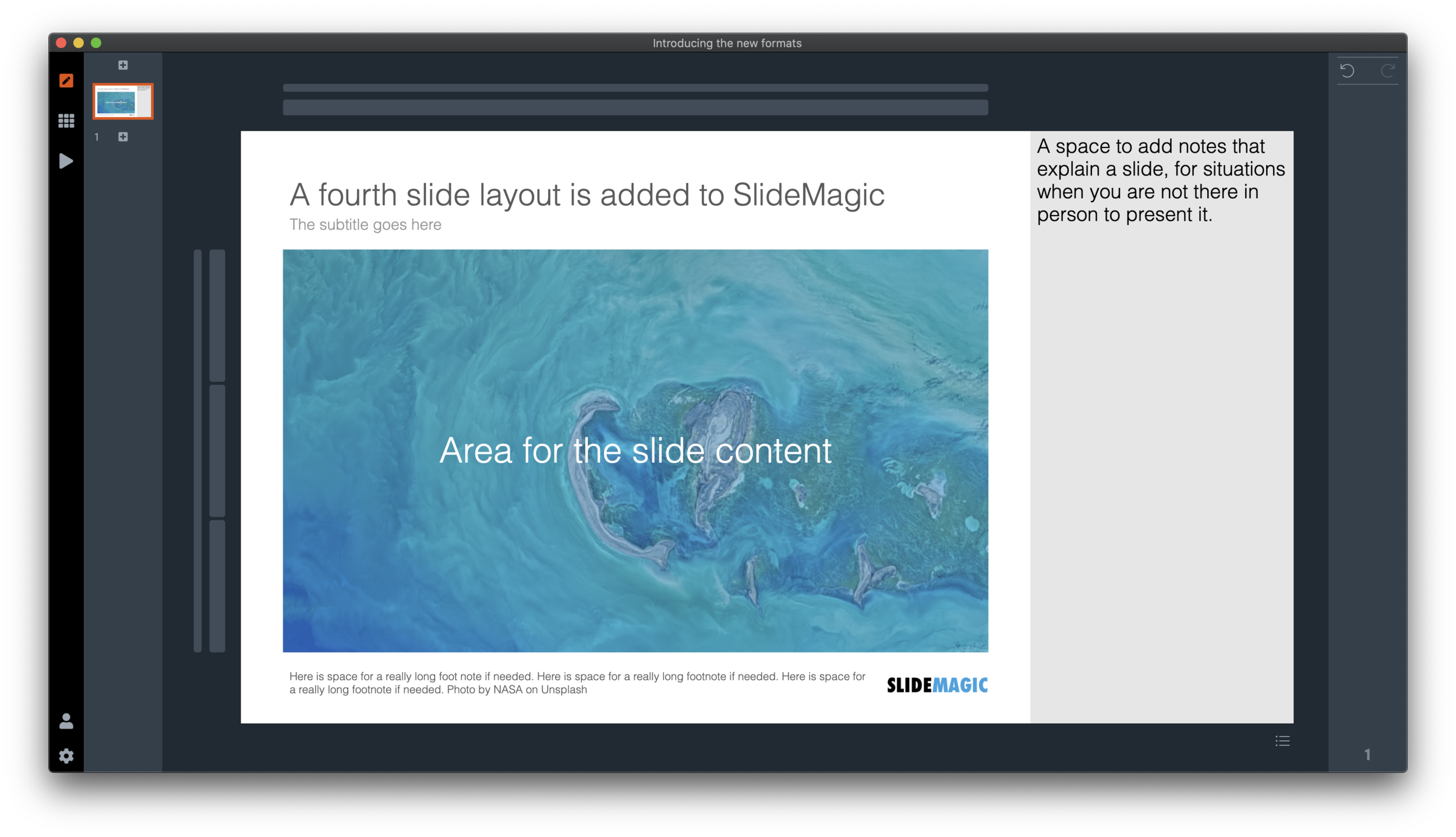
SlideMagic has now 4 screen modes, and you can switch instantly between them:
Traditional 4:3 narrow
16:9 wide screen
A 4:3 slide with an explanation panel to the side to leave notes for when you are not there in person to present the slide
The new and shiny 16:9 side title
Soon, I will rerun the PowerPoint conversion algorithms on the server to increase the size of the SlideMagic PoiwerPoint template database with 25%, each slide will now be available in the new format as well,.
(Hmm, the side panel needs some more padding, I will fix that [Fixed in 2.4.1]). There are a number of other new features introduced in version 2.4.
It is now also easier to select the “frame” element of the slide, I added 2 thin selection bars next to the regular grid selectors.
Also the right-to-left mode is completely rewritten (SlideMagic is based in Tel Aviv :-)) so that the side panel and side title show up in the right place.
Version 2.4 is a major update, please report any glitches you might experience.


