Tel Aviv is trying to improve the clarity of their parking signs, who can park when. The sign below is the new format. (If you do not read Hebrew, you will get tickets…)
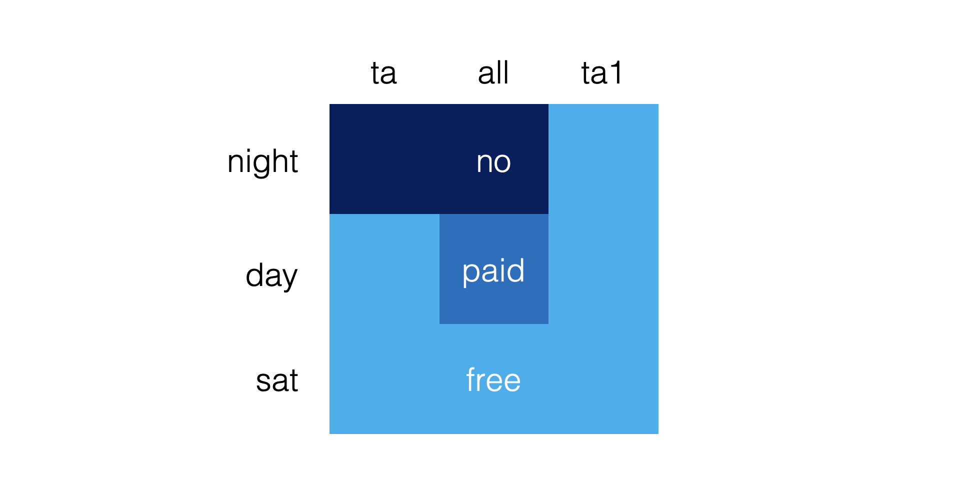
I would have gone for a much simpler shape that would make the table easier to read. Here is a sketch (obviously not a final design)
Put all the details (hours of day and night, etc.) in a dense footnote at the bottom. Once you have read the footnote once, you can just glance at the shape anywhere in the city and now what you are up to.
My guess is that the detailed table with explicit instructions was selected to make it easer to deal with law suits of people disputing their tickets.


