
For periodical update meetings, you often can use the same presentation with just the numbers updated. When the audience is internal to the company, many will just use a spreadsheet printout rather than transferring the data to a presentation.
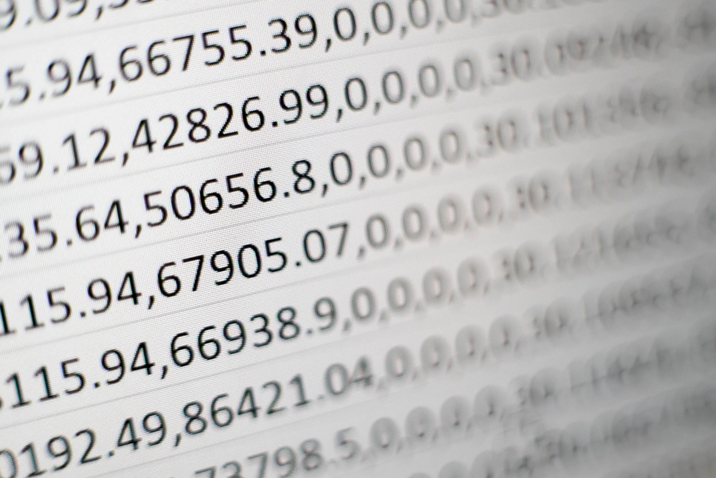
The result, a presentation that looks like, well, a spreadsheet.
There is more information presented than needed for the meeting
Numbers are highly precise and not rounded up
Fonts are tiny, as the spreadsheet tries to show everything on 1 page’s width
Colors and fonts are those of Excel, not the company
The last 2 rows of the table moved over to the next page
Etc.
If you need this report often, it is worth investing some time in setting up your spreadsheet properly.
Leave your “engine” untouched and create an entirely new work book that is your “presentation”
Get rid of spreadsheet gridlines and show the page cut offs so you get a clear view of the boundaries of your “slides”
Set colors and fonts the same way you would do in PowerPoint
Now build your slides page by page, by pulling in the data from the engine sheet, round numbers up as you go ( / 1000, show 1 decimal, etc.)
With these types of reports, you variability between slides will be in the column widths, not so much in the rows. To keep your “deck” all in one workbook, move horizontally, and add pages to the right rather than below
(Optional) The next level up is to introduce shapes and other graphics in your spreadsheet, and you can get to the same level of finish that you can achieve with regular presentation software.