Viewing entries in
Investor presentation

Team slide, in the front or in the back?

Team slide, in the front or in the back?

Where to put the slide with the team? Early in the presentation, or towards the end? It depends.

  • If your team is one of the main assets of your startup, well, put it up front.
  • If the majority of your team is sitting physically in the presentation room, well, you might as well use the team slide upfront to introduce them
  • In other cases, I gravitate towards putting the team slide in the back, after your pitch of the big idea of your venture.

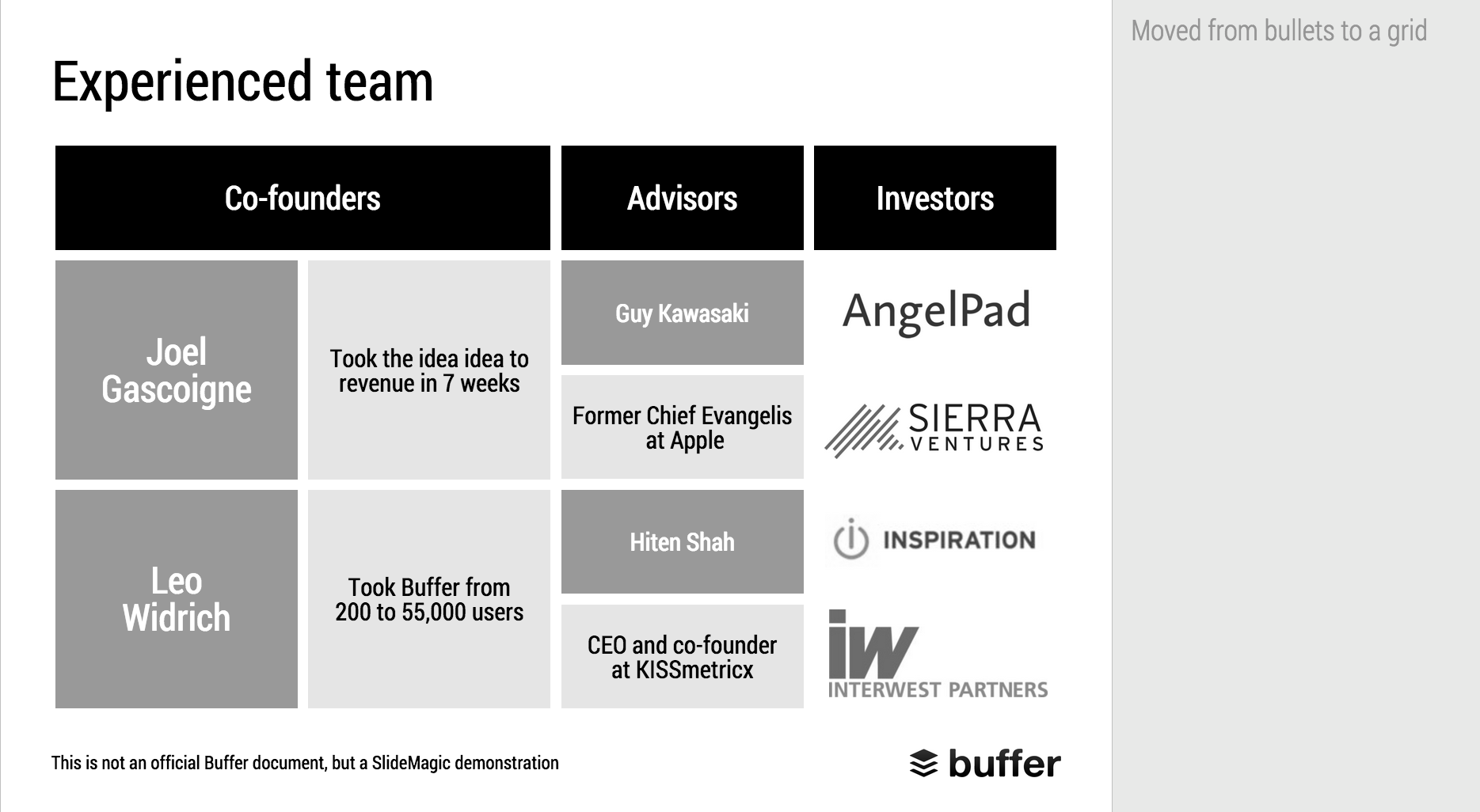
The team slide in a live presentation is different from a detailed bio

  • The presentation slide should emphasise what is remarkable about your team, and omit other details:
    • If your team worked at a lot of big, blue chip companies, splatter the slides with recognisable logos
    • If your team has a history of working together, show a time line with overlaps
    • If your team consists of brilliant scientists, show the awards they got
    • If your team has complementary skills, show the puzzle with all the pieces
  • The detailed bio is important as well, for people to read/study after the meeting. This can be a dense font 10 page that goes in the appendix of your presentation. You can include links to LinkedIn profiles as well on this page.

Art: Jacob Jordaens (1593–1678), The King Drinks

SlideMagic: a platform for magical presentations. Free student plan available. LEARN MORE
Salami slicing valuations

Salami slicing valuations

Negotiating company valuations is part art and science. Science (Excel sheets) can be helpful, but also dangerous in investor presentations. One risk is "salami slicing". I explain what this is in 2 examples

  • You email the full valuation Excel model that backs up your $95m valuation (cell D34 of the DCF worksheet) to the other side. Obviously this model is full of assumptions, and these assumptions are set with a seller's bias. The buyer can now take each of these assumptions one by one, nock them down a bit, and get an instant reduction visible in cell D34. Your own logic is being used against you. In M&A situations it is better to just exchange assumptions and let the other party stitch them together to a point estimate in their own model.
  • You are an extremely early startup and benchmark your valuation against an Internet giant on let's say a sales multiple. The salami slicing can now happen in multiple ways. You should correct the multiple downwards to compensate for some assets that facebook has, and you obviously do not have, or people can go back in time and see what facebook's valuation was when Mark just started out in his garage.

Watch out for the salami slicer.


Art:  Albert AnkerStill life Excess (1896)

SlideMagic: a platform for magical presentations. Free student plan available. LEARN MORE
Investors spend <4min on your pitch deck

Investors spend <4min on your pitch deck

Here is an interesting analysis of VC pitch decks that were hosted on the DocSend slide hosting/viewing platform. They aggregated data (anonymously) about what slides were included, how long the slides were viewed, how many meetings it takes to close the round etc.


Investors spend on average 03:44 minutes on a pitch deck, and 12% of them does so on mobile devices. In the second screen shot you see what this means per slide: 10 to 25 seconds. That is all you have to get your message across.

I do not completely agree that the ranking shown here implies how important slides are. Slides with financials, competitors, and team bios on them take more time to digest. 

You can see the full results of the survey here.


Art: The dance to the music of time c. 1640, a painting by Nicolas Poussin

SlideMagic: a platform for magical presentations. Free student plan available. LEARN MORE
Makeover of the Buffer pitch deck that landed them $500k

Makeover of the Buffer pitch deck that landed them $500k

When Googling for examples of VC pitch decks, the on that Buffer used to raise $500k in 2013 ranks high. I decided to give it the SlideMagic treatment: how would the deck have looked when the slides would have been created in SlideMagic.

  • I changed the slide design to fit SlideMagic
  • I did not change the slide content
  • I did not change the story flow

I have a few comments on the slides that I have put in the SlideMagic explanation boxes.

Here is the original:

Here is the same deck in SlideMagic. You can clone this presentation to your own SlideMagic account by clicking this link and use some of the slide concepts in your own presentations. I have also added this presentation as a template in SlideMagic's template library.


Art: Johann Zoffany paints a group of Englishmen in Rome for the Grand Tour, united only by their wealth and love of art; unlike most conversation pieces, this was not a commissioned work


SlideMagic: a platform for magical presentations. Free student plan available. LEARN MORE
Design DNA

Design DNA

Design DNA is engrained in a company. It shows in presentations, in the web site, in the way the office is laid out. When a visitor/user/viewer gets in touch with a company, she makes up her mind in the first millisecond about the design DNA of the company, by comparing it to all other presentations, web sites, and offices she has seen. We have all seen these stereotypes:

  • The bare bullet point presentation in the standard Microsoft Office 2007 format
  • The over-designed PowerPoint template with gradients, images with faded edges and huge logos at the top of the page
  • The social media expert website full of call to actions to buy her $5 ebook on being a social media expert
  • The traditional, hierarchal office with too many big leather board seats crammed around a too small board table in a board room that doubles as a storage room for exhibition displays
  • The hipster I-don't-really-say-anything web site
  • The girly office full of plants and cute natural-material furniture
  • The macho office with an impressive collection of booz in the lunch room
  • The 1990s tech company web site: takes 40% of your screen and has detailed product hierarchies that get to pages that don't really say much about that specific product
  • The startup web site where "tour", "about us", "benefits", and "product" tabs pretty much say the same thing

At every point you come in contact with a client, user, investor, make sure you look the way you want to look. Even if your investor presentation looks right, that impression can be undone in one second when someone opens your web site.

One strategy is to change and align everything to make sure it is consistent. Another one is to recognise who you are, and change the 1920s cute art deco look of your presentation if you are in the business of selling 4x4 car suspension systems.


Art: Henri Rousseau, The Dream

SlideMagic: a platform for magical presentations. Free student plan available. LEARN MORE
Startup pitches are changing

Startup pitches are changing

A few things are going on in startup land, especially for consumer facing apps:

  • It takes less and less money to launch a product (who could have thought 10 years ago that 1 person could self-finance and launch a PowerPoint alternative)
  • Startup ideas and pitches are fragmenting and are everywhere around us. Most ideas are variations on existing concepts that everyone is using. "Uber for gardeners", got it.
  • Business communication gets more efficient. Phone calls, coffee chats, Hangouts: the big, formal standup presentation where everyone patiently and politely let's you finish your bullet points is on its way out.

What does all this mean for investor pitches?

  • Do not feel worried if you can explain what your idea is in just 2 slides. If you are done, there is no need to add padding.
  • Since it is so easy to get an app up and running, the actual beta/prototype web site/app is a large part of the product pitch. Does it look polished? Does it work? Do you feel like signing up?
  • Related: market size analysis is increasingly replaced with "what % of your user base are willing to pay the $10 per month for this, and how fast you growing?" 
  • The big, big, big, question is: do users like it. User growth, traction, user behaviour analytics. Numbers, data. All this matters a lot. The qualitative upfront part of the presentation (emotional pictures that show the problem) gets smaller, and the quantitative what is your LTV, CAC, churn, etc. gets bigger. Pitches start to look like consulting decks again.
  • Success/failure will be evident in a shorter period of time, so you need to be sure what you are doing with the money you are raising. (You are no biotech startup that raises a lot of money to "continue doing clever R&D"). Know where you spend things on shows that you are mature to investors, but is also protecting you. If you do not have good customer conversion rates, it is a waste of money to raise capital to spend on marketing and attract lots of people at the beginning of the funnel, who will then leave.

In biotech, enterprise IT, I continue to see the traditional startup pitch (pain, market, etc.). In consumer, things are different.


Art: The Rainbow Landscape or is a c.1636 landscape painting by Peter Paul Rubens

SlideMagic: a platform for magical presentations. Free student plan available. LEARN MORE
What to put in a short-term budget

What to put in a short-term budget

In investor pitches there are usually 2 types of financial forecasts:

  • Short-term: super precise, usually mostly cost
  • Long-term: ball park, usually mostly revenue

Why do investors want to see some sort of short-term budget?

  • While the long-term revenue outlook of a startup is highly uncertain, the near term cost drain is pretty much set in stone. Investors want to know where her money goes: in development, in an expensive, all-or-nothing/bet-the-company Super Bowl ad?
  • Investors want to check the consistency of your story. You say that you are not focused on getting customers right now, so you should not be spending anything on marketing. On the other hand, you plan 25 new features in your product, where are the developers (and their salaries) who are going to make it happen

A short term cost budget does not need to contain 25 lines of Excel, by month. A simple x% of revenues number is a bit too simple though.


Art: Marinus van Reymerswaele, The moneychanger and his wife (1539), Museo del Prado, Madrid

SlideMagic: a platform for magical presentations. Free student plan available. LEARN MORE
Ban social media speak

Ban social media speak

Self-proclaimed social media experts have taken all credibility out of buzzwords such as engagement, social, conversation, sharing, etc. etc. Clean your investor pitch from social media speak or you run the risk of sounding like a social media expert.

Instead, to describe what users actually do, use human language. To explain how your business gets traction use really hard, quantitative, measures that add up to the bottom line. "Buzz" does not necessarily bring dollars.


Art: Shepherdess With a Flock of Sheep, Anton Mauve, sign up for SlideMagic, subscribe to this blog, follow on Twitter.

SlideMagic: a platform for magical presentations. Free student plan available. LEARN MORE
Kawasaki: the only 10 slides you need in a pitch

Kawasaki: the only 10 slides you need in a pitch

Guy Kawasaki (the person behind the 10/20/30 rule) listed these 10 slides as the only ones you need in a startup pitch to investors. I agree and disagree with him.

I agree that these are more or less the 10 points you need to hit. But in order to hit these points, you might need more (visual) slides. Especially number 2: the problem/opportunity. A one slide explanation might not make the point emotionally. Or number 4: the magic, might take more than one slide.

The biggest problem is not which slides you need, the challenge is how to design them. Design is easy for the straightforward slides: title, business model, go-to-market, management team, projections. The other ones are a bit more tricky.


Art: Rothko number 10, sign up for SlideMagic, subscribe to this blog, follow on Twitter

SlideMagic: a platform for magical presentations. Free student plan available. LEARN MORE
2x2 matrix clarity in presentations

2x2 matrix clarity in presentations

The 2x2 matrix is a favourite layout for differentiating yourself from others. 'We, the good guys, are in the top right corner".

But people sometime force the framework somewhat. If you are having trouble filling the bottom left box, consider using a Venn diagram (a "best of both worlds concept").

If it is going to be a 2x2 matrix and your axis choice is a bit tricky, write things out in full. Rather than "ease of deployment, low, high" consider ignoring the axis name and write the 2 categories: "Big system integration project", "Up and running in 5 minutes". You can also write explicitly in the 4 boxes what they are about (BCG did that with their brand matrix: "dogs, cows, stars, question marks")

Framework in pitch presentation are different from those in a micro economics Phd thesis.


UPDATE January 2018: we have now added 2x2 presentation templates to the SlideMagic template store.


Art: Peterka Vlada, Sunset at Liberty Square, Oil on canvas, 40x28 inches ( 100x70 cm ), 2012
Subscribe to this blog, follow me on Twitter

SlideMagic: a platform for magical presentations. Free student plan available. LEARN MORE
"We can skip the problem"

"We can skip the problem"

Often, this is what a confident sales rep says when discussing the brief for a sales presentation. For industry insiders, it is true that you do not have to elaborate much about issues they already know. But I think plunging straight into features, benefits, and solutions is the wrong approach.

It is much easier to sell a problem than to sell a solution. Almost all my sales and investor presentations elaborate on the problem.

  • For sales presentations, it is a good opportunity to discuss individual issues the client has. The best sales presentations talk about the client, and not about the seller. Even if it is old news for the audience, it is good to start your story on common ground. And most importantly, I often present the solution using a slide layout that I already introduced during the problem part of the presentation. "Here is that same slide we discussed before but now with that big messy part ripped out".
  • For investor presentations, you actually need to educate the audience about the issue that your innovation is solving. So here the problem section is actually very important.

So, next time push back when they tell you to skip the problem.


Art: Dalí Atomicus (1948) by Halsman in an un-retouched version
Subscribe to this blog, follow me on Twitter

SlideMagic: a platform for magical presentations. Free student plan available. LEARN MORE
Should you work for free?

Should you work for free?

I design a lot of investor presentations (hey, Google views me as the #1 investor presentation designer!), including pitches for startups. And companies that need to talk to investors are by definition short of budget. Many startups ask me whether I consider working for a delayed fee. Usually, I say "no" and that sounds harsh to a boot strapping startup. Here is a ruthless profit seeker trying to extract money from a small, fragile, company that could do amazing things for the world.

Here are some points to remember, and I invite all freelancers to use them where appropriate:

  • Deferred payment is real money. Yes, you are not selling a physical product (nobody would walk into a car showroom and have the guts to ask for free vehicles with payment after the next fund raising round, if it happens), you sell time. But there is a real opportunity cost to working on one project: you cannot work at the same time for a client who does pay cash.
  • Deferred payment is your own money. Most startups have some sort of funding, which means that they benefit from OPM (other people's money). Freelancers cannot. It is their own cash. (In my case where I am funding SlideMagic from own personal savings this argument is especially true).
  • Startups do not equal charity. Startups want to become a commercial success. Doing pro bono work fore a cause you belief in does not equal providing free work to a company that is raising money.
  • Success fees have to be so large that no startup will pay them. Venture capitalists require that their investments need to return 3, 5, 10 times their money. And VCs invest in a stage of a company where at least one risk has been eliminated: funding risk. The designer working on an investor presentation comes in before that, which would merit an even higher return. No startup has agreed to pay 10x the price of a regular project.
  • The carrot, we will generate lots of work for you in the future does work for a big company that needs to feed a big fixed cost infrastructure. A successful freelancer will have no problem filling her work pipeline with other clients.
  • This startup is not the only one. I get these type of requests every week. If I would say yes, I could spend 120% of my time working on a deferred payment basis. Why should I say "yes" to this startup and turn down the other 10?

And finally, there is a psychological argument here. Over the past 10 years, I have had very little success with deferred payments. Usually the startups who believe in themselves, pay cash, and stay happy clients for many years. The ones that seek deferred payments somehow don't make it, as if they know something already.

What is the solution? Some startups are happy to pay for a good investor presentation and see it is a crucial investment to get through the very first stages of their company. In other situations, I try to find a working model where I can be involved less to get to an acceptable result for a much better price.


Art: Giacomo Francesco Cipper - Peasant Repast with a Young Beggar, 1725
Subscribe to this blog, follow me on Twitter

SlideMagic: a platform for magical presentations. Free student plan available. LEARN MORE
Investors, it is your track record

Investors, it is your track record

Many of my clients are venture capitalists themselves who need to go out and raise money from big pension funds or wealthy individuals.

There are usually two big components in their own investor presentations:

  1. The concept of the fund (where/what/how much it invests)
  2. The investor track record of the team.

Investors tend to spend a lot of time on number 1, but the thing that really matters is number 2. Unfortunately, most investors cannot say that they were seed investors in Facebook, Google, Twitter, and Uber. So the challenge of the presentation is to convince institutional investors that you can be trusted with their money.


SlideMagic: a platform for magical presentations. Free student plan available. LEARN MORE
Overpolishing

Overpolishing

Some stories are best served raw. The other day, a client pitches a wonderful startup idea to me. The company solves two broken issues (sorry for the cryptical language), and has a solution that changes something that has not been changed since the 1950s.

During the design process I felt somehow that we made it too polished, adding too many "and also, and also, and also" points. It is the full story, the full picture, but the additions kill the energy of the pitch. I think we should go back to the raw version and accept that in a 20 minute pitch we do not have time to cover everything.


Art: Vertumnus, a portrait depicting Rudolf II, Holy Roman Emperor painted as Vertumnus, the Roman God of the seasons, c. 1590

Click here to subscribe to this blog

SlideMagic: a platform for magical presentations. Free student plan available. LEARN MORE
Presenting at a pitch competition: audience versus professional jury

Presenting at a pitch competition: audience versus professional jury

They are different. The audience will put more value on:

  • Entertainment value ("stunning" slides, unusual props, presentation style)
  • Emotional connection to your business idea (not-for-profit ideas do well)
  • Emotional connection to the speaker (is she sympathetic, an underdog taking on big bad forces in the world)
  • Whether they actually remember you after a long morning of pitches (most of the audience will not take notes)

The professional audience will put more value on the business potential of your idea.

Focus on the objective: winning the pitch competition, which is different than receiving a cheque.


SlideMagic: a platform for magical presentations. Free student plan available. LEARN MORE
The excitement sapper on the last page

The excitement sapper on the last page

A good pitch should be a crescendo of energy and excitement. Ideally it goes up all the way through the story. But it is hard to avoid even for the best story tellers that in the middle of the presentation the audience attention drops a bit. Make sure to bring everyone back to the tip of their chairs at the end tough.

A sure energy sapper is a last presentation slide full of bullet points that recap the entire presentation. "Oh no, he is going to read out the entire thing!" When the presenter is at bullet 2, the audience has finished reading the entire page full of things they already heard over the past 20 minutes.

A better approach is to repeat one crucial visual, diagram, image on the last page that reflects a key point in your presentation. It will be visual memory anchor point for your entire presentation. 


Art: Paul Klee, The Red Balloon, 1922

Click here to subscribe to the blog

SlideMagic: a platform for magical presentations. Free student plan available. LEARN MORE
How to pitch a VC, according to VCs...

How to pitch a VC, according to VCs...

There is no better person to get VC pitch advice from then the people who sit at the receiving end of your presentation. Here are startup VC pitch suggestions from a few well known people in the industry. Click on the image to see what to they have to say.


Mark Suster, Upfront Ventures

Mark Suster, Upfront Ventures

Dave McGlure, 500 Startups

Dave McGlure, 500 Startups


Paul Graham, Y Combinator

Paul Graham, Y Combinator

David Rose, angel investor

David Rose, angel investor


Reid Hoffman, LinkedIn

Reid Hoffman, LinkedIn

Vinod Khosla, Khosla Ventures

Vinod Khosla, Khosla Ventures


SlideMagic: a platform for magical presentations. Free student plan available. LEARN MORE
Big data overload

Big data overload

"Big data" is fashionable right now and many startup pitches emphasise how if an investor wants to put dollars in big data, this company is the best place to do it. Visualisations look similar: a big spaghetti of lines enters a box and out comes a super insight. The traditional IT-way of visualising the world: everything fits in an architecture diagram.

The problem: all these decks look and sound the same.

Architecture diagrams that describe the technology in a top down view are not always the best tools to pitch business ideas. The other approach is bottom up, story, and case example driven. Take one specific insight, and work your way through the system and show how it was produced. Super detailed, super specific, and super real.

Once the audience is convinced that this one microscopic case example works/is brilliant, they will have no problem believing that it works for the other 5 billion possible use cases. And in the process, they are convinced that you did not just slap the label "big data" on your pitch because it is the latest fashion.

Art: Jackson Pollock, Autumn Rhythm, 1950, image by Matthew Mendoza

Click here to subscribe to the blog 

SlideMagic: a platform for magical presentations. Free student plan available. LEARN MORE