Viewing entries in
Investor presentation

The video call is the new call

The video call is the new call

Some positive culture changes in this time of remote working, from my own experience, and observing my venture capitalist wife:

  • Calls that were, well, just calls, are now almost all video calls

  • Things start on time, on the dot (Germany-style)

  • Small talk formalities are shorter, but much more effective with the video picture present

  • Investors can size up the management team of a startup earlier in the process

  • Body language makes it easier to adjust the flow of the presentation (in cases of boredom, confusion, and/or excitement and interest)

Photo by Thomas William on Unsplash

SlideMagic: a platform for magical presentations. Free student plan available. LEARN MORE
SlideMagic is a desktop app, and it isn't

SlideMagic is a desktop app, and it isn't

“What, you are making a desktop app in 2020? Well, we (the U.S.) have moved totally into the cloud now, everyone is using Google Docs to collaborate. Maybe people in less developed countries might find your product interesting if it is offered at a low price (i.e., people who cannot afford Google Docs and/or are using pirated copies of PowerPoint. Your next challenge is to make your product available in non-English languages and get sales distribution in these markets (do you need some contacts?).”

OK.

I now start to feel first hand what entrepreneurs go through when talking to others (especially investors) with their product. I am not raising money at the moment, but here is a possible way of answering a question like this.

  • On the one hand SlideMagic is a desktop app, on purpose. Presentation design requires a super snappy interface, and deep access to the operating system (dragging things between 2 files open in a window for example).

  • On the other hand, SlideMagic is not a real desktop app. It is written in HTML and Javascript and runs on Google Chromium, the current web development setup, and the app is updated very frequently in the background (sometimes daily).

  • SlideMagic focuses on 1 (huge) issue in presentations: story clarity and design, not online collaboration, not enterprise security, not cloud file storage, not data analysis, not stunning animations, not knowledge storage and search, not intra-employee information sharing. All these are important issues that have great software products built for them, by billion dollar companies.

  • SlideMagic’s economic setup allows it to do this: a super lean cost base, and a former strategy consultant, presentation designer, computer scientist brain combined in one head to try and get product-market fit for what no one has managed to do: get people to make better presentations. Millions of dollars of VC money, huge teams of people with the objective of dethroning Microsoft or Google is not what were are doing here. SlideMagic needs very little to turn profitable, SlideMagic can afford to take its time with product iterations to get there. Only when the formula catches on, investing is growth is on the agenda.

In short, SlideMagic might sound like a crazy idea, but it is a calculated risk where the whole combination of technology, idea, economics, and entrepreneur is in balance and hangs together. It might not work, but it could work, and when it does, presentations will become a lot better.

You see how I tried to answer the question: factual, reasonable, and even a bit vulnerable. Not every investor will agree with you, not every investor will think she is a fit with your business (these are 2 different things) but every one of them should think that you are a sensible person and see where you are coming from.

Photo by Andre Mouton on Unsplash

SlideMagic: a platform for magical presentations. Free student plan available. LEARN MORE
Warren Buffett's investor presentation slides

Warren Buffett's investor presentation slides

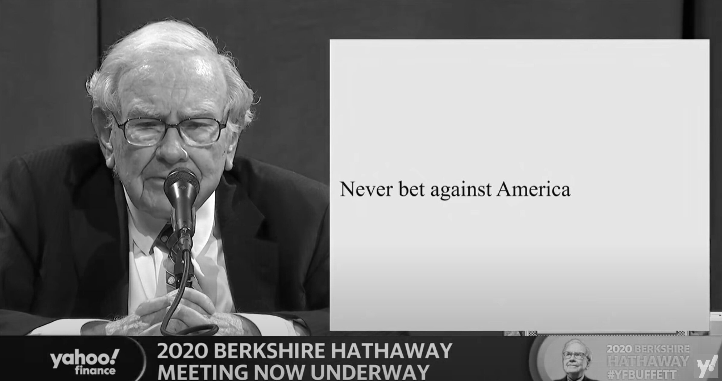
This tweet flew by about Warren Buffett’s slides during his annual investor meeting.

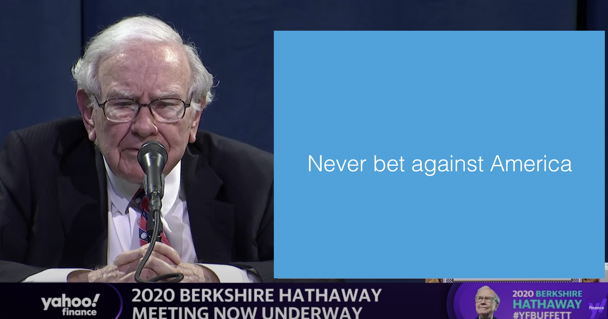
A sans serif font and centering the text would have made it look better, but overall, this slide is actually not that bad. One big message without distractions. (If Warren had used SlideMagic with this template, his slide would have looked like this)

Screenshot 2020-05-03 07.34.29.png

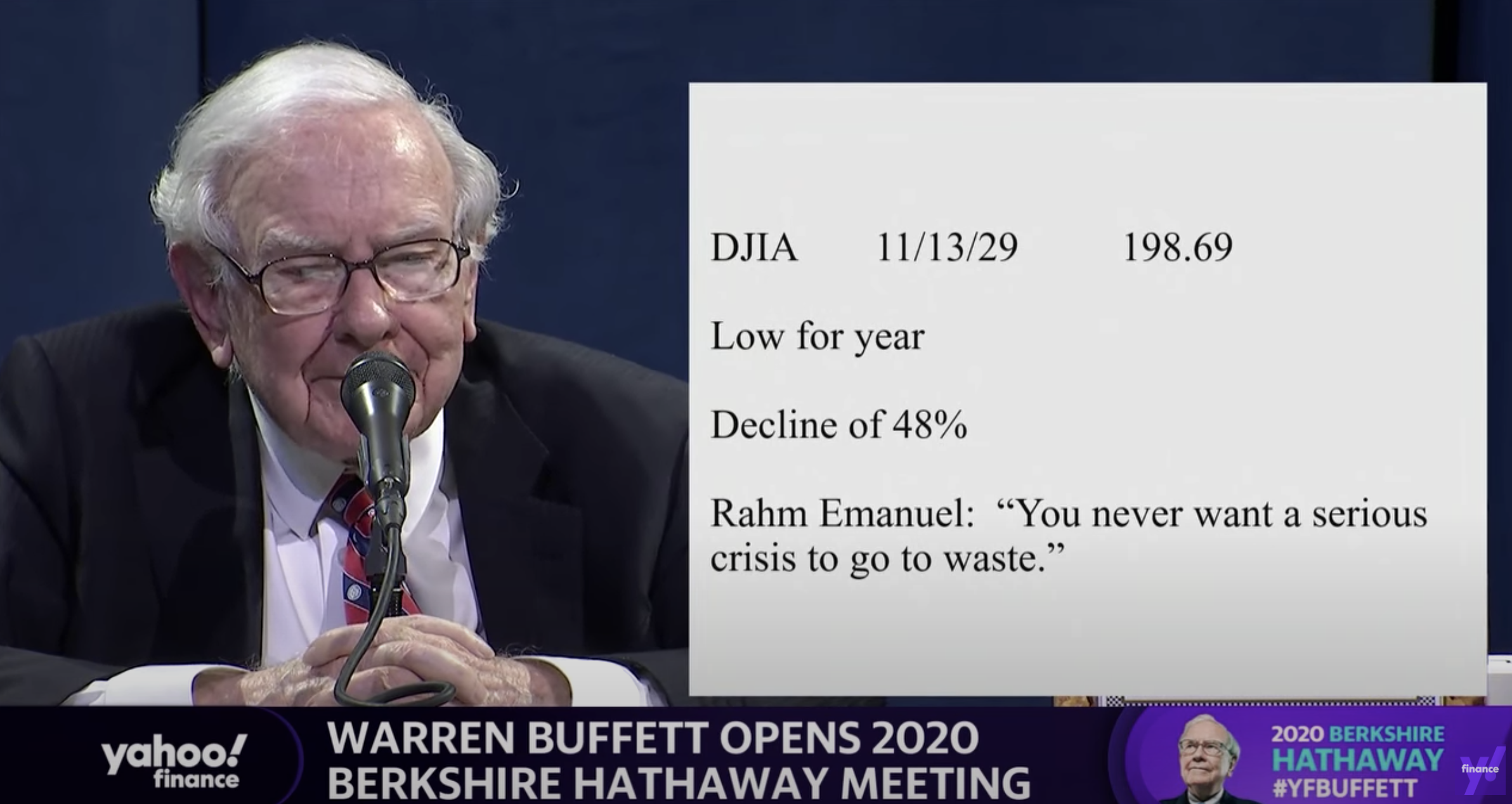
Other slides are less crisp though, as seen in the example below:

Screenshot 2020-05-03 07.24.07.png

But, Warren does not read out the bullet points, he tells a story starting with background about his father. People will read the slide for 2 seconds, wonder about the quote, and then focus all attention back on him.

OK, I could not resist, SlideMagic would have produced the following slide (a quick search for “1930” in the built-in Pixabay image search delivers good results)

Screenshot 2020-05-03 07.51.59.png

I would put the quote on a completely separate slide, if at all.

Coming back to the first tweet. If you are Warren Buffett, then you get away with pretty much any slide design. On the contrary, making it all too fancy is a direct contradiction to his modest life style. If you are not Warren Buffett, putting in 2 seconds worth of effort with SlideMagic will definitely make a difference.

I tagged these 2 slide examples with “buffet” in SlideMagic, you can use them in your own designs and find them in the presentation app, or download them here.

SlideMagic: a platform for magical presentations. Free student plan available. LEARN MORE
Corporate earnings call deck

Corporate earnings call deck

I am in the process of adding more full slide decks to SlideMagic. Now all the investment in automation starts to pay off. Creating slides is incredibly fast in the app, after that the server takes over and creates thumb nails, organises tags, uploads both individual slides as well as the full deck for download, in powerpoint 4x3, 16x9, and of course .magic format.

Today, I added a possible layout for a big corporate quarterly earnings call deck, loosely based on a recent earnings presentation of a large pharmaceutical company (these presentations are obviously in the public domain).

SlideMagic subscribers can download the earnings call presentation template here.

Let me know what other type of slide decks you are looking for.

SlideMagic: a platform for magical presentations. Free student plan available. LEARN MORE
The asterisk

The asterisk

I am preparing a few more stories to add to SlideMagic, one of which will be a sanitised box-standard quarterly earnings presentation template for a typical manufacturing company. Just stumbling on this tracker page. It probably started out good, but then the legal department got involved and put in all the disclaimers… “36 consecutive years of growth” sounds a bit better… I would have put that in the slide, and then clarified the “adjusted earnings” part all in the foot note.

36 consecutive years of adjusted operational earnings growth*

Screenshot 2020-04-14 14.31.25.png

SlideMagic: a platform for magical presentations. Free student plan available. LEARN MORE
Testing the first SlideMagic stories

Testing the first SlideMagic stories

I reshuffled the code on the server, so I can now stitch entire decks (I call them “stories”) together that you can download in one go. I think these stories can complement the offering of individual slides.

  • Slide templates are focussed on one particular design or image that cover a certain topic

  • Story templates are all about well, the story. I expect them to contain mainly very simple slide layouts, what matters is what is written in them, and in what sequence they are put together.

I am starting with a quick make-over of the YCombinator seed deck, you can download it for free here. See the original post on YC for the background.

It is available both as a .pptx and a .magic file, but it with these simple slide layouts where the power of SlideMagic comes in: quickly adding or deleting rows without messing up your slide layout. You know which I would pick :-)

There is still work to do, you can’t get to the stories easily from the top slide menu. Also, the user interface can be confusing now when as a user you are not sure whether you are browsing slides or stories. Also, in-app story downloads are not your implemented . Work in progress.

SlideMagic: a platform for magical presentations. Free student plan available. LEARN MORE
Credibility

Credibility

YCombinator VC Paul Graham argues that the current pandemic has exposed politicians that talk confidently about things they do not understand: see the post her about credibility in corona times.

  • He is right

  • Most of these politicians probably did not knowingly lie, I assume they believed they understood things, that’s probably a key asset of being a politician

When it comes to pitching to investors, credibility is crucial, and you can only loose it once. Investors will have to work with you for a long time, they don’t have time to check everything you do, so as soon as one incident gets exposed where it appeared that they cannot trust you, that’s it.

So you get a question you do not know the answer to:

  • If it is factual, give the answer after you consulted with someone who knows, maybe after a short delay

  • If you truly don’t know, say so, with an approach how you mitigate the uncertainty.

Bluffing an answer is not the right thing to do here.

So as a startup CEO, you can still be highly confident that your idea is going to work, and keep credibility while admitting that you do not know everything, and that you might actually be wrong.

Photo by Dayne Topkin on Unsplash

SlideMagic: a platform for magical presentations. Free student plan available. LEARN MORE
We will get to that on page 35...

We will get to that on page 35...

Working from home means that I cannot help to overhear fragments of startups pitching to a VC (my wife is a partner in a healthcare venture capital fund).

You are in a Zoom call, going through a deck with a few people from the VC, and the senior management team of the company on the line. One of the impatient investors throws in a question on a crackling audio connection. Answer it, or (tell her to) wait for page 35?

If you were presenting to a huge crowd (webinar, live audience), then the answer is clear, tell them to wait for page 35, or even ask to leave all questions to the end.

The “intimate” Zoom call is similar to a conference room setting though that opens the door to more interaction that throws you of your planned story script. There is no general rule, but here is how I would handle the interruption.

  • Always give some sort of very brief answer: ‘The short answer is “yes”, it has something to do with “this and that”, we will discuss it in more detail on page 35. This takes you as much time and disruption as saying: “sorry, page 35 will show up in 20 minutes”

  • Then calibrate based on the sort if question. If it is a super naive question (junior analyst, VC who does not really understand the substance), maybe insist on continuing your story line so everything falls into place nicely. If it is a razor sharp question by someone who is really informed, pinpoints the exact weak point in your story, and/or addresses a big elephant in the room, you could assume that people have done their homework and know what they are talking about. Sticking to your script might not give you points here.

  • If it is a big interruption of your original flow, have a way to continue the story in a slightly different order, bringing everything back together for the other people in the room

  • If you get tripped up a lot by questions, maybe this is a sign that your story flow might not fit that of your audience. The 101 sequential story is great for explaining things to the uninitiated, but will not work for impatient experts in the field.

Photo by Ussama Azam on Unsplash

SlideMagic: a platform for magical presentations. Free student plan available. LEARN MORE
Instant reaction to a draft pitch deck

Instant reaction to a draft pitch deck

The other day I was eye balling a pitch deck and here I am jotting down my reactions as I go page by page:

  • Logo and colour on the front page looks nice, a grammatical error and an over used buzz word in the slogan

  • Vision statement instead of describing what the app is all about. Vision statement contains overused buzzwords, and lists actually multiple possible consumer hooks, each could be a business in its own right, some are features, some are business models

  • App screen shot looks nice, but highlighted features do not match the vision of the previous page

  • Lots of market data, but in this industry, no one will ever doubt that the market is small, the question is how to take on the existing giants and way of doing things

  • Product description (matches the screen shot, not the vision). Trying to relate this product to products I know (both traditional ones, and other innovators I am aware of). Maybe this product is new and does not merit a direct comparison, but still I am trying to understand what it actually does before getting into the positioning. Existing product comparison are good for the purpose of educating.

  • Very dense internal consulting chart that shows how the team came up with the value proposition

  • Competitive analysis is a detailed spreadsheet, competitor columns need re-ordering, feature rows need re-ordering and grouping

  • A key strategic partner pops up at the end of the slide deck as a very important part of the brand

This is not a critique of a final, polished investor pitch, this document was just version 0.1 of an interested customer of SlideMagic, asking me what templates to use. SlideMagic can instantly upgrade the looks of these slides, some of the consulting frameworks are on board as a template already. But designing the deck is too early.

It looks like the project started as an original product idea with a very distinctive feature. Now the team is working to build the right consumer positioning out of it and is mid-way. Some recommendations:

  • Keep the investor positioning and the consumer positioning separate. For investors, be very clear how your product/technology fits, relates, is different from other players in the market. The consumer pitch can sound different. You need to have a consumer pitch, since the investor wants to be confident that you know how to market, but that is a different check box you need to tick.

  • Separate the charts from you internal consulting project from the pitch deck, they are totally different. Not only in graphical style, but also in content. Working documents show doubts, trade offs, analysis, pitch charts have a very clear and confident message

Photo by Science in HD on Unsplash

SlideMagic: a platform for magical presentations. Free student plan available. LEARN MORE
It makes sense, but it does not

It makes sense, but it does not

I have been in many of these types of presentations:

Some of the reasons why the overall conclusion of a presentation does not make sense, while the individual slides do:

  • Maybe the people, the organisation, and its culture is not the right environment to make a plan happen. Who is going to do it?

  • The probability curve: on average, normally speaking, the strategy makes sense. But what if things start deviating from the average. What is the potential downside and could it be catastrophic to the compony?

  • The self-fulfilling prophecy. Yes, the deck has 50 slides, discussing 50 different aspects of the idea, but when you look at it, they all depend on ver few (maybe even one) assumption about the market outlook, a valuation of a company, etc. That assumption could be wrong.

Unlike for big companies, for tiny startups the opposite could be true. The slides might not all make sense, but the team is fantastic, the downside is not that big, and an angel investor is willing to bet on that one big assumption.

Photo by dylan nolte on Unsplash

SlideMagic: a platform for magical presentations. Free student plan available. LEARN MORE
How would you introduce it?

How would you introduce it?

When someone asks me for an introduction to my network with an idea that needs to be pitched, I noticed that I can be as effective in explaining the basics of an idea in a few lines in an email as an entire slide deck.

Why?

I really think about my “audience” (usually a friend or business relationship that has a lot of prior knowledge or interest in the thing I am pitching, otherwise I would not bother to make the introduction). Out go the buzzwords, the market stats, directly raising the points that are unusual, surprising, unexpected, to someone who has a decent understanding of this type of business.

Personal recommendations can be much more powerful in an informal email between friends. You cannot put “she was only the junior assistant on the team, but believe me, she single-handedly delivered that project” on a slide.

You can raise risks in an honest way that are not always detrimental to the pitch: “the whole thing hinges on whether they can get product costs down, but I think they have a good shot at it”.

Next time when you write a pitch deck, ask yourself the question, what would a friend who is doing you a favour have to write in the cover of the email? Read the resulting text, and maybe it inspires you to change your pitch deck as well.

Photo by Helloquence on Unsplash

SlideMagic: a platform for magical presentations. Free student plan available. LEARN MORE
Pitch advice

Pitch advice

Some useful guidance by Jason Lemkin, a VC. Two items on the list stand out:

The initial decision is made within 20 minutes of the first face-to-face. Make it exciting, speak with data, and get to the point. The initial Yes, Maybe or No decision is made within 20 minutes. So save slides 20–200 for questions and back-up.

Making stuff up is death, or close to it. If you don’t know the answer, just say that, it’s fine. But make something up that the VC knows the answer is otherwise … that’s almost always a No right there.

Photo by Jhonatan Saavedra Perales on Unsplash

SlideMagic: a platform for magical presentations. Free student plan available. LEARN MORE
White elephants

White elephants

A VC friend got sent a pitch the other day that sounded like an exact copy of a company that underwent a spectacular and well-known crash a few months ago. The pitch completely ignored this white elephant and followed the standard presentation structure.

It is unlikely that this copy was indeed an exact replica of the famous failure, and it is unlikely that the pitching entrepreneur would think that seasoned investors did not know about that crash.

So in your pitch, you might as well take it straight on. The highly publicised failure did already part of the work for you, that, if you get this company to work, the market expectations are pretty big. Now on to the more difficult part, why that one failed and this one won’t.

Photo by Lili Koslowksi on Unsplash

SlideMagic: a platform for magical presentations. Free student plan available. LEARN MORE
"Your colleague will understand better"

"Your colleague will understand better"

Overheard from a VC friend: an entrepreneur who was pitching suggesting that his colleague would for sure understand the opportunity, since he has an undergraduate degree in the subject at hand, A few mistakes:

  1. You lost a few niceness points there

  2. Your score for judgement as a salesman in sales pitches just was lowered

  3. Yes, 4 years of undergraduate education in a certain subject has value, but so has 30 years of professional and investing experience.

Even if you think the VC you are pitching does not understand the subject at hand (and you could be totally right of course), hold the feedback for yourself. Instead, make it your problem to convince him.

Photo by Wynand van Poortvliet on Unsplash

SlideMagic: a platform for magical presentations. Free student plan available. LEARN MORE
Grading exams

Grading exams

I asked a teacher in high school once how he actually grades exams. I think it was the history teacher, or a teacher of another subject that invites verbose and unstructured answers from students.

Students were trying to cram in as much material as possible in the answers (the shot of hail approach) to maximize the probability that they got something down on paper that could deliver them points. Students also tended to pepper their writing with buzzwords, or complicated language to show off their mastery of the subject.

The teacher on the other hand simply had a list of a handful of short bullet points and you got subpoints for whether it was included in your answer or not. No bonus points for elaborations, or verbal padding.

That teacher is a bit like a potential customer or investor evaluating your pitch.

SlideMagic: a platform for magical presentations. Free student plan available. LEARN MORE
Logarithmic scales

Logarithmic scales

In the 1980s, I remember plotting the results of science experiments in high school on millimeter paper. Logarithmic scales came in handy: they allow you to plot data series with big variabilities accurately, and/or they can show mathematical relationships beautifully (a completely straight line on a logarithmic scale for example).

Scientific charts are for pondering at your desktop, a different setting from a 20 minute all or nothing investment pitch. When you show a boring growth line and have to alert the audience that the tiny labels on your y axis are in fact on a logarithmic scale, you have lost some of your fire power. It looks less spectacular, and more importantly, it requires additional thought steps in the brains of your audience. The hockey stick simply works better.

If you are dealing with serious science, consider 2 charts right after each other, the first (populist) one showing the raw growth, then followed by a logarithmic one that takes the responsible scientific approach.

Cover image by Sawyer Bengtson on Unsplash

SlideMagic: a platform for magical presentations. Free student plan available. LEARN MORE
Pitch deck = open book exam

Pitch deck = open book exam

Well said:

So a pitch deck:

  1. Makes you in charge of the flow

  2. Helps you show data

  3. Is a check list

  4. Lets you rehearse

“Earth shattering, stunning visuals that will convince the investor in the spot” does not feature in this list.

Cover image by Hans Vivek on Unsplash

SlideMagic: a platform for magical presentations. Free student plan available. LEARN MORE
Pitch who you are

Pitch who you are

I cannot find the original tweet anymore, but the gist of it was this: if you are pitching your company to investors and pretend it is later stage than it really is, don’t be surprised that the whole story will come crashing down if the VC starts discussing metrics that are appropriate for the stage you claim to be in.

It is better to be honest about the stage of your company, but then blow investors away with indicators that show that you are well on track to reach the next level soon, either with or without her.

Cover image by Miguel A. Amutio on Unsplash

SlideMagic: a platform for magical presentations. Free student plan available. LEARN MORE
4 types of VC meetings

4 types of VC meetings

Why did the VC take your meeting after reading the pitch deck that you emailed?

  1. She pretty much understood what you are trying to do from the slides you sent, and is now moving to the next stage of due diligence: figuring out you as a potential new colleague to work with in her portfolio.
  2. She pretty much understood what you are trying to do from the slides you sent, already knows it does not fit her investment strategy, but takes the meeting anyway because of external pressure (someone who referred you for example)
  3. She pretty much understood what you are trying to do from the slides you sent, already knows it does not fit her investment strategy, but gives in to a relentless pressure from you insisting that she is wrong and you have answers for all her questions and doubts.
  4. She did not fully understand what you are trying to do from the slides you sent, and is really looking forward to sit down for an hour to clarity what's in the deck.

Think about which of these scenarios you are in. Think about which of these scenarios are most likely to happen. Think about what your chances are in scenarios 2, 3, and 4.


Cover image by rawpixel on Unsplash

SlideMagic: a platform for magical presentations. Free student plan available. LEARN MORE
Look like a company that gets funded

Look like a company that gets funded

When you are going on your first fund raising round, you need to stand out from the crowd in 2 ways: 1) investors need to remember you, 2) investors need to remember you as a company they want to invest in.

Creating an over the top, crazy, original, cutesy, pitch deck will score you point 1, but it is a risky bet, 1 does not automatically lead to 2.

I can't find the exact blog post to link to, but Seth Godin always preaches to look like the company you want to be. And in startup fundraising, it is pretty much the same. Early pitch decks of successful companies that got funded just have that look of companies who get funded. Yes, a tautology. 

It is very hard to copy a certain look. Try and copy the look & feel of a famous poster in your presentation, and it almost always comes out differently. It is very difficult for the brain to look and reproduce things objectively. Yes, the margins are a bit smaller, the fonts are different, what is wrong with using black instead of dark grey. Each change is small, but they all add up.

Don't copy an old pitch deck slide-by-slide, but step back and put yourself in the shoes of an investor, and reverse engineer why she decided to put in her money after reading/seeing the slides. 


Cover image by Markus Spiske on Unsplash

SlideMagic: a platform for magical presentations. Free student plan available. LEARN MORE