Viewing entries in
Layout

Slideuments and graphics designers

Slideuments and graphics designers

Many designers with excellent skills in web and/or print design somehow cannot deploy their talent very well in PowerPoint/business presentations. I have been thinking hard about why this could be.

The key challenge I think is the tight relationship with content and design. In print/web the design of a page does not really change that much if the content changes (it is still a block of text, an image, and an icon that fit in the same overall grid). In a business presentation, everything goes upside down when your competitor analysis needs to include 3 instead of 2 dimensions.

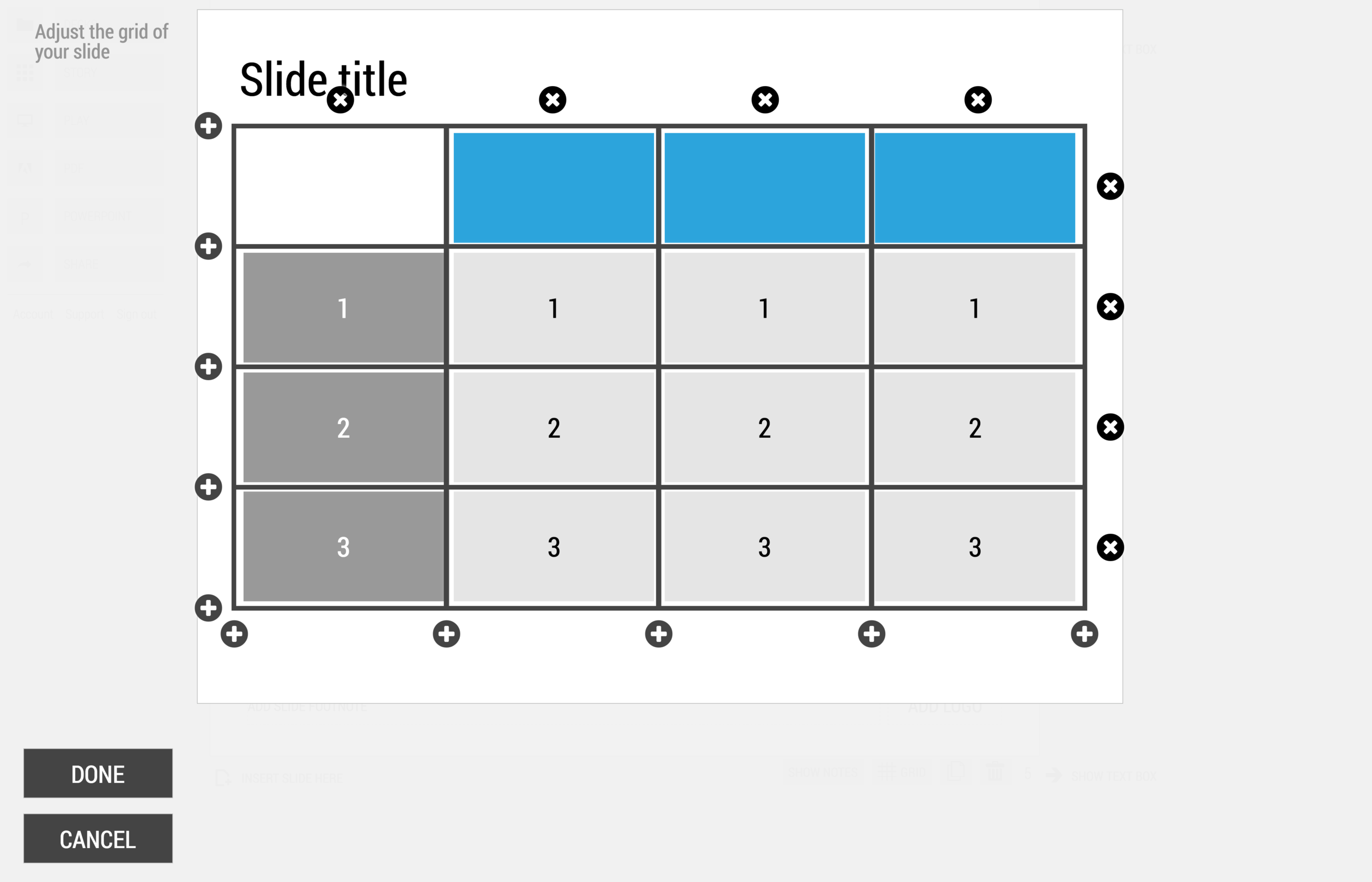
The second reason is - I think - that both people who write presentations and designers who polish them, stick to the conventional slide format: title across the top, list of bullets.

Now here is an interesting experiment for a 100% graphics designer who is not allowed or does not have the knowledge to touch any of the content (the classical print graphics designer situation). Assuming the presentation is a slideument (meant for reading rather than presenting).

Hand over the material in a word processor, as a long text file rather than a partly finished PowerPoint presentation. Now give the designer total freedom to present this material in any form she wants, even in any software she wants, using any page layout she wants.

Changes are you might get a pretty good lucking slideument by taking "PowerPoint" and its familiar layout out of the equation.


Image via WikiPedia

SlideMagic: a platform for magical presentations. Free student plan available. LEARN MORE
Useful busy slides

Useful busy slides

Increasingly, presentation meetings are about discussing a proposal for investment or a product sale, rather than confronting an audience with an idea for the very first time. People have gotten the basic idea in material they saw beforehand.

So, there is a new role for busy slides, meant for pondering on a desktop screen.

A number of things can make slides busy:

  • Too many topics/ideas to cover
  • Lots of filler/buzzwords that inflate a simple point into a paragraph of prose
  • Complex relationships, dependencies, architectures, pricing models

The first two are a no-go, even for presentations that are meant for reading. The third option however, can be useful. In many cases, it is virtually impossible to visualize a complex timeline or network in a series of slides with pretty pictures and one word on them.

Some guidelines how to design these useful slides crammed with content:

  • Think about every word/label you type, can it be shorter, and if so, will we save an entire line?
  • Grid, grid, grid: make sure everything lines up with everything where ever possible, this will make the composition calmer on the eye
  • Hierarchy: create multiple layers of insight, big bold ones that catch the eye immediately, smaller subtle one for the reader who has more time
  • Use color to connect items

Image via WikiPedia

SlideMagic: a platform for magical presentations. Free student plan available. LEARN MORE
4:3 or 16:9?

4:3 or 16:9?

"What, it is 2017 and you design a deck in 4:3 format?", I got these questions a few times. Here are the pros and cons of both formats.

A 16:9 or widescreen aspect ratio will give you a nice image on an LCD conference room monitor or desktop/laptop screen with the black bars on the left and right

A 4:3 aspect ratio will look better on projectors, which are still used in many larger presentation rooms. Also: 4:3 looks better when decks are printed, a habit that is still very common in the financial services industry where people like to take notes, look in detail at data tables, (and probably want to take an opportunity to quickly flick ahead if the presenter is slow/boring).

And personally, I like the design freedom of a more even design canvas (4:3) better than the wide screen version, which forces me to make horizontally stretched slide designs. (A cheat: put the headline across a number of lines to the left of the slide and use the imaginary 4:3 canvas to the right of it for your slide content.

So, here you have it. I don't think 4:3 is old fashioned for presentations (it is for movies), it just depends on the most likely presentation context you expect.

In my presentation app SlideMagic, I used a 4:3 canvas, but use the extra horizontal space of a 16:9 screen to add your "explanation boxes" that you can slide in and out. When set to "out", the presentation becomes 16:9 with a more detailed description of the slide in case you send the document ahead of a meeting and the recipient will open/read it without you being there to explain it.


Image via WikiPedia

SlideMagic: a platform for magical presentations. Free student plan available. LEARN MORE
My standard page layout

My standard page layout

The empty template in my presentation app SlideMagic uses pretty much the same layout as my bespoke work in PowerPoint/Keynote for clients:

Big slide headline that can run over 2 lines (I like elaborate titles, similar to newspaper headings), without any graphical elements (lines, banners, logos)

  • Small logo in the bottom right, I compromise here and give in to most companies insisting that the audience should be reminded to whom they are listening on every page. Many clients want to move that logo left, which creates a graphical imbalance: the bottom right logo balances the weight of the left-aligned title in the top left. Also, a logo at the left creates problems with footnotes.

SlideMagic: a platform for magical presentations. Free student plan available. LEARN MORE
Small changes

Small changes

Design is hard because there are many small decisions that lead to a great-looking page. Everyone knows the concepts: white space, big images, good-looking fonts, but even with that knowledge it is hard to get it right. Pretty much like composing music: everyone can master music theory or playing an instrument with a little effort, very few can compose master pieces.

Very often, I email a deck back to a client at the end of a project and say "I might a few very small changes, you probably won't notice them". But, these small changes added up can make a big difference to a layout.

So what is it I do in the final stages of a presentation design project? It is hard to capture.

The main thing I think is completely stepping away from the actual content, i.e. the text that is written in boxes. Instead I see black/light grey patterns of characters, boxes in different shapes and colors. Almost "squinting" at the page and making adjustments until this "cubist painting" looks right in terms of proportions and balance.

Most of the times, it work but yes, there are pages where even me as a professional simply cannot get it right. 


Image via WikiPedia

SlideMagic: a platform for magical presentations. Free student plan available. LEARN MORE
Frame guide lines

Frame guide lines

In PowerPoint, you have to option to display drawing guides that help you align objects on a slide. A common application is to have some sort of frame around your slide to make sure that you have the same margin around all your slides in a presentation.

I find these frames very useful, but there is a small issue you need to watch out for, when making compositions, my brain actually assumes that the dotted lines are part of the slide, and I start positioning objects accordingly. When you switch of the frames, or look at the slide in presentation mode, the whole balance looks wrong somehow.

So: always check your slide compositions with those drawing guides disabled.

PS. In my presentation design app SlideMagic, there is no need for drawing guides, since you are forced (kindly), to use a predetermined grid. Try it out!

SlideMagic: a platform for magical presentations. Free student plan available. LEARN MORE
The bullet points are your starting point

The bullet points are your starting point

Most finished slides show a list of bullet points as the final design, they are the finished product.

Instead, consider them the starting point. Ignore that guilty feeling of writing bullets, ignore the worry about a poor slide. Write all out, re-write it, write it again, and again. Take a step back:

  • Is this actually what I want to say? If not go back to step 0
  • Do I pad too much, can I cut fluff, buzzwords?
  • Do I write too little, can a layman understand what I mean?
  • Do I say something 2x? If so, delete one
  • Is one point a sub point of another one?
  • Are all points equally important?
  • Do I combine 2 important points into one?
  • Do I make 2 completely different points, if so split the slide
  • What is the basic structure of my story: a contrast, a ranking, a cause-effect, a trend, a missing puzzle piece, best of both worlds, an overlap?

After this process you should have a razor sharp list of "what should go in", plus a good understanding of the structure, the "verb" of the slide. Now create a composition solely based on that info. 

When you insert a new slide in my presentation app SlideMagic, you are presented with a number of slide templates which are not put in randomly, I thought about every single one of them pretty hard. These are the usual "visual verbs" I encounter. Try using them as the basis for your next slide design.

SlideMagic: a platform for magical presentations. Free student plan available. LEARN MORE
Where visuals are crucial

Where visuals are crucial

If I sit down with a client, in almost all cases, the pitch of a company comes out fine verbally. People know how to tell their story. The order might not be perfect, there are some repetitions, here and there one of my questions needs to be clarified, but all in all, in 30 minutes we got a pretty good understanding of what is happening.

My work is to translate that story into visuals. And given the above, there are different types of slides.

Some slides are absolutely crucial to understanding the pitch. These are the ones that people are opening their laptops for, and pull up page 37:

  • Screen shots and images of applications/products, in many cases it is actually unclear what the product does. This is specifically the case in internet applications, or medical devices where a picture of the actual product explains a lot.
  • Data visualization that emphasizes how big something really is compared to something else, how fast things are growing or declining. Visuals do a much better job here than spoken word
  • Complicated relationships, competitive positionings, IT architectures. These cases require a map on which both brains can sync to disentangle these complex structures.

Other slides are mere backup for the spoken word. They help to make the story more powerful, but are not essential: large photographs of metaphors (endless road, squeezed orange, confused customer) or simple text charts that support the flow of the story.

The purpose of the last group of charts is 1) to give your company a professional look & feel, and 2) make it possible for people to read/digest the story without you being present.

SlideMagic: a platform for magical presentations. Free student plan available. LEARN MORE
Chart hygiene

Chart hygiene

Here are some slide make over suggestions for messy PowerPoint presentations that do not require any changes to content. They fix basic graphical hygiene:

  • Make sure all slides use the same slide master template: titles, page numbers, logos (if you want to use them), all sit in the same place
  • Find/replace fonts: make sure all fonts in a deck are the same
  • Create a frame of guides in the master slide and make sure all slide content fits inside the frame on each slide
  • Apply a consistent color scheme to all the slides
  • Eliminate italics
  • Make sure that characters in the same box, paragraph have the same font size (huge differences are OK, but very small size differences do not look good)
  • Un-stretch photos with the wrong aspect ratio
  • Align and distribute slide elements where ever you can
  • Play with line breaks and font size to avoid orphan words on a second line
  • Remove multiple, overlapping "confidential" labels and page numbers from pages
  • Draw a shape, set proper colors and fonts, and make it the default shape, delete the shape, repeat for a text box and a line

That was presentation make-over V0.1, the content might be bad, the layouts could be poor, but it will look organized.

If you have been working in my presentation app SlideMagic, you will have noticed that is almost impossible to make the mistakes I am correcting in the above.

SlideMagic: a platform for magical presentations. Free student plan available. LEARN MORE
Making image grids in PowerPoint

Making image grids in PowerPoint

It is tricky in PowerPoint to make a nice grid of images that comes from different sources, in different sizes, and in different aspect ratios. How do you get them all the same size? It can be very tedious to crop them all to the same proportion, and then line them up correctly. There are always one or two that are wrong.

Here is what I do. Crop each image to a certain aspect ratio, don't worry yet about the exact size. Now select them all and give each the same height, the width will automatically be adjusted as well! Pro-tip, crop to 1:1 and then try cropping to a circle.

In my presentation app SlideMagic, it is impossible not to lay out images in a grid :-)

SlideMagic: a platform for magical presentations. Free student plan available. LEARN MORE
What are good slides?

What are good slides?

We all understand that the ultimate slide is a visual composition that has such an emotional impact on us that the moment we walk out of the auditorium, we go and do something we did not plan on doing before.

For most day-to-day presentations, the objectives of a slide will be a bit more down to earth:

  1. Can you actually read what is written on the slide from a distance (font sizes, graphs)?
  2. Does it look as professional as the company/entity you are representing? Comic sans, clip art, low resolution pictures, distorted aspect ratios, PowerPoint bevels. (Professional and pretty are not the same things).
  3. Does the chart just have one message?
  4. Is information laid out so it supports the message? A trade requires pros and cons, a trend should come out of a graph, A implies B, there is a clear differentiation
  5. Does the slide actually look pretty in terms of design, composition, balance?

Slightly related: here is a Dutch TV commercial from the 1970s with a quality inspector stamping "OK" on peanuts. 

SlideMagic: a platform for magical presentations. Free student plan available. LEARN MORE
Feedback from a UI designer

Feedback from a UI designer

A few weeks ago I had a call with one of the staff of my client, who was a user interface designer for mobile apps. Although the investor presentation was not his responsibility he wanted to give some feedback, speaking "designer-to-designer".

In the discussion I noticed that I am actually violating some design principles that are thought in design school (I never went to such a place). Being an opinionated designer, I still think that my approach is correct, but the debate was interesting. Here are my "sins":

  • Long headlines that run over 2 lines. Yes, the font looks a bit smaller, yes, the slide has less of a punchy/pretty headline, the title is basically a small text block. BUT it allows me to put in a slightly more sophisticated message which is especially useful for decks that are read on a screen, rather than serve as a background for a live presentation.
  • While I cut text and clutter to the maximum extend possible, I tend to make the slide content really big, actually: too big according to the designer. The proportion between the headline and the core graphic of the slide is off. Technically correct, BUT I am trying to keep my slides readable on a mobile phone screen.
  • Some of my data charts actually of a lot (too much) data in them. BUT I like to create layers in a data chart. The super simple, most important message jumps in your face, but if you ponder a bit longer, you can see additional layers of information and get the full picture of the data.
  • I reduce the number of colors as much as possible (SlideMagic allows you to use only one), but I splash healthy doses of that accent color on the the slide. Designers might cringe at all that bright colorfulness. BUT it allows me to really rub in the message of chart, especially for highlighting a contrast, and/or connecting multiple "dots" that belong together.

Interesting discussions. There is one lesson here for clients, pick your designer, just one, and stick to that one. Two design captains on a ship will not work.


Art via WikiPedia

SlideMagic: a platform for magical presentations. Free student plan available. LEARN MORE
The secrets of making system diagrams

The secrets of making system diagrams

System architecture charts can be incredibly complex, and I need to include them sales/investor presentation for almost every client that I work with. They serve an important purpose: 1) demonstrate that you know what you are doing on an emotional level, 2) ability to answer detailed technology questions on a factual level.

As I dig into these puzzles, I discover that in most cases the diagram is very complex, but the underlying system architecture is not. Most diagrams are created with some kind of drawing tool. Their main purpose is system specification, make sure that people are designing the right system. They are not meant at all for communication. (In that respect things are similar to Excel: a great tool for analysis, a poor tool for communication).

The solution is to disconnect from the diagramming app and start sketching your system architecture again, purely for the purpose of communication.

  • Grid, grid, grid. Line up all the boxes properly, space things out. Keep boxes the same size/shape as much as possible 
  • Eliminate as many overlapping connectors as you can. Try again, again, again, again, and one more time. Overlap spaghetti is a sign that you have not really understood how to explain your architecture.
  • After you eliminated your overlaps, you should be left with a grouping of boxes that is more or less logical. If there is a sequential process, there is a high chance that your boxes line up according to it. If things are related, they are probably located next to each other. In the previous steps, you looked purely for overlapping connectors, now go over your diagram again and think about function.
  • Next, use color to group things together. The great thing about color is that it can make a connection between objects which are not necessarily sitting next to each other on the page
  • Omit, collapse boxes that are not that important (this would have disastrous consequences if we did this in the system design diagram)
  • Think hard about what text, titles to use in the boxes, cut words where you can, use rectangular instead of circular shapes to fit more text if needed. Go for a smaller font size, but don't fill the entire box with text to make your composition look calmer.

SlideMagic: a platform for magical presentations. Free student plan available. LEARN MORE
"Do you do web sites as well"?

"Do you do web sites as well"?

New startups are in need of all kinds of marketing collateral: pitch decks for investors and/or potential customers, product brochures, and a web site. I think that in the beginning, people are aiming too high with the web site: super effects, video backgrounds, sparkle, and glitter.

But the experienced investor or corporate purchaser sees through the facade immediately, this is a brand new startup with hardly any customers and 6 months of VC funding left. Instead, you can build a web presence that show yes, that you are young, but that you are serious and know what you are doing.

  • There is actually some sort of web page on your URL, not an "under construction"
  • Use squarespace, Wix, or another template engine for a modern look and feel, with at least a premium enough version that it does not say "proudly built with Wix" at the bottom.
  • Make sure your branding is consistent: accent color (you don't need a lot of it), and a simple logo (does not have to be a master piece) 
  • No gmail or hotmail email addresses
  • Your LinkedIn profile actually says that you are the CEO of this company, and not a marketing consultant from 2004 to present
  • The company has an address that when entered in Google street view does not point to a residential street
  • When the site has a "news" section, or a blog, it should contain fresh articles, if not, just don't put it on.
  • The web site should actually describe what the company is doing, without buzzword overload

In the early phases, especially for enterprise sales, Google will land you a lot of customer inquiries, but rather people will visit your web site after a meeting as a form of due diligence.


SlideMagic: a platform for magical presentations. Free student plan available. LEARN MORE
The trouble with 16:9

The trouble with 16:9

This tweet by a highly competent designer flashed by:

It is work in progress on a presentation. You see what direction he is taking: the big headline on the left, rather than across the slide, and a paragraph of very small text.

I think this might be a format that many presentations will use:

  • More and more display devices are now wide screen (which is a great format for movies)
  • Headlines that stretch all across very wide screens are unreadable.
  • The best visual compositions / layouts are not very wide ones
  • Increasingly, we use presentations to send beforehand, without actual presenting/verbal explanation, hence the need for explanatory text

In my presentation app SlideMagic, I stuck to the 4:3 aspect ratio for slides, enabling you to put the headline across the slide, and added an optional slide out panel for plain text that turns the 4:3 composition into a 16:9 one.

SlideMagic: a platform for magical presentations. Free student plan available. LEARN MORE
What the template says about you

What the template says about you

These food packaging make overs illustrate what is wrong with many of today's presentation templates: they make you look like you are "that kind of company". But remember, the hipster customer segment is likely to be a lot smaller than the mass market. Think about your audience, and whom you want to look like. 

SlideMagic: a platform for magical presentations. Free student plan available. LEARN MORE
Learn slide design from Teletext

Learn slide design from Teletext

In The Netherlands the old Teletext system is still up and running online. Now ported to the web and mobile apps, the 1970s clunky graphics are still there. Its designs fits 2017 actually very well:

  • Simple but consistently applied fonts and colors create a recognizable visual identity and make things clutter, distraction free and clear
  • Text space limits are really credible, so content writers need to make sure that everything fits in. The result: well-written headlines, and clear paragraphs.
  • A 3-digit menu system that is remarkably effective to get to what you want to know quickly.

Today's presentations and web sites can learn a lot from that old UI.

SlideMagic: a platform for magical presentations. Free student plan available. LEARN MORE
How important is the logo?

How important is the logo?

Many early stage startups that need an investor presentation do not have a proper logo and graphical identity yet. Is this a bottleneck for a presentation?

Not really. I do not believe that you need to put your logo prominently on every page of your presentation. Hence, it is not very important in presentation design. The most important design element for a presentation is color. The color scheme will decide how your slides look.

So, pick a color scheme you think is appropriate for your business. It can be done very quickly. Every investor will forgive you if you decide to change it later. In the early days, you can simply use a text logo without any design to show your project's name. If you are not sure, a temporary project name can be a better solution than a poorly chosen brand name. That brand you chose late at night while brainstorming with the founding team might work great for you, but could be less optimal for your target audience.

Obviously if you are launching in the market than logo, identity and picking the right color becomes (a lot) more important.

SlideMagic: a platform for magical presentations. Free student plan available. LEARN MORE
Smart row / column insertion

Smart row / column insertion

My presentation app SlideMagic is all about the grid. We have made some improvements to make the workflow (even) faster. Now, when you insert rows and or columns, it copies its design and structure from its neighbors. This will save you a lot of time in more complicated table layout with different background colors.

1) Our starting point

1) Our starting point

2) Open the grid editor

2) Open the grid editor

3) Add a row and a column

3) Add a row and a column

4) The result

4) The result


Image via WikiPedia

SlideMagic: a platform for magical presentations. Free student plan available. LEARN MORE
How to brief a presentation template designer

How to brief a presentation template designer

The traditional approach is to hand the designer a blank slide and say "we need a fresh PowerPoint template". You will get a slide back full of supporting graphics, logos, page numbers which shows that the designer added some value.

Here is the better approach: give an actual slide with content and ask her to improve that, including the template. The likely result is a well-designed slide. Now delete all the content and see what you are left with. It is likely to be an empty page... Here is your new PowerPoint template.

Oh, and the most important part of the template design project is not the template (i.e, the blank page). It is to make sure that the standard colors and fonts are programmed correctly. That's a programmer's job, not a designer's job.

In my presentation design app SlideMagic, things are easier. Upload your logo, use the color picker to select your accent color based on the logo, and you are all set.


SlideMagic: a platform for magical presentations. Free student plan available. LEARN MORE