Viewing entries in
PowerPoint

PowerPoint vs Keynote in 2018

PowerPoint vs Keynote in 2018

Over the past few days I converted all the slides in the SlideMagic store from PowerPoint 4:3 into PowerPoint 16:9, Keynote 4:3, and Keynote 16:9. That was quite a bit of conversion and uploading work... As a result I got an even better understanding of the differences between PowerPoint and Keynote. Here is the 2018 version of the comparison.

Overall both programs are excellent, as you would expect from software that has been around this long. Bugs have been ironed out, and both programs have "learned" from each other to get to a good workflow. So the differences are not that major.

Where PowerPoint is stronger

  • Workflow for advanced users. I can customise the top tool bar with the functions I use most (aligning, distributing, moving things to the back, etc. see my full list of toolbar short cuts here). Also in Keynote it can get confusing at high speed to change colours of text and shape fills, too many clicks, and too many opportunities to get it wrong. The interface looks elegant, but it slows you down.
  • Data chart editing is better in PowerPoint with the full power of Excel behind it
  • Stretching of (groups of) shapes is predictable in PowerPoint: you can distort aspect ratios. Keynote is more restricting and protects the novice designer with stretching images. But, it does the same for large groupings of objects, as soon as you have a few connectors inside, it is no longer possible to stretch complex diagrams across the page, without also increasing its height. This cost me a lot of time to clean up my flow chart template for example. I could not understand when Keynote decides it is OK to stretch, and when not.
  • Complex connector diagrams run more smoothly in PowerPoint. Keynote is "smarter" and helps you pick/decide/suggest possible connector lines between shapes, but because of that, it is harder to convince it to something you want against its own suggestion. In more complex diagrams this becomes a problem.

Where Keynote is stronger

  • Cropping of images is more intuitive in Keynote
  • For the first time I really worked with the file manager (duplicating instead of "save as") and went into the version history of Keynote, no need to worry about saving, which was actually really convenient.

There are some charts which PowerPoint can make and Keynote not, I found out the hard way with my conversion effort:

  1. Slides that use 3D positioning of objects and text distortion
  2. Slides that use bevels and 3D lighting/shading. I am sure it is possible by carefully selecting the gradients, but there is no 1-click solution

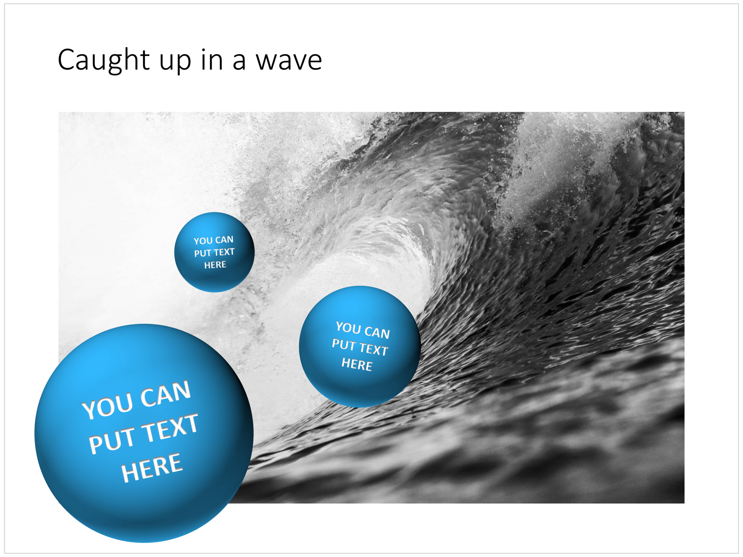
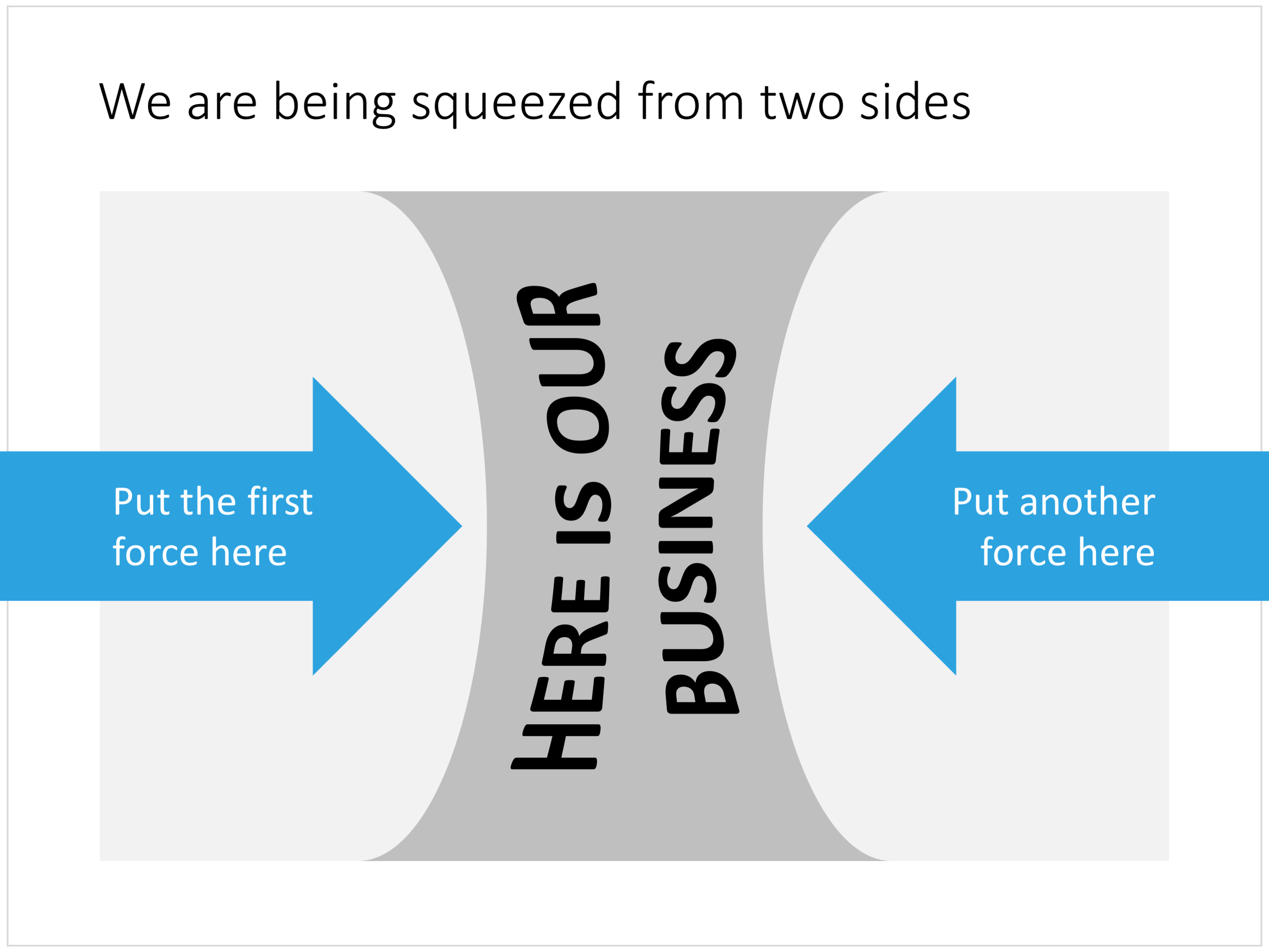
Both of these are not crucial to presentation design. In fact, too much 3D fire power in the hand of the layman designer might not beneficial to the quality of the slides. Below are examples of charts from my template store which are not available in Keynote because I simply could not covert them. (Click the images to be taken to the template store).

Balls bouncing on a big wave

Balls bouncing on a big wave

Domino pieces in PowerPoint

Domino pieces in PowerPoint

Proliferation of options

Proliferation of options

The start line: comparing two optionis

The start line: comparing two optionis

Black hole

Black hole

Squeezed

Squeezed


Cover image by Chris Sabor on Unsplash

SlideMagic: a platform for magical presentations. Free student plan available. LEARN MORE
Puzzle pieces in PowerPoint

Puzzle pieces in PowerPoint

Although you could consider them a presentation cliché, puzzles can work really well in a presentation:

  • Show how things fit beautifully

  • Show how your are missing (hopefully just one) critical piece

  • Show that you finally managed to plug that last gap

Puzzle shapes can also work great when you use them in combination with images. You can go back to this blog post about making Photoshop-like image cut outs in PowerPoint.

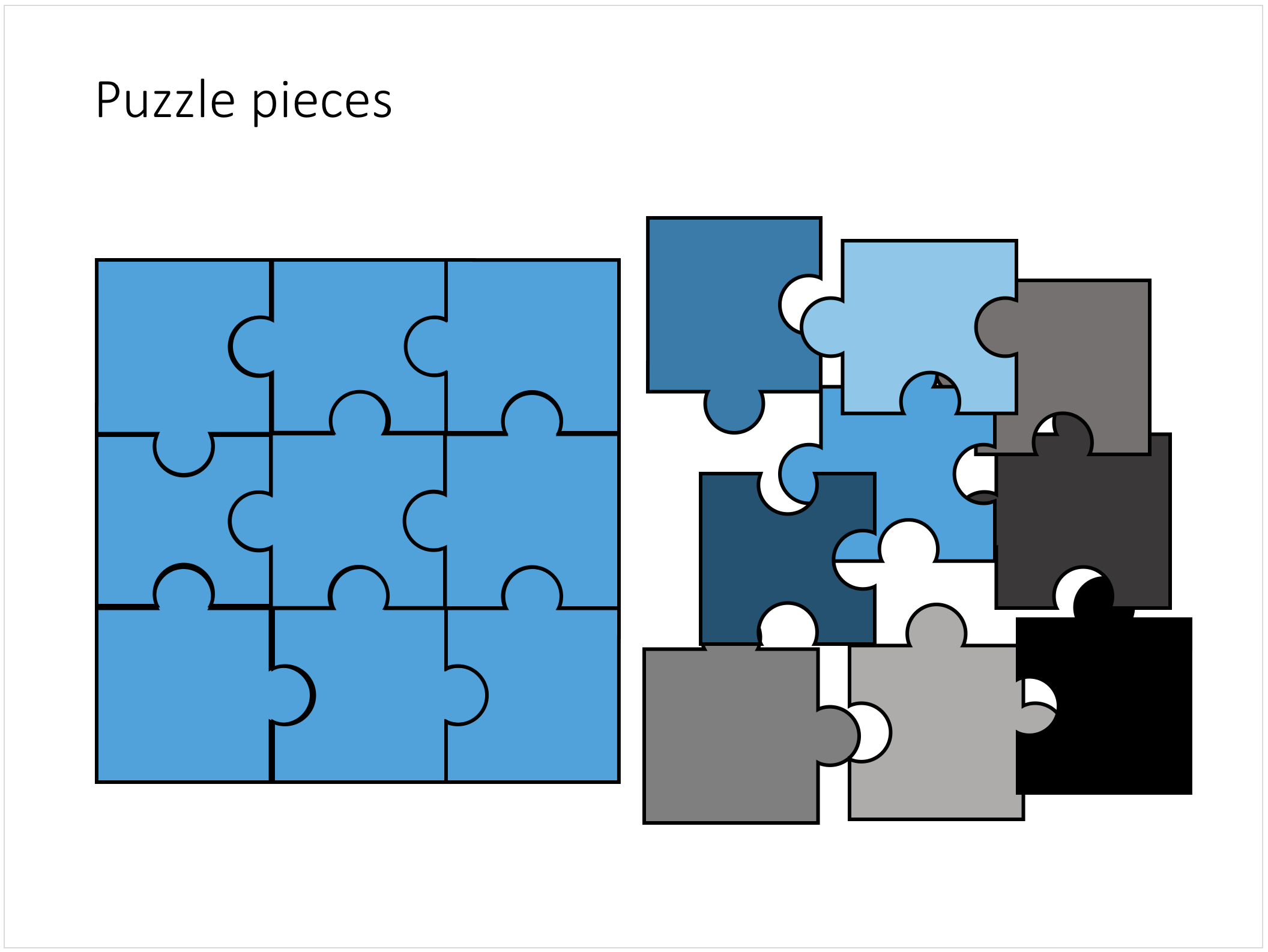
Stock image sites are flooded with millions of puzzle piece designs, but they are not very practical for the average PowerPoint designer (especially late at night working for tomorrow's deadline). Almost all these puzzles pieces are vector objects or images that are impossible to edit in PowerPoint. Moreover, all these puzzle pieces have wildly irregular shapes that make them hard to fit in your slide composition that requires exactly nine of them.

This PowerPoint puzzle slide solves the problem for you. The pieces inside are fully editable PowerPoint shapes, you can change their colour, you can put text in them, you can reconfigure and piece them together as you see fit. Yo'u can download the finished slide by clicking the image (An Apple Keynote version is available as well).

You can try to create the pieces yourself if you want, I used simple square shapes and circles, either joining or subtracting the shapes. Circles and squares might not be the most realistic shapes, but they are very practical when have to piece things together. There is a little bit of math homework to do to determine which type of puzzle shapes you actually need, and which ones you can create by rotating existing pieces.

SlideMagic: a platform for magical presentations. Free student plan available. LEARN MORE
Concentric circles in PowerPoint

Concentric circles in PowerPoint

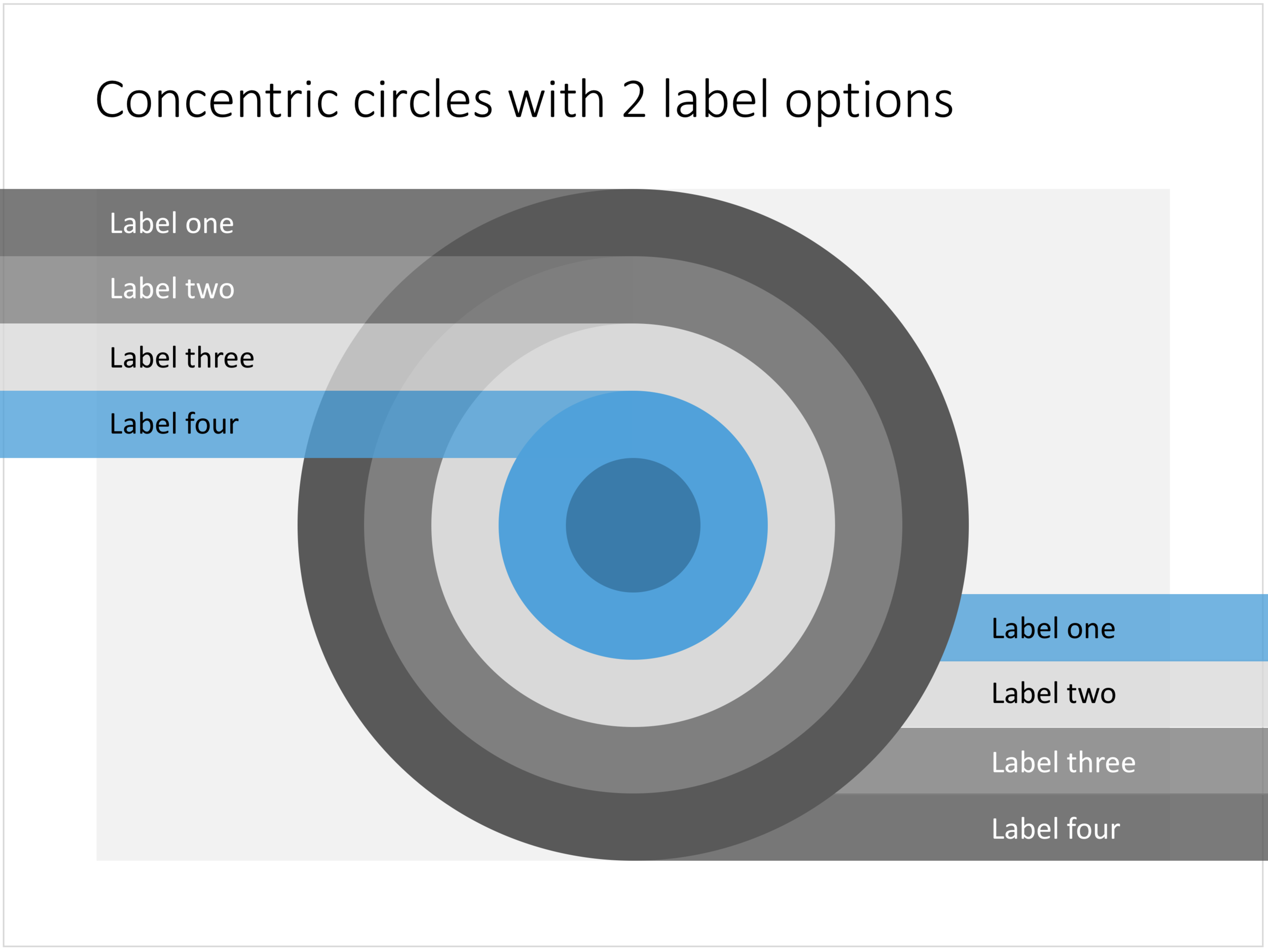
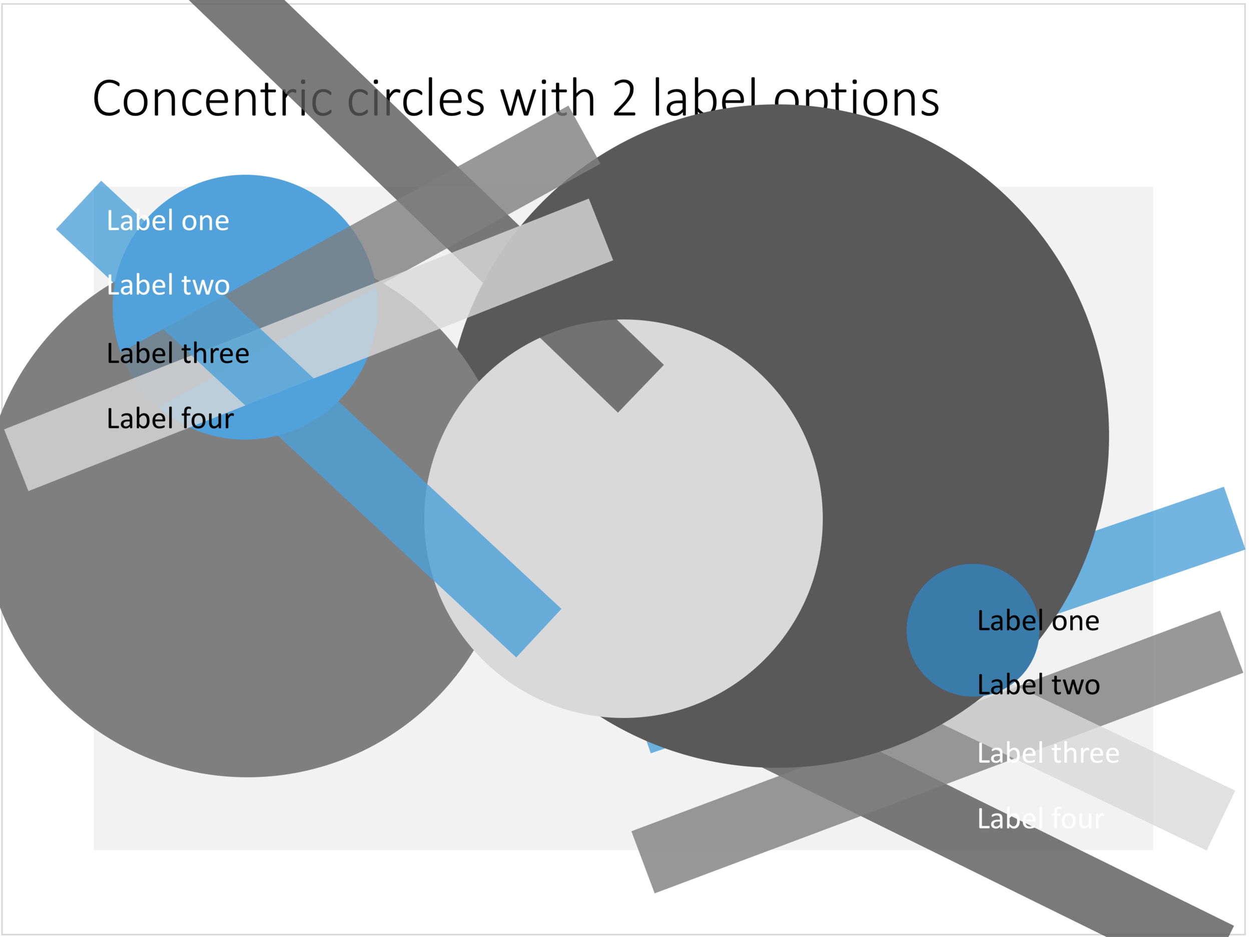
You can create very beautiful compositions by just using basic shapes and a few colours. Below is a presentation slide with concentric circles, and an image that shows how it is constructed. Feel free to borrow the design approach, or you can download the finished slide here.

This technique was often used by the Swiss graphics designers in the 1960s. You can use the slide concept below in a number of ways: show some sort of layering, show multiple layers of security or protection, show a whirl or rolling dynamic. You can take the labels of and just use the circles.

Concentric circles in PowerPoint

Concentric circles in PowerPoint

How to make concentric circles in PowerPoint

How to make concentric circles in PowerPoint

SlideMagic: a platform for magical presentations. Free student plan available. LEARN MORE
Quote slides in presentations

Quote slides in presentations

Quotes can add credibility to your presentation. If experts, celebrities, and/or customers agree with you, you must be right. But, not all quotes have equal weight. They have been overused in many PowerPoint decks. (Anyone can find a picture of a serious-looking person and get her to say what you want her to say in a few mouse clicks).

Here is a check list:

  • The person needs to be relevant and credible (third tier social media "experts" do not carry much weight)
  • The person needs to be identifiable ("Senior marketing executive at major high tech firm" can be anyone and is most likely you)
  • The quote needs to be interesting, cut the buzzwords and marketing language, cut the cliches ("Wow,  these guys really have a targeted value proposition that resonates with my medium-term return on investment objectives")
  • The text needs to be long enough that it is specific, and short enough that it reads like a headline. A full page of verbatim will not come across 
  • The quote needs to be relevant, a generic motivational quote might not help close that enterprise software contract.

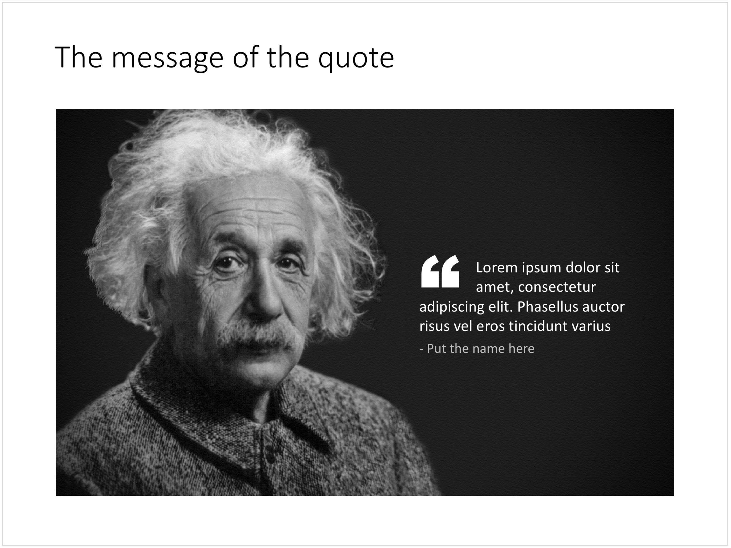
Quote slides are (and should be) pretty simple: a nice big image with a big text overlay. Still there are some things to watch out for. Below is a quote slide that I have added to the SlideMagic template store. Let's go through the design process.

  • The image should have a calm background with enough "white" space for text. You don't need to be a Photoshop guru to extend the background of an image in PowerPoint, it is easy to add a black or white box next to images. You can use the colour picker to match the precise colour, or use semi transparent overlays for the best effects
  • Make the quote symbol stand out. Regular quotes are too small, and the layout does not look good, as the quote pushes the start of the paragraph in. There are endless ways to do it and I settled on this one. One big quote at the beginning of the paragraph with a text indent. Take some time to find a quote in a good font. In the above slide, the text font is the Microsoft Office standard Calibri, but the quotes of this font don't look that "fat", I used Arial.
  • This slide is a framed image slide, which gives me the opportunity to add a big headline at the top of the slide with the main message (the headline can say "Customers are really happy", the quote can say "With product [x], I no longer need to use a pencil".

Feel free to borrow the suggestions above, or you can download the finished slide here. The template store has related designs for quotes, or customers.

SlideMagic: a platform for magical presentations. Free student plan available. LEARN MORE
Blue ocean strategy in a presentation

Blue ocean strategy in a presentation

Most investor or sales presentation have some sort of slide about the competitive environment. (Here are earlier blog posts about how to present the competition). Usually, people use tables, or 2x2 / 3x3 matrices to show how they are different.

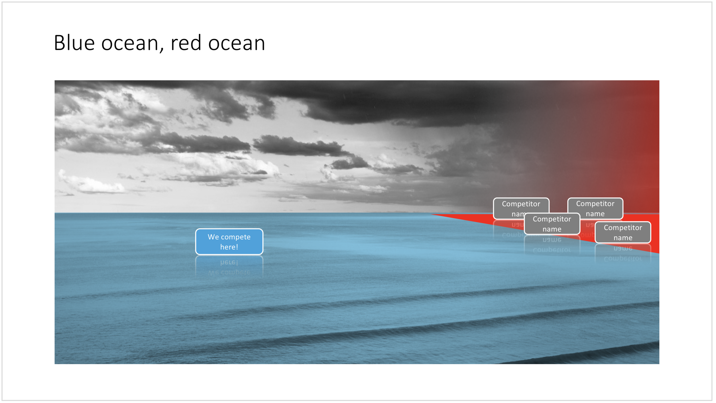
The chart below might a completely different take on the subject. The Blue Ocean strategy concept developed by INSEAD argues that is often better to define an entirely new market rather than battling with all the existing companies that go after well-established market segments. You can download the slide here.

Visualise the competition using "Blue Ocean Strategy" in a presentation

Visualise the competition using "Blue Ocean Strategy" in a presentation


Cover image by Ishan @seefromthesky on Unsplash

SlideMagic: a platform for magical presentations. Free student plan available. LEARN MORE
Presentation layout for when you are stuck...

Presentation layout for when you are stuck...

Sometimes the simplest slides can be the most effective ones. This slide layout shows a big arrow crashing into a wall to visualise your obstacle or roadblock. The wall image is framed, while the arrow is bleeding of the page, adding an extra movement effect.Edit to text in the arrow and/or on the wall to show your audience what it stuck. The text in the arrow will automatically tilt in the right 3D angle, and both the wall and arrow will colour in your primary accent colour. Please copy this slide into a presentation that uses your own corporate presentation colour theme.

I am gaining a lot of experience now in translating PowerPoint designs into Keynote. This chart is only available in PowerPoint and not in Keynote, because the latter cannot tilt objects in a 3D space. The same problem arises with charts that rely heavily on bevels or other 3D lighting effects, which is not obvious to do in Keynote.

Here you can find this wall layout in the SlideMagic store. Cover image by Chris Benson on Unsplash

SlideMagic: a platform for magical presentations. Free student plan available. LEARN MORE
Layering PowerPoint shapes

Layering PowerPoint shapes

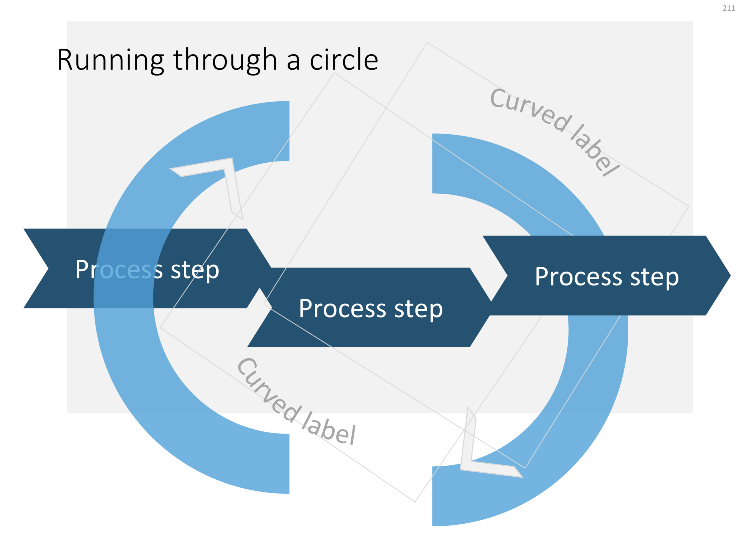
Here are some examples of PowerPoint slides that cleverly use layering to create a "woven fabric" effect. Why clever? Take the circle for example with the arrow flying through. Part of the circle needs to below the arrow, part on top. The solution? Cut the circle in half... The interwoven arrows have small square blocks in the right colours pasted in the relevant junctions, and the spiral was a bit tricky, placing small black cut outs on the junction with the blue arrow.

Click the image if you want to download the relevant slide. Alternatively, search the template store for keywords like "arrow", "downward", "circle", "process" etc. to get to charts like these.

A regular process, with a circular process around it

A regular process, with a circular process around it

"The making of"

"The making of"

Layered PowerPoint arrows give a fabric or knot type slide layout

Layered PowerPoint arrows give a fabric or knot type slide layout

A downward spiral in PowerPoint

A downward spiral in PowerPoint

Photo by Christian Perner on Unsplash

SlideMagic: a platform for magical presentations. Free student plan available. LEARN MORE
The iceberg in PowerPoint, presentation cliches

The iceberg in PowerPoint, presentation cliches

I think people are spending way too much time on creating corporate presentation documents for internal company  meetings where the objective is to get your colleagues to agree on something that needs to happen next. Not every meeting is your all company annual sales kick off.

Presentation cliches can be effective visual shortcuts to get your point across. People have seen them before, instantly connect to the concept, and you can move on. The challenge is to make your slide look decent, maybe even referring to the cliche in a tongue-in-cheek way.

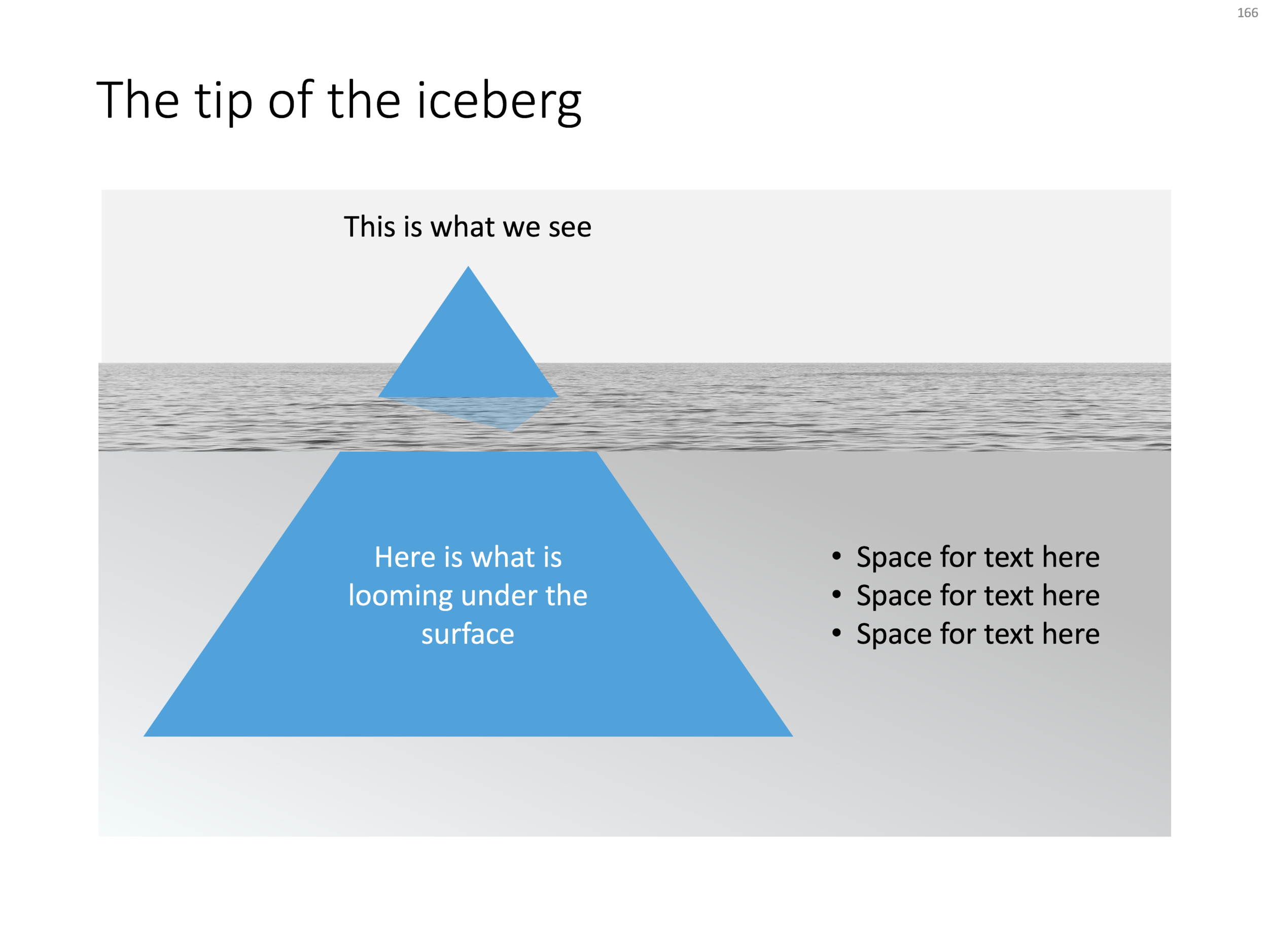
Below is what I tried to do to the infamous tip of the iceberg slide.

The tip of the iceberg presentation "classic" (or cliche?)

The tip of the iceberg presentation "classic" (or cliche?)

  • Don't try to make it look too photo realistic, but rather use an abstract simple geometrical shape, and use the presentation accent color (instead of white against a dark background)
  • Keep the slide very simple, but the depth effect is actually created with clever layering of (partly semitransparent) shapes and image crops, it took me some head scratching to figure out
  • Shift the whole composition to the side to leave some more space for text, if you need it.

All in all, this chart looks better than a boring list of bullet points that describe some looming threat you want to warn your colleagues about. Just resist the temptation to fill that empty piece of arctic ocean on the right or the crisp polar sky with text.

If you want, you can download the tip of the iceberg slide here.

Photo by paul morris on Unsplash
SlideMagic: a platform for magical presentations. Free student plan available. LEARN MORE
Quarterly performance summary: lots of different KPIs on a page

Quarterly performance summary: lots of different KPIs on a page

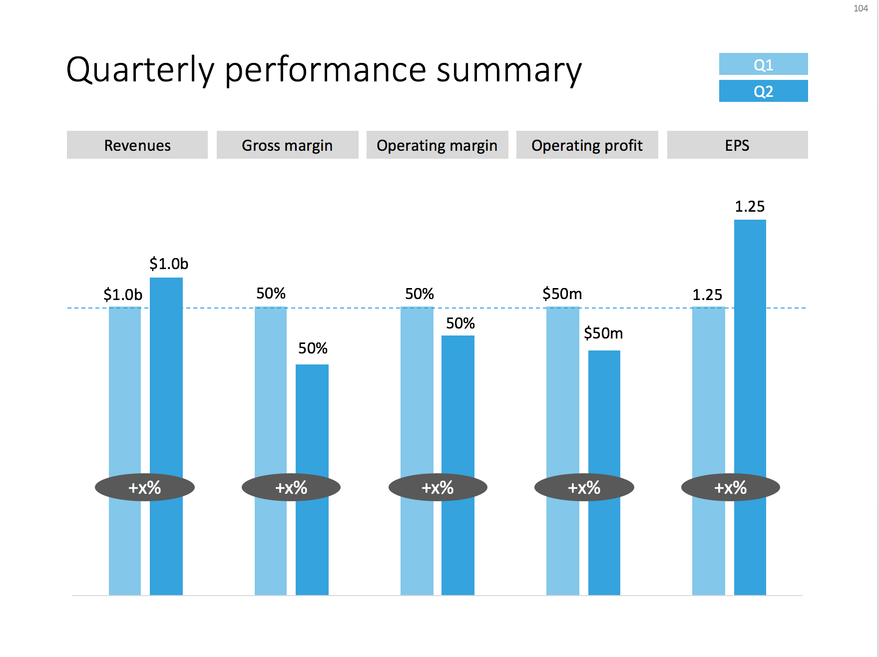
I often use the slide below in quarterly investor presentations for large corporates. How to give a quick overview of the key financials in one chart?

A chart with an overview of the main financial indicators of the last quarter

A chart with an overview of the main financial indicators of the last quarter

This chart is an example of why often a "manual" chart is much more powerful than a simple copy and paste from Excel:

  • The chart contains values that can differ vastly in range: sales can be 100s of billions of dollars, EPS can be less than a dollar. Margins are percentages, not dollars.
  • Despite this, I forced the Q1 column of each of these values to be the same. In the underlying spreadsheet, they will all say "100". The other values are calculated as a relative value compared to this 100. To accentuate this in the chart, I connected the left columns with a dotted line.
  • As a result, all labels in the chart need to be filled out by hand, the same for the growth bubbles which I placed over the columns (again a bit unusual)

You can download this KPI chart from the template store.

Photo by Sabri Tuzcu on Unsplash

SlideMagic: a platform for magical presentations. Free student plan available. LEARN MORE
How to make organization charts in PowerPoint

How to make organization charts in PowerPoint

I added the first organization chart to the template store. It is hard to design a generic template for organizations, there are so many different permutations possible. This is the reason they are still hard to create in my presentation design app, and this is probably also the reason that it is tricky to create beautiful organization diagrams from simply copying pasting a pre-fab template. Let's give it a try.

Here is the process I usually go through when designing an org chart:

  1. Make a sketch on paper, and reshuffle, re-juggle existing PowerPoint organigrams. These are made by HR people, not by designers. Often you can rearrange objects in such a way that you get a much nicer composition without changing hierarchies and relationships between people and departments
  2. Find out the horizontal layer that has most boxes in it, this will determine the size of the horizontal grid. Find the person with the longest name / role title, which will give you a clue about the maximum font size you can use.
  3. Put this layer in, and add all organization elements relevant to this layer.
  4. Make sure every object is perfectly aligned, and start putting in the PowerPoint connectors. (You will immediately see when you made a small alignment glitch, the connectors will not fit nicely)
  5. Now that the whole structure is in in place it is time to put in names and roles, and if required the FTE count of the various units (the small black bubbles in my example). 
  6. Take a step back and look at the whole structure to see whether there are opportunities to use color to make things clearer.
  7. You got your reference slide was all the info about all the people in the right places, the final step is to think what your specific slide actually really needs to say: our organization is big, or organization is flat, our organization mirrors our customer segmentation, everyone in the organization is over-stretched, our organization is basically 3 silos. Start deleting, adding, coloring things just to make that point.

Related to point 7, remember that some of the points you want to make in an organization do not always require an organization diagram. I nice photo of the lunch room can show that you have a big group of people working here for example. And, the names, lines, dotted lines, titles, are incredibly important for the people who work in the organization, for some people that title might be the reason they show up in the morning. For many outsiders however, these details are far less important. In startup organizations, the org chart changes every week, the structure is not that relevant, what is important though (for potential investors) is the caliber and experience of the people you managed to get on board. I simple team overview slide can do the trick here. You can search the template store for "team" and see whether a suitable design comes up.

Let me know if this template (you can download it here) works, or whether I should add more permutations.

A PowerPoint presentation design template for an organization chart

A PowerPoint presentation design template for an organization chart

Photo by Vincent Botta on Unsplash

SlideMagic: a platform for magical presentations. Free student plan available. LEARN MORE
How to cut out shapes out of images in PowerPoint

How to cut out shapes out of images in PowerPoint

PowerPoint can do Photoshop-like tricks. One of them: cutting shapes out of images. Here is how to do it:

  1. Drag your image on the slide

  2. Draw a shape on top of it (the freehand shape allows you to create a very precise shape)

  3. First select the image, then select the shape (shift click)

  4. Now select the Shape Format menu

  5. Click Merge Shapes

  6. Click Subtract

That's it. Below is a slide from the template store that uses this technique (you can download the ready-made slide if you want)

The final template slide

The final template slide

The making of

The making of

Photo by Joanna Kosinska on Unsplash

SlideMagic: a platform for magical presentations. Free student plan available. LEARN MORE
The snapping chain

The snapping chain

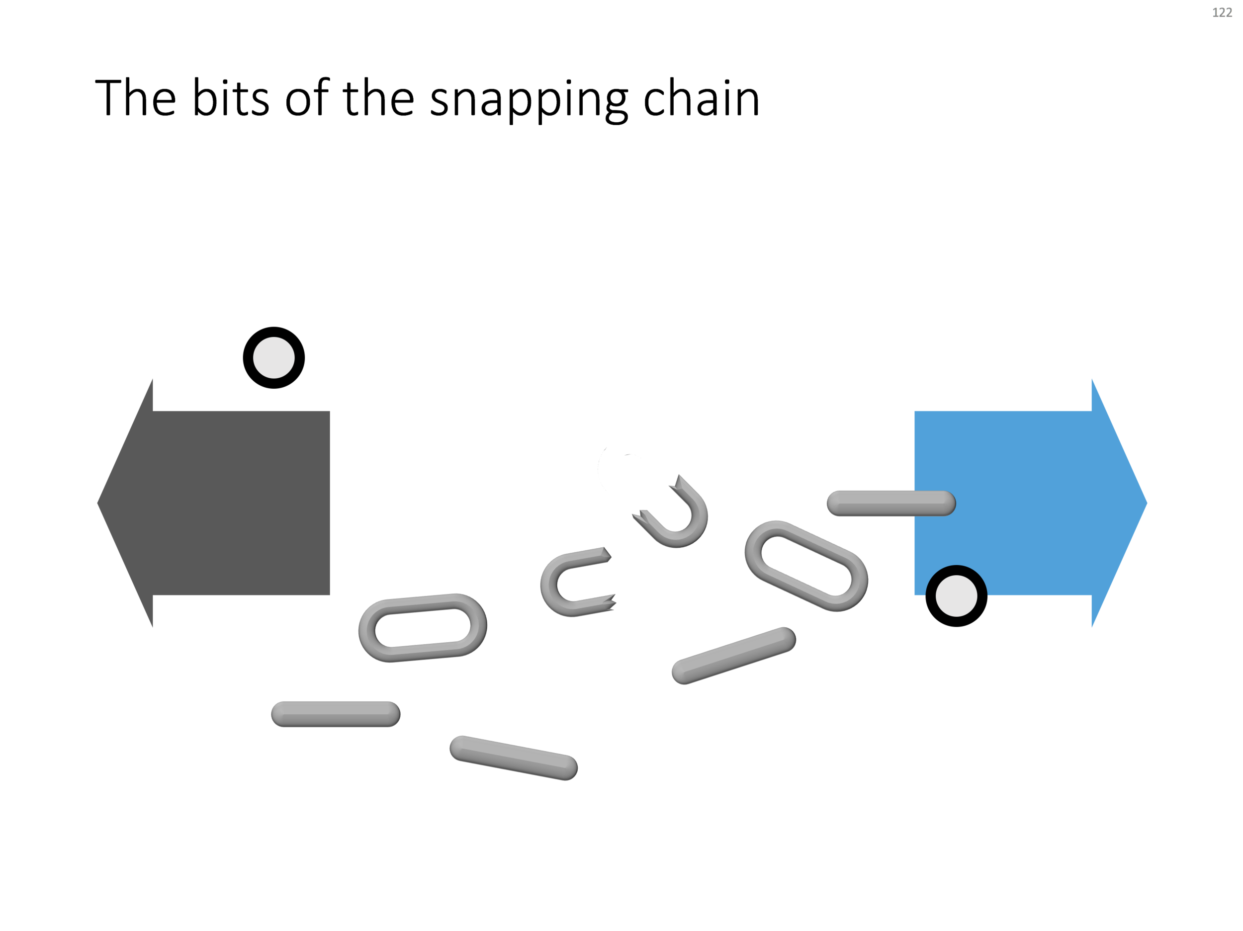
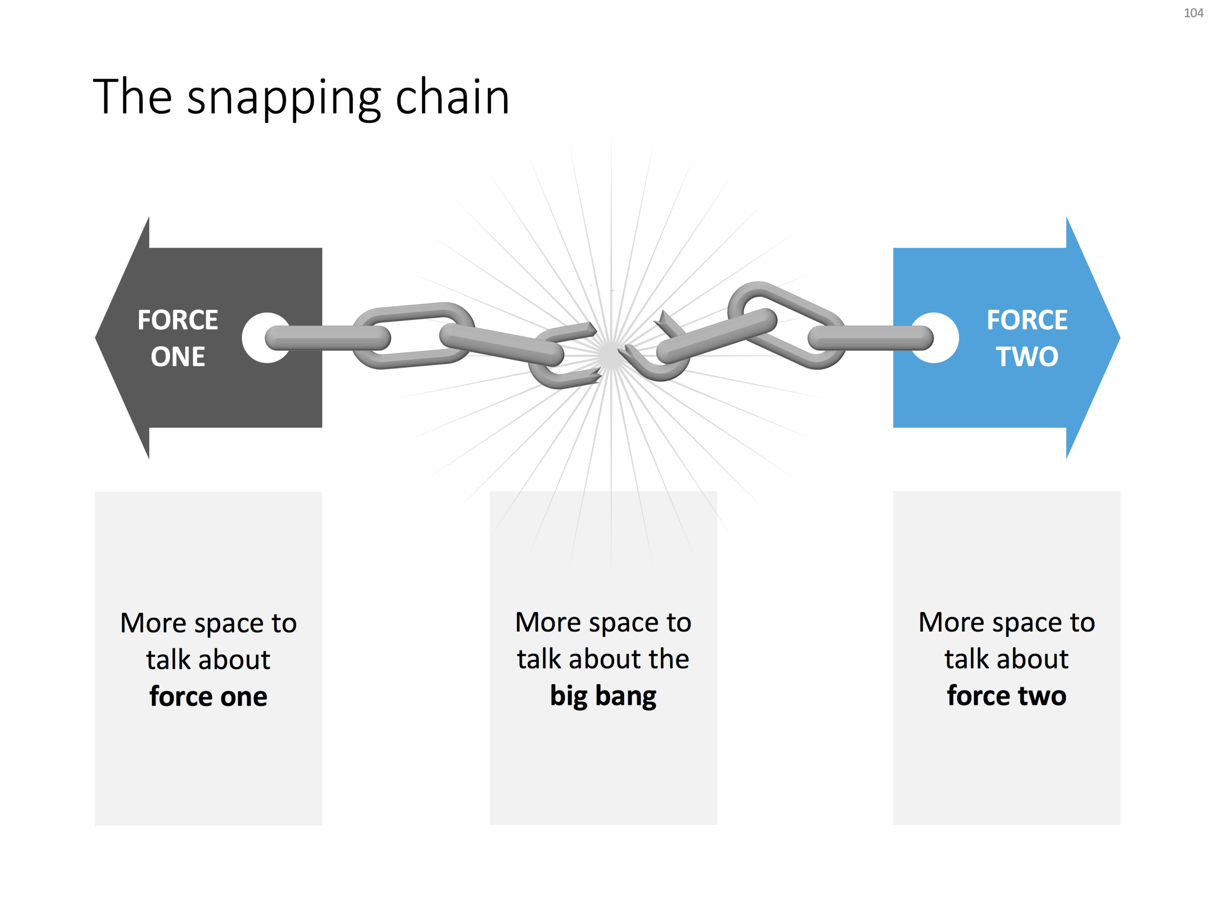
Business presentations usually rely on a few basic concepts. One of them is the snapping chain or rope, where 2 forces pulls something apart. One way to create this is with a stock image of a snapping rope or chain, but it can be hard to find one without an unhelpful 3D rotation, another approach is to create a chain from basic PowerPoint shapes.

Here is what I did

  • Take a rectangle with rounded corners
  • Increase the rounded corners until they become half circles (the small yellow dot in the shape)
  • Copy the shape, make it smaller
  • Centre the 2 shapes, subtract the smaller from the bigger
  • Apply some 3D bevel to to get the basic chain ring
  • The other chain ring is simply a rectangle with rounded corners.
  • Now, scribble a "saw" freehand shape.
  • Copy a chain ring, subtract the saw shape to get the broken ring
  • Copy this broken ring, and subtract it from another ring (to get the exact complement of the break lines)
  • Line everything up for the final composition.

You can follow these steps, or download the finished product from the template store.

Once you have your chain, "store it in a safe place", there are endless ways you could use it in future slides: multiple chains, longer chains, chains that go all around the slide :-) Here is another possible composition from the SlideMagic archive

The resulting chart is not a master piece illustration, but its unpretentious simplicity can do a decent job in an everyday business presentation. People spent too much time dealing with presentation software, and the objective of SlideMagic (the app, the store) is to help you get business concepts on a decent slide quickly and move on with more important things in life (and business).

SlideMagic: a platform for magical presentations. Free student plan available. LEARN MORE
Turning a bar chart into a Gantt diagram

Turning a bar chart into a Gantt diagram

From bar chart to Gantt. Read in this blog post how you can turn a stacked bar chart into a Gantt diagram.

SlideMagic: a platform for magical presentations. Free student plan available. LEARN MORE
Using perspective in PowerPoint

Using perspective in PowerPoint

How to create a 3D perspective in PowerPoint. Most of the time, 3D is not required in business presentations. But sometimes, it is. See how to position objects on a 3D canvas in this post.

SlideMagic: a platform for magical presentations. Free student plan available. LEARN MORE
How to export PowerPoint slides as high res images on a Mac

How to export PowerPoint slides as high res images on a Mac

How to export PowerPoint slides as high res images on a Mac. See how by setting the slide width to 2998 things somehow seem to work.

SlideMagic: a platform for magical presentations. Free student plan available. LEARN MORE
The origins of PowerPoint

The origins of PowerPoint

The origins of PowerPoint. This article The improbable origins of PowerPoint is probably the most detailed story of how PowerPoint became what it is today I have read.

SlideMagic: a platform for magical presentations. Free student plan available. LEARN MORE
My own clean PowerPoint template

My own clean PowerPoint template

PowerPoint templates get corrupted over time. It usually starts with a template that was designed by a print graphics designer as an after thought after designing the logo and the business cards: creating slide layouts without paying much attention to the technical issues of programming a template that can be (ab)used by thousands of employees. Then over, slowly but gradually, "foreign" templates infect the original until nothing is left of the original.

I go back to zero every time I design a new presentation. The file that I put up in the SlideMagic template store is pretty much the one I start every new presentation design project with. It is really simple. You can customise it with your own colours and you are good to go.

When creating a new slide, go to the "Layout" button in the top left of the menu to create a select a new slide layout.

SlideMagic: a platform for magical presentations. Free student plan available. LEARN MORE
Slideuments and graphics designers

Slideuments and graphics designers

Many designers with excellent skills in web and/or print design somehow cannot deploy their talent very well in PowerPoint/business presentations. I have been thinking hard about why this could be.

The key challenge I think is the tight relationship with content and design. In print/web the design of a page does not really change that much if the content changes (it is still a block of text, an image, and an icon that fit in the same overall grid). In a business presentation, everything goes upside down when your competitor analysis needs to include 3 instead of 2 dimensions.

The second reason is - I think - that both people who write presentations and designers who polish them, stick to the conventional slide format: title across the top, list of bullets.

Now here is an interesting experiment for a 100% graphics designer who is not allowed or does not have the knowledge to touch any of the content (the classical print graphics designer situation). Assuming the presentation is a slideument (meant for reading rather than presenting).

Hand over the material in a word processor, as a long text file rather than a partly finished PowerPoint presentation. Now give the designer total freedom to present this material in any form she wants, even in any software she wants, using any page layout she wants.

Changes are you might get a pretty good lucking slideument by taking "PowerPoint" and its familiar layout out of the equation.


Image via WikiPedia

SlideMagic: a platform for magical presentations. Free student plan available. LEARN MORE
Making a transparent cube in PowerPoint

Making a transparent cube in PowerPoint

There is a 3D cube shape in PowerPoint, here is how you can make it transparent. The secret: rotate a copy of itself and paste them over each other.

Screenshot 2017-09-19 07.52.33.png

Image via WikiPedia

SlideMagic: a platform for magical presentations. Free student plan available. LEARN MORE
Size creep

Size creep

Super high resolution images of small slide elements can inflate the size of your PowerPoint or Keynote file without you noticing. A common culprit is an innocent looking page with 30 customer logos. Compress your images often to keep file sizes in check.

Another common file size mistake is to include high resolution images in the slide master to make it easer for people to understand template slides that are meant for photos. As a result, even a simple text slide will create a huge file as the slide master gets saved as an integral part of the document. This can add up in a company with 10,000 employees.

Image compression in PowerPoint can sometimes produce unpredictable results, especially when you tick "apply to all" and you have a presentation with a lot of photographs. I often see cropped images going haywire, the only rescue is to compress images one by one. Always save a copy of your file before attempting to compress the file.

Handy link: how to reduce file sizes in Office


Image via WikiPedia

SlideMagic: a platform for magical presentations. Free student plan available. LEARN MORE