Viewing entries in
SlideMagic

A matter of speed

A matter of speed

A few years ago when I started thinking about about the SlideMagic project I though it was all about the design. Just find a way for people to make beautiful charts and it will be a big hit.

I am close to completing version 2.0 of the SlideMagic app, and am now in a position I have never been in before: I can design the actual user experience of someone creating slides click by click, being free fom common software design platforms, standards, and practices. And here is the real magic. I make dozens of user interface decisions a day, what colours get copied, what things get highlighted, how font sizes are set, what box is selected after you did an action. Hundreds of small decisions add up to a big experience. You cannot pinpoint why it works, but it does somehow. It is all a matter of incredible attention to detail.

The pitch of SlideMagic is changing. It will all be about the speed at which you can design a pretty decent looking slide.

(Don’t tell this secret to anyone).

Photo by toine Garnier on Unsplash

SlideMagic: a platform for magical presentations. Free student plan available. LEARN MORE
Feature preview: matching slide and user interface colours

Feature preview: matching slide and user interface colours

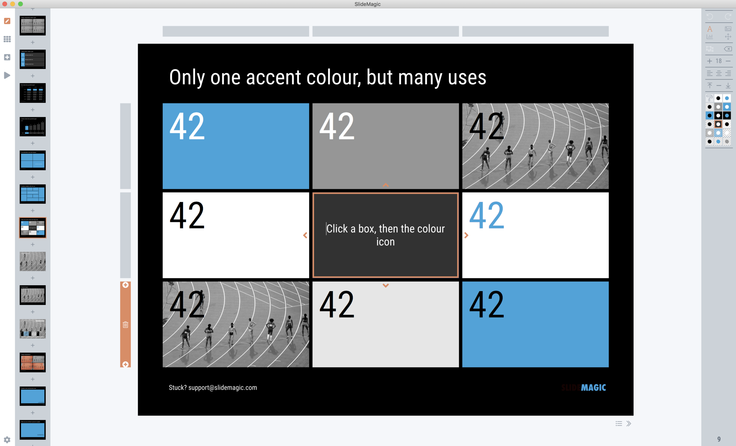
In SlideMagic 2.0, I have pushed the use of colours in the application user interface further. The look and feel of the application will be the opposite of the slides you are working on:

  • If the slides have a dark background colour, the application will be light

  • The accent colour of the application will be the opposite colour on the colour wheel from the colour .you are using in your slides.

Here are some screen shots from the alpha version:

Brown/red in the slides, green in the app

Brown/red in the slides, green in the app

Switch the slide background to dark, the app turns light

Switch the slide background to dark, the app turns light

Slides on the clipboard are in the template bank are presented in the opposite colour so you can differentiate easily between the slides that are already in your presentation, and the ones you could add.

Slides on the clipboard are in the template bank are presented in the opposite colour so you can differentiate easily between the slides that are already in your presentation, and the ones you could add.

SlideMagic: a platform for magical presentations. Free student plan available. LEARN MORE
Starting to use the store myself

Starting to use the store myself

Recently, I have started to use the template store myself for the few bespoke design projects I still do for long standing clients (SlideMagic gave me a really attractive rate :-)). My hard drive is filled with 1000s of slides and still it is difficult to find a nice clean layout to use as a basis for slide number 1001.

Up until a few weeks ago, I started every slide pretty much from scratch, I have gotten pretty fast in setting up yet another 4x5 table grid. But even I can't beat search the store for "table" and re-download that slide again and hit the ground running.

I am continue to monitor which slides people decide to buy, and which slides are downloaded by subscribers. Many subscribers download a lot of slides right after they made the purchase, and then don't return for a couple of weeks. Initial downloads include slides that you can only use in very specific situations, like these sheep. They hardly ever download the same slide 2x. There could be 2 possible explanations:

  • Less likely: after that $99 annual subscription, you better make sure you get what you paid for, maybe the store will stop running somehow before the 12 months are up.
  • More likely: we have built up the habit of mining through old decks, and recycling slides into a new presentation.

As a designer who now uses its own store, I would encourage you to think Netflix, iStock, Spotify: your slides will always be there, and search is there to help you find the slide you need at the moment (and nothing else). Change your design process:

  • From: open your consolidated SlideMagic deck (which took time to assemble from all the individual slides you had to download), pick 20 designs you think you are going to need, see how you can tell your story with these 20 designs
  • To: scribble your story flow on a piece of paper, create a deck of empty slides with just titles, search the appropriate slide template on SlideMagic

It will take you less time, and you get better presentations. And remember: I am constantly adding new slides so your first burst download will run out of date soon.

Having said that, I am willing to look into a technical solution to combine multiple slide downloads in one deck, my commerce platform cannot handle that (yet).


Cover image by Henrik Dønnestad on Unsplash

SlideMagic: a platform for magical presentations. Free student plan available. LEARN MORE
Mysterious shipping charges

Mysterious shipping charges

It is very hard to tell eCommerce platforms, Google shopping, tax authority and other sites that digital downloads do not require shipping of physical stuff. Deep down in the bowels of my system $20 shipping charges were still present for some countries. I think I cleaned everything up now. Let me know if you see any other irregularities. If it looks wrong to you, it probably is wrong.


Cover image by chuttersnap on Unsplash

SlideMagic: a platform for magical presentations. Free student plan available. LEARN MORE
A Pareto chart

A Pareto chart

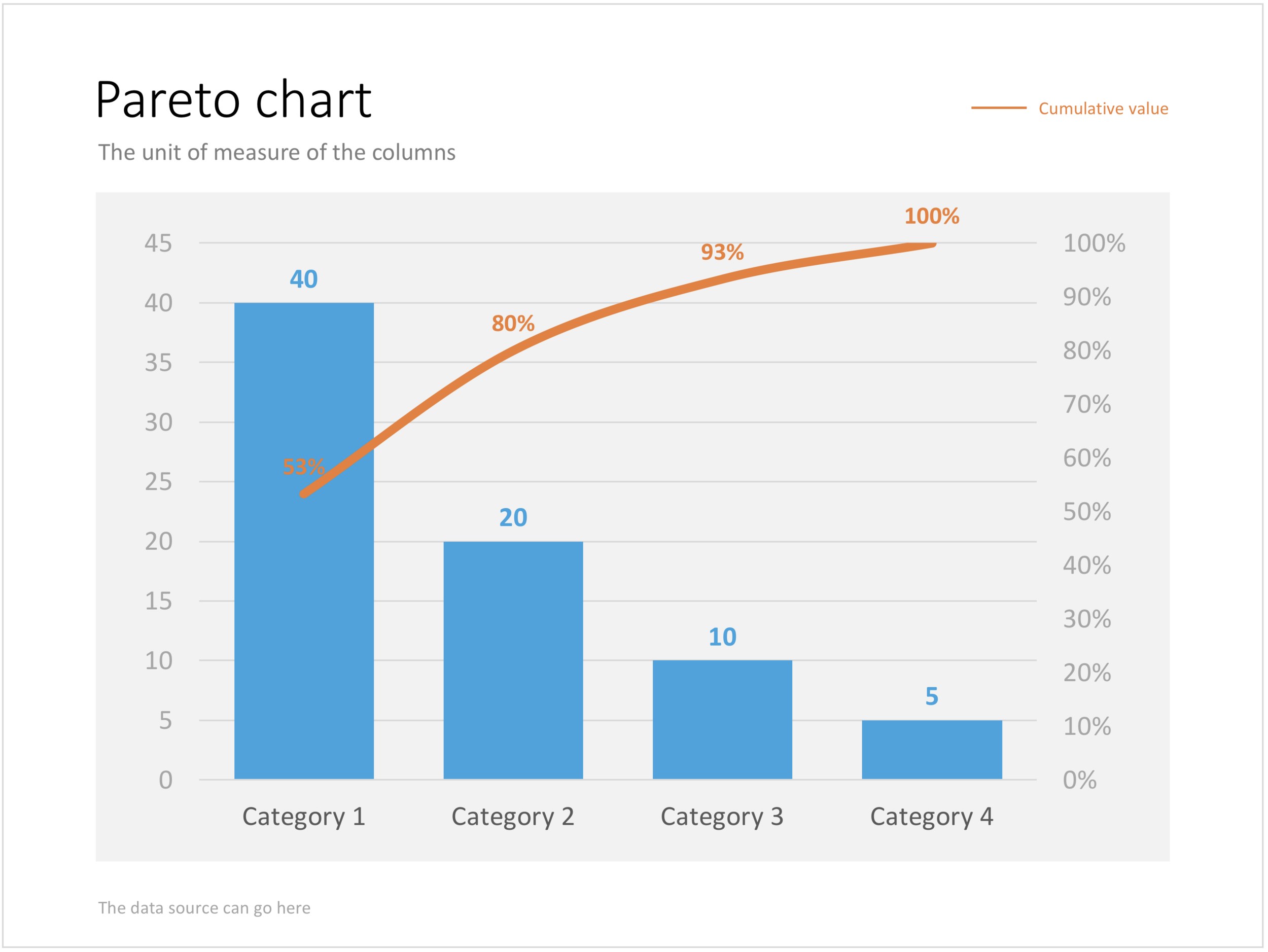
Recently, someone searched for a Pareto chart on my site. I must admit, I had to consult WikiPedia about this type of slide. A Pareto chart shows 2 data series, each with their own vertical axis; the first show the absolute frequency count of something, the second one the cumulative occurrence of the data series, adding up to hundred for the last entry. I have added the Pareto chart to the store. 

SlideMagic: a platform for magical presentations. Free student plan available. LEARN MORE
Puzzle pieces in PowerPoint

Puzzle pieces in PowerPoint

Although you could consider them a presentation cliché, puzzles can work really well in a presentation:

  • Show how things fit beautifully

  • Show how your are missing (hopefully just one) critical piece

  • Show that you finally managed to plug that last gap

Puzzle shapes can also work great when you use them in combination with images. You can go back to this blog post about making Photoshop-like image cut outs in PowerPoint.

Stock image sites are flooded with millions of puzzle piece designs, but they are not very practical for the average PowerPoint designer (especially late at night working for tomorrow's deadline). Almost all these puzzles pieces are vector objects or images that are impossible to edit in PowerPoint. Moreover, all these puzzle pieces have wildly irregular shapes that make them hard to fit in your slide composition that requires exactly nine of them.

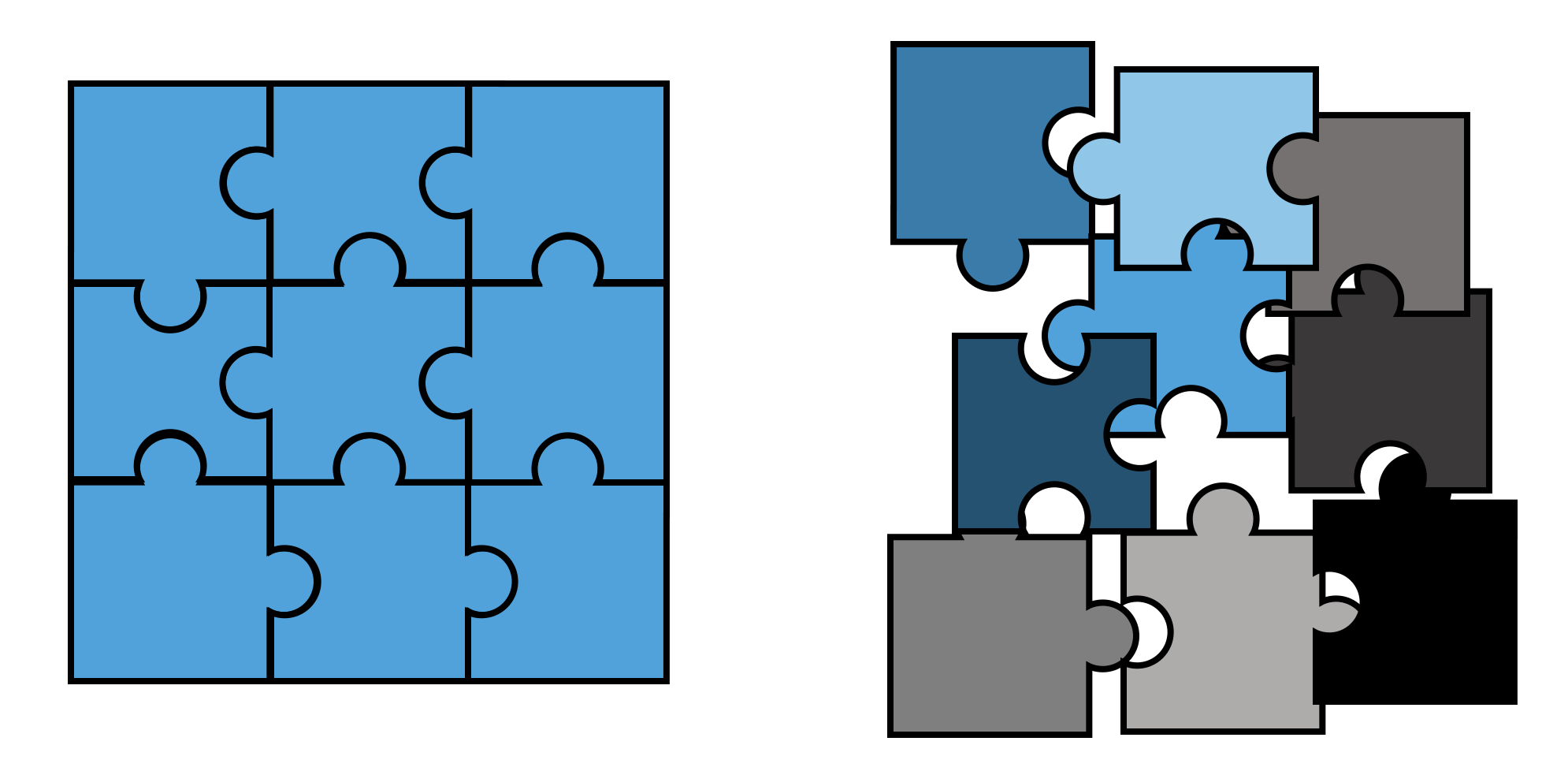
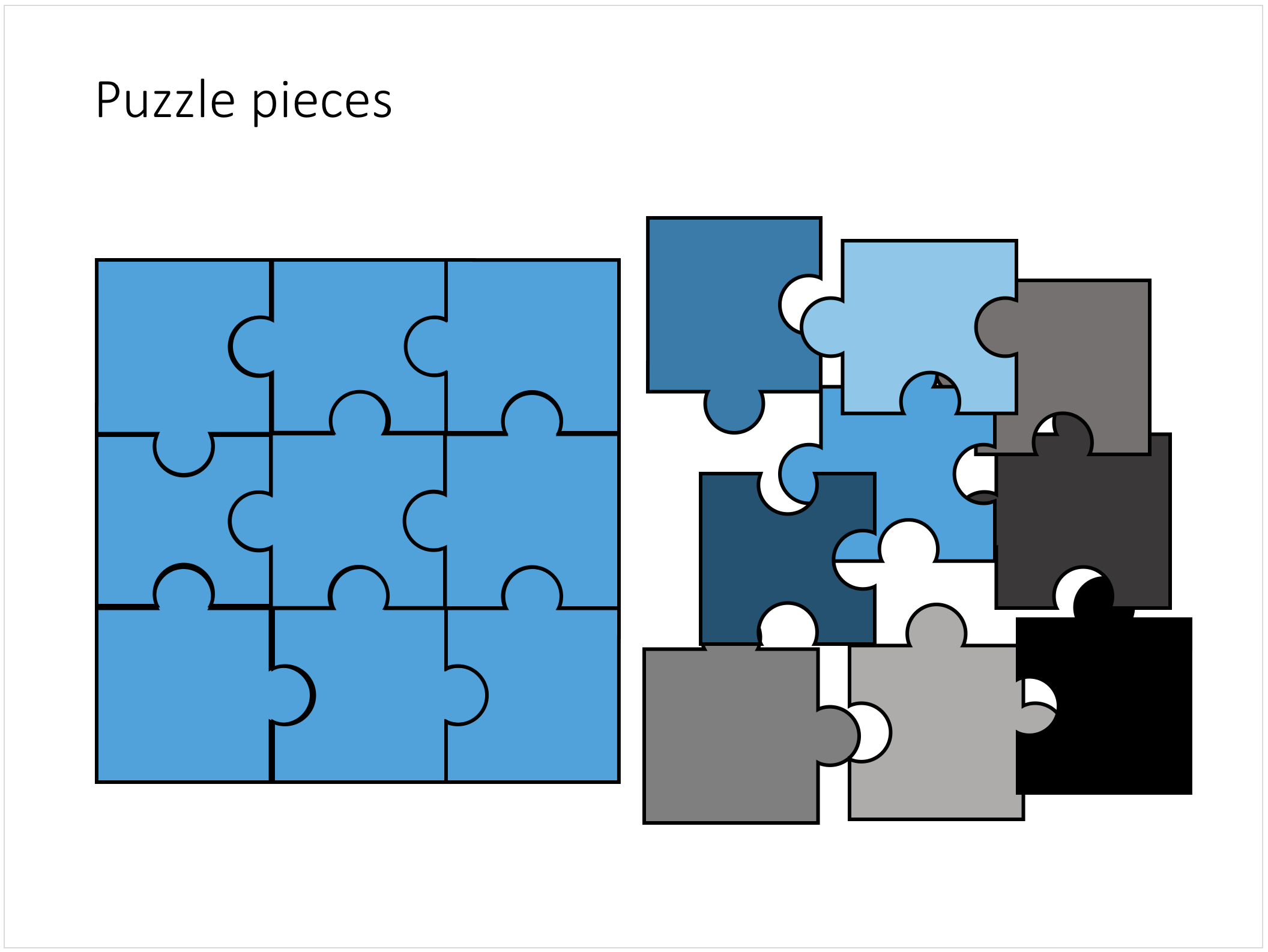
This PowerPoint puzzle slide solves the problem for you. The pieces inside are fully editable PowerPoint shapes, you can change their colour, you can put text in them, you can reconfigure and piece them together as you see fit. Yo'u can download the finished slide by clicking the image (An Apple Keynote version is available as well).

You can try to create the pieces yourself if you want, I used simple square shapes and circles, either joining or subtracting the shapes. Circles and squares might not be the most realistic shapes, but they are very practical when have to piece things together. There is a little bit of math homework to do to determine which type of puzzle shapes you actually need, and which ones you can create by rotating existing pieces.

SlideMagic: a platform for magical presentations. Free student plan available. LEARN MORE
Concentric circles in PowerPoint

Concentric circles in PowerPoint

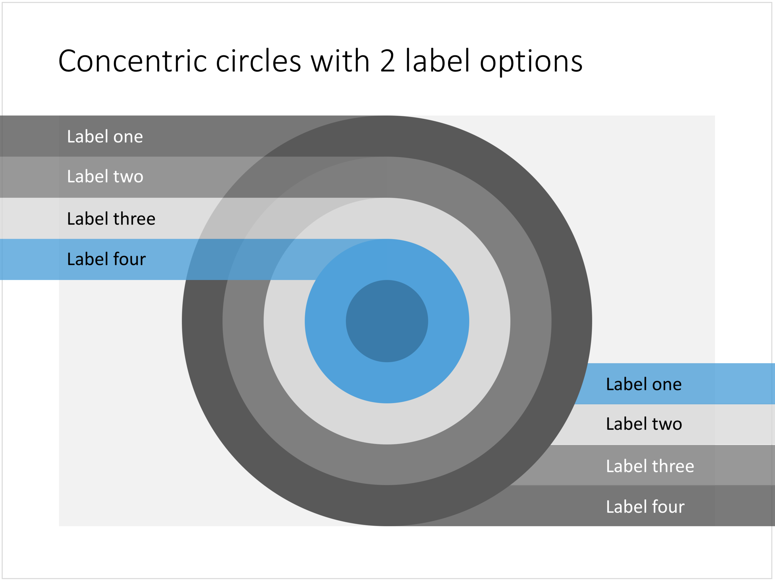
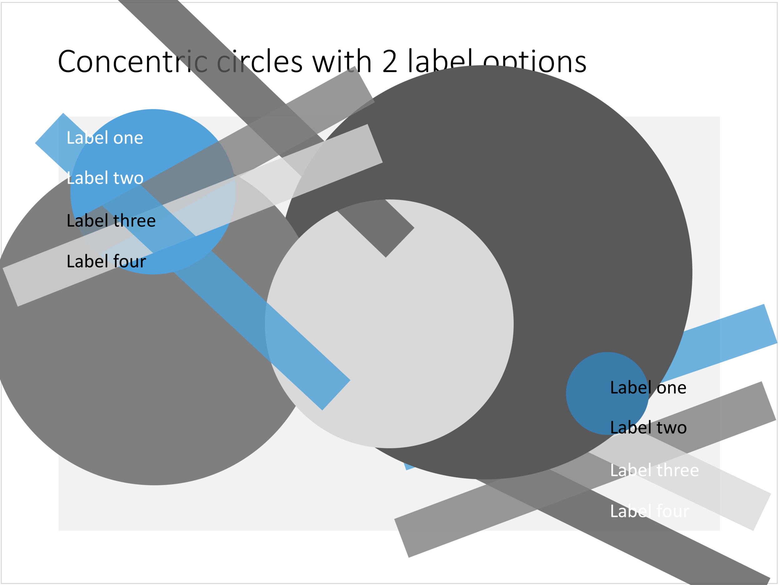
You can create very beautiful compositions by just using basic shapes and a few colours. Below is a presentation slide with concentric circles, and an image that shows how it is constructed. Feel free to borrow the design approach, or you can download the finished slide here.

This technique was often used by the Swiss graphics designers in the 1960s. You can use the slide concept below in a number of ways: show some sort of layering, show multiple layers of security or protection, show a whirl or rolling dynamic. You can take the labels of and just use the circles.

Concentric circles in PowerPoint

Concentric circles in PowerPoint

How to make concentric circles in PowerPoint

How to make concentric circles in PowerPoint

SlideMagic: a platform for magical presentations. Free student plan available. LEARN MORE
Quote slides in presentations

Quote slides in presentations

Quotes can add credibility to your presentation. If experts, celebrities, and/or customers agree with you, you must be right. But, not all quotes have equal weight. They have been overused in many PowerPoint decks. (Anyone can find a picture of a serious-looking person and get her to say what you want her to say in a few mouse clicks).

Here is a check list:

  • The person needs to be relevant and credible (third tier social media "experts" do not carry much weight)
  • The person needs to be identifiable ("Senior marketing executive at major high tech firm" can be anyone and is most likely you)
  • The quote needs to be interesting, cut the buzzwords and marketing language, cut the cliches ("Wow,  these guys really have a targeted value proposition that resonates with my medium-term return on investment objectives")
  • The text needs to be long enough that it is specific, and short enough that it reads like a headline. A full page of verbatim will not come across 
  • The quote needs to be relevant, a generic motivational quote might not help close that enterprise software contract.

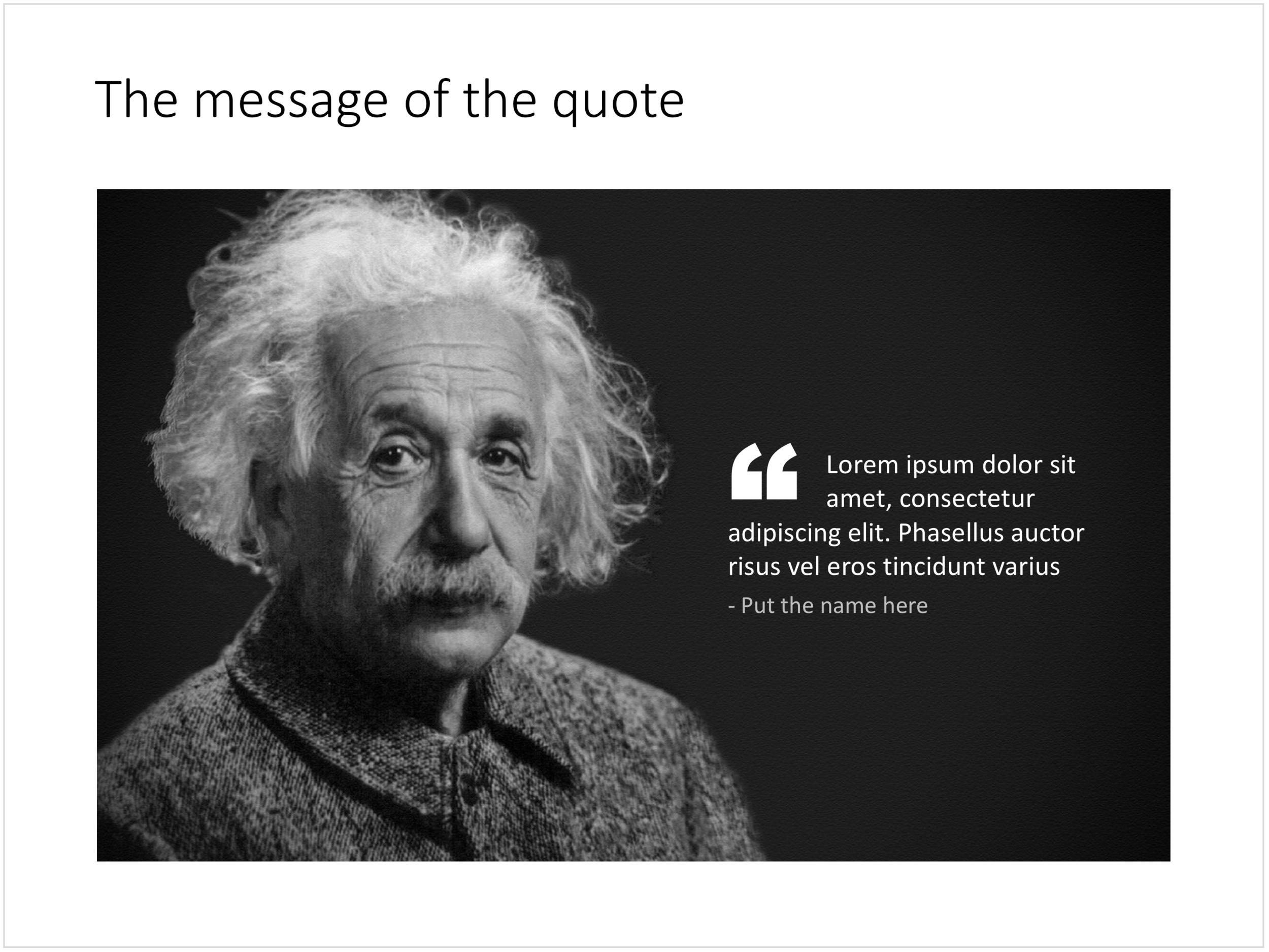
Quote slides are (and should be) pretty simple: a nice big image with a big text overlay. Still there are some things to watch out for. Below is a quote slide that I have added to the SlideMagic template store. Let's go through the design process.

  • The image should have a calm background with enough "white" space for text. You don't need to be a Photoshop guru to extend the background of an image in PowerPoint, it is easy to add a black or white box next to images. You can use the colour picker to match the precise colour, or use semi transparent overlays for the best effects
  • Make the quote symbol stand out. Regular quotes are too small, and the layout does not look good, as the quote pushes the start of the paragraph in. There are endless ways to do it and I settled on this one. One big quote at the beginning of the paragraph with a text indent. Take some time to find a quote in a good font. In the above slide, the text font is the Microsoft Office standard Calibri, but the quotes of this font don't look that "fat", I used Arial.
  • This slide is a framed image slide, which gives me the opportunity to add a big headline at the top of the slide with the main message (the headline can say "Customers are really happy", the quote can say "With product [x], I no longer need to use a pencil".

Feel free to borrow the suggestions above, or you can download the finished slide here. The template store has related designs for quotes, or customers.

SlideMagic: a platform for magical presentations. Free student plan available. LEARN MORE
Blue ocean strategy in a presentation

Blue ocean strategy in a presentation

Most investor or sales presentation have some sort of slide about the competitive environment. (Here are earlier blog posts about how to present the competition). Usually, people use tables, or 2x2 / 3x3 matrices to show how they are different.

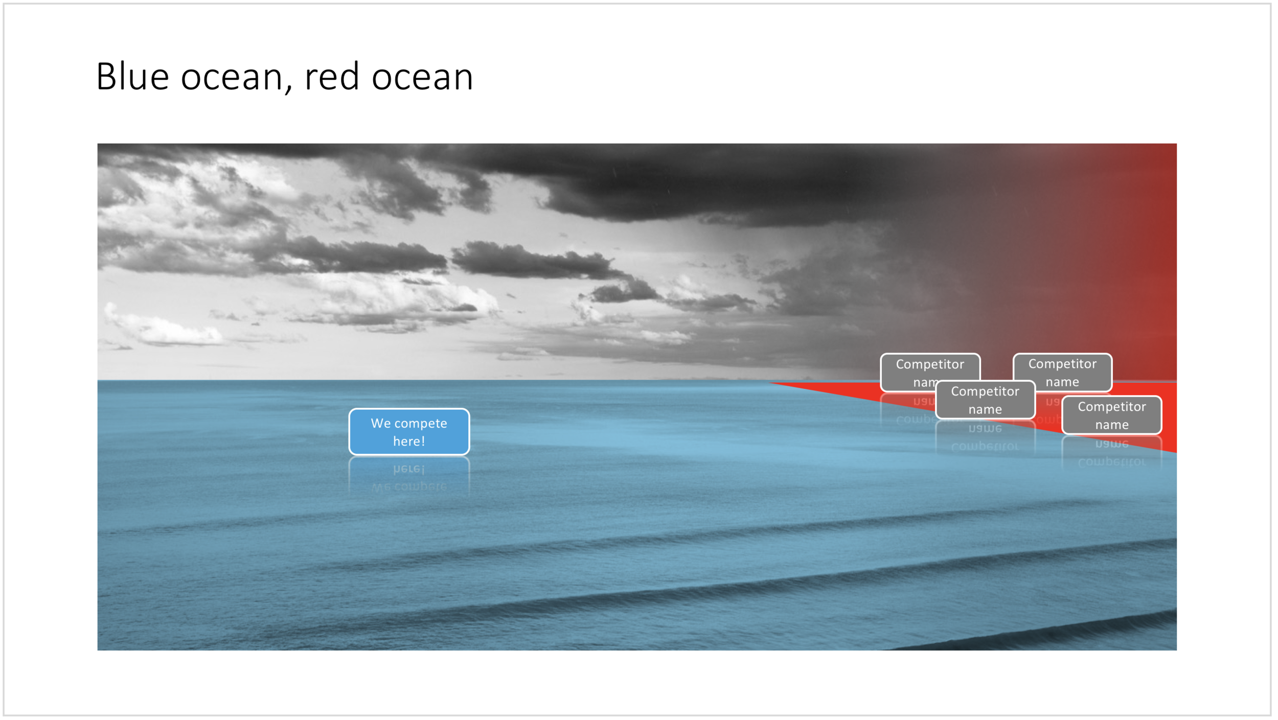
The chart below might a completely different take on the subject. The Blue Ocean strategy concept developed by INSEAD argues that is often better to define an entirely new market rather than battling with all the existing companies that go after well-established market segments. You can download the slide here.

Visualise the competition using "Blue Ocean Strategy" in a presentation

Visualise the competition using "Blue Ocean Strategy" in a presentation


Cover image by Ishan @seefromthesky on Unsplash

SlideMagic: a platform for magical presentations. Free student plan available. LEARN MORE
Presentation layout for when you are stuck...

Presentation layout for when you are stuck...

Sometimes the simplest slides can be the most effective ones. This slide layout shows a big arrow crashing into a wall to visualise your obstacle or roadblock. The wall image is framed, while the arrow is bleeding of the page, adding an extra movement effect.Edit to text in the arrow and/or on the wall to show your audience what it stuck. The text in the arrow will automatically tilt in the right 3D angle, and both the wall and arrow will colour in your primary accent colour. Please copy this slide into a presentation that uses your own corporate presentation colour theme.

I am gaining a lot of experience now in translating PowerPoint designs into Keynote. This chart is only available in PowerPoint and not in Keynote, because the latter cannot tilt objects in a 3D space. The same problem arises with charts that rely heavily on bevels or other 3D lighting effects, which is not obvious to do in Keynote.

Here you can find this wall layout in the SlideMagic store. Cover image by Chris Benson on Unsplash

SlideMagic: a platform for magical presentations. Free student plan available. LEARN MORE
Bubble charts in PowerPoint and Keynote

Bubble charts in PowerPoint and Keynote

Bubble charts are useful to present and analyse very large datasets. The standard template in PowerPoint and Keynote still needs some adjustment to make the chart useful. In this bubble chart on the SlideMagic template store, I have tried to do the hard work for you.

This a reformatted version of the standard bubble chart that you will find in PowerPoint and Keynote, on top it has the layout of a 2x2 matrix. The bubble chart is useful when you want to compare a data series with 3 elements, across a large number of data points. Examples are countries, business units, regions, products, etc.

The first two elements will be plotted on a regular XY chart, the 3rd element is the size of the bubble. PowerPoint or Keynote do not support labelling of the bubble very well, which are put in manually.

A 2x2 matrix structure is put on top of the regular bubble chart, giving you 4 distinct quadrants to segment your bubbles in. In the current example, the quadrants have the same size, by putting the 2 axes right in the middle. To do so, you need to manage the ranges of the axes carefully. If this is not important to you, you can put the X and Y axes where they are relevant without worrying about this. Quadrants of unequal size will still look good.

I am working hard to make the store more useable. This layout is an example. There are 4 variants of the chart: PowerPoint, Keynote, both in 4:3 or 16:9. I tried to add all the right instructions about how to use the layout, and show many links to other relevant slides in the store. While working on your presentation, you can go back and forth between designs and get ideas on how to visualise the key messages of your presentation. Some layout suggestions, you might be able to create yourself, others you might already have bought and can re-use, or you can download a layout right away to add it to your library. SlideMagic will be a place that saves you time making your business presentations.

Cover image by Alejandro Alvarez on Unsplash

SlideMagic: a platform for magical presentations. Free student plan available. LEARN MORE
Most templates now available for Apple Keynote

Most templates now available for Apple Keynote

The template store now supports Apple Keynote, a drop down menu let's you make a selection between your preferred presentation software. Not all templates could be converted, Keynote is missing the 3D shape rotation feature of PowerPoint that I used in some of the slides.

The store now gives you the option to download templates either as a PowerPoint or Keynote file

The store now gives you the option to download templates either as a PowerPoint or Keynote file

Slides in Keynote look the same except for the font

Slides in Keynote look the same except for the font

The only adjustment I made was the font: switching it from PowerPoint's default Calibri to Helvetica Neue for  Keynote. I am keen to keep the look and feel of the charts as "standard" as possible to make it easy to integrate the design in the corporate presentation templates that people are using.

Under pressure!

Under pressure!

The slide above is a layering of 2 images that visualizes a big dam that is under pressure from something. You can use it either to show that something is about to burst, or the opposite, that defenses are strong and holding out well. I love the massive architectural scale of these hydro power installations, especially when you can highlight it with this tiny car driving across it. You can download this dam template here.

Looking for other visual concepts that are similar? You can try and search the store for "forces", "down", or this search "downward" and see what slides come up. That is my longer-term vision: no more boring bullet point charts, and no more searching for "where is that slide that I made 2 years ago", but rather have all the relevant designs ready at your finger tips. The search engine with design ideas is almost as important as the actual design itself.

Searching for "downward" in the template store

Searching for "downward" in the template store

SlideMagic: a platform for magical presentations. Free student plan available. LEARN MORE
The snapping chain

The snapping chain

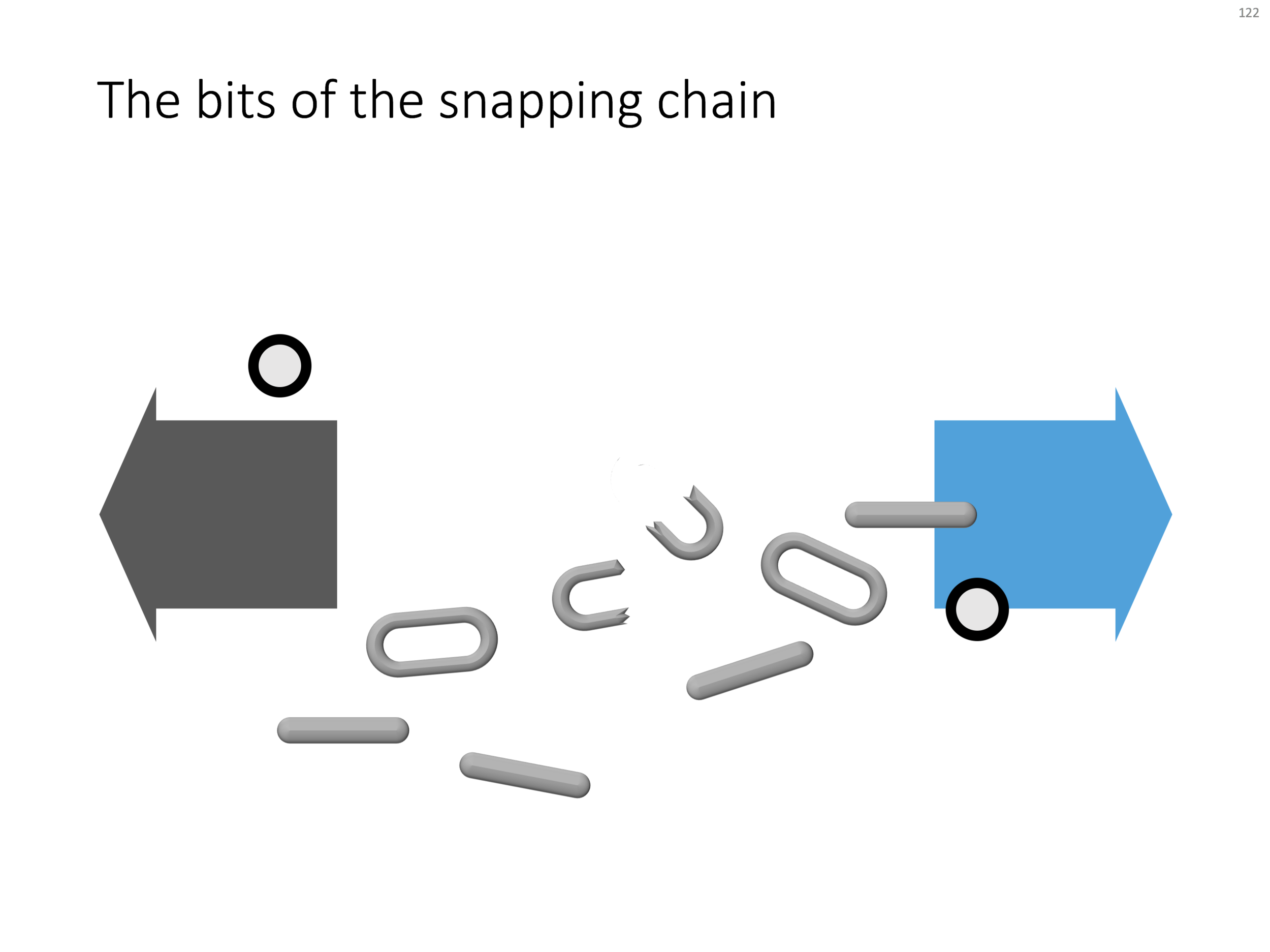
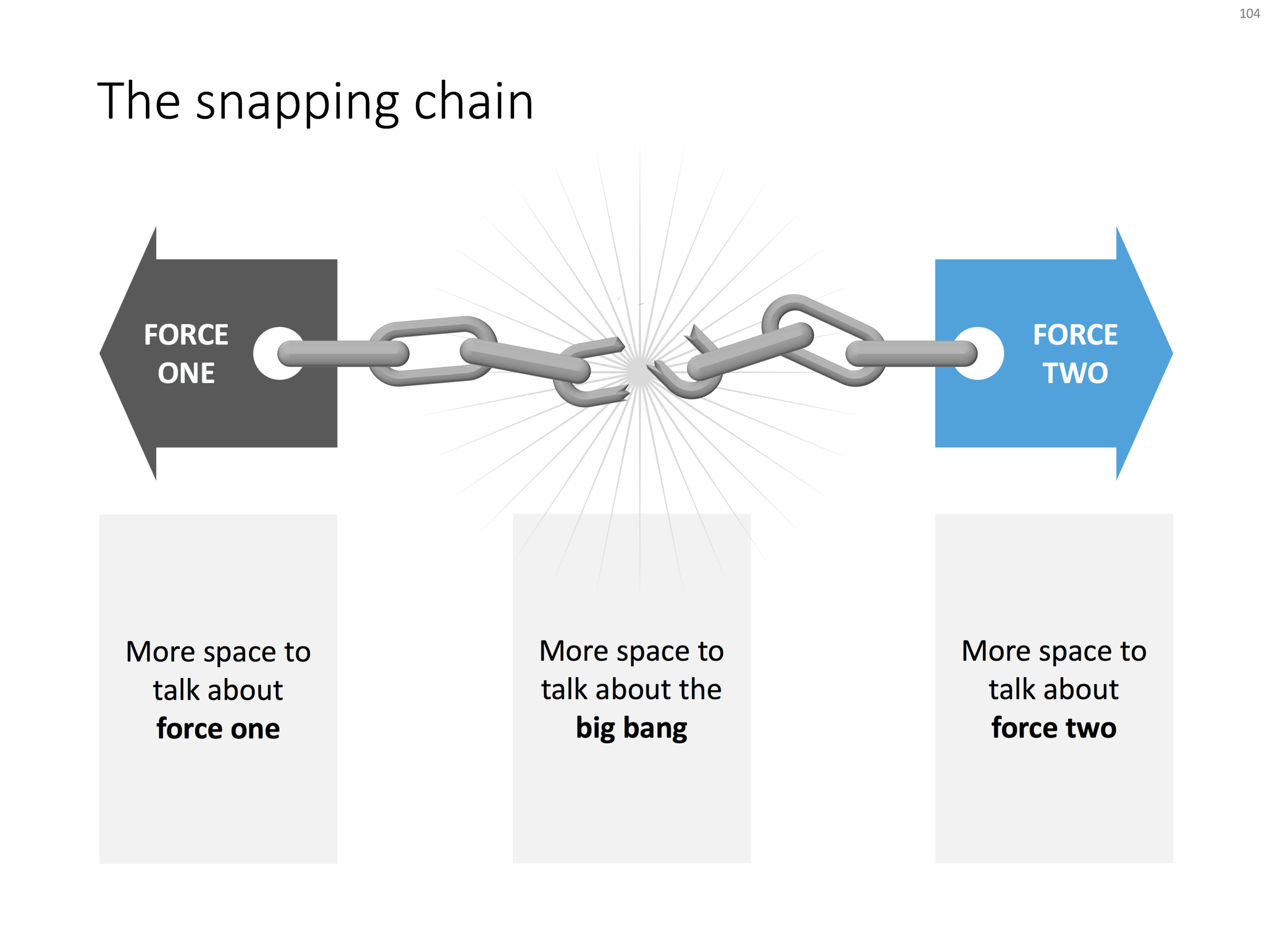
Business presentations usually rely on a few basic concepts. One of them is the snapping chain or rope, where 2 forces pulls something apart. One way to create this is with a stock image of a snapping rope or chain, but it can be hard to find one without an unhelpful 3D rotation, another approach is to create a chain from basic PowerPoint shapes.

Here is what I did

  • Take a rectangle with rounded corners
  • Increase the rounded corners until they become half circles (the small yellow dot in the shape)
  • Copy the shape, make it smaller
  • Centre the 2 shapes, subtract the smaller from the bigger
  • Apply some 3D bevel to to get the basic chain ring
  • The other chain ring is simply a rectangle with rounded corners.
  • Now, scribble a "saw" freehand shape.
  • Copy a chain ring, subtract the saw shape to get the broken ring
  • Copy this broken ring, and subtract it from another ring (to get the exact complement of the break lines)
  • Line everything up for the final composition.

You can follow these steps, or download the finished product from the template store.

Once you have your chain, "store it in a safe place", there are endless ways you could use it in future slides: multiple chains, longer chains, chains that go all around the slide :-) Here is another possible composition from the SlideMagic archive

The resulting chart is not a master piece illustration, but its unpretentious simplicity can do a decent job in an everyday business presentation. People spent too much time dealing with presentation software, and the objective of SlideMagic (the app, the store) is to help you get business concepts on a decent slide quickly and move on with more important things in life (and business).

SlideMagic: a platform for magical presentations. Free student plan available. LEARN MORE
Popping out of the box

Popping out of the box

Popping out of the box. Unlike many designers, I actually like framing my slides, leaving white space around the edges. Stretching your picture all the way to the slide boundary looks nice on one page, but creates inconsistencies with more traditional data slides, and reduces the readability of slide titles.

SlideMagic: a platform for magical presentations. Free student plan available. LEARN MORE
App demo slides

App demo slides

App demo slides. Doing a live app demo in a 20 minute pitch meeting is risky, the technology might go wrong, and probably more than half the time you spent in a 2 minute app demo could be things that are not really interesting: logging in etc. Instead, I usually prepare a series of screen shots with big explanation bubbles in my presentations.

SlideMagic: a platform for magical presentations. Free student plan available. LEARN MORE
Focal point chart

Focal point chart

A while ago, I discussed how to create a "focal point" slide, where a series of triangles can create the illusion of text boxes all disappearing in one big point. You can read the instructions how to create it in this blog post, but now you can also find them in the template store.

I am spending part of my daily time that I used to invest in blog posts, and increasing the library of my template store, I have an infinite amount of template ideas in my head, so there is still a lot of work for me cut out. Ultimately, the value of this store will be some sort of subscription, as a sign of support for me, in return for which you get unlimited access to all the designs. The combination of a powerful search engine and the largest library of useful charts on the net, I think the proposition of 1 second downloads will beat the alternative of manually copying my designs. Let's see how it goes.

SlideMagic: a platform for magical presentations. Free student plan available. LEARN MORE
Soft launch of the SlideMagic template store

Soft launch of the SlideMagic template store

Many users of the SlideMagic presentation app ask for the slides that the app generates in PowerPoint format. In response, I have built a SlideMagic presentation slide template store. The basic store infrastructure is finished, but the amount of slides available is still small.

It was quite interesting to see how in 2017 it is possible for a designer to pull of a full-fledged digital content eCommerce store with downloads and payment processing in a matter of days. (OK, my computer science engineering degree came in handy a few times when I had to go deep into HTML to customise the store template in a few places). A few years ago I was toying with the same idea, but the required investment in technology would have been a lot higher.

The main shortcoming of PowerPoint templates vs my presentation design app also applies to my own template store: templates are hard to customise. Adding a row of boxes to an existing design and getting everything to line up properly requires a bit of design skill. It is a trade off you have to make. The app is free to use, and makes these adjustments really easy. Where possible I will add slide variants to accommodate the layman designer where possible.

There are thousands of presentation template stores on the Internet and I tried to make mine different. All stores try to hard: designs are too sophisticated, full supporting graphical clutter that makes slides hard to customise and hard to fit in to corporate templates. My slides are incredibly simple and should blend in nicely when pasted into another corporate colour scheme.

The other missing item in template stores is search, how to find a decent template that fits your specific business concept you want to visualise. In my template store, I will start with paying close attention to tags and search terms. For future releases, I am working an "AI engine" that can guide you through a process to match your visualisation challenge with an actual slide suggestion (this is the biggest source of value, a library with thousands of suggested layouts is not).

I will build up the slides in the stores gradually. My first challenge is the complete the basic library of the store, then I should be able to add a few slides per day. Maybe changing the scope of my blog a little bit, discussing a possible visualisation of a business concept, and then putting the final result up in the store. With 250 blog posts a year, this will get us to a nice library over time.

I am using the gradual approach as well to get feedback. The most important one is customers voting with their money. Which slides will sell, which ones not? I have no idea yet. Secondly, I am encouraging users (you) to post requests for slide designs. If I can can accommodate them, I will add the relevant slides to the store.

The business model for the site is not yet finished. Once the library gets bigger, an "all you can eat" subscription model seems the most sensible. This is especially valuable for users as I keep on adding slides and concepts from blog posts and user requests.

Some of my clients have already noticed that I have a bit bandwidth for bespoke projects at the moment. I might drop a daily blog post here and there as I am trying to focus to get the slide library to a decent size over the coming weeks.

As I make changes to the store, the site might go "black" now and then, apologies in advance. I would invite you to look around and send any feedback to jan at slidemagic dot com. Let me know what you think!


SlideMagic: a platform for magical presentations. Free student plan available. LEARN MORE
Working in Google Slides

Working in Google Slides

Recently, a client insisted on using Google Slides for our presentation design project, especially because of its good collaboration features. Instead of starting a presentation in PowerPoint, then converting it to Google Slides, I took the native approach, and created a presentation from the ground up in this application.

The design of Google's office user interface has improved a lot over the years. Things look beautiful and work fast and snappy. Still, the Slides product is full of little issues that 1) slows down a pro-user like me, and 2) makes it harder for the layman designer to make good looking documents.

Because I invested my own hard-earned money in my presentation app SlideMagic, I feel a bit hesitant here to spoon feed a ready made upgrade suggestion list to a multi-billion dollar software developer with the world's smartest programmers ready to implement them....

In 2017 - leaving minimalist SlideMagic aside - I think PowerPoint is again/still the best slide design software out there (also on Mac), better than Google, better than Apple Keynote. The main criterium here is not feature set, but workflow.

There have been many of these types of posts on my blog over the past 9 years, and I am sure there are many more to come as products continue to evolve.

SlideMagic: a platform for magical presentations. Free student plan available. LEARN MORE
Building image grids in PowerPoint

Building image grids in PowerPoint

Making a grid of images in PowerPoint is tricky. Images never have a consistent aspect ratio, and when you place a lot of them on a page, the guide suggestions always snap in the wrong place somehow. Here is a survival guide.

  • Copy all your images inside the page and select them all
  • Right click and go in "format picture"
  • Tick the "size" icon, and click "size" 
  • Hit "reset" to kill any aspect ratio distortion
  • Hit "lock aspect ratio"
  • Now select each image one by one, hit "crop", hit "aspect ratio" and pick one
  • After this, select all the images again, and give them the same width with a numerical value
  • Position the images on your grid
  • Take each image in turn, select "crop" and move/zoom the image mask for the right composition

The above was a major consideration when designing the image grid system in my presentation app SlideMagic.

SlideMagic: a platform for magical presentations. Free student plan available. LEARN MORE
Trends in presentation and pitch design

Trends in presentation and pitch design

I opened some old presentations on my hard drive and started thinking about how my work has evolved over the past years. Here are some observations:

  • Starting points of presentations (the briefing decks I see) have gotten a lot better. Garr Reynolds, Apple product launches, TED talks, etc. etc., and maybe most importantly a younger post-overhead project generation is joining the workforce, raising the bar in presentation design
  • The audience has evolved as well. People know the general drill of a startup pitch, the Internet or a smartphone is not as strange as it was in the early 2000s. People have the courage to cut a bad presentation short. 
  • Back in 2003, I was probably one of the very presentation designers in the world, now there are thousands. 
  • Given the above, my work is moving on a bit. While I still do the proper upgrading of the look & feel of a presentation, it is completely not the most important thing I do anymore. Actually, my graphics and visual concepts are getting simpler, and simpler, maybe even regressing to what I did a few years back.
  • Orchestrating the flow of a pitch is still important, but as pitches get shorter and shorter, and everyone has pretty much settled on a classical investment pitch are start to focus more and more and the pacing of the story. People skip over important things too quickly, while spending far too much time on the obvious, and finally sometimes they do not even touch on a very fundamental missing step in their arguments. 
  • My favorite design work are the "puzzles": diagrams that need to show very complex trade-offs, technology infrastructures, or relationships of multiple factors impacting each other. In the end, these diagrams look very simple, but they can take a relatively long time to construct, burning through endless amount of scrap paper in the process.

Here it all comes back to my presentation app SlideMagic: the final technical slide design is increasingly a very, very simple diagram. The tricky bit is 1) get the pacing right, 2) find that simple composition that summarizes that complex relationship.


Painting by Max Lieberman

SlideMagic: a platform for magical presentations. Free student plan available. LEARN MORE