Viewing entries in
Software

...And more app updates

...And more app updates

Screenshot 2019-10-30 16.18.11.png

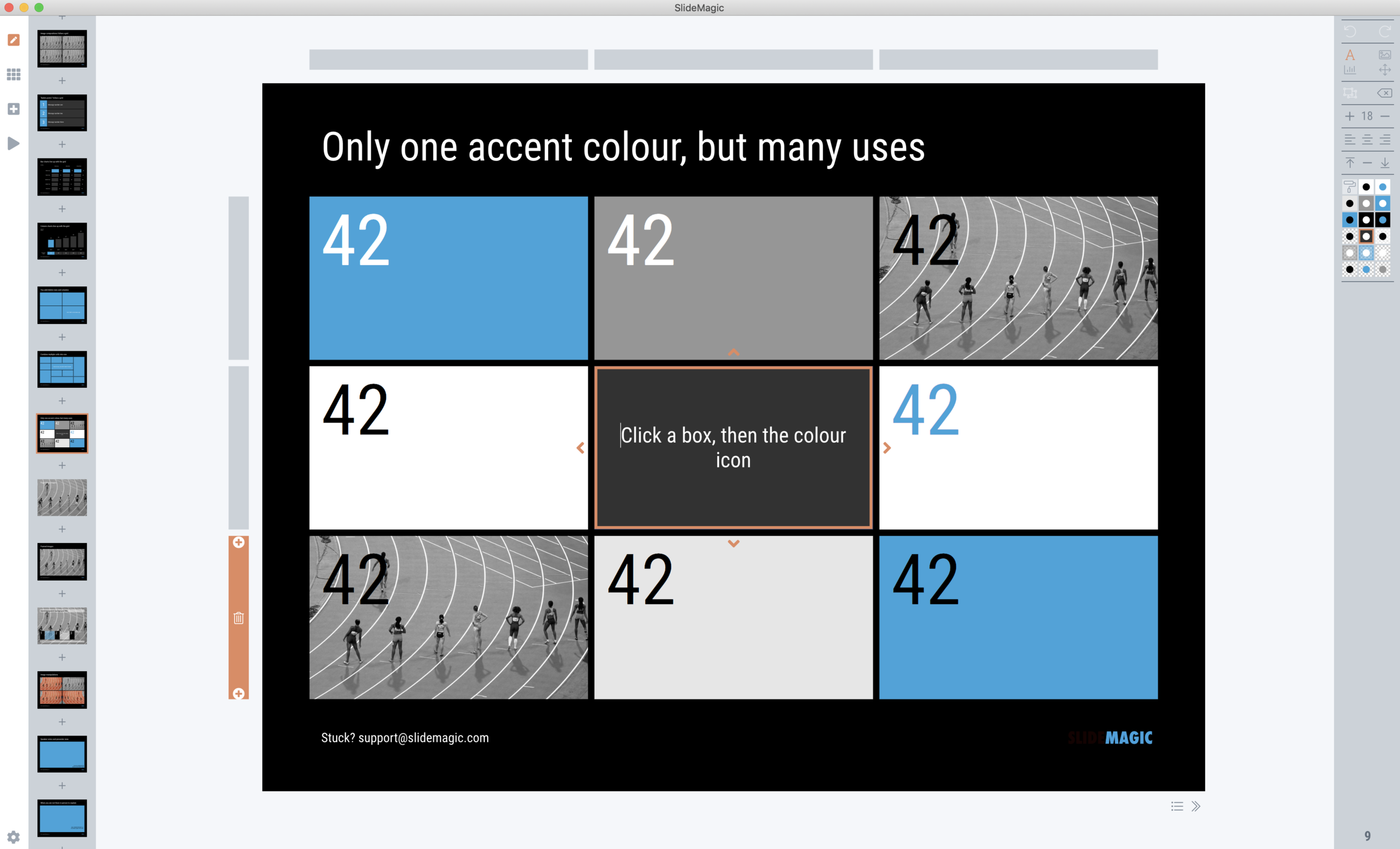
I am focusing on increasing the template database and in the process encounter more ways to make working with SlideMagic faster, and slides prettier. After the past days:

  • Various bug fixes, and code cleanups. I can now laugh at some of the code I wrote at the very beginning of this project, what was I thinking…

  • A proper way to deal with text overflow in boxes, things look professional now when font sizes are getting to big

  • The grid bars now light up when you select shapes

  • A allowed bolding of text with CTRL-CMD B, unlike bullet points, I think this actually does add something to the slide (not yet reflected in PowerPoint and PDF conversions, I might have to write a text block parser to make this happen).

  • Building on bold text, I made the overall font thinner

  • And I added slide subtitles as a fixed feature to each slide template.

To be continued

SlideMagic: a platform for magical presentations. Free student plan available. LEARN MORE
Where are the bullet points?

Where are the bullet points?

A question I got from a SlideMagic 2.0 beta tester.

The answer: there aren’t any. I am trying to create a presentation design tool that changes people’s design habits. SlideMagic does not have built-in bullet point formatting options. It is meant to be that buzzer that reminds you to find an alternative design solution the moment you are about to fall back to your old habits.

It is possible to create lists in SlideMagic though. Below a screen shot from a template search in the (still very small) slide library. If you need to make a list as a conscious design decision, you can, if you want to fill a box quickly with a number of bullet points, you can’t.

Maybe I am pushing things too far here, but I am not yet ready to give in.

Photo by Jon Tyson on Unsplash

SlideMagic: a platform for magical presentations. Free student plan available. LEARN MORE
Is it just me?

Is it just me?

Years ago I started SlideMagic 1.0 “brain washed” by “modern” application design: cloud, tablet-friendly, SAAS, an always up to date version of software running in the browser.

Bit by bit, I am reverting to a 1990s setup for SlideMagic 2.0, focused on a desktop application with a selected cloud-tweaks:

  • Design apps need to be super snappy and fast, latency because of saving stuff in a database that sits at the other end of the world is not ideal

  • Presentations do get edited on planes that still do not have 100% WiFi coverage

  • Presenting a presentation on a screen that is dependent on a live internet connection is risky, yes even in 2019.

  • Having multiple windows on a screen and copying, pasting, dragging things across is actually useful (not yet implemented in SlideMagic 2.0). It is funny to see the developer discussion on bulletin boards where people are waking up to the challenges of managing multiple windows of the same application. Something web designers usually do not have to do.

  • Storing things in a tried and trusted local file system solves security headaches and is good set up for when creating documents: finding things, copying, pasting. (Long-term storage and archiving is a different story)

Photo by Matthew M on Unsplash

SlideMagic: a platform for magical presentations. Free student plan available. LEARN MORE
Stress-testing monitors

Stress-testing monitors

A critical feature of any presentation app is the management of screens when presenting for a live audience. The presentation needs to show up on the big screen, and if possible, the presenter windows with the slide count, next slide preview, and timer needs to pop up on the secondary monitor.

Messing with monitors under the stressful time pressure of standing in front of a waiting audience requires serious stress testing. I am now doing this for SlideMagic 2.0. Pulling out monitor cords mid-presentation, sticking them back in, closing windows. I removed many bugs, but there are still a few left (the dual operating system set up is causing some additional challenges).

Soon, I will have ironed them out all. But as a precaution, I might not go as far as PowerPoint or Keynote where the user does not see the presenter and audience windows explicitly. I will leave them visible as non-maximised windows so the user can find them and move them around if Murphy’s Law strikes.

To be continued.

SlideMagic: a platform for magical presentations. Free student plan available. LEARN MORE
App update

App update

Apologies for the quiet blog this week. I am extremely busy ironing out the SlideMagic 2.0 app. This week the focus is on tightening the integration with the Windows and Mac operating systems:

  • Designing app and file icons that look good and stand out next to other desktop icons (clutter)

  • Linking those icons with the ‘.magic’ file extension on a computer

  • Making sure double clicking icons, recent files, recent files in the dock, etc. works

  • Certifying the app both with Apple and with a certification agency for Windows so that double clicking an installer does not generate scary security warnings

  • Adding SSL security to file downloads

  • Accept-cookie banners, and other regulatory issues

To be continued. Beta testers can check in now and then to download a later version of the installer, I am putting a new one up almost every day now.

SlideMagic: a platform for magical presentations. Free student plan available. LEARN MORE
(Careful) beta test for both Mac and Windows

(Careful) beta test for both Mac and Windows

I am ready to release a useable version of SlideMagic 2.0 to a very small group of users. There is an app for both Windows and Mac. If you are interested, you can sign up here: http://cloud.slidemagic.com/beta/apply, and I will let you know in the coming days (maybe week) if you made it to the very first beta test group.

In the not too distant future, there will be a broad/no application beta test program, but at the moment I am keeping things small to make sure I have the bandwidth to support early users.

Photo by Abbie Bernet on Unsplash

SlideMagic: a platform for magical presentations. Free student plan available. LEARN MORE
How I brought my coding skills back up from the 1990s

How I brought my coding skills back up from the 1990s

This list of resources might come in handy for anyone who is considering learning how to code from scratch, or like me, wants to get back into things again. Your objective could be

  1. to land a job as a developer,

  2. have a startup idea and you want to build it, at least build a prototype in a low risk way without the pressure and money required to hire professional developers

  3. you just feel a bit technology illiterate and want to acquire basic coding skills just as an interest.

For me it started actually with number 3, that slowly turned into objective 2. Back in the 1980s and 1990s, you could simple turn on a computer enter a few lines of simple code and get a computer to do things. Now there is actually a bit more ‘overhead’ required before you have a basic piece of code running that can take an input and do something with it.

Option 1. and 2. are very different. Being a developer inside a huge organisation, and at the receiving of incoming feature requests by others is different from building a project that is really yours. Option 1 can actually be very similar to a regular admin job (a ‘cog wheel’ inside a big machine).

Thinking a bit ahead, I think that ultimately I will not be the person to keep un coding SlideMagic if it ever becomes a big and successful operation, but I am convinced that it is very hard (maybe impossible) to run a technology company if you yourself are completely illiterate in the world of coding.

So, my starting point was an engineering degree from the early 1990s, where I mainly programmed in Pascal. What is sort of left is a basic understanding of algorithms, functions, loops, and variable scopes, that is basically it.

So here is what happened over the course of a year or so:

  • After some deviations, I decided on a language: Javascript and stuck to it. Javascript is broadly used, and can be applied anywhere, from front-end web pages to servers. Only one language to learn that covers everything and is modern and fresh.

  • In my spare time I started reading this book: Eloquent Javascript in multiple rounds. (It is free). First pass to broadly familiarise myself with concepts, notation and terminology. Then to understand it better, then to do some exercises.

  • I made sure I set up some kind of environment on my computer to write code, save it, “spell check” it, in my case I use the open source Microsoft Visual Studio Code (this is different from the paid Visual Studio that is geared more towards development for Windows).

  • I made sure I had some sort of project I could focus on to practice my skills. In my case, the first challenge was to interpret presentation files from my own SlideMagic 1.0 system: could I read the file, extract its components and start rendering things on my screen? In this way I could gradually up the complexity: starting with boxes and text, moving to images, and graphs. Doing the actual coding is super important. It is like learning a spoken language, you will never learn if you don’t do.

  • Stackexchange is your biggest friend. There are millions of people trying to learn how to code, they all have the same questions like you, google any question, and this site will give you the answer.

  • Prioritise what you want to learn. The mess that is front end web design can keep you distracted for days trying to figure out how to get things to line up on the screen, during this time you are actually not progressing with your coding skills.

  • To build a web server I followed along with one online video instructor: Academind. (I checked out many). First random videos, then following some of their YouTube playlists for free, then subscribing to their paid Udemy courses: highly recommended.

  • The development world is full of framework that go in and out of fashion. I actually decided to stay away from them at the moment, and learn the pure approach and not to get locked into something specific.

As I am writing this, I am still learning and you could do too. As a profession, as an entrepreneur, as an interest, or maybe as an interesting project to take on with your kids.

Photo by Belinda Fewings on Unsplash

SlideMagic: a platform for magical presentations. Free student plan available. LEARN MORE
Sketch - Photoshop killer

Sketch - Photoshop killer

I am (was) a casual Photoshop user. Now and then, I need a tool like this to take a background out of an image, or project een image on a 3D object such as a well.

For more than a decade, I have been pulling my hairs out every time I tried to use the program. I am a pretty skilled computer / software user, but I never managed to get over the dip of becoming an efficient user. In addition, the hefty subscription charge that was introduced does not really make sense for light users such as me.

Now, in my role as coder of my own presentation design app, I actually need a PS-like tool again to manage images that need very precise dimensions and DPIs (something irrelevant in PowerPoint). An inability to create a simple background image that scales on retina displays @2X in less than half hour with the final blow.

So I tried Sketch and everything was done within 5 minutes without the need for any tutorial. Creating the background, adding text, adding shapes, scaling, exporting. Highly recommended!

Sketch is a role model for SlideMagic. The software was started as a graduation project (actually by a student of the same university I got my Computer Science degree), and then moved slowly but surely over the course of a decade to become a market leader.

SlideMagic: a platform for magical presentations. Free student plan available. LEARN MORE
App update

App update

It took me a few days after the holiday to get back into my own code again (scary how fast you forget things). But I am on a roll again. A major achievement for a 1990s computer scientist is that I got the SlideMagic server running: you can log in as a user to activate the pro features (probably spotless and instant PDF and PowerPoint conversion) and equally important, access to a much broader searchable layout database. The latter works now as well, the server responds with dynamically generated slide suggestions based on search keywords.

The next challenge will be to 1) expand the slide layout database, and make the search suggestions smarter, and 2) to make the user signup/login robust. For most developers, 2) is easy (this is coding 101) and 1) is hard (this requires 25 years of slide design experience). For me it is the other way around.

Photo by Markus Spiske on Unsplash

SlideMagic: a platform for magical presentations. Free student plan available. LEARN MORE
Accurately cropping images

Accurately cropping images

Cropping an image accurately can be tricky, especially when PowerPoint is trying really hard to suggest possible cuts alongside snap lines it thinks are useful. My solution, drag the image to a huge size (without distorting its aspect ratio), crop, and shrink it down again.

Photo by Morgan Harris on Unsplash

SlideMagic: a platform for magical presentations. Free student plan available. LEARN MORE
App update

App update

I am posting a bit less frequent these days since all my posts originate directly from the work I do day to day, and presentation design work has pretty much dropped to zero at the moment…

So what is happening with SlideMagic 2.0? I pretty much completed the desktop app but still think it is not ready for public release as small bugs continue to pop up, and I keep on discovering tiny, but annoying usability issues for which I do not need the help of others to discover them. The feature set is frozen, but experience is super important for a presentation design app (the big issue with version 1.0).

Hunting tiny bugs is not the most inspiring things to do, so I split my day now between this, and the next challenge: creating a template “store” with a smart search engine that integrates tightly with the app (unlike the current Shopify site). Technically, this is a lot simpler than the complex desktop app that I created, but for me it is a bigger challenge as I need to dive into the world of server design, which did not really exist when I graduated in Computer Science in 1992.

The potential upside should be interesting though, as this is the final barrier for me to go all out in thinking about what technology can do to help make the creation of presentations easy. Again, I will start with the tinkering approach, slowly iterating towards a product that is useful (which involves backing out of a lot of dead end alleys.

To be continued.

Photo by Christian Kaindl on Unsplash

SlideMagic: a platform for magical presentations. Free student plan available. LEARN MORE
Animations in user interfaces

Animations in user interfaces

I usually don’t put animations in my presentations, they don’t add much, and in web interfaces I find them mostly annoying. I just discovered an exception: the tile or story view of presentation software. If you add or remove slides from the grid in one “bang” (instantly rendering the sequence of slides), your brain gets confused and does not seem to understand what just happened.

I have something else to learn…

Photo by DESIGNECOLOGIST on Unsplash

SlideMagic: a platform for magical presentations. Free student plan available. LEARN MORE
Farewell to static charts? Um, no.

Farewell to static charts? Um, no.

A quote from a Venture Beat post that paints a bright future for BI (Business Intelligence) dashboards:

Say farewell to static charts pasted onto presentation slides — the new standard is shareable data stories

I have heard it many times before. Your new BI system plugs into whatever data you have, you click and browse through the data, and automatically the most insightful slides and tables are generated, on the spot.

I think BI vendors are mixing up a few quite different activities:

  • Analysis is finding the problem and solving it, presenting is communicating the results and getting people to act.

  • Freely flowing in data, slicing, dicing, charting, is analysis. It is actually pretty hard to find what is going on in a business, especially with an overload of data available. This is definitely not something you do in front of a live audience.

  • Once you have identified the problem, and even found the solution, it is again pretty hard to craft that one chart that explains it all in less than 5 seconds. You need to take exactly the right data, cut it the right way, and highlight the right trend. Again, something that takes too much time to do live.

Where I see role for these type of dashboards, is after you did the hard work: you figured out what data is important, what statistics to track, what charts to show. Then, you can use the power of modern BI systems to pull together slides on the spot. You get instant updates about the state of the business today, or you can apply your methodology to other business units, other geographies and see what you can learn.

So BI systems don’t solve problems on the fly, they automate the data in your deck, after you did the hard work of actually designing a good old static chart, probably by hand.

Photo by Jason Coudriet on Unsplash

SlideMagic: a platform for magical presentations. Free student plan available. LEARN MORE
Designing with phone cameras in mind

Designing with phone cameras in mind

A large portion of conference audiences now diligently snaps a photo of every slide that the keynote speaker presents. Some implications:

  • You can no longer hide secrets by quickly going to the next slide. A high resolution camera got all those quarterly sales numbers in that nano second the slide was one. If you don’t want things to end up in the public domain, don’t put it on a slide, not even small. Yes, that might mean investing an extra half hour recreating that graph from the budget document.

  • The opposite is also true. Slides have a second use, pondering over them after the big presentation. This means you could add more content than you normally would do for an in-person presentation. One way to do that is to use an “explanation box”, like this feature in the SlideMagic presentation app. The main slide and the explanation are clearly separated.

  • You could take it even further by designing slides explicitly for the photo: for example, a calculation how you got to a certain number. Show it, say what it is, invite a picture, and move on.

The SlideMagic presentation software has an explanation panel that you can slide in and out.

The SlideMagic presentation software has an explanation panel that you can slide in and out.

SlideMagic: a platform for magical presentations. Free student plan available. LEARN MORE
A matter of speed

A matter of speed

A few years ago when I started thinking about about the SlideMagic project I though it was all about the design. Just find a way for people to make beautiful charts and it will be a big hit.

I am close to completing version 2.0 of the SlideMagic app, and am now in a position I have never been in before: I can design the actual user experience of someone creating slides click by click, being free fom common software design platforms, standards, and practices. And here is the real magic. I make dozens of user interface decisions a day, what colours get copied, what things get highlighted, how font sizes are set, what box is selected after you did an action. Hundreds of small decisions add up to a big experience. You cannot pinpoint why it works, but it does somehow. It is all a matter of incredible attention to detail.

The pitch of SlideMagic is changing. It will all be about the speed at which you can design a pretty decent looking slide.

(Don’t tell this secret to anyone).

Photo by toine Garnier on Unsplash

SlideMagic: a platform for magical presentations. Free student plan available. LEARN MORE
Feature preview: matching slide and user interface colours

Feature preview: matching slide and user interface colours

In SlideMagic 2.0, I have pushed the use of colours in the application user interface further. The look and feel of the application will be the opposite of the slides you are working on:

  • If the slides have a dark background colour, the application will be light

  • The accent colour of the application will be the opposite colour on the colour wheel from the colour .you are using in your slides.

Here are some screen shots from the alpha version:

Brown/red in the slides, green in the app

Brown/red in the slides, green in the app

Switch the slide background to dark, the app turns light

Switch the slide background to dark, the app turns light

Slides on the clipboard are in the template bank are presented in the opposite colour so you can differentiate easily between the slides that are already in your presentation, and the ones you could add.

Slides on the clipboard are in the template bank are presented in the opposite colour so you can differentiate easily between the slides that are already in your presentation, and the ones you could add.

SlideMagic: a platform for magical presentations. Free student plan available. LEARN MORE
A few screen shots

A few screen shots

Below are two screens of SlideMagic 2.0, all work in progress (the careful viewer can spot the bugs). The new app will be how the first one should have been: slide design will be mostly the same, the UI will be a lot better to work with. (No, not April’s fool…)

Screenshot 2019-04-01 07.49.43.png
Screenshot 2019-04-01 07.54.00.png

SlideMagic: a platform for magical presentations. Free student plan available. LEARN MORE
PowerPoint on iPad review (2018)

PowerPoint on iPad review (2018)

Microsoft is on a roll, and now that I am turning temporarily into a developer, I appreciate them even more with very powerful code editors, and repeated decisions to open source their software (the entire Windows platform engine is going open source), and make other sensible decisions (moving to the Chromium browser rendering engine inside Edge).

The office apps are no exception, and I took some time to play around with PowerPoint on my new iPad.

The app looks and feels fantastic (I have something to aspire to), and all the basic design features work flawlessly. I find it easier to find my way around coming in “cold” then the keynote app for iPad. The small screen encourages you to design simpler slides, and spend less time adding stuff that is not essential to your story.

In 2018, things are still not perfect though. But most shortcomings are to blame on the iPad form factor, not Microsoft:

  • Presentation design is a creative process that needs space, a big screen, accurate placing of objects (fingers are less good here than a mouse). An iPad is just not a focussed design interface.

  • File management is still cumbersome on an iPad. Finding that deck from last week, opening a spreadsheet side by side, copying an image from the web browser, things that take a second on a computer are not intuitive on an iPad.

  • Because of the form factor Microsoft has cut down the features for PowerPoint on iPad. In itself, this is great (I am also focusing the features in my app), but, once the genie is out of the bottle, it is very hard to have the same application on different platforms with different feature sets, especially if you are working with collaborators on different devices. “Please create this bar chart”, is emailed to the analyst working on an iPad in the taxi who then discovers that data charts are not really supported. It also hard to create custom themes and colour schemes.

So my verdict is basically the same as in previous review: a beautiful application that is an extension of the computer version: best used for delivering presentations to small audiences, and make emergency slide edits.

Now that iPads become very powerful the logical thing to do for Microsoft, to switch to a full blown 1-in-1 copy of the desktop application as soon as it recognises that the user has hooked up a bluetooth keyboard and (let’s see if this will ever happen), a bluetooth mouse to the device.

SlideMagic: a platform for magical presentations. Free student plan available. LEARN MORE
Light or dark mode?

Light or dark mode?

Applications with a dark background are fashionable now. I can still remember back at the end of the 1980s, when screens went the other way: light backgrounds with dark letters, even on green and amber monitors.

Research (lots of it done in the 1980s), suggests that light backgrounds are better. Light tightens the iris, and and a smaller iris can focus better. (Think squinting and pinhole cameras).

As I am coding away on my app, I need to think about this.

  • Again, not all user interfaces are the same. Dark mode can be useful when reading Twitter feeds late at night in bed with others sleeping, but this is not the context of presentation design.

  • We need to separate presenting and designing. Presenting on a big screen is better with a dark background, since the speaker does not get overpowered by this big wall of light. (Dark backgrounds will encourage people to dim the lights in the conference room though, encouraging sleep). In some industries, people sill print decks (banking), and a white background saves a lot of ink cartridges.

  • When it comes to user interfaces, I am again on the fence. Coding on a dark background is more convenient because it is easer to see subtle differences in text color (functions, variables, etc.).

  • Apps need to be more or less consistent. Switching back and forth between light and dark is tiring. If the everyone goes dark, I probably have to follow. (This was probably one of the main reasons for people to switch in the 1980s, switching back and forth from the screen to paper)

  • There is an opportunity to make a starker contrast between the design canvas and the software UI, making one light, the other dark

  • In 2018, dark applications give the impression of being “cool” and modern, which is what a new startup needs…

In short, it is complicated.

Photo by Dmitri Popov on Unsplash

SlideMagic: a platform for magical presentations. Free student plan available. LEARN MORE
Qwerty in software design

Qwerty in software design

For a number of reasons, keyboards do not follow an alphabetical layout, including increasing typing speed by promoting the use of alternating hands, and/or preventing jams of hammers in mechanical type writers.

I feel that many of today’s presentation (and all other productivity) software is still in the ABC phase. Functions are grouped logically so you can more easily find them the first time around. Instead, they should be grouped in the way you actually use them:

  • How often are they required?

  • What features are typically used together?

The resulting user interface might not be logical, but will be very useful. Work in progress.

Photo by rawpixel on Unsplash

SlideMagic: a platform for magical presentations. Free student plan available. LEARN MORE