University text book killer = a good presentation + slideshare

A great blog post by Seth Godin on why university text books are a waste of time & money and are inherently out of date. There is a natural role for presentations here.
Is there anything better that a university lecturer can use to transfer an idea in an hour or 2? Putting it up on Slideshare for free afterwards gives the most return to the government education budget. A creative common license makes it easy for lecturers to borrow the best slides from each other. Over time constantly updated "crowd-sourced" education decks will emerge that beat any text book easily. Better teaching material, no cost.
Related: a post on the Duarte blog on how presentations could mark the end of the boring press release.

SlideMagic: a platform for magical presentations. Free student plan available. LEARN MORE
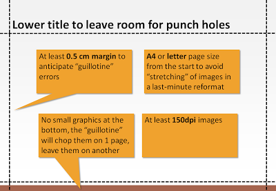
If you (might) need professinal paper prints - prepare beforehand

Handouts or regular hardcopies ("napkins") of a PowerPoint presentation come out OK on a laser printer, the device will shrink the slides to leave a white band around them.
Although less common now, sometimes a napkin-style hard copy is not enough. Especially investment bankers like to hand out high-quality prints of a presentation. If you haven't set up your presentation for this properly, you wil be faced with a lot of re-design work hours before your presentation. The image below (click for a larger picture) contains the essentials that can save time and stress.
Some more advice. All of this probably makes perfect sense to the graphics design professional working in Adobe InDesign, but PowerPoint "amateurs" (including me) have figured this out by experience (unfortunately).
  • Dark background colors are high risk with professional printing
  • Budget time for a printer disaster and a possible re-run
  • In case of double-sided printing, remember that the punch holes will also appear at the bottom of the pages (leave more white space there as well)
  • Think hard whether you need those print outs, instead of relaxing and preparing for that important presentation, you are going to be stressing around with printers, carrying kilos of paper, preventing yourself form making last-minute edits to slides.
  • Heavier, or more expensive paper is not always better. Children's books are printed on cardboard to prevent pages from being torn out.
  • A related point: the "dip" (to use a Seth Godin term) of print quality. Everyone appreciates a nice-looking laser-printed hand out. Everyone loves that "annual report-style" glossy brochure. If you're stuck in the middle (and as a PowerPoint amateur you are likely to be), the result might actually not look that good.

SlideMagic: a platform for magical presentations. Free student plan available. LEARN MORE

Graphical inspiration via RSS feeds (and hard-to-read-typography)

There are many great creative web sites that you can add to your feed reader for a daily dose of graphical design inspiration, far away from the PowerPoint slide editing screen. One example is Behance showing projects in typography, graphics design, illustration, photography, and other design disciplines.
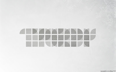
Today, "hard to read typography" by Simon Page is one of the items featured on the front page. Here is one example from the collection that is actually relatively readable.
A bit harder to read:
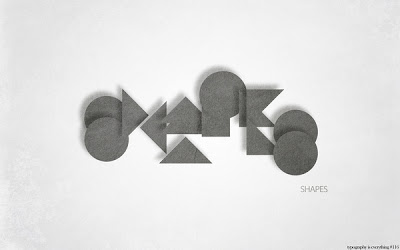
What's written here? Is "shapes" a helpful hint?

SlideMagic: a platform for magical presentations. Free student plan available. LEARN MORE
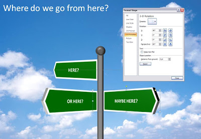
Chart concept - where do we go from here?

It is easy to make your own 3D road sign image, no need to buy a stock image, and you get the 3D text perfectly aligned. Click the image for a larger picture (with the settings in the "format shape" box).

SlideMagic: a platform for magical presentations. Free student plan available. LEARN MORE
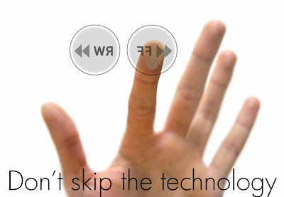
VC pitch - don't skip the technology

Here is another slide from my "how to pitch to a VC" presentation explained in more detail. (The "Zen"-style slides do not stand on their own very well)
When people have limited time for a presentation they often start to cut "the meat" of the story. What's left after the trimming is a set of generic "summary slides" at such a high level of abstraction that they don't say very much anymore.
Venture capitalists do not have much time. Still, resist the temptation to skip the technology section when pitching your startup. This is the key asset you have. This is what makes you stand out from the competition. This is what makes VCs understand that there is a real business here, not just a set of PowerPoint slides.
How can you present a complex technology in very little time? Don't spend time on exhaustive architecture diagrams with layers of details and boring process flows. Instead make people understand why your technology is so unique and so hard to copy.
The deep dive is a good technique to do this. Take a few very specific examples, and dive all the way down into the detail to make your point. Show the complex code, show how long it took you to solve the issue, and show how it will take the competition double this time to imitate it. 
Remember, your audience is smart (and busy). Any scientist or engineer should be able to explain the technology solution to an intelligent layman in just a few words and a few images. There is no bigger offense to your audience (and a guaranteed VC turn-off) then to say "this might be a bit too complicated for you, I'll just skip it in this executive summary".

SlideMagic: a platform for magical presentations. Free student plan available. LEARN MORE
The Sword of Damocles - with a bit of shadow drama

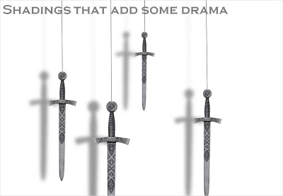
I had to design some apocalyptic presentations lately (sign of the times) and the Sword of Damocles composition below gave me the opportunity to play around with PowerPoint shadows.
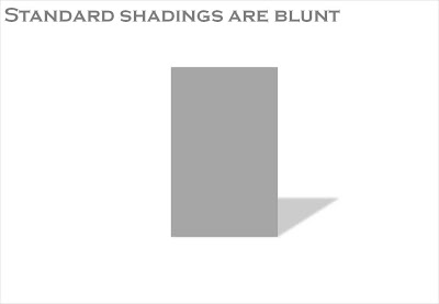
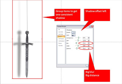
The standard shadings in PowerPoint are a bit blunt and boring. Go into the "format shape menu" and click the "shadow" box. Experiment with the settings to get something more interesting. Increasing the blur, and increasing the distance creates the illusion of a wall right behind the subject. Just what I needed.
When you apply shadings to compositions make sure to group all items together first to get one smooth shading of the entire shape instead of individual shadings for the individual components.

SlideMagic: a platform for magical presentations. Free student plan available. LEARN MORE
The venture capitalist will see you for 15 minutes now

Brad Feld, a well-known VC, wrote an interesting blog post about "Preparing for a first meeting with me". Short (Feld likes 15 minutes) 1-on-1 meetings with VCs are often a first step to more elaborate pitch presentations. I won't repeat the things Feld has written in his post [Feld-style efficiency: you can click the link yourself :-)], but there some interesting points hiding in the text that are not explicitly spelled out.
  • Cut the small talk and the personal introductions. Get me excited about an idea, I am not (yet) interested in building a personal relationship
  • Surprise me. I want to learn something new. Don't bore me with the obvious, I know it all already, I have seen it all before
  • "Packaging" is irrelevant. I see through it. No need for slick visuals. I prefer sketches on napkins.
What sort of presentation/visuals to bring to these meetings? There is probably no right answer, but here is a suggestion:
  • Take your full PowerPoint pitch deck as a basis and show on a laptop 5 "Zen-style" slides that highlight the problem you are solving. These can be presented in 3 minutes. Close your lap top.
  • Bring with you print outs of selected other slides in your deck that can serve as a basis for your napkins. Print outs are great: you can present them in any order depending on the flow of the conversation. You can sketch and write on them. Good napkins to have as a backup are the competitive landscape (you're in the top right corner, different from anyone else), and a simple tree that explains your revenue model ("here's the magic of the numbers"). Ditch all other typical pitch deck slides (for the moment): revenue hockey stick, go-to-market strategies, team CVs etc. etc.
And now hope that you made it to a "proper" VC pitch in a next meeting.

SlideMagic: a platform for magical presentations. Free student plan available. LEARN MORE
Font information in a book's small print

Most books mention the fonts used in the small print on one of its first pages (together with the publisher info, ISBN, etc.). This a great way to discover new fonts, because a full book sample is so much better than a few characters of sample type on a computer screen. Children's books are my biggest source of inspiration.

SlideMagic: a platform for magical presentations. Free student plan available. LEARN MORE
The power of repeat - redux

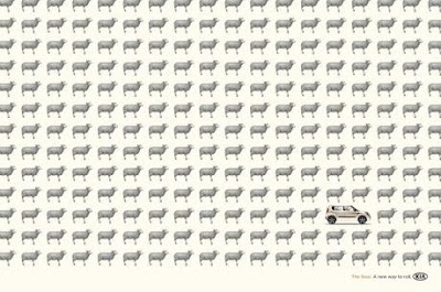
Computers love to repeat things. You should use it in your PowerPoint presentations. Control-C / control-V the same object over and over, making sure that things are aligned and spaced properly. The resulting chart is both busy and calm at the same time. Possible applications:
  • There are lots of these things arond 
  • It's crowded
  • We're different (2 out of the 234 sheep in this ad are different for example)
"Repeats" are sometimes used to compare values in infographics. I do not think that this is a good application of the technique. Use repeats to talk about one variable, use regular bar charts to compare things.

SlideMagic: a platform for magical presentations. Free student plan available. LEARN MORE
Think of the 3rd dimension in stock images

99% of PowerPoint slides and 99% of stock images are 2 dimensional: showing an object or a shape on a flat background. When looking for your next stock image, try picking out those that add 3 dimensional depth.
The image of the flower field above (bought on iStockPhoto) is a good example. The whole point of the picture is the depth, not the objects in the photograph.
  • Taken very close to the ground
  • Focus close to the lens
  • Lines that come together to disappear at the horizon
A good image to support something that goes on and on and on, or a new and untapped source of information that all of a sudden becomes available.

SlideMagic: a platform for magical presentations. Free student plan available. LEARN MORE
Logo repeats - bullet points in disguise

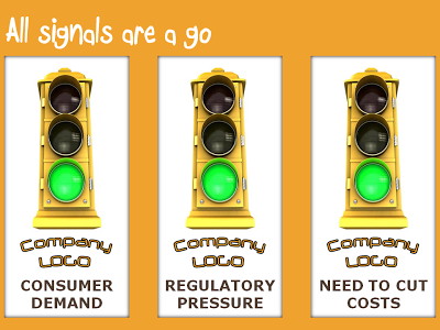
I often use a "logo repeat" technique to hammer home a set of interesting assets a company has, or a number of favorable forces that are helping a company. I must admit that these slides are bullet points in disguise, but the repetitive use of logos and other graphical elements make them powerful somehow.

SlideMagic: a platform for magical presentations. Free student plan available. LEARN MORE
The cobbler walks barefoot

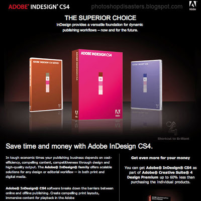
You would expect Adobe, the publisher of many design software packages, to be pretty good at designing print advertising. Not always. Have a look at this image that was featured on Photoshop Disasters.
Especially Adobe should have spent more effort to get the reflections right (see the right box), make the box shots look more realistic, and use better typography. This image looks like a poor "Photoshop", not the best way to promote the Photoshop software.
Leaving the technicalities of the ad aside for the moment, there is a broader lesson here. This ad looks exactly like PowerPoint slides that many technology companies use to promote their product. They can do better.
  • A lot of headlines competing for attention
  • Box shots (software is not a breakfast cereal)
  • "White paper language": spelling out the product benefits explicitly using very generic statements that do not get internalized by the audiece: "superior", "dynamic", "competitiveness", "scalable"

SlideMagic: a platform for magical presentations. Free student plan available. LEARN MORE

Use regular polygons to place objects on a slide

You can use geometrical concepts to get the perfect spacing of objects on your slide. Use the corners of regular polygons (all angles are the same, all sides have the same length) such as regular triangels (3), squares (4), regular pentagons (5) to position your objects with the aide of a few guides that you can remove later.
Note that you can draw regular polygons in PowerPoint by holding down the shift key to lock the aspect ratio of any shape you are drawing.

SlideMagic: a platform for magical presentations. Free student plan available. LEARN MORE
Online tilt-shifting image manipulation tool

Tilt-shifting is a photographic technique that creates images with very narrow depth of field. It can be used to take real images and make them look like photographs of miniatures. The site tiltshiftmaker.com creates the effect for you. It works best with images with lots of detail on the foreground: houses, cars, people. An example from the tiltshiftmaker site, a town on the Amalfi coast in Italy.
Via GeenStijl

SlideMagic: a platform for magical presentations. Free student plan available. LEARN MORE
Typography basics: readability, legibility, and impact

I am reading an article in Layers Magazine with a good summary about the basics of typography:
  • Readability: how easy is it to read a long block of text
  • Legibility: how easy is it to recognize short bursts of text instantly
  • Impact: what emotional reaction does a type face provoke
I often use all caps in PowerPoint. It was interesting to read that all caps forces the brain to read the word letter by letter before it can be recognized, while with regular type a word gets identified instantly.

SlideMagic: a platform for magical presentations. Free student plan available. LEARN MORE
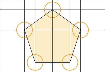
Chart concept - bouncing ball

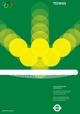
The best graphics design work is often the most simple one. Noisy Decent Graphics pointed to these beautiful Olympic posters designed by student Alan Clarke. (They were not adopted by the organizers of the Olympics though).
The bouncing ball in the tennis poster gave me inspiration for a concept that I can use in PowerPoint charts. Semi-transparent circles (with different levels of transparency) flying over the screen are great to show movement. Be sure to remember the law of reflection though,  :-).

SlideMagic: a platform for magical presentations. Free student plan available. LEARN MORE
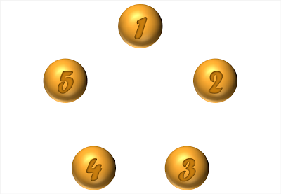
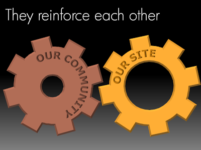
Chart concept - look, they reinforce each other!

Sometimes two things go together hand in hand, they make each other stronger. Big interlocking wheels are a great way to show this in PowerPoint. Add some nice circular text and here you go. Resist the tempation to make them turn using an animation though...

SlideMagic: a platform for magical presentations. Free student plan available. LEARN MORE

Chart concept: slowing down

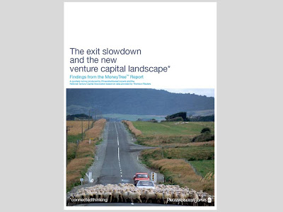
This cover of a PwC report is an example of an excellent use of images.
  • You get the point instantly, even from a far distance, the concept is right
  • Both the report cover and the image have lots of "white space"
  • The image is a completely natural and real one, no artificial models, compositions
  • There is a great sense of depth and perspective in the image, search "sheep + road" in a stock photography site and you get a whole bunch of very unexciting pictures
  • The picture is cropped nicely, see the road running on the golden proportion
  • The image colors blend in with those used in the report (blue highlights)

SlideMagic: a platform for magical presentations. Free student plan available. LEARN MORE
ColoRotate - new color design tool

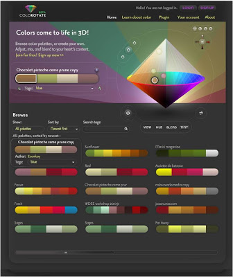
Your colors scheme is the most important driver of your presentation's look and feel. Much more important than logos or other graphical elements on the page. Adobe's kuler is a popular example of an online tool that helps you pick colors (even from an image if you want to) and define a nice matching color scheme.
Recently, ColoRotate has been released. ColoRotate uses a 3 dimensional approach to picking colors wich it claims is closer to the natural way the brain processes colors. It relies less on the sliders that are common in kuler and other tools. Color schemes you create can be shared in an online community, similar to kuler.
I have played around with the tool a little bit and like it, but it requires a bit of studying and practice before you get the hang of playing with the 3D axes and their impact. This tool is likely to appeal most to graphical professionals.
Having said that, the web site contains a good introduction article to the art and science behind picking beautiful color schemes.

SlideMagic: a platform for magical presentations. Free student plan available. LEARN MORE

Make-over artist tip: don't underline words

Underlining words just doesn't look good. Especially not in headlines. Use a bold font instead, or italics inside body text to emphasize.

SlideMagic: a platform for magical presentations. Free student plan available. LEARN MORE