Finding font inspiration in Bauhaus architecture

More presentation design and art today. I had a very clear policy on the use of fonts and typography:
Until now. I just finished a presentation:
  • Set in ALLCAPS
  • Using the Futura Bk font
  • 90% of the slides are set in bold (yes, ALLCAPS bold)
The Futura font family is to blame. The history of the font go back to the 1930s and its design is heavily influenced by the Bauhaus movement. Clean geometrical shapes, look at these o's, almost perfectly round.
Maybe being located in Tel Aviv, a city that has one of the world's most extensive collection of Bauhaus architecture, had something to do with it. The picture below is an example of a Bauhaus-style building in Tel Aviv, the "Bait ha'Onia" or "Ship house" on 56 Levandah Street, designed by architect Arieh Cohen and built in 1934-1935. To make the side track complete, if you are interested in Tel Aviv Bauhaus architecture, make sure to get your hands on this book (text both in French and in English).
Back to presentation design. In particular I like two font variations of Futura. The Light version (Futura Lt) for thin, elegant, sentences in sentence case, and the Book version (Futura Bk) for all caps. The allcaps look especially impressive in fat bold (look at the font in the image). Obviously, some of my old font design principles still hold. Allcaps bold fonts should only be used in presentation that contain a few words per slide.
The Futura fonts came standard with my Microsoft Windows XP Professional and/or Microsoft Office.

SlideMagic: a platform for magical presentations. Free student plan available. LEARN MORE

McKinsey flashback: logic, rhetoric, and presentations

Recent tweets by Nancy Duarte about her reading up on classic rhetoric and a clean-out of my book shelf with old McKinsey training material triggered this post. How can we use the ancient rules of logic and rhetoric in our presentations? Some of my observations.
Logic is necessary but not enough to convince. The perfect logical argument often fails to make people believe your message with their heart. There are still many people that smoke despite this:
  1. Smoking causes cancer
  2. Cancer kills
  3. People do not like to die
  4. Therefore: stop smoking.
The Greek philosopher Aristotle was well aware of this. Logic and rhetoric are often confused to be the same thing. Actually, logic (logos) is one of three components of rhetoric. The other two 2 are ethos (credibility of the speaker) and pathos (emotional appeal to the audience).
Why is logic so popular among McKinsey consultants? A number of reasons:
  • Lack of time. There is an often overlooked difference between a problem solving structure and a solution presentation structure. Logic is a great tool to solve a problem: cut your issue up in pieces, find facts and other evidence to solve sub-problems, and finally build up the overall solution again from the component solutions. Management consultants often stop there and do not invest time to translate the problem solving structure into a compelling and convincing story to communicate the solution. It is not that they don't want to, at 2AM before the final review meeting there is often simply no time left.
  • Like-minded people. Management consultants usually are very logic-driven people. It is logical work, that attracts logical people, who hire more logical minds. So, the language between management consultants among themselves is highly logical. Some people however have a totally different brain structure (clients of management consultants included).
  • Collaboration. A logical language and structuring technique is very well suited for people that need to work together but have never met each other before. Once you have learned the methodology, you can put a team of consultants from different countries together that can produce results almost immediately.
There a number of logical concepts that any presenter should use, regardless of the audience, regardless of the structure you want to use for your story.
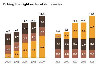
  • MECE, consultant speak for no gaps and no overlaps. Say things once/do not repeat yourself/keep things short. Group points that are related together, together.
  • The number 3. Most people can easily remember 3 points, I like breaking up a story in 3 key messages for people to remember.
  • Levels of logic. Separate the key points of your story and the sub points that support the key points. Build a tree-like structure for your argument.
And an important one: in what order to present your story? Most stories can be crafted using 3 components: the situation, the complication, and the resolution. The order in which you chose to present them sets the tone of your story:
  • Solution - situation - complication, this is what consultants use most of the time, a no-nonsense approach. If you do not have time to read the whole story, you get the answer in the first paragraph/on the first slide. Functional, but boring.
  • Situation - complication - resolution, the most natural one to present a case, starting relaxed, adding stress but then calm things down again at the end.
  • Complication - situation - resolution, a flow of arguments that creates a sense of urgency.
Now, where do we need that classical rhetorical argument? There are two types of logical arguments, and I am making the Case (with a capital C) that you do not need the second one very often:
  • Inductive: you take a number of specific examples and draw a generic conclusion from it. This is the form of logic I use most in my presentations. A simple summary of tangible (i.e., not abstract) examples is a good way to get ideas across.
  • Deductive: you present a series of true statements, the combination of which produce a very specific conclusion. This is the pure logic used by mathematicians. (All men are mortal, Socrates is a man, therefore Socrates is mortal). This one is harder to use in presentations. It is abstract and requires a logical audience. The only times I had to use it in my 17 years as a strategy consultant was in cases with a highly controversial and counter-intuitive recommendation. This is not a situation of a presentation in front of big audience, but rather a one-on-one meeting with an executive, taking him step by step through your analysis: "Do you agree with this?" "Yes." "Do you agree with that?" "Yes." "Then you must agree with this!" "Huh, wait a minute, again."
To make a long story short. Use logic to develop the solution, but then take a step back and think how you can communicate that solution best. Communication and problem solving is not the same thing.
If you are interested in McKinsey-style story line development you could read The Minto Pyramid Principle: Logic in Writing, Thinking, & Problem Solving
P.S. Speaking about deductive logic, the name of my company is Axiom One. An Axiom is a basic assertion that you assume to be true (it is so basic that you cannot prove it), this basic fact can then be used to construct more complex logical arguments)
Disclosure: if you purchase a product on Amazon through links on this site, I earn a small commission.

SlideMagic: a platform for magical presentations. Free student plan available. LEARN MORE

Harmonizing images using Photoshop filters

A presentation should have a consistent look and feel on each slide. When you are using just text and PowerPoint shapes, this is no problem: just use consistent fonts and colors. Images complicate things because they usually come from different sources and - as a result - have different styles:
  • Colors
  • "Real" images versus studio shots
  • "Real" images versus computer-generated renderings
  • "Real" images versus "real" art versus stock image art
  • Vintage versus modern images
  • Portraits, landscapes, objects
Have a look at well-designed books with many images: the images are different but somehow fit together. You as a presentation designer can do a number of obvious things to harmonize image styles:
  • Actively pick an image style when you start out designing a presentation (or - like me - adjust the image style as you go through the design process, replacing images as you go)
  • Minimize the number of image sources
  • Use less images
  • Take out the color of all images, and just use black & white, or apply a color overlay
Recently I discovered another solution: applying consistent PhotoShop filters throughout your presentation. A slightly brutal way to harmonize images, but the result can be a presentation with a unique look and feel. The image below has been subjected to a "poster edge" filter, creating a pop-art style of presentation if you apply it consistently to every image in your presentation.
Image via iStockPhoto

SlideMagic: a platform for magical presentations. Free student plan available. LEARN MORE

Chart concept - confusion

A client needed to visualize the regulatory uncertainty in his industry after the financial crisis. This traffic light tree in London is a very useful art installation that you can use in many other confusing situations. The high rises of large financial services firms in the back help complete the picture (my client works in that industry).
The Internet is full of images of the sculpture. Try searching Flickr for images with a Creative Commons license.

SlideMagic: a platform for magical presentations. Free student plan available. LEARN MORE

Getting your idea across in 1:35

Sometimes, a live presentation can be a pretty inefficient way to get a message across. For example, TED presentations are usually really good, but they still need around 20 minutes of your time. Have a look at the new fund raising video of the Acumen Fund that was released yesterday. It lasts 1:35.
In this 1:35 the video manages to explain a completely revolutionary concept to charity. It is not about giving food, it is not about giving the tools to grow food, but it is all about investing in profitable businesses that produce goods/services, create wealth and can grow by themselves.
The video does not need long speaker introductions, does not use spectacular motion graphics, does not rely on "look how miserable these people are" images. Just a number of upbeat people talking straight in the camera at you. It is hard to do this in 1:35 on stage with PowerPoint slides.
Sign up for the recently established social network of the Acumen Fund to learn more about the dramatically different approach the organization is using to combat poverty.

SlideMagic: a platform for magical presentations. Free student plan available. LEARN MORE

Sometimes a simple table is best

I have been thinking hard about how to incorporate negative numbers in stacked column and bar charts. The example below shows that it is possible. However, it might be the exception of the rule that graphs are usually better at presenting data than tables.
  • The chart takes a bit of time to figure out. "It's about cost, so income is negative". "Ah, the negative offset of the chart is revenues".
  • The chart goes against common practice of accountants and other financial professionals to look at annual financial data in tables.
What do you think?

SlideMagic: a platform for magical presentations. Free student plan available. LEARN MORE

Finding inspiration in CD cover images

More and more, I am trying to make each presentation in a unique style that is consistent on each slide. Paintings are a good source of inspiration, but so is cover art of CDs/LPs. Today I used this one from Remastered: The Best of Steely Dan - Then and Now
Steely Dan used an image of "Carhenge", an art installation by Jim Reinders, somewhere in Nebraska, a modern-day version of Stone Henge in England.
It provides all I need for a presentation with a consistent accent:
  • A slightly apocalyptic theme (this presentation was for a client in the asset management industry talking about changes since the economic meltdown of 2008)
  • Cars, especially vintage cars, a rich hunting ground for images expressing all kinds of concepts
  • The large bold font with a blank fill
  • Blues and yellow/oranges as colors.
Disclosure: I earn a small commission if you purchase products on Amazon through links on this site.

SlideMagic: a platform for magical presentations. Free student plan available. LEARN MORE

Book review - 1001 paintings you must see before you die

Paintings are excellent inspiration for presentation design:
  • Color schemes designed to provoke an emotion, often going against the rules of color theory
  • Lessons in composition and page layout
  • Ideas to give your presentation a distinct style or personality
The Dutch educational system plus graduate degrees in computer science and business administration have not contributed much to my knowledge of art history. I want to catch up quickly, but it turned out to be more difficult than I thought:
  • There are many web sites devoted to a painter or a museum, I have yet to discover one that cuts across artists, locations, styles and periods in time
  • The same issue is true for many art history books: one style, one painter, one museum.
  • More-over art history books (surprisingly) have usually more text than images in them. Text full of elaborate interpretations by the author, that is clearly written with student education in mind.
How happy I was to find this book: 1001 Paintings You Must See Before You Die.
Thousand pages of one painting per page, designed as a guide for museums to visit before your time on the planet is up (but then, there is no clear museum index, and many paintings are taken from private collections).
Leaving this small criticism aside, I found this book truly useful to digest a vast amount of images of paintings in a short time. Color picture, a bit of background on the artist, a bit of background on the painter. It contains both the block busters such as the Mona Lisa as well as lesser known works of art. Great.
Disclosure: I earn a small commission if you buy products from Amazon via links in this post.

SlideMagic: a platform for magical presentations. Free student plan available. LEARN MORE

Chart concept - in the spot light

I saw this spot light concept in an invitation for an event. It can easily be recreated in PowerPoint, ideal for a chart to make a big announcement. Click on the second image for some more explanation about the shapes to use. And if you like those tiny eyes, you can read more about them in one of my previous posts.

SlideMagic: a platform for magical presentations. Free student plan available. LEARN MORE

Blending PowerPoint shapes into your image

A recent image I used for a cover page of a presentation provided some excellent opportunities to blend PowerPoint text and shapes into the image. Use the strong red light source to create matching shadows and colors. Click on the image with the boxes to get a larger picture.

SlideMagic: a platform for magical presentations. Free student plan available. LEARN MORE

In what order to display data series?

Look at the data of your stacked bar and column charts. I prefer to put the series that changes the most last, so it becomes very clear what variables are changing, and what variables not.

SlideMagic: a platform for magical presentations. Free student plan available. LEARN MORE

Da, da, da, it's OK to let go of the rules of design (sometimes)

Color theory provides us with a clear set of rules of colors that go well together. Kuler has them even built in: complementary colors, triad, monochromatic, etc. But hey the world would be boring if everyone would follow the rules.
Look at the world of music for example. Jazz drummers only really start to swing when they go slightly off-beat. Many R&B songs have their drum computers programmed with delayed beats, providing a punch a fraction of a second too late.
If not, the music would sound like a 1980s Casio keyboard.
In my presentation work I recently stopped using these color composition rules. Instead I often look at a beautiful image or a powerful painting to design the color scheme of my presentation. Find a painting that provokes an emotion, load it up in kuler, and use it as the basis for the colors of your next presentation, even if it does not exactly follow the rules of color composition..
Wassily Kandinsky. Church in Murnau. 1910. Oil on cardboard. 64.7 x 50.2 cm. Städtische Galerie im Lenbachhaus, Munich, Germany

SlideMagic: a platform for magical presentations. Free student plan available. LEARN MORE

Keep your text trapped in its box

The elaborate tornado illustration of this ad is pretty, but it looks like there was not much time left to think of a good place for the punch line and the dates of the event. Eyes and brains do not like reading text over fluctuating backgrounds.

SlideMagic: a platform for magical presentations. Free student plan available. LEARN MORE

Richer color textures for presentation design?

Colors for computer screens and printers are created by mixing primary colors. (See this background article about RGB (adding primary colors for screens) and CMYK (filtering primary colors for printers).
In theory, it is possible to create any color you want using the right RGB codes (more about the color wheel here). Still, I find it almost impossible to recreate the colors that some of the great painters are using in their paintings. Obviously they did not use tools such as kuler, but rather relied on mixing colors on a palate by hand.
Take this painting as an example: The Arnolfini Portait by Dutch painter Jan van Eyck, painted in 1434. It has unbelievable light effects and color textures. (Huge image here). How to recreate this fabulous green (some think symbolizing the hope of starting a healthy family) in PowerPoint?
Kuler does not do a good job, see the color codes below.
Zooming into the dress gives some clues about the answer. Van Eyck added bits of yellow and paint texture effects to give the dress a warm velvety appearance.
In the early days, PowerPoint had a rich set of patterns to fill objects with grey shadings. Based on this principle, and with increased computing power it should be possible to offer much more complex color textures to the presentation designer as well. Textures that go beyond the "plasticy", shiny, and glass-like surfaces that are available now.

SlideMagic: a platform for magical presentations. Free student plan available. LEARN MORE

Tilt those Google maps

Google Earth is a wonderful tool to produce maps in your presentation. Select the area you want to cover, do a screen dump and crop your image in PowerPoint. Make sure to make the best use of the power of Google Earth. Tilting the map to a level that the horizon becomes visible adds a nice additional perspective to the chart. Especially when you visualize paths.

SlideMagic: a platform for magical presentations. Free student plan available. LEARN MORE

Chart concept - "Stuck!" (redux)

This ad uses a visual concept which I discussed in an earlier post. The easiest way to recreate it in PowerPoint is to stick to simple shapes with numbers, similar to the original puzzle with 15 pieces. You can go one level up and use an image (like in the ad). To do this, re-read an earlier post about slicing up PowerPoint shapes.

SlideMagic: a platform for magical presentations. Free student plan available. LEARN MORE

Frans Hals: 27 shades of black

It is thought that Vincent van Gogh once admired the Dutch painter Frans Hals (1580-1666) for using 27 shades of black in one painting. If you study the works of the Dutch masters carefully, you can see that they actually do use very little color. (Here is an example from Rembrandt: black, red, yellow) Part of this is due to space limitations on the color palette. Pink skin tones take a lot of space, leaving not much room for other colors.
Painting above: Frans Hals, The regentesses of the Old Men's Home in Haarlem, 1664, Oil on canvas, 170.5 x 249.5 cm
There is a similarity to designing presentation slides here. You use shades and tints of the same color to create a calm background visual, while directing the eye of the viewer with bright highlight colors to the important information on the slide.

SlideMagic: a platform for magical presentations. Free student plan available. LEARN MORE

Just listen to yourself

We've all been there. You're stuck. Analysis-paralysis. Writer's block. Structure-overload. Where to start? How to break the deadlock?
Imagine you're sitting in front of a really experienced investor (Warren Buffett?). You have 10 minutes.
Press record.
Just tell your story. There is no time for buzz words. There is no time for complicated frameworks to structure your story (first we do a SWOT, then we leverage our core competences to differentiate from our competitors and make sure we reach critical mass before the window of opportunity closes). Just tell from the heart why someone should invest in your business.
Press stop and play back.
What did you say? In what order? When did you feel the need to take out a pen and scribble a simple diagram on a piece of paper? When did you "see" Buffett frowning and felt the urge to explain something again? What metaphors did you use to explain the technology?
Now let's go back and re-do that PowerPoint presentation completely.

SlideMagic: a platform for magical presentations. Free student plan available. LEARN MORE

Why does Helvetica look so great on a Mac and so poor on a PC?

I like the clean Helvetica font in print material. I like the Helvetica font in presentations designed on a Mac. Somehow, the PC version does not appeal.
The answer is: it's not Helvetica. To save on royalties, Microsoft included the look-alike Arial with its Office software suite. The fonts look similar, but there are subtle differences. And they make all the difference.
Image designed by the ragbag, found via Swiss Miss.
I have not solved the problem myself. I think none of my clients have Helvetica installed on their PCs, and despite workarounds, I hesitate to create font issues with my presentations.

SlideMagic: a platform for magical presentations. Free student plan available. LEARN MORE

Motion graphics done right

Two days ago I posted about a motion graphics video that was designed beautifully but relied too much on text bullet points to compare quantitative data, the brain had to do too much work in too little time (before the next piece of information shows up):
  1. Read sentence
  2. "Visualize" numbers internally
  3. Interpret them
This is a better example of the use of motion graphics. Zooming is used to visualize the enormity of the number 1 trillion. It comes at a price though: this video is almost a full-blown animation. A bit of PowerPoint/PhotoShop skills and After Effects are not enough to produce it (unfortunately).
Video by Maya Research, found via Core77

SlideMagic: a platform for magical presentations. Free student plan available. LEARN MORE