Book review - "Resonate"

Anyone interested in presentation design will have heard about or bought Nancy Duarte's latest book: Resonate. I managed to read it over the weekend, here are my impressions.

While her previous book slide:ology was mostly about slide design, Resonate is about stories, stories that get your audience to change their perspective, and take action, do something, change something. It is actually the right order of learning how to become a good presentation designer: first acquire the skills to visualize a single concept in a chart, then focus on weaving those charts together to build a powerful story.


This is what I see happening around me. The current Slideshare presentation of the year competition shows that thousands of people have acquired the skill to make "stunning visuals" using images. But most story lines are still relatively simple: sequences of chars showing how big something is, or sequences of images that show emotions/feelings that we all recognize. Great movie directors or authors posses the art to take you along a more complex path  that will change you and the perspectives you have of the world. This is what Resonate is trying to get to.

Slide:ology is a reference book that I still use when designing slides, Resonate is different. It is a book with an idea, looking at the cover on the book shelf will remind you to check whether this is the best story line you could come up with

Large parts of the book are written using reverse engineering, analyzing great presentation and speeches and see why they had so much impact on their audiences. But on top of that, Nancy threw in her own presentation design experience, and embarked on a significant research effort in areas such as movie scrip writing and classic rhetoric. A few of the interesting points that were highlighted in the book (just random examples, not a MECE (what's this?) summary of the book's contents):
  • Humility. The presentation is not about you, but about the audience, and audiences do not connect with arrogant speakers. Nancy is giving the example herself throughout the book, it is written in a very personal, understated style, admitting some personal mistakes, all of this given her impressive background in presentation design.
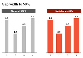
  • Contrast keeps the audience interested: constantly move between the "what is now" to the "what could be". Change pace, change the type of slides, change, change, change to prevent boredom.
  • Add emotion to the cold facts. Go back into your own memory to find your own stories to add a personal touch to your presentation
  • Micro-segment the audience. Really understand who's in it. (I liked the observation that analytical audiences are suspicious).
Slide design you can learn/teach with a bunch of practical tricks to fix the basic mistakes. Story weaving is something different. Books such as Resonate remind us how important it is, and give use some idea where to get started, but story telling is impossible to "automate" using a prescribed process. It is an art.

All links to Amazon on this post are affiliate links.

SlideMagic: a platform for magical presentations. Free student plan available. LEARN MORE

Sync those charts

The idea behind the chart in the Haaretz newspaper is a good one: breaking the GDP growth up in its components (click the image for a bigger picture). The charts are not aligned very well:
  • The horizontal axis are not aligned
  • The scale of the vertical axis is different for each chart

SlideMagic: a platform for magical presentations. Free student plan available. LEARN MORE

iPhone business idea

I stumbled across these web sites recently. Poolga let's you pick artistic wallpapers for your iPhone, Tseventy gives a collection of hand-picked photography that you can download to your iPhone. Strange that all images seem to be portrait though.


The iPhone opening screen is a waste of screen real estate. Why not have a new image everyday, a useful quote or an interesting stat, or a word of the day? We need a (presentation) designer and an iPhone app programmer to get together...

It reminds me a bit of the early 1990s when Internet-powered screen savers clogged up corporate networks (remember Pointcast?). Leaving network performance aside, it did not work for desktop screens because people are staring all day at these. The mobile screen in your pocket might just be suited though.

SlideMagic: a platform for magical presentations. Free student plan available. LEARN MORE

Book review - "Bibliographic"

I stumbled on this book: Bibliographic: 100 Classic Graphic Design Books in a Tel Aviv book store the other day. The vast majority of recent books on graphics design are meant to be "eye candy", sitting on coffee tables without being read in detail. What a joy it is therefore to go back to older titles.


This book lists 100 important books on graphics design and typography. Each book is discussed, put in its historical context, and highlighted with an image of the cover and  a few page spreads.

It is striking to see how only a few decades ago, graphics and type still looked so basic. But equally important is the realization how the current overdose of computer-generated images and decorations detracts from the basic purpose of a poster or a slide: convey a message. When people just had type and basic shapes as design tool, it forced them to make the most of them. I find myself in a similar situation, armed with PowerPoint, fonts, images but without the graphic artillery of sophisticated Adobe Illustrator designs. Looking some of the designs from the 30s or 60s convinces me that I can do without this back up.

Some books discussed in the book are still in print, and I have added a few to my wishlist:
Here is an extensive book review with a full list of the book titles inside by Swipe in Toronto (it is these type of specialist stores that I miss now and then here in Tel Aviv). Any more suggestions on typography and graphics design classics?

All links to Amazon in this post are affiliate links.

SlideMagic: a platform for magical presentations. Free student plan available. LEARN MORE

Simple shapes, powerful message

This image tells 2 things:
  1. Have the courage to deviate from standard visual cliches
  2. Simple shapes can still convey a powerful message

SlideMagic: a platform for magical presentations. Free student plan available. LEARN MORE

Gap width to 50%

Microsoft PowerPoint sets the standard gap width between columns or bars to 150%. Graphs look much better if you set it to 50%. Right click the columns/bars in your chart, select format data series and lower the gap width value.

SlideMagic: a platform for magical presentations. Free student plan available. LEARN MORE

Showing versus describing

Describing is an indirect way to convey a message:
  • We have systems in 3 countries
  • They are maintained on different time schedules
  • Five different departments are interfering with maintenance
In short, it is a mess. The bullet point chart above does not convey the message very well. Why not show the mess and create a chart with boxes for each of the countries, the departments and connect them with arrows color-coded by time to show what's going on.


The chart will be busy, the chart will be dense, the chart might even be incomprehensible, but hey, you wanted to convince your audience that it is time to do something about this? No better way to do it.

Image credit: Mr. P

SlideMagic: a platform for magical presentations. Free student plan available. LEARN MORE

Do fonts display correctly?

I have changed the fonts on this blog to Helvetica Neue, they look great on every computer/browser that I have tried even if you do not have these fonts installed on your computer. Every, except for one computer/browser combination: my own Chrome browser on my own desktop (IE works fine)... Please let me know if you are experiencing garbled fonts on this site.

SlideMagic: a platform for magical presentations. Free student plan available. LEARN MORE

Graphics design overload?

I have been browsing through a number of books on contemporary graphics design recently and I must say: "more is better" seems to be the motto of many designs. Adobe Illustrator is powering complex gradients, elaborate ornaments and sophisticated hand-drawn effects. Maybe graphics design is ready for a "Zen revolution" similar to presentation design? (Or I simply have been reading the wrong books?).

SlideMagic: a platform for magical presentations. Free student plan available. LEARN MORE

stickyslides.com without the blogspot

I am embarking on a rebranding exercise of my presentation design business and in the process, I am also sorting out the various URLs of my online presence. I will continue to host Sticky Slides with Blogger/Google despite the slightly "amateurish" look and feel of the site:
  • I do not want to disrupt existing RSS subscriptions
  • There is actually something to an "amateurish" corner where we can discuss issues related to presentation design outside the context of a corporate brand
Having said that, I managed to get rid of the "blogspot" bit in the URL and the site can now be accessed both on stickyslides.blogspot.com and stickyslides.com, including links to older posts and images.

SlideMagic: a platform for magical presentations. Free student plan available. LEARN MORE

Original PPTX files from my posts

Now and people comment that they would like to receive the original PPTX files of the slides I discuss here on the blog. I am hesitant to put them up on a regular basis, but will respond to a request by email or in the comments.

SlideMagic: a platform for magical presentations. Free student plan available. LEARN MORE

Chart concept - negative lettering space

Here is a cute idea for a slide: negative lettering space. Computerarts.co.uk has a full tutorial how to create this effect here. It is easy to copy in PowerPoint: start with a word in a huge font on a page, set the font color light grey (or another color with a light contrast to your background), fill the page with the images you want, and as a final step delete the text or color it the same as your slide background.


Here is a search for earlier posts with a "can't see the forest through the tress" type of concept.

SlideMagic: a platform for magical presentations. Free student plan available. LEARN MORE

An emotion is worth a thousand pictures

"A picture is worth a thousand words" is a famous cliche, highlighting how inefficient reading text is as a means to transfer information.
  1. Read/recognize words
  2. Construct sentences
  3. Extract meaning
  4. Visualize image
Just looking at a picture directly would have saved a lot of time/brain power.

But this is just one level of efficiency/shortcut. Let me explain.

Locked up in your brain are millions of experiences and emotions that you have accumulated over the years. These stored experiences are of a totally different order of magnitude than a simple image. A good presentation slide manages to unlock these hidden experiences in a microsecond: a super brain short cut.

A crude comparison is to look at the basics of the transistor, an electronic component that was the basis of the rise of the portable radio and modern consumer electronics. A small current to the Basis terminal, unlocks a much larger current between the other 2 terminals (image via Wikipedia).


In his book Brain Rules, John Medina explains how smell is actually an even more powerful trigger of releasing experiences than visual stimulation. Besides the technical challenge of using smells in a presentation, it would also be impossible to use them: the smell that counts is the one you personally experienced when "recording" the emotion. They are different for every member in the audience.

I always like to contradict myself, so here we go. Hemingways' famous 6-word story:
For sale: baby shoes, never used.
is actually an example of how a few words can actually trigger a complex chain of emotions in our brain. More 6-word stories here. But I think it is the exception to the rule.

Back to presentations, how to use this when designing slides? When looking for images, test (on your self) how good a job a candidate does in triggering a broader state of mind, beyond the plain descriptive features of the photo you have in front of you.

SlideMagic: a platform for magical presentations. Free student plan available. LEARN MORE

Getting the best creative commons images via Flickr

Stock images are often staged, not natural, lacking spontaneity. Images with a creative commons license on Flickr are an excellent alternative, with one drawback: it is a bit harder to find the right image.

Here is what I do. Now and then I take a Flickr "deep dive" and just randomly browse/search images not using a functional key word such as "chair", "pilot", or "apple". Rather use characteristics that a photographer would use to describe an image. As an example, see what a range of beautiful images comes up when searching for "focus".

Browse through the images and bookmark them or save them to a tool such as Evernote for later use. An example, a very detailed image of the Manhattan Bridge by See-ming Lee.

SlideMagic: a platform for magical presentations. Free student plan available. LEARN MORE

Simple diagrams creates well, simple diagrams

Simple diagrams (link) is a nice little tool to create simple sketches in the spirit of Dan Roam's book "The back of the napkin" (review). You can either use it as a sketch tool to develop ideas, or as slides in your presentation. The extreme scenario would be to create an entire presentation out of these types of diagrams.


The program uses aggressive pop up messages to get you to use the full version. There are more subtle ways that will get to the same effect.

SlideMagic: a platform for magical presentations. Free student plan available. LEARN MORE

$10m - 3 companies - 5 slides

An interesting post on TechCrunch today: Socialcast founder Tim Young explains how he raised $10m for 3 companies using a 5-slide PowerPoint presentation. Some of the points that stood out (please read the full post for the complete picture):
  • In 1-on-1 meetings you can try to avoid the confrontational both sides of the table setting by sitting next to each other and sharing a laptop screen
  • Remember what the objective of your 1st VC meeting is: get to the 2nd one, it is - not yet - about trying to tell the potential investor everything you know about your business in the hope that he will sign the check after 30 minutes. Getting to the 2nd meeting is all about avoiding "rat holes".
  • Focus your slides (in come the 5 slides he used), but have the 45-slide backup in your back pocket in case you need to lift out a slide.
  • Use (real) images of faces wherever you can to introduce people that are involved with the business (instead of names). When he says faces, faces, faces, he obviously is not referring to anonymous models that are too often found in stock images.
I agree with this approach, I just would like to give a word of caution/some comments. Each startup has a different set of 5 slides. Don't just copy the ones Tim used. Rather look through the slides and see what Tim is doing.

His 5 slides have no story in themselves, they are pact with facts. Tim is telling the story himself, without slides. Only when he needs facts he reverts to slides. "Look at the credible team and investors we have" [Very dense slide packed with names, photos, and logos]. "See that there at the bottom? 75,000 i.s.o. 5,000 users per server, let me explain" "We're on a roll" [Very dense slide with performance metrics], etc. The exception is slide 3, an abstract graphic that you can almost draw on a napkin to explain the key idea behind the business. 

Part of why he got his $10m is probably because of the 5 slides. But the majority of the convincing is done by his own presence in the room. Maybe he could have pulled it off without any slides?

The approach in summary: 
  1. Think of the objective: 30 minutes 1-on-1 to get to meeting #2
  2. Design the story
  3. See where you cannot convey the information verbally, and plug the hole(s) with a few slides

SlideMagic: a platform for magical presentations. Free student plan available. LEARN MORE

Chart concept - 2000 iMac versus 2010 iPhone 4

A chart concept I used yesterday in a client's presentation to demonstrate the progress of personal computing technology over the past decade (technical details taken from this post by AdamH).


There is no point to construct complicated bar charts to compare the values of the technical specifications, they are similar (the point of the chart). Rather what is important, is to shrink the image of the iPhone so that it's more or less to scale with the much bigger iMac.

SlideMagic: a platform for magical presentations. Free student plan available. LEARN MORE

Review: Art Authority for iPad

I often use paintings as an inspiration for slide design. Sometimes you can actually use the actual painting itself, but more often, I use a painting to borrow a color scheme (earlier post).


There is  a big problem with art books: it is hard to browse vast quantities of images quickly, slice and dice art works by artist, time, genre. A good painting requires time to appreciate, once you found it. However, the finding is the difficult bit.


The iPad is a wonderful device to navigate huge image data bases (earlier post). I am a bit late to discover Art Authority for iPad, an application that make this a reality for art. Over 1,000 (Western) artists, with each painting properly documented plus links to Wikipedia for more information.


Most art books show the same "greatest hits" paintings, not spending paper on less well-known works by artists, paper publications cut off the long tail. Not with Art Authority that shows works beyond the beaten path.

$10 well-spent.

SlideMagic: a platform for magical presentations. Free student plan available. LEARN MORE

Portraits that do not really look you in the eye

Stock images libraries are full of pictures of models that look towards the lens, but are not really look at you. The man in these ads does better than the woman (maybe the squinting, or his age), but it is hard to beat a painter's ability to get those penetrating eyes.


The ads were taken from Ads of the World. The painting is "Girl resting on her arms" by Eugene Vidal (1847-1907), Oil on canvas, 47 x 59 cm.

SlideMagic: a platform for magical presentations. Free student plan available. LEARN MORE

Feedback from a seasoned graphics designer

A meeting of 2 generations yesterday, when I sat down with a retired graphics designer who spent his professional live designing logos and visual corporate identities (some of which are highly visible icons in the Israeli high street). He has not used a computer ever to support his design work, and is now focussing on art.

I opened my lap top and showed him some of my work. Some of the points he made:
  • "Each of your slides looks good and makes the point. The visual connection between them is weak though." He suggested to put logos and/or other corporate graphics on each page. I do not agree with him, but he had a point that using images of paintings, "real photos" and stock images created a mixing of styles
  • "Each point does not need a slide." I agree with him for live presentations, and I am actually retreating more and more from the avalanche of slides approach for these types of presentations. For an online presentation though, one slide per point is the way to go though
He showed me his own slide deck that an assistant prepared for him, mainly filled with copies of his own work (logos, paintings, building exteriors). What struck me is the breathing space around each slide. I also use a lot of white space in my slides, but keep the margin around the slide very small. Maybe time to change that.

An interesting meeting.

SlideMagic: a platform for magical presentations. Free student plan available. LEARN MORE