Add slow-zoom to PowerPoint images

Add slow-zoom to PowerPoint images

Many documentary films are in fact a series of still images with a very slow zoom effect applied to them. The brain does not really notice that it is not looking at live video footage. The example below is my attempt to take you to the start of a story in the streets of Paris.


So how do you create these?
  1. Take an image and stretch it bigger than the PowerPoint canvas
  2. Select the object and pick an emphasis animation: either grow/shrink, or a motion path
  3. Set the effect option to very slow
In this case I used a "grow/shrink" with a 130% magnitude over 5 seconds.

Thank you Eole Wind for this beautiful image.

SlideMagic: a platform for magical presentations. Free student plan available. LEARN MORE

Speech on video? Think of the day after

If your speech is recorded on video, think about online viewing that will start the day after, and lasts forever, especially when you want to use the video for promoting your business for example. In your speech:
  • Try to avoid talking about time-sensitive details (explicit reference to dates/places, jokes/references to items in the news, etc.
  • Avoid "off-the-record" type remarks: things that are probably OK for the moment, for that audience, but can be harmful for an online audience. Revealing confidential strategic information will prevent you from posting the video online, jokes/remarks can backlash when taken out of their presentation contest.
  • This might be a bit hard: trying to avoid references to previous speakers.

SlideMagic: a platform for magical presentations. Free student plan available. LEARN MORE

(Soft) launching Idea Transplant

I am in the process of re-branding my presentation and pitch business into idea transplant. I felt that this name reflects what I do, taking your idea, and making sure other people get it. "Getting it" is more than a simple registration in your audience's brain, a presentation's success equals people living and breathing your idea in their heart. Hence the slight medical twist of the brand. You can see the first version of the redesigned web site here, but I am still not done with finalizing logos and colors (suggestions are welcome).


Do not worry, I will keep the name Sticky Slides for this blog.

SlideMagic: a platform for magical presentations. Free student plan available. LEARN MORE

Lessons from the 2010 SlideShare presentation competiton

The winners are announced of the 2010 edition of the Slideshare World's Best Presentation Contest. Here are the #1, #2, and #3. Congratulations to each designer:
YOU SUCK AT POWERPOINT!
View more presentations from @JESSEDEE.
Some lessons we can learn from these presentations:
  • Dare to use fonts beyond the standard ones (but make sure that it does not create problems)
  • Select images with lots of white space
  • Match image style, image color, font, font color on the same page
  • Maintain a consistent graphical styles across slides
  • Look at the people-flat-on-the-ground sequence in the smoke presentation to see how you can achieve cinematic effects in PowerPoint
Remember, these presentations are made for SlideShare/online viewing. In other contexts the style used would be somewhat different.

SlideMagic: a platform for magical presentations. Free student plan available. LEARN MORE

You can do without that verbose business plan

Overhead: "We completed this extensive business plan for our startup 3 months ago. Check! It is a lot of work, but hey potential investors want it, so we churned it out."

Here is what investors really want:
  1. A good visual presentation that helps them understand your business quickly 
  2. A company that knows what it is doing, has a clear plan going forward
  3. More detailed data/information after 1. has been digested
None of these require a long, text-loaded document. Text is the worst way to deliver 1., the exciting investor presentation. And text is not the best vehicle to deliver 2. and 3.

There is a reason why management consulting reports are written in PowerPoint, in a style that is somewhere in between the Steve-Job-style-keynote and the densely written marketing text book.
  • Business issues/strategy can best be communicated/discussed using a visual language: it is about data, relationships, positioning, pros and cons, time lines. Diagrams (even poorly designed ones) do a much better job than a dense paragraph of text
  • Things change all the time, and text is hard to change. Swapping the flow of a story, adding a piece of information, updating the market shares. "We did this business plan in September, but it is already out of date (December)." A document in PowerPoint is easy to change and update.
  • PowerPoint document can be navigated quickly. It is easy to browse through sections, zoom in, zoom out.
  • It is very hard/time-consuming to get the exact wording of something right, especially to agree something among a group of people with different styles. In PowerPoint you cut words, leaving less room for lengthy editorial discussions
  • Most business documents are written in English, most people who write them are not native in this language. For a non-native speaker, it is hard to write a good proper long-hand text in 100% good English (native-speakers probably have spotted this in this blog). Most people can reach 80% correct English, and in PowerPoint you get away with it.
In short, save yourself the time of writing that verbose business plan.

SlideMagic: a platform for magical presentations. Free student plan available. LEARN MORE

Looming and blurring

Somehow, this big bulldozer looks scarier after a treatment with PowerPoint 2010's blur filter. If you do not have PowerPoint 2010 installed, you can find it in Photoshop as well. The second advantage is that a blurred image is more friendly to put text on.

SlideMagic: a platform for magical presentations. Free student plan available. LEARN MORE

Review: Slideboxx, a PowerPoint search engine

I have been testing Slideboxx over the past day (Windows-only). Slideboxx is a tool that crawls all PowerPoint files on your computer (it counted more than 5,000 on mine...) and stores visual thumbnails and keywords of all the slides in a searchable database. You type in a keyword, you get instantly served icons of matching slides with options to refine your search, find similar slides, and even "frankenstein" (what?) a new presentation from old slides.

First of all, there is a real need for a tool like this. The legacy Windows filing system based on file names and application icons is useless for visual files such as PowerPoint slides. I am now using Gmail to track down presentations ("where is that file I sent to [x] a month ago?") because a date, a keyword, and a person is a better clue to what I am looking for than a location on a hard disk.

There are more companies developing professional solutions to dig through data stored in enterprise networks, not just PowerPoint, but including spreadsheets, PDFs, databases, etc. BA Insight is one for example.


Back to Slideboxx. The software is easy to install, the interface is nice and clean, and the program is very powerful to dig up long-forgotten slides.

For someone with a lot of slides who makes presentations for one company, or related to one subject area, the tool makes a lot of sense, and could actually be a significant time saver.

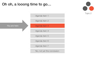
For my 5,000+ files the search results are sometimes a bit too broad, I would love to have an option to narrow searches actually by a folder on a hard disk. Another approach would be to add generic presentation tags to all slides in a presentation. For example the company name on the front page of the deck, the name of the presenter, the subject of the presentation, the items of the agenda, each of these are relevant to all the slides in a presentation, while they might not be written down explicitly on each slide.

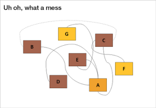
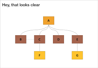
The ultimate feature would be to include more advanced image search into the algorithm. Most of my slides contain few words, which makes them hard to search. If this technology progresses you could even imagine auto-taggin image files (not PPT slides) on your hard disk with the key words that were used in slides that incorporate the image.

A work around could be a highly visual search process in which you put a lot more thumbnails on the screen (at the moment I have not found a way to change this) and have an option to click thumbnails rapidly "more like this", "less like this" to create a human-powered image browser.

All in all I think this is a useful tool for people with lots of PowerPoint files on their hard disk. If some of the points I made in this review are because I simply did not understand the software correctly yet (I have been using it for a day) I am happy to get corrected in the comments.

SlideMagic: a platform for magical presentations. Free student plan available. LEARN MORE

The art of writing diplomatic cables

In a background article on the leaked diplomatic cable archive, the NYT today discusses the "Ambassador's Cable Drafting Tips" by Richard E. Hoagland, the U.S. ambassador to Kazakhstan. From the article:
  • Pay attention to the first 5 words, they need to catch the reader's attention, they are the only thing diplomats see in the electronic cable queue
  • Avoid flabby writing (see this too often in diplomacy)
  • Incorporate story telling
  • But: cute writing is never acceptable, only for toddlers, not for professionals...
Now someone needs to leak these cable drafting tips so we can all learn from it...

SlideMagic: a platform for magical presentations. Free student plan available. LEARN MORE

Story in flat images

Some images contain an entire story. While it is hard to match the effect of this photo in an everyday presentation, you should at least try to use cinematic effects in composition: suggest movement, create tension of something that is about to happen, but has not yet. The man who is about to open the door creates a much stronger visual, than the image 5 seconds later of him escaping the women's dressing room.


The original ad can be found here on Ads of the World. (By the way an example of an image that is grey, but not really grey)

SlideMagic: a platform for magical presentations. Free student plan available. LEARN MORE

The final fixes

The final version of most business presentations is created when the person-with-the-pen hits "save" after the wording is agreed in a slide-by-slide meeting.

If you are the person-with-the-pen, why not wait for everyone to leave the room and go over each slide one more time, but now focus on the visual fixes. Align boxes, sort out the fonts, round up those decimals and hit "save" again.

Twenty minutes of work with great impact. It might not be a big deal, but the brain is distracted/bothered by small layout errors in a slide. Like the urge most people have to straighten that curtain, "it's been bothering me all evening".

SlideMagic: a platform for magical presentations. Free student plan available. LEARN MORE

Free the world of trackers

Many business presentations are loaded with tracker elements:
  • An agenda page with a highlighted bar that moves as we go from section to section
  • A miniature version of a framework in the top right corner of a slide with a changing color highlight to remind people what we are talking about.
I find trackers great for big documents: it allows fast browsing if you need to refer back to material. In (shorter) presentations I try to avoid them:
  • If you need trackers to keep people hooked to your story, your story is probably very boring. Maybe you can try to change the story?
  • These top-right symbols add clutter to the slide design
  • A big tracker agenda can come across daunting for an audience: "oh no, 5 sections before we get to the conclusion, let's check email on the Blackberry..."


I am all in favor of structure, just let it come natural via your story, without having to "rub it in". One elegant solution is the full page separator slide like the ones I used in the IDU Biometrics presentation. They can contain a few words about what comes next e.g., "technology", or better you can write a question that wakes up the audience and makes them curious to find out more what's next: "why is this such a great biometric?".

SlideMagic: a platform for magical presentations. Free student plan available. LEARN MORE

Designing a minimalist Twitter page

I gave my Twitter page an overhaul. Designing a Twitter page is tricky:
  1. On small screens the side bar on the left gets eliminated
  2. A twitter stream is a cacophony of links, icons, avatars, buttons
Here is the approach I took:
  1. Minimize the use of distracting colors that only add to the chaos of avatars and links
  2. Use a background image that gives a sense of open space, with a light source from the top, and minimal visual distractions
  3. Invert the colors of the right side bar: really dark semitransparent background, with a white font (it will look a bit weird in the Twitter style editor). I find it very hard to get any color to look good here, because the semi-transparent setting will make any of your choices look pale.
  4. The same is true for links, I struggle to find good link colors and as a result set them light grey. Most Twitter links are shortened URLs that people do not need to read anyway. The alternative would have been to pick a very bright one with high contrast, but that would only add to the cacophony of the page.

What do you think?

SlideMagic: a platform for magical presentations. Free student plan available. LEARN MORE

Back to simple

There are just so many advantages to making slides with very simple shapes:
  • It focuses on what you want to say only
  • They are easy and quick to make
  • They look highly professional without a degree in graphics design and/or the full suit of Adobe software
  • It easy to create a sense of motion
  • There are no issues with images/illustrations that do not fit your color template
An example is this poster by Network Osaka (actually must better than a concept designed by me a year ago):


SlideMagic: a platform for magical presentations. Free student plan available. LEARN MORE

IDU Biometrics: 41 slides in 6 minutes

One of my presentations in the public domain. This time the setup was the global finals of the 2010 Global Security Challenge in London. Startups that had won the regional semifinals were granted 6 minutes to pitch their company in the field of IT security to a jury. I designed the presentation for IDU Biometrics within the following constraints:
  • 6 minutes, no second more
  • An audience that understands IT security, but has no idea what so ever about the company the moment the 6 minutes start, we begin at level 0
  • A very tight startup budget: all designed in basic PowerPoint without sophisticated effects and/or illustrations, one file that forms the basis for the company presentation, a looping presentation inside the company booth at the exhibition that was held in the same venue, a video for online viewing, and a good introduction for a broader presentation for fund raising from venture capitalists.
Here is the video version of the presentation:

SlideMagic: a platform for magical presentations. Free student plan available. LEARN MORE

PowerPoint/Office 2011 for Mac - mixed reviews?

I considered upgrading my Mac Microsoft Office software (including PowerPoint) to the new Office 2011 release but hesitated after this review by David Pogue of the New York Times, and a few negative reviews on Amazon that seemed genuine. Have any of you tried it?

SlideMagic: a platform for magical presentations. Free student plan available. LEARN MORE

Dropbox' YCombinator fundraising application

This interesting file from 2007 made it to the top of Hacker News at some time during the day: the application of Dropbox for funding by YCombinator. The question/answer exchanges read like a high-paced due diligence interview by a potential investor. The answers are short and to the point, the questions are short and to the point. Learn from it and improve your own investor pitch.

SlideMagic: a platform for magical presentations. Free student plan available. LEARN MORE

So how many different types of slides are there?

I think there are 4 different type of visuals,  Have I forgotten any? (The images below are taken - out of their context - from previous posts on this blog)
  1. Big picture, big emotion slide. A huge image of a squeezed orange "the competition is killing us!", a big picture of an audience asleep "presentations are boring!", swimmer dives in the pool "let's go for it!" (lot's of cliches here, but I have seen many good ones as well). These slides are an emotional shortcut, they unlock an idea/feeling that is already present in everyone's brain quickly.

  2. Location port, a big image of a place, a street, a country, a customer. Pretty much like a movie director opening a film to bring us to a different time, a different place. An image of the interior of a messy store is much more powerful than a list of bullets: isles are not straight, labeling is unclear, lighting is poor.


  3. Relationship slide. Shapes/boxes with text, arrows, to show how issues are related, impacting each other, are dependent on each other, sit in different places on the same map.


  4. Data chart showing us a trend, or comparing numbers.

An incredibly dense relationship or data chart should actually be in the "location port" category, the U.S. army spaghetti chart is an example: it is not so much about understanding the chart in detail, rather the viewer understands immediately that "it's complex" (earlier post).


Common mistakes that people make today:
  • Over-use the big picture slide, creating a machine gun fire of cliche images flying across the screen. Impressive pictures, but a hollow story
  • Using bullets to describe what's should be inside a "location port" image
  • Using bullets to describe forces/relationships/dependencies that can more easily be visualized in a relationship chart
  • Making unfocused data charts showing information that is not essential to make the point that needs to be made

SlideMagic: a platform for magical presentations. Free student plan available. LEARN MORE

Some grey is not grey

Grey colors can come in a lot of variations. People who have renovated a house know that grey can be a bit green, red, blue, brown. If you are using black & white images in your presentation and you see one that is off-grey, it is better to force its color to be pure grey so it is consistent with the rest of the presentation.

Select the image, click format, select re-color and pick a black and white color scheme for the already almost grey image.


Photo credit: Matt Clark

SlideMagic: a platform for magical presentations. Free student plan available. LEARN MORE

Image consistency

One of the things I find the most difficult in presentation design is to get a consistent look and feel across all slides in the deck. It is tempting to come up with the killer chart for each concept that you want to communicate. Each slide is great, but if you look at your slides in the slide sorter, nobody would guess they are taken from the same story.


So, we have to add one more constraint to the design process: consistency. Some visualization ideas might just not work given the overall context of the presentation, sorry.

In the design process, I always start with the most important slides that convey the heart of the message. Brainstorm, sketch these, and then freeze the look and feel of the entire presentation based on these few slides:
  • Fonts
  • Colors
  • Position of titles
  • Type of images (cartoon, nature, vintage, people, color)
Think of your presentation as a movie that runs in the background, it is set in a time, a place. You pick them all, but stay inside the world of your presentation. 

Image credit: Copeau,

SlideMagic: a platform for magical presentations. Free student plan available. LEARN MORE