A fresher look for the blog

I made some changes to the blog today:
  • Re-installed the Disqus commenting engine (it works with the new Blogger template designer)
  • Big and bold title (is it too in-your-face?) so the site looks better on mobile devices
  • Cut the ugly share buttons, very few people used them and they were just an eye sore... (what do you think?)
Feedback is always appreciated.

SlideMagic: a platform for magical presentations. Free student plan available. LEARN MORE

Back to the 50s

I am reading up on the history of graphics design and typography and it struck me that non-professional PowerPoint presentation designers today have a similar tool set available to them as the analogue graphic design masters from the 30s to the 60s. Classic fonts, simple shapes, primitive/manual image manipulation tools.

Have a look at this poster by Joseph Muller-Brockmann (I cannot paste it here because of rights): basic fonts, basic shapes. The power of the design is solely created by proportions and shapes.

I stocked up on some more books for design inspiration.

SlideMagic: a platform for magical presentations. Free student plan available. LEARN MORE

Little (cultural) differences

More and more people understand the power of personal stories in presentation design. One of the easiest sources of stories are things you are passionate about. Many people are passionate about sports, and as a result, sport analogies often are used to give a more personal flavor to a presentation.

That is great, but only for a national audience. There are little cultural differences.

People in Europe have never seen the 2006 Super Bowl finale, and do not know who the coach of the New York Yankees is. And vice-versa, very few people in the U.S. will remember European sports stars.

If your presentation travels across borders, think of other ways to connect to your audience.

SlideMagic: a platform for magical presentations. Free student plan available. LEARN MORE

Make the small print really small

On the first day of my career at McKinsey we were told to put the sources of our analysis really prominently at the bottom of each chart. Even if the source of the data was yourself, simply put "Team analysis".

Still, many presentation slides have very conspicous sources and foot notes at the bottom. It is a typographical eye sore. When you are standing up to present your slides, people are not interested in reading the small print.

I am not advocating to take the foot notes of all together. Readers who go through the deck afterwards might be interested in them. It is also very hard to keep a good book keeping of data sources, better to have them handy all the time (I do not have the discipline to keep on updating that page with all the sources in the back of the document). And finally, taking of the reference to a photographer in an image with a creative commons license is not good practice.

So instead, do the obvious. Make the font really small (you can overwrite the "8" as smallest font size in the PowerPoint drop-down menu and make it a 6). And give the font a color with low contrast with the background. In that way, you get the best of both worlds.

This might also be the way to handle your lawyer who insists to put “confidential” and other disclaimers on every slide of the deck. Page numbers can be treated the same way. Sometimes they need to be there, but only for people who stand with their nose against the screen.

SlideMagic: a platform for magical presentations. Free student plan available. LEARN MORE

9 out of 10

The Zynga IPO presentation made a statement that they created nine out of ten of the world's biggest social games. There are two issues with this statement.

First, this very powerful statistic is buried inside a series of bullets. For you the presenter, it is a totally obvious shortcut. For the audience that just gets to you know your story, it is simply too short to grasp in full. Instead, spend an entire chart on this one point. Show the ranking of the top 10 social games. It will take you almost exactly the same time to present, and this time, with the ranking visually in front of them, the audience will get it.

The second problem with nine out of ten is that you take up 90% of some category. It does not mean much to the audience. What makes it interesting and more understandable is to contrast the top 10 with the top 15 or top 20. Shows which very famous titles did not make it in the list. Often, a concept is defined by its opposite.

SlideMagic: a platform for magical presentations. Free student plan available. LEARN MORE

Hidden space wasters

File sizes in PowerPoint can quickly mushroom. We discussed PDF-ing and/or image compressing before to get the size of your files down.

But here are 2 additional inflators of file sizes that these techniques might not catch. The first one is logos. In order to get the sharpest logo images, you need to search for large logo images. So a typical logo page with 20 or so logos can become a huge consumer of space. But the resulting logo images are actually not that big, you can compress them further (to 96 dpi) than the other, larger images in your presentation. Make sure you uncheck the apply-to-all-images-in-this-presentation box when doing this.

Another space waster is your template. If you were guilty of Frankensteining a deck together from multiple presentations, changes are that your slide master contains duplicate copies of slide masters. Especially title pages with big images can add up. Go through your slides and the slide master to clean things up.

SlideMagic: a platform for magical presentations. Free student plan available. LEARN MORE

Music while working

Recently, I discovered the joys of playing music while working. I feared that it would distract me, but the opposite is true; I find that I am able to concentrate for longer stretches of time, with fewer temptations to check email or Twitter streams.

What sort of music works best for me? Jazz. Why? It is great as a background music that does not take over your mind. (I do not understand why they do not play more jazz in elevators). Pop music gets stuck in your head. Classical music has many repetitive patterns that do not work for me while designing.

I tend to switch on an Internet streaming music service to avoid listening to familiar music, and have the hassle of switching CDs every hour. (Poor store sales people who have to listen to the same track 15 times a day).

If you do not have the luxury of your own office, a good set of headphones might be a worthy investment.

What is your favorite music while working?

SlideMagic: a platform for magical presentations. Free student plan available. LEARN MORE

The Zynga IPO presentation

The Zynga IPO presentation is in the public domain, you can watch the video here. I watched the first 15 minutes of the presentation. Some comments.

Overall it is a pretty good presentation. The slides are organized, decently formated, the speakers are clear. And I guess this is what you have to do for a video-ed delivery about an investment opportunity that is aired for everyone to see on the Internet.

But what could be improved?

I think the presentation was taped with a tele-prompter as the only audience. The pace of speaking is constant. The result could have been better to put in a small live audience in the camera room, to make the delivery more real, more emotional.

Zynga must have many highly skilled graphics designers. I would shed the red border around the slides, get rid of the clouds in the title, but ad more game props and other graphics inside the slides to get the Zynga cartoon-like graphic style in the slides. The team slide with the cartoon characters and the logos of the previous employers is a good example.

The opening slide with the bullet points is an example how bullet do not stick. The slide gets put up. We look at the speaker, try to figure him out. We look at the background, the globe, the dog, start reading the points and note that the speaker is sticking exactly to the bullets. The content of the bullets does not sink in. The bullet slide could have been shortened and instead the opening shot could be focussed on just one message: we have Amazon in shopping, Google in search, Facebook in social, and now there will be Zynga in gaming for the next decade. If you want to invest in social gaming, there is no alternative but to invest in us.

Most investors will believe that the gaming market is big, that the mobile opportunity is huge. Some key advantages of Zynga are buried in the middle of the presentation. The difference with traditional revenue models depending on the opening weekend. The presentation uses terms like unmatched investment, infrastructure, platform, scalable, many times, but the meaning of it does not come across very well. (The key point is that Zynga built it, and no one will be able to catch up). Most important of all, the demo of a game itself comes in late. I guess is that many institutional investors actually never tried a Zynga game themselves. There is not better way than explaining social gaming by actually showing how it works.


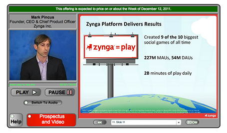
Some extraordinary statistics are downplayed. The CEO puts up the 9 out of 10 social block busters were ours bullet points, but you only realize what it means when the more detailed chart comes up later. During a boring slide about the advertising revenue model, the COO talks about an amazing story of how gamers built 8 million Best Buy stores. The audience is reading how advertising is 5% of Zynga revenues.

In short, I tend to go against the investment banking practice of a highly structured investor pitch. Rather, I would keep the opening structure really short. Feed some really exciting facts in the form of small stories and case examples, focus on those elements of the pitch that the public might not be aware of, and bring back the structure and summary investor pitch later.

Thank you Wouter Deelman for pointing to this story.

SlideMagic: a platform for magical presentations. Free student plan available. LEARN MORE

If it is a text doc, treat it as text doc

Some PowerPoint documents are meant for reading, not for presenting. In many ways, PowerPoint is a more flexible tool to write text documents than a rigid word processor. It is easy to add graphs, shapes, text boxes.

If your document is a text document, treat it as such and do not try to turn it into an on-screen presentation. The resulting presentation will be something in between that is not good to present on screen, and not good to read on a monitor. It does definitely not look Zen, and the short bullet points in big fonts are too cryptic for someone to understand without explanation.

Instead have a look at what great document, brochure and newspaper designers do to make text readable. Smaller, lighter fonts for body text. Lots of white space around text blocks. Subtle use of colors. Subtle highlights of titles. Columns to avoid straining the eye across long lines.

Sometimes you can mix styles. A stunning image with a big headline that says that food shortage will be a major issue in 10 years from now. The next page is a restrained text page full of facts and information supporting your point.

There is nothing wrong with a text document in PowerPoint, as long as you admit that it is a text document.

SlideMagic: a platform for magical presentations. Free student plan available. LEARN MORE

Color theory can be boring

Nature or artists usually do not stick to color theory to create an interesting color scheme. Jazz bands really start to swing when the drummer goes slightly off beat. If you restrict yourself to complementary colors, your choices are limited and the look of your presentation resembles those of many others who use the same approach.

Instead, get inspired by art (try Art Authority) or a or a colorful sea creature, or a photograph (check out Steve McCurry's blog) and upload the image to a color extraction tool such as Adobe Kuler. It will make you work more original, plus it adds a little personal secret to your presentation, your favorite painter or that memorable place that is hidden in the slides somewhere.

SlideMagic: a platform for magical presentations. Free student plan available. LEARN MORE

Get decent team images

The other day I put a large picture of member of a management team in an investor presentation. “Hey, that one is much too large!” was the reaction of the client.

College year books and newspapers have programmed us to look for passport-sized images of people. Usually they have an inconsistent color and/or background, and people have an awkward starte into the lens of the photo booth.

You do not see images like this in well-designed magazines. Why not give your presentation that same look and feel. This is especially important if you email a presentation ahead of the actual live performance. The person opening the document might not know you and a big image might help establish a better connection.

So bigger images of management team members is one step. The next step up is to hire a good photographer and actually take a shot of the team working together. Preferably in a different pose than the ones we see in wedding family photos or football team shots.

SlideMagic: a platform for magical presentations. Free student plan available. LEARN MORE

Hard-to-find Excel 2011 shortcuts

I do not use many Excel keyboard shortcuts. But my switch from Windows to Mac OSX showed that I really was dependent on a few that were hard to find in my new software. Maybe you have the same issue.
  • In Windows, I constantly used the Office 2010 (Windows) CTRL-MINUS and CTRL-PLUS to add/remove columns and rows. For some reason CTRL-PLUS does not work in Office 2011. To insert a row or column on the Mac, select it and hit CMD-I instead.
  • I use the soft line break in an Excel cell a lot, on the PC it is ALT-ENTER, on the Mac it is ALT-CMD-ENTER.

SlideMagic: a platform for magical presentations. Free student plan available. LEARN MORE

Do you believe in your own hockey stick projection?

“Look, we have proof! Excel says that we will be a $50m company in year 5, the hockey stick revenue forecast shows it all!”

No investor will buy this story. She knows the forecast is ridiculously optimistic, but she can check 2 things:
  1. Is there more logic to the $50m than a conservative 5% of a $1bn IDC market forecast? Have you thought about how your business works, and how to think about its revenue potential? If not, the investor should invest in a company that claims the other 95% of the $1bn.
  2. Are you driven, motivated, determined enough to go after the $50m against all the odds?
In other words, do you believe it yourself (really)? That might be the sign an investor is looking for.

SlideMagic: a platform for magical presentations. Free student plan available. LEARN MORE

One-line investor pitches

In the first second you meet an investor, you want her to stop guessing what you are doing. Describe in a short sentence what you are about, then move on with the more detailed pitch. An investor who is guessing what you are about is not listening to you.

I pulled up the trending startups of last month on AngelList.
  1. These slogans are targeted at investors, not (potential) customers
  2. They do not contain buzzwords or fluff (at least 99% of them) and describe what you are doing (not one of these is enhancing the social browsing experience with sticky semantic and relevant content dissemination)
  3. They can be very descriptive about what a company is about. Often direct comparisons to existing companies are used as a short cut.
  4. Startups are not afraid to put these type of descriptions in the public domain. The benefit of interesting a large potential investor base far outweighs the thread of someone copying the idea (based on the slogan) overnight
Here are the first ones that come up:
  • A high-quality, low-cost 3D printer that works out of the box
  • Safe driver score
  • Everyone's second job
  • Spy on competitor's display ads
  • Detailed social analytics for marketers, brands and agencies
  • Meetup for mealtimes
  • The Internet, peer-reviewed
  • Video advertising platform for mobile apps
  • Check in your daily accomplishments
  • Evolving the user experience for web interaction
  • An augmented reality gamification platform
  • Simple social business CRM
  • Mobile customer service ratings
  • Daily deals matched with industry leading publishers through editorials
  • Market place for artisan food
  • Flipboard for documents
  • Pinterest for places - spots you love from people you trust
  • Yelp for health
  • Beautifully simple dashboards
  • Building the neighbor graph
  • Cloud-based platform for visual and statistical text analysis
Not every one of these has the power of  “10,000 songs in your pocket”, but they are still pretty good.

SlideMagic: a platform for magical presentations. Free student plan available. LEARN MORE

Nothing wrong with manual charts

Automated charting is great if you want to analyze data quickly; grab an excel table and turn it into a chart with one click.

It is different in presentation design though. When you generate a chart in PowerPoint, the colors are off, there are ugly tick marks, the labels do not look right. In most cases, I create the chart almost entirely by hand. The only thing that PowerPoint does is generate the actual bars or columns, the rest is put on by me as text labels in the right place.

Usually a presentation only contains a few very important data charts, and they deserve the time to get them absolutely right.

SlideMagic: a platform for magical presentations. Free student plan available. LEARN MORE

In Paris early December (LeWeb'11)

I will be in Paris around the LeWeb'11 conference early December. Feel free to contact me if you would like to hook up in person.

SlideMagic: a platform for magical presentations. Free student plan available. LEARN MORE

Focus!

Here is a shape that I recently constructed to highlight that a company was doing lots and lots of things and all of it got focussed on just one area of expertise. The chart was not designed to read out the individual bits, but rather show that there are many, many, many aspects. Later, the presentation elaborates them one by one. You can see that I created the shape through a number of aligned triangles, alternating between the foreground color and white. Make sure that the biggest one is in the back, the smallest one at the front.


SlideMagic: a platform for magical presentations. Free student plan available. LEARN MORE

A camera in the hand of a kid

Slightly off topic topday. Here is a holiday gift idea for small children: a very cheap, simple digital camera with a huge memory card. The key is that the buttons are easy to use. The camera app on a discarded iPhone or iPod is still to fiddly for a small child to use.

The result is an amazing stream of pictures of the life of a child through her own eyes. Camera positions are low and subjects are interesting. Art work that she created. A castel that was built. Daddy checking email on his phone again and not paying attention to you. A nanny preparing the bath water. Mammy fixing car seats.


If you upload the camera images together with the ones you are taking, you get an amazing recording of family life organized with time stamps. Lower the resolution and the file size on the camera so she does not fill 4GB in 2 days though.

It is interesting to see that preserving visual memories does not really require pin sharp images with millions of pixels, it just needs someone to be there at the right moment, snapping the right image. Adults usually lose the moment. Your kid photographer will not.

SlideMagic: a platform for magical presentations. Free student plan available. LEARN MORE

Text columns in PowerPoint

Sometimes, you need to fill a PowerPoint slide with text. These slides are obviously not meant to be presented on a big screen. Still, I make them now and then; a legal disclaimer on page 1 of an investor presentation, detailed bios of the management team in the back, or a page of text in a PowerPoint document that is meant for reading rather than supporting a live presentation.

It is difficult for the eye to follow very long lines of text, because when the eye has reached the far right end of the sentence it has to move all the way back and find the start of the line below it. This gets hard with long lines. Also, long lines of text look ugly. Print designers discovered all this centuries ago, and invented the text column.

If you right click a text box in PowerPoint and select format text, you see that one of the options you can choose is columns (Mac). Play around with the number of columns and the white space in between them to get the desired effect. As an example, below are the opening paragraphs of Alice in Wonderland.


SlideMagic: a platform for magical presentations. Free student plan available. LEARN MORE

What is a good fund raising web site?

I see many startups pitching for VC or angel money early in their life. The investor presentation is often first piece of collateral that the company produces. The second one is a web presence and people ask me how it should look like.

A fund raising web site of a company that is not operating yet is completely different from one that provides a service and/or processes live transactions: it is a relatively static piece of fund raising content. The only visitors it is likely to get are investors you have met or heard about you checking out the company, or maybe potential users that have found out about you in the rumor mill. The web site should be designed with that audience in mind.

The content of an investor web site can be very minimal, look and feel should be highly professional. Let’s start with the look and feel.
  • URL. Make sure that you have the URL to your company name and that your sites uses it (and that you use it for your emails). This is check 0 of an investor to see whether you are actually real or not. Gmail addresses and Google sites do not score you any points here.
  • Template. The site needs to look like that of a serious company, not a MySpace social media profile. Just setting up a Wordpress blog in disguise (i.e., a blog template that is used as a static site) with a nice minimalist template should do (go to sites like Theme Forest to find one).
  • Style, colors, and logo. The rules for designing good PowerPoint slides also apply to web pages. No need for spectacular effects, reflections, animations. It should just look clean and calm. Contrary to a PowerPoint slide, your logo should be up there (nicely done in a crystal clear sharp image, no dirty and blurry graphics here), and the color scheme of the web site should reflect the colors in the logo.
  • Real images. If you put up pictures, make sure that they are of real people, and stay away from cheesy stock images. Anyone can see that pretty call center operator with hear headset is not manning your busy phones day and night.
Now moving on to content. This can be kept incredibly simple. At this stage in the life of the company, your site is a place holder, an online brochure. No need to add a lot of stuff, or start padding it with SEO terms. People get to your site by typing in the URL, not by Googling a keyword.
  • You. Make sure that the names, (very short) bios, and - if possible - the pictures of your management team is on the site. Again, investors check out whether you exist, and it is re-assuring to see the names behind the company appear on the web site. Get decent bio pictures that are similar in style, or even better have a team group photo taken.
  • An address. A physical address and a real phone number shows that you exist and that there is a way for people to contact you. 
  • No dead feeds. A news section, a Twitter account, a Facebook page, a blog should only be put on the site of their are humming with activity. A Twitter account with not followers and 2 Tweets and and the last news item from 2 years ago do not add to the credibility of your page.
  • What do you do. A very simple and brief description about what the company is about (within the boundaries what you want to make public. You can apologize that at this stage you cannot disclose information but provide an email address to request beta invites or express interest as a potential investor.
So, these are the most important elements. For these, no web designer is required if you know how to program a blog template. The site gives you a professional online presence and not more. If you are daring though, you can consider putting up part of your actual investor presentation which is what this company did.

SlideMagic: a platform for magical presentations. Free student plan available. LEARN MORE