New book by Duarte

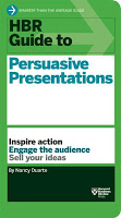
Nancy Duarte is probably the only person in the world that has managed to create a very large business in the presentation design market. As a result, she is a true authority on the subject because of here experience with designing presentations ranging from the high profile money-no-issue keynote presentations to the day-to-day high volume make-overs of slides for internal management meetings.

Her new book HBR Guide to Persuasive Presentations is different from the previous two (Slide:ology and Resonate): it is far more practical. Out goes the glossy paper, the beautiful diagrams, the client case examples, and instead we have a highly useful list of tips and tricks that can help you make better presentations the moment you put the book down. Almost every paragraph starts with an action verb, a recommendation of something that you can do better.


The book covers a wide range of subjects related to presentation design, from analysing your audience to building an online social media following for your decks, but the core of the book is in story and slide design. Some new ideas that I got out of the book:
  • Create two endings in your presentation, if you run out of time you can always stop at the first one
  • Pick the right type of slide: walk-in slide, title slide, navigation slide, bullet slide, big word slide, quote slide, data slide, diagram slide, conceptual slide, video slide, walk out slide
  • Ideas how to translate words into diagrams.
One point of disagreement, the book advocates using a 10% rule for executive summary slides, so a 50 slide deck needs 5 summary slides (5 minutes), and 45 appendix slides. Pretty much what we tried to do at McKinsey. I increasingly try to shorten that executive summary to one super short summary, and follow it to a slightly longer story that encapsulates the entire story, hoping to be able to hang on to senior management attention for maybe 10 or 15 minutes instead of 5 when the cross fire of questions begins and your slide presentation in the conference room basically ends.

So in short, if you are in doubt which of the 3 Duarte books you should start reading first, I suggest it is this highly practical one. A great and useful read.

Disclosure: links in this post to Amazon are affiliate links and I did receive a free copy of this book for review.

SlideMagic: a platform for magical presentations. Free student plan available. LEARN MORE

First impressions of Windows 8

Although I have switched to a Mac, I dip into the world of Windows now and then on a virtual machine, for such things as running .EXE CD ROMs with medical images on them, or editing a chart for a client still on PowerPoint 2003. The latter is no longer necessary, and that is a good thing, since Windows 8 is no longer supporting PowerPoint 2003.

So, I took the plunge and installed Windows 8 on my Parallels 8 virtual machine. I ignored all the scary warnings on the Parallels web site and managed to get a perfect install.

As a non-Hebrew speaker in Israel I always have an additional issue when installing new software. Trying to change the system language on a computer without being able to read most of the text on the screen. Gambling, plus comparing English and Hebrew screen shots finally did the job, but my computer science undergraduate degree came in handy. Not something for novice computer users as languages for application screens, keyboards, user accounts and welcome screens all seemed to be controlled in a slightly different way.

OK, back to the software. I will not describe the ins and outs of the new operating system here, but stick to my personal impressions. Detailed descriptions can be found in other reviews.

I really like the new Microsoft graphical look and feel of the new Metro interface. It is calm and clean, with simple clean graphics without shadings, gradients, drop shadows and near-realistic leather or paper effects. Some of the tiles on your home screen update in real time with weather, stock market information and a flow of pictures of your facebook and Twitter friends. I switched these live updates off, too distracting.

I hope that Microsoft will push this new tile design philosophy fully into the design. So, no more disguised Windows 7 user interfaces, and a deep application of the concept in its Office application suite (including PowerPoint).

The new super thin iMac eludes to the desktop computer of the future: a super powerful, large iPad-like device that can be put on a stand. High-end Wacom touch screens are also a sign of things to come. You put the screen up to view, or write text, put it down to design and draw, and interact with the screen using touch. We need software that can handle this type of design environment. I like the new PowerPoint (my PPT 2013 review here) but it nowhere near a touch application.

Microsoft lost the battle for consumer touch devices, but if it manages to move the corporate world that uses Office applications and that is afraid of Dropbox to a touch environment with a secure Microsoft Sky drive, it might have a chance to turn the tides.

The key is to innovate the applications such as PowerPoint and how they work. The actual operating shell matters less.

Have you tried Windows 8?

SlideMagic: a platform for magical presentations. Free student plan available. LEARN MORE

The exact marketing messages

Marketing messages cannot be translated 1-on-1 into a presentation. Do not forget to make the translation. The language translation requirement is obvious (everyone can see that marketing jargon does not resonate with a consumer). Sometimes though, you have to further than that and cut messages out, or move them from the explicit text, to the implicit part of your presentation: in between the lines, or told in the verbal explanation of the slides.


Image found on Things real people do not say about advertising.

SlideMagic: a platform for magical presentations. Free student plan available. LEARN MORE

Is it really about the presentation?

“My boss wants me to make a presentation about our strategy next Wednesday, help!”.

What does she mean? In most of cases (especially for an internal audience), she probably does not want you to focus all your energy on making the slides as pretty as possible (that would be a nice-to-have).

Instead, she needs to have the strategy itself ready and nailed. And the process of designing the presentation-that-presents-the-strategy might reveal holes, inconsistencies, and ambiguities in the strategy itself.

Your boss wants the strategy to be ready by next Wednesday. (Help!)

SlideMagic: a platform for magical presentations. Free student plan available. LEARN MORE

Uniform logos

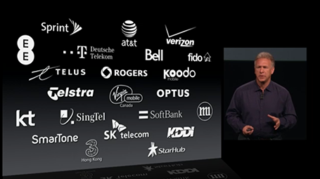
A page full of logos in different colours can look cluttered. Apple re-did their partner logos in white on black in their recent product presentation. I am not sure whether all the graphic designers that were behind the logos would agree to this, but it sure looks better. I would have taken the slide design one step further though, and organise the logos in a rigid grid.

SlideMagic: a platform for magical presentations. Free student plan available. LEARN MORE

Light or dark background?

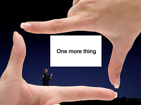
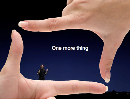
For big audiences, you need to get the entire look of the stage right, not just your slides. Below you see that a dark background works better. A light background on a huge screen overpowers the presenter. For small conference rooms, a light background will do fine, and for reading on screen, a light background is actually better.


SlideMagic: a platform for magical presentations. Free student plan available. LEARN MORE

Presenting to your CEO

You are the country manager of one of a company’s 100 territories, and the CEO is coming to visit. You probably have a deck somewhere that you can use to Frankenstein the all encompassing presentation about your country organisation.

But maybe it might be better to start from scratch for this new audience.

Some content can go, all the tactical details about combatting that local competitor really excites you, but is not that interesting to the CEO.

Some extra content is required. What is special about your country compared to others? You never had to worry about that before when presenting inside your own market. It might be good to take a step back and go further back in time than the last 2 quarters to show the evolution of your market. Your staff knows it, but the CEO does not. Adding some pictures of staff, or some examples of marketing material will add even more flavour to your story. Maybe it is necessary to  convert all financials in a different currency.

In short, Frankensteining is not enough.

SlideMagic: a platform for magical presentations. Free student plan available. LEARN MORE

How to position a logo

Many logos come with tag lines and/or (R) or (TM) attachments. When positioning a logo on a page, ignore these and focus only on the main text or graphic to align the image on a slide (even better: violate the logo style rules and crop them out). For horizontal alignment of a number of logos in a row, draw a temporary line and make sure the text of all the logos sits right on it.

SlideMagic: a platform for magical presentations. Free student plan available. LEARN MORE

"Hot"

Some sectors of the technology market are “hot”, everyone wants to buy the products, all investors want to get in.

But writing that sentence explicitly in your presentation might just give the impression that you are in a bubble that is about to pop. Get the sizzling temperature of your market across without saying it directly.

SlideMagic: a platform for magical presentations. Free student plan available. LEARN MORE

Your James Bond opening?

James Bond movies always start with an opening scene before the title roll. You get lifted out of our audience chair and thrown into the action. In presentation design, you have a similar option.

The conventional route is to put up a summary chart with the key messages you want to give. The James Bond option is to start with some interesting stories and case examples that are not completely tight together in some logical structure. After that short introduction you can put up the page that puts it all together.

SlideMagic: a platform for magical presentations. Free student plan available. LEARN MORE

Story procrastination

Life is tough in the corporate world today. Endless (often useless) meetings, short-term requests that frustrate your attention to get the big job done, a relentless stream of emails. With all these distractions, it is hard to find the time to simply sit down and design/write/dream the story you want to tell. And on top of that, managers assume (correctly) that they know what they want to say, so there is no point wasting two hours to go over the obvious. Incorrect.

Managers suffer from the Curse of Knowledge. Yes, they do know the substance inside out, but cannot explain it to outsiders. Buzzwords and corporate speak have become a morse code, a short cut, that management understands perfectly, but that does not stick with outsiders.

Moreover, outsiders might have difficult questions that do not follow the business-school-like structure a manager would use to explain her business. Writing a story to lecture someone on a new topic is different from writing a story to address the concerns of a highly cynical audience.

And finally, writing a presentation without a proper story brainstorm takes out those personal anecdotes and jokes that can make your presentation so much more interesting.

In the end, many corporate presentations work out and are great. But very often this is the result of a reset in the middle of the design process. After the presentation is almost ready to go, people take a step back and start discussing the story, which often in  a complete redesign of the deck.

Maybe that meeting should have been the first in the design process, not one of the last ones.

SlideMagic: a platform for magical presentations. Free student plan available. LEARN MORE

One framework fits all?

Some presentations are a series of ideas, a number of products, a string of business unit updates. Most people try to force some sort of uniform framework to discuss all options: market potential, challenges, next steps, etc. But often you find that that one framework does not work for all the stories you want to tell. In those cases, feel free to drop the uniformity and pick the visualisation that fits best for that particular story.

SlideMagic: a platform for magical presentations. Free student plan available. LEARN MORE

VCs can also improve their pitch!

As a startup you are used to sitting in the hot seat while the VC (venture capitalist) is grilling you on your business idea, and in the process gives you some advice on how to pitch it better. True, VCs probably know best how it is to pitch to them.

But VCs themselves can improve their pitches as well. I have designed many fund raising presentations for VCs and later-stage private equity (PE) funds pitching their next fund to institutional investors and high net worth individuals. Here are some of the common mistakes in version 1.0 that comes across my desk:
  • A lot of attention to the mechanics of the fund; how the due investment process works, and how the fund is organised. 
  • Very generic descriptions of what sort of companies the fund will be looking for: great product, great management, no competition, sound business model
  • (Every fund does this) a chart emphasising that the fund (unlike all other funds) will actually be really hands-on with their portfolio companies
  • A dry summary of the investments made and financial returns, forced in the same generic framework that is applied to all the portfolio companies (with completely different stories) often lacking the real story behind the investment decisions and the portfolio's company progress over time 
  • Investment banker-style, dense, bullet point slides that are meant for printing and reading, not for presenting.
Investors in VC funds have heard the exact same story from all the other funds that are pitching for their money. VC/PE funds need to really think hard and articulate their story, and how it stands out from other funds.
  • For a second time fund, highlight the real story behind your investments, how you picked them, how you made a difference. Track record is the most important aspect institutional investors are looking at.
  • Yes, institutional investors can also respond well to more visual slides. The dense stuff can go in the backup or the PPM (private placement memorandum)
  • Make the audience excited about the field of technology you are investing in. Where do you think the opportunities are.
  • Without mentioning them explicitly, differentiate yourself from the competition / other types of investors that are out there in the market.
Some VC/PE funds have such a track record that they can just pick up the phone and raise a fund by asking the question “Come on, are you in or out?”. For all the other ones, and especially first-time funds, fund raising is as hard (maybe even harder) than the process a startup has to go through. Better get your deck sorted.

SlideMagic: a platform for magical presentations. Free student plan available. LEARN MORE

All the big points by page 3

Many clients insist on making sure that all the big points of a presentation are made by page 3. Why? Decades of boring PowerPoint has shown them that things past page 3 get lost in an endless stream of bullet points. Making sure your point gets made by page 3 means making sure that your point gets made in the first 20 minutes of a pitch.

The result: you are stuck in the middle. The story up to page 3 is too long to serve as a really crisp summary, and falls short on conveying the message with full impact (the real killer chart sits on page 37). A shame that people will switch off on page 4 and beyond.

Here is a better strategy: design a deck that takes 20 minutes to present with all the important points inside, telling your story once instead of saying what you will tell them (by page 3), saying it, saying what you just told them (slide 78).

SlideMagic: a platform for magical presentations. Free student plan available. LEARN MORE

Infographic hieroglyphs

Sometimes I come across slides that simply try too hard. A stunning image with a hard to understand analogy, or an infographic-style rebus that looks like ancient Egyptian hieroglyphs. OK, it is a visualisation, but a puzzle does not make it easier for your audience to understand what you try to say. Even worse, an overly simplistic symbol might play down the seriousness of the business you are trying to pitch. Instead of creating a puzzle, why not simply write down what you want to say. Image via WikiPedia

SlideMagic: a platform for magical presentations. Free student plan available. LEARN MORE

Hey, where is the colour?

A recent client was wondering why I turned all images in his presentation to B&W.

The answer: because I matched the colours of the presentation to the colours of his brand; shades of grey plus a strong blue as accent color. These type of colour schemes are actually my favourite ones. They look elegant, are recognisable, and it is very easy to create a harmonious, consistent set of slides through the deck with out the distraction of clashing colours. Definitely not a presentation with a 1980s, pre-colour monitor, look and feel.

SlideMagic: a platform for magical presentations. Free student plan available. LEARN MORE

Data chart make over

Here is diagram published on TechCrunch about the financial returns of angel investors. There are 2 ways to improve the diagram:
  1. Make it a simple stacked column diagram that adds up to 100%, 1 column for the US, 1 column for the UK next to it.
  2. Use more contrasting colours than the dark blue and red
Then there are a few more things you can do to make it look less like Excel: tick marks out, big title at the top left, replace the Times Roman font from something sans serif, value axis title below the main title (i.e., no vertical text).


SlideMagic: a platform for magical presentations. Free student plan available. LEARN MORE

Slides from Barcelona

Following requests, I uploaded the slides I used for my talk in Barcelona about investor presentations. They are pretty minimal, so it will be hard for those who did not attend to grasp the full meaning, sorry. (I am working on documenting its content though, watch this space) Thank you Barcelona entrepreneurs for a great event!


SlideMagic: a platform for magical presentations. Free student plan available. LEARN MORE

Too generic to sink in

Opening slide bullets:
  • Industry #1
  • 15 consecutive quarters with growth
  • 40% EBIT margin
  • Offices in 35 countries
Pretty impressive, but when you put on a slide like this the audience is unlikely to digest the numbers fully. Almost every opening slide of almost every corporate presentation has numbers that look like this (something about growth, something about margin, something about locations, we do not pay that much attention to the actual numbers).

Instead, break up the slide, show that you are bigger than IBM, show a column chart with growth in the past 15 quarters, show that competitors are struggling to achieve 5% EBIT margin, show a map with 35 dots. It takes the same time to present, but your audience will remember.

SlideMagic: a platform for magical presentations. Free student plan available. LEARN MORE

The conversation first

Yes, many of the slide decks I design for clients are meant as support for a stand up presentation. But I think these cases are the minority.

What most clients are after is a different concept: the documentation of their story. The idea in their head, captured, recorded, somehow. This story can then be emailed, shared online, discussed in a 1-on-1 meeting and yes, presented live.

And when I stand back and see from which perspective I design, I think - to my surprise - that it actually is the 1-on-1 personal dialogue. When that conversation is nailed, I make the adjustments for bigger audiences.

Maybe not so strange after all though. Everything starts with a simple human conversation.


SlideMagic: a platform for magical presentations. Free student plan available. LEARN MORE