Amateurish format or no format?

It requires some skill to get a presentation to look professional. And when you are a boot strapping startup, I think most investors will forgive you if you did not have time or money to get your investor slides look completely perfect. You decided to put your effort elsewhere, rather than spending it on PowerPoint looks.

So, the bare PowerPoint template with a tiny logo on the bottom right looks, well, bare, but you could still say it is professional, sort of. Worse is when you put in a lot of effort and the results do not look good:
  1. Clashing colours
  2. Too childish, or too cute for predominantly machine/male investors
  3. Tacky, cheesy stock images
  4. Super complex gradients and other template graphics that take over 50% of the slide surface
No format works for an early stage startup investor pitch with a good idea, it will not work in a sales presentation though. 

SlideMagic: a platform for magical presentations. Free student plan available. LEARN MORE

The ponder slide

Not all PowerPoint presentations are in front of 500-seat TED audiences. Many presentations get emailed around and read on screens.

Strategic decisions are usually a careful trade-off between options. Some choices are clear, fact-based and objective. Others are qualitative, and yet others are complete leaps in the dark.

To make a decision you need to have all of the factors on some page somehow. Yes, this dense slide violates all the rules about good presentation design. But there is one big difference: the audience that will appreciate it are insiders, who suffer from the Benefit of Knowledge (the opposite of the Curse of Knowledge [what?]). They have heard the arguments before and they are ready for decision time.

How to design a good decision slide for these people?
  1. A table: options in the columns, arguments in the rows
  2. Group the options and arguments somehow, sort options by risk, how radical they are, something. Group arguments: similar arguments go together, if they are sort of the same thing, you collapse them into one. Group the factual arguments, to make the more contested ones stand out.
  3. Label your options and arguments for the audience with the Benefit of Knowledge, short labels or placeholders that are enough for them to understand the full picture. After months of discussions “Blink first” might be enough to describe a strategic scenario covering 25 pages.
  4. Frame the options so that the answers are in the same direction: I usually pick positive ones: no cannibalisation, retention of talent, limited competitive threat. Etc. 
  5. Now the tricky bit: score options (1, 2, 3, low, medium, high) and use colours to distinctive good or bad. Re-group, re-sort options and arguments until you get the maximum number of continuous good and bad fields.
  6. Look at the result and tweak scores and weights until you reach your conclusion. If you had the push up the weight of the leap-of-faith type of arguments a lot to balance the factual criteria, you know what you will have to explain in your presentation
  7. Once you reach your conclusion you can make a hugely simplified version of this matrix, collapsing all similar arguments together and boiling it down to the 2 or 3 points that will tip the balance

SlideMagic: a platform for magical presentations. Free student plan available. LEARN MORE

Substance first

So, you have been assigned the responsibility to get 15 senior business unit leaders all over the world to produce one coherent company strategy presentation in 2 months. Your role is just process, you are a relatively junior executive in the organisation, and the only leverage you have is backup by your CEO. A dream assignment...

It is tempting to try to make it as easy as possible by creating standard presentation structures, standard colour templates for everybody to follow. On top of that you could force deadlines on everybody to write down the key messages of the presentation first, ahead of the actual slides. You can write all this down in a beautiful Gantt chart.

In theory, this all makes sense. In practice though, I see that people only really start to focus when the actual content of the story is produced. So, here is an alternative and slightly more messy approach.

Start with the substance. Have each business unit Frankenstein together a deck of existing slides, and use that first presentation as a basis for a discussion what the business unit actually wants to say. What matters here is the sound track, the verbal story, not the actual slides. You need a trigger for them to start talking to you.

Second, try to get a fellow junior executive in every business unit who takes ownership of the presentation. This person will be easier to access and more skilled in PowerPoint than the business unit leader.

Now, start working with your 15 colleagues on getting to a uniform presentation. Create the common PowerPoint template and sketch out the structure of a business unit-specific deck based on the verbal briefing you had. Give home work to your 15 colleagues and follow up with frequent progress reviews. Create some competition by putting up draft presentations for everyone to read throughout the 2 months progress.

While visually the presentations should look the same, it is OK that each presentation deviates slightly in structure. Each business unit is likely to have its own story, requiring its own flow. And listening to 15 presentations that follow exactly the same rhythm is very boring.

Good luck!

SlideMagic: a platform for magical presentations. Free student plan available. LEARN MORE

The new Yahoo! logo

Marissa Mayer “Geeked out” on a new Yahoo! logo in a weekend (pretty much the same way in which the gmail logo was created) and designer Oliver Reichenstein rants about how she violated every best practice of corporate branding.

I am somewhat in the middle between the 2 extreme viewpoints. What Marissa did, was not a major rebranding of the company, she fine tuned the existing logo. I think it actually looks better than the old one, but - to Oliver&rsqo;s point - the Yahoo! brand has not changed for me. Marissa is only showing that she is making an effort to change things.

On the other hand I do find that big corporate branding projects often have a “the emperor has no clothes” feel to it. A company’ brand is more defined by what a company actually does: what product it delivers, and how she interacts with customers. Fluffy marketing slogans and long brainstorm sessions about logo personalities do not change much.

You could say that the Curse of Knowledge also applies to multi-million dollar logo redesign projects: for the people who were part of the design process and sat through all the workshops, it is perfectly clear that small green oval (no, not a circle) at the top right symbolises openness. For everyone else, it has no meaning. In that respect, many logo design projects are similar to mission statement crafting projects.

I guess there is a difference for companies with different logo audiences. If you are a big holding company, your corporate logo probably only speaks to 500 investment analysts. If you are a big retailer that needs to stand out in a busy high street full of visual clutter, your logo all of a sudden becomes a lot more important.

From a presentation design perspective, I do not care much about logos. If the client insists, I will put a tiny, tiny logo at the bottom right of a page. What is hugely important though is the colour scheme. The colours define the look and feel of a presentation and should be consistently used on every slide.

Startups often ask me whether they should invest in a logo. I usually advice to put their money to work somewhere else for the time being. Put something together quickly and make it look cleaner and more professional than the first gmail logo. Think about colours. Later on, invest money in a logo redesign.

SlideMagic: a platform for magical presentations. Free student plan available. LEARN MORE

Business English

I left the Netherlands in 1994 and have since then worked in international environments where English is the business language. And business English is different from regular English: it has a very small vocabulary. Why? Many non-native speakers have to speak it, and you actually do not need a very rich vocabulary to get the basic business concepts across.

Now and then I come across business communications from the Netherlands and am surprised to see how the English language is invading the Dutch business language as well. I am not a big fan. You either write in English, or in Dutch. While I would not go as far as the French and insist on inventing new native words for English concepts (Internet browser?), I think it is a bit strange to see a Dutch sentence with 25% English words in it. Even if you did not intend to, the English words contribute to a feel of fluffy buzzword abuse.

For a presentation, the safest solution is to write the document in 100% English, so you can use it for every audience and change the language in which you present depending on your audience.

SlideMagic: a platform for magical presentations. Free student plan available. LEARN MORE

Investor pitches evolve

As your company evolves, so will your investor pitch. At the idea stage, you are mainly concerned with explaining your idea and establishing you as a credible entrepreneur.

But with a product up and running, a few customers, and some revenues, investors will turn to other things like customer acquisition cost, churn, customer close rates, whatever is relevant for your industry. Inevitably, your deck will become less creative and resemble more a standard business presentation full of numbers and data.

Do not use the pitch deck from last year for your next investor meeting.

SlideMagic: a platform for magical presentations. Free student plan available. LEARN MORE

Visualising verbs

So, you need to depict an important concept in a slide. How do you do something more interesting than just writing a paragraph or 3 bullets on a page?

Here is how I start. That paragraph that you were about to write usually has one over-riding verb or action in it. Zoom in on that verb/action and use it to set up the overall structure of the slide:
  • We are better than an alternative: comparison, box on the left, box on the right
  • We stand out from the crowd: lots of elements in grey, one element in a bright colour, or clever 2x2 plot if you can find the axis definitions
  • We are squeezed, arrows pointing to a box in the centre
  • The inevitable conclusion: horizontal arrows at the left, pointing to a box on the right
  • There is a trade off: simplistic scales: box on left, box on right, tilted bar across the 2 of them, the preferred box is hanging down
  • The best of both worlds: overlapping boxes
  • We are the biggest: bar charts
  • It is complex: 25 factors written in font 10 all over the place
  • Etc.
This overarching visual movement sets the framework of your slide. Even if you cannot create an artistic master piece like a pro, your slide will be 10,000 times better than a list of bullet points. Good luck! 

SlideMagic: a platform for magical presentations. Free student plan available. LEARN MORE

Guitar strumming

My encouragement for my son to take on guitar lessons is that I join him and take lessons as well. The way the teacher introduces a new guitar strumming pattern is a good example of the Curse of Knowledge (it is difficult for an expert to explain things). The teacher has the full song playing in his head so for him, the strum is a piece of cake. Me, lacking the full context it is just very hard to memorise those ups and downs in the right rhythm...

The same is true for your presentation. For you, your story is totally obvious, for the outsider it is not.

SlideMagic: a platform for magical presentations. Free student plan available. LEARN MORE

Become a great graphics designer

I am reading the book How to Think Like a Great Graphic Designer (affiliate link) by Debbie Millman (picked up at Rizzoli in New York, a great place to find design books). The book comprises of a series of interviews with famous graphics designers. Here are some common themes in all the discussions.
  • The process to getting to a good design is messy: you try, try, try, and then all of a sudden it happens (or not). Different from churning out analysis and data charts one after the other.
  • The standard career path for a graphics designer (start at the bottom in a big studio) inhibits success later on. Multiple designers spoke about finding a career setup that frees you from a big corporate structure in your formative years (a financial challenge).
  • You need to find time to do work away from the day-to-day pressure of a client. Again, this is a financial issue. Designers quoted lucky family situations and/or a large steady client as the enabler for creative freedom.
  • Pro-bono work often brings out the best in a designer, since “the client who is not paying has no right to interfere with the work”
  • Many designers are introverts, like to work by themselves, and stay in the front line of design work, i.e., they do not move into the management ranks.
  • Almost every designer talks about art versus design. I think deep in their hearts they regret not having made it as an artist.
An interesting book with many abstract concepts, it will resonate with somehow who designs day in, day out.

SlideMagic: a platform for magical presentations. Free student plan available. LEARN MORE

Dummy grid

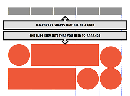
Drawing guides are a pain in PowerPoint (when you need to move an object close to the grid, you always end up moving the drawing guide line by accident). Also, grids can change from slide to slide.

My solution, quickly plop in some dummy shapes that define the grid for the slide you are working on. With snap to shape, you can create the slide layout you need, and get rid of the temporary shapes when you are done.

SlideMagic: a platform for magical presentations. Free student plan available. LEARN MORE

How did you become a designer?

I get asked this question frequently by people who are considering a career change. Here is my story.

The first 10 formative years of my career were spent with McKinsey, a strategy consulting firm, working in the London and Amsterdam offices with projects pretty much in every country in Europe. My stay there was a bit different than the norm: 1) I stuck around for about 10 years, versus 2-3 on average, and 2) I did not specialise in one industry (banking, consumer goods, etc.), but rather did a functional specialisation: mergers and acquisitions, usually on the sell side. In short, I helped big Fortune 500 companies sell themselves to other big Fortune 500 companies. As a result, every project that I worked on was in a different industry, and I had to adjust rapidly to understand a completely new field of work (beer, pet food, DIY retailing, petrol retailing, grocery, retail banking, asset management, insurance, private equity, e-commerce, mobile payments, postal services and logistics just to name a few). Little did I know then, how useful this skill would come in a decade later in a briefing for a new presentation design project.

After leaving the Firm, I moved with my family to Tel Aviv where I started out as an independent strategy consultant. Soon, I got in touch with the Israeli high tech industry. The small startups could not afford (and probably did not need) me as a strategy consultant for 6 months but saw value in my PowerPoint slides for meetings with potential investors (these charts were still B&W, highly organised, full of consulting speak at that time). It was here that my gradual transformation to a presentation designer started. Gradual is important here, I think no freelancer figures out exactly his professional niche from day one. In my case it probably took around 2-3 years to stop calling myself a strategy consultant.

So, after the Israeli startups came the Israeli VCs, I started writing the blog, and in came international clients (most of my clients are in the US now), and increasingly the McKinsey-style big companies came back as clients, this time for presentation design.

So, here is the story. Two things to remember. Finding your niche takes time, and it depends highly on the coincidences that formed your specific skill set.

Good luck with your journey!

SlideMagic: a platform for magical presentations. Free student plan available. LEARN MORE

Big co versus small co

I have seen big improvements in the presentation design of my startup clients over the past year. In some cases when the design is adequate, I have to admit that my involvement might not be the best return on investment for a start up on a tight budget.

Whereas startups are adopting new design and story telling ideas rapidly, the opposite is true in big corporates. Corporate culture (“This is how we do things here”) is reflected in PowerPoint decks that look pretty much the same as they did 5 years ago. Managers go through the ranks by continuing to use PowerPoint like they used to do, and new recruits get told to stick to the format.

When designing for a startup, we can dive straight into the content of the presentation, when designing for a big corporate we first go through a process to convince them that a visual presentation can still be serious.

SlideMagic: a platform for magical presentations. Free student plan available. LEARN MORE

Native PPT on iPad

Parallels (best know for enabling virtual PCs to run on Macs) now offers a product that allows you to run any PC or Mac app (including PowerPoint and Keynote) on an iPad: Parallels Access.

How does it work? You need to install software on your PC or Mac that beams your application screen to your iPad. But Parallels Access is more than a simple remote access tool: adjustments have been made to add iPad-specific controls to PC or Mac apps (copy/paste, scrolling, etc.).

The service costs $80 per year, per machine you want to broadcast.

My take? I still think that the current iPad user interface is not suitable for intensive office work: you start missing a keyboard and a big screen when working for 8 to 10 hours per day. So I do not expect people to use this app when they are 5 meters away from their desk machine. Instead, it provides convenient access to crucial office applications when away from your desk (last minute changes in the taxi on the way to the sales pitch for example).

The pricing is also clearly aimed at the large corporate market. If you are interested in this type of solution, it might be worth to check out Splashtop.

SlideMagic: a platform for magical presentations. Free student plan available. LEARN MORE

Fewer stock images

I noticed that I am using fewer and fewer stock images in my slides. Not so long ago, almost every slide started as a brain storm about what image concept to use. Not anymore for 2 reasons.
  1. Stock images are often cheesy and unnatural and have a very specific style, which makes it hard to mix them with other stock images in the same deck. I also suspect that stock image providers have been adding a lot of content to their databases thereby diluting the quality of the search results.
  2. My slide designs are getting simpler and simpler and often I can design them without the need for an image. A simple message written on a slide can be more effective than a slightly forced visual analogy in an image.

SlideMagic: a platform for magical presentations. Free student plan available. LEARN MORE

Be annoying?

A question to you, to be answered from the point of view of 2 audiences: 1) you, people who are interested in presentation design and early adopters of new ideas, and 2) everyone else struggling with PowerPoint decks.

 I have the option in my upcoming presentation design app to eliminate features that contribute to bad slide designs. The result will be that you simply cannot do what you used to do for 20 years, and you will also have to say “no, not possible” to your boss who just asked you to do something to a slide.

Will this be a liberating experience, or will tired employees just switch back to PowerPoint at 23:15 in the evening to get the deck out for tomorrow morning 09:00 and still get some sleep?

SlideMagic: a platform for magical presentations. Free student plan available. LEARN MORE

Design process killers

Here are creative design killers that are common in many big corporate offices.
  • Constant interruption by phone, walk-ins, or your boss who cannot find that slide deck you created last week. Open plan office layouts are especially difficult to work in. After an interruption it can take some time to get back in the flow. A 10 second call can equal 30 minutes in lost time.
  • Meeting schedules that fragment an entire day so you do not have time to start any major piece of design work (manager versus maker schedule).
  • Feedback and input from colleagues who have not taken sufficient time to digest what you actually created. Things get read over quickly, not internalized, and people provide some high level comments that do not build on the work you already did.
  • People start working on the presentation of the story, when the actual story is still not clear. At the last minute a whole slide deck needs to be re-written to support a different conclusion. 
  • Long work hours turn employees into robots with little energy for creativity inside them. Work has become a process to try to empty the in-tray, rather than produce beautiful presentations.
  • Multiple authors try to write the overall storyline, each with their own structure and style.
  • Throughout a project, team members usually develop a common language where one simple concept can depict a very complicated issue. For the insiders, writing the name of the concept on a slide makes it all clear, the outsider, has no idea. The result: pages and pages of hollow inside jargon. (The curse of knowledge)
As a result of all of this, most employees need to do the creative work after hours when they are free of interruption, which results in a poor lifestyle, sleep deprivation which in turn drains more creativity.

If you can, try to avoid these.

SlideMagic: a platform for magical presentations. Free student plan available. LEARN MORE

2-step scientific charts

Especially for my pharmaceutical clients I often need to produce scientific presentation slides. I tend to take a different approach to the industry standard when I need to present to a non-scientific audience: split the chart in 2.
  1. Chart 1 focusses just on the message and is highly simplified (“Survival rates went up 35%”)
  2. Chart 2 provides all the details about the study (number of patients, patient profile, confidence interval)
Springing the full combined chart with all the detail will just overwhelm the laymen audience. Medical professionals have trained decades to extract chart 1 from the combined chart in a nano second. The average investor lacks this experience. 

SlideMagic: a platform for magical presentations. Free student plan available. LEARN MORE

That does not make sense

We try to fit any new idea that comes our way into our mental model that we have built up since we were born. Every aspect that fits the model is absorbed easily but also easily forgotten, it does not stand out. It becomes interesting when things are counter intuitive, when it does not seem to make sense. Two implications for presentation design:
  1. Use this to build your story line. Here is how things are done, here are the limitations, but we can solve things by coming at it from the a completely different angle. 
  2. Use this to predict the type of questions the audience will have. It is better to answer the big obvious question in your presentation, rather than rely on Q&A to bring out the key point of your presentation.

SlideMagic: a platform for magical presentations. Free student plan available. LEARN MORE

Back to normal

I enjoyed a fantastic holiday in NYC and the Canadian Rockies and will resume my normal posting schedule. Apologies for the hiatus!

SlideMagic: a platform for magical presentations. Free student plan available. LEARN MORE