Viewing entries tagged
sales presentation

Should we do a video?

I get this question often from startups who are in the process of fund raising. If you are on a tight budget, you might be able to hold off the big expense of producing a video.
  1. There are videos and videos. Many of the animated videos you see today on the web (“So, you want to [FILL IN UNMET NEED]”) are presentations in disguise: an animated sequence of static slides. For some products, showing moving footage of the product is really useful. Examples are gadgets and other hardware that you often see on sites such as Kickstarter. If your product does not depend on a live demonstration, a sequence of presentation slides can be as effective.
  2. Unlike consumers, investors are usually perfectly happy to click through a sequence of slides instead of playing a video
  3. Videos are permanent and very hard to edit. Startup stories always evolve and change.
So, the best approach might be to start with an animated series of static slides. You perfect the flow over time and if you really feel you nailed the story flow (and you have the budget), you can make the expensive of creating a pitch video.

SlideMagic: a platform for magical presentations. Free student plan available. LEARN MORE

Who are you?

I am in the process of beefing up my software skills (Logic Pro X, nothing to do with presentations), and am spending a lot of time watching screen shot movies. I am just wondering why in these training sessions, the face of the presenter is not shown? OK, the screen real estate needs to be as big as possible, and a constant “talking head” on your screen distracts, but maybe a small introduction, at the beginning of a lesson?

This could be an idea for presentations that are used in cold email approaches: put a very short, very short, intro video of yourself on page 1 (to keep file size emailable and not take away the attention from the slides that follow).

SlideMagic: a platform for magical presentations. Free student plan available. LEARN MORE

"I need only 10-15 slides"

Some clients ask me whether a project can be cheaper if we cut the number of the slides, the answer is: not really. If your presentation designer is charging you by the slide, it means that she is likely to focus only on beautifying graphics page by page, rather than turning your entire story upside down and designing it from scratch.

Every presentation design project has a big fixed cost component: getting to know the client, getting to understand the story, setting up the overall look and feel of the presentation. After this, you need to put in however many slides it takes to tell the story, and I tend to err on putting in more than less. 30, 40, or even 50 slides, it does not make a lot of difference in the cost of a project.

SlideMagic: a platform for magical presentations. Free student plan available. LEARN MORE

Feature laundry lists

Many tech presentations contain have the feature laundry list table in them: 15-20 great things your application can do. Here is how to make them better:
  • For reading: reduce the font and add more text to make the feature and its benefit explicit: from “historical overview” to “Compare usage levels over the last 30 days and spot unusual drops in demand”
  • For presenting: Option 1: if you only want to show that you have lots of features, keep the text short and put 20 boxes in a nice 4x5 grid on the slide, do not even bother to go into the specifics. Option 2: if you want to go into the specifics, create 20 slides addressing one feature/benefit each, make sure you can present each slide in 10 seconds while at the same time being specific enough so people can understand things beyond a vague description.

SlideMagic: a platform for magical presentations. Free student plan available. LEARN MORE

Icons in PowerPoint

With smaller screen sizes, icons are becoming an increasingly important element of user interface design. Not everyone of you is likely to be using PowerPoint to design a web app (hey I do), but icons can also be useful in regular presentation design.

I am not talking about floppy disks and other ancient icons we still use, but stylised symbols that can be an effective visual short cut to a category of (pick the appropriate) products, benefits, user problems, etc.

One option is to create your own icons in PowerPoint, set the zoom to 400% and create miniature shapes using shape booleans. Often you can use a quick Google Image search to find inspiration for your icon.

Stock photo sites sell endless amounts of icons, but there are compatibility issues when using them in PowerPoint or Keynote. Most icons are design as a vector graphic in Adobe Illustrator. It makes them infinitely scalable (like a PowerPoint shape), but PowerPoint does not read this file format. Copy-pasting Illustrator objects (if you have the software installed) is unpredictable and results in a shape that is hard to manipulate (changing colour for example).

Cropping icons out of a JPG or PNG file is not a solution either, if you forget to compress the small image file, you end up storing a huge image file with all your icons multiple times on a PowerPoint slide. Cropping also kills the vector-like scaling of icons, and background transparency.

A recent trend in web design might provide a solution: custom icon fonts. Modern successors of Zapf Dingbats (what?) provide clean icons that are scalable and can be manipulated (colours, shadows, and - do not use this - reflections).

The web is full of free icons fonts but not all of them work with PowerPoint and Microsoft Office (Font Awesome for example). There is a solution for this problem: custom font creation tools such as Fontastic. You can select icons from multiple sources and use them to create your own custom fonts. If you do not see the icons you need available, you can upload your own SVG files from stock image site purchases.

Obviously, using custom fonts in PowerPoint has its issues: users need to have your font installed in order to see the characters correctly rendered. PowerPoint has an option to embed fonts inside presentation files, but unfortunately this does not work on Mac OS X.

It is interesting to see that a software trick to scale Arial in a web browser is turning into a broader software solution for scalable graphics, including very large objects across different display engines.

SlideMagic: a platform for magical presentations. Free student plan available. LEARN MORE

Two ways to keep it short

Option 1: lots and lots of benefits, but each one is described in just one, really short bullet point (i.e.: “A flexible solution”)
Option 2: Only 3 benefits, but each is described with rich and elaborate stories

The same amount of words, but guess which option will be remembered best. Too many benefits equals no benefits.

SlideMagic: a platform for magical presentations. Free student plan available. LEARN MORE

A real person

When you write a presentation, it can be helpful to have a real person in mind that you need to convince. With real I do not mean the actual sales prospect you are going to pitch to next week, but someone who you know better, personally.

The hard-nosed venture capitalist, the hipster designer, the over-loaded IT manager, the stylish marcom lady, the social media expert, the alpha-male sales director, the super-bright hedge fund manager, the Israeli wheeler-dealer, the geeky startup founder, etc. I have a cast of characters who always travel with me and are always willing to receive a mental pitch.

SlideMagic: a platform for magical presentations. Free student plan available. LEARN MORE

Nitty gritty

One of my clients has a technology that can save cost for a retail business. They did a pilot implementation at one retailer and have a lot of cost saving data as a result.

You can present this data to other potential clients (sanitised of course) in 2 ways. Approach one is the absolute number: we helped save $x,000 in costs. But this is hard to relate to for other retailers with different types of businesses. Better is to do it relatively: “we shaved 10% of the cost of item x.”, but it is still a bit generic, any startup with a cost saving technology has a sales pitch deck with these types of numbers. A credibility issue here.

Even better is to go into the nitty detail and highlight simple case examples of things that go wrong every day in a retail store, and how the solution helps to prevent it. It shows that you know what you are talking about, and lends instant credibility to your story.

At McKinsey we used to say: retail is detail.

SlideMagic: a platform for magical presentations. Free student plan available. LEARN MORE

Big architecture slides

Almost every presentation by a tech company has a big architecture slide in it, lots of boxes that are connected to the cloud. This slide does not explain what your products are, let alone how these products help solve your customer’s problems. It does show that though that your product is a master piece of engineering. If you want to say the latter, use the big architecture slide, but probably not on page 2.

SlideMagic: a platform for magical presentations. Free student plan available. LEARN MORE

From memory

I realised that I hardly look back at my notes from a briefing meeting when designing a presentation. The big story is designed from memory, only for facts I need to revert to my scribbles.

I guess that your brain gets used to recording stories when you design presentations for a living. When I listen to someone (more important than seeing an existing presentation) I record the information by creating a story flow in my head that is more memorable than scribbles on paper.

SlideMagic: a platform for magical presentations. Free student plan available. LEARN MORE

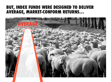
On the way to average

I designed the chart below for a sales presentation for an asset manager who is about to go on a roadshow to pitch a new investment fund to potential distribution partners. Yes, you saw that right, I did use a reflection effect.

SlideMagic: a platform for magical presentations. Free student plan available. LEARN MORE

Presentation design phases

Every presentation design effort goes through a similar process flow:
  1. Brainstorm of the content, sketching, scribbling
  2. Designing the big idea
  3. Creating the bulk of the content
  4. Small tweaks
You need to think about these phases when designing a presentation for a big deadline. Often, critical data for slides only becomes available at the very last minute. And most of the time, stakeholders only start to focus on the presentation in the last minute, and only when they see slides that are ready. The result: a lot of stress and sleepless nights. So what to do?

Early in the process, move from phase 1 to phase 2 and start crafting the critical slides that convey the most important ideas of your presentation, with imperfect data, maybe even without data at all. It forces senior management to get out of the blah blah blah zone, and gives specific input on the story line. When phase 2 is completed, nobody will be nervous anymore that the project might not come up with a good end result. Everyone is calm.

I find that a long-hand story board written in a word processor is equal to phase 1.5: people will react to it and give input, but when you turn that into slides, the whole thing can go upside down again. Push for phase 2 early, and do not get stuck in 2 pages of bullet points.

Now the bulk of the sweat work is phase 3. There is no reason to postpone that to the last night, you can prepare 98% of most business presentations with incomplete data.

With these preparations you are just left with phase 4 at the very last moment in the project. These changes can be done on auto pilot with the creative brain asleep at 3AM in the night.

SlideMagic: a platform for magical presentations. Free student plan available. LEARN MORE

Look serious

It is difficult for a startup to sell to a big company. Even if your solution is really innovative, large companies prefer to work with financially stable, large companies.

The look and feel of your sales presentation can add to that nervousness in the under belly of a big-corporate purchasing officer. Looks to avoid:
  1. Amateurish layouts with childish colours and water cooler fonts such as Comic Sans.
  2. Overly cute, touchy feely, retro look and feel, especially when selling in a male-dominated corporate culture (sorry).
Now we all know that the a slick visual deck full of stories and very little text will do great in these meetings (option 3), but, there is one surprising other option (4): the big corporate, lots of bullet points, serious, boring slide deck. Purely from a look and feel perspective, you will fit right in with all the other technology vendors, unlike option 1 or 2.

If you cannot pull off option 3, option 4 is still preferred over option 1 or 2.

SlideMagic: a platform for magical presentations. Free student plan available. LEARN MORE

16:9 layout

The 16:9 format was invited for movies not for presentation slides. Over the past 500 years, there is hardly any print work in a wide 16:9 format. Text that spans a wide column is hard to read, and most diagrams, paintings, visual concepts are more square than rectangular.

If you want to design slides in a 16:9 format you could consider breaking some of the slide design conventions. Examples: putting a multi-line slide header at the top left or even bottom left of your slide, saving up valuable vertical slide real estate. Or maybe even simpler: leave a lot of calming white space on the left and right of your slide.

SlideMagic: a platform for magical presentations. Free student plan available. LEARN MORE

The big picture first

Doing the product spec slides of your sales presentation is relatively easy. The big picture, how you position yourself versus the competition is harder. It is tempting to start with the easy bits and worry about the difficult things later. Still, I suggest to take on the positioning first since all other slides will depend on it. Moreover, it is the overall product concept that you are selling, not the features of individual products.

SlideMagic: a platform for magical presentations. Free student plan available. LEARN MORE

Imagine your audience - literally

Yeah, yeah, we know that our audience matters and we should take it into account, but in practice, most of us dive straight into designing the slides.

Thinking of your audience is especially important for sales presentations. I have had a few clients situations where I was asked to help design decks that are used by a sales force that targets small business owners.

In those cases I actually imagine the actual/real owner of a restaurant or pharmacy who I have seen recently and wonder what it would take to convince her.

SlideMagic: a platform for magical presentations. Free student plan available. LEARN MORE

Market research lingo

Questions in market research surveys are long and wordy, partly because you need to make it unambiguously clear to your participants what you want them to answer, and partly because marketeers want to put their own language into the mouth of consumers (see a previous post).

When presenting the results of market research I often chop down these sentences to the bare essential. It makes them easier to digest. A small footnote sends people to an appendix where they can read the full prose.

SlideMagic: a platform for magical presentations. Free student plan available. LEARN MORE

Technology lecture vs value pitch

Two approaches to pitching your product. I prefer #2
  1. Engineering approach: explain the layered product architecture and the solution process, and after this theory lecture you can make a perfect logical case about why your product delivers this great value to your customer.
  2. Customer-focussed approach: highlight the big issues the customer has (to get that nodding head), go through the benefits that your solution offers and only hint at the technical magic that allows you to deliver them. If the customer is interested, you can do pitch #1 in a second meeting.

SlideMagic: a platform for magical presentations. Free student plan available. LEARN MORE

Project pictures

Many business presentations contain pages with images of projects: real estate, solar farms, factory installations. Usually, they are small, low resolution, many on a page, and backed up by a dense paragraph of explanation.

To make your presentation look better: do the opposite. Stretch them across the full page, use high res images, use 1 image per page, and set a brief explanation text over the image.

The audience will not notice that you clicked through 7 slides when discussing your project portfolio. For them, it is just one slide.

Another way to show off your portfolio is to use the images throughout the presentation on separator and title pages that mark the beginning of a new section in your story. So, you have 1 image on your portfolio slide with the explanation that is 1 of 35 buildings. The audience gets a sense of the other 34 throughout the presentation without talking directly about them.

SlideMagic: a platform for magical presentations. Free student plan available. LEARN MORE

Amateurish format or no format?

It requires some skill to get a presentation to look professional. And when you are a boot strapping startup, I think most investors will forgive you if you did not have time or money to get your investor slides look completely perfect. You decided to put your effort elsewhere, rather than spending it on PowerPoint looks.

So, the bare PowerPoint template with a tiny logo on the bottom right looks, well, bare, but you could still say it is professional, sort of. Worse is when you put in a lot of effort and the results do not look good:
  1. Clashing colours
  2. Too childish, or too cute for predominantly machine/male investors
  3. Tacky, cheesy stock images
  4. Super complex gradients and other template graphics that take over 50% of the slide surface
No format works for an early stage startup investor pitch with a good idea, it will not work in a sales presentation though. 

SlideMagic: a platform for magical presentations. Free student plan available. LEARN MORE