"We should add a few extra bullets"

"We should add a few extra bullets"

The time of a presentation is finite. You have 20 minutes, not more. So, if you discover that you did not address a certain issue, message in your presentation, you can only add it at the expense of other content.

Just "adding a few bullets about it on page 12" will have 2 implications:

  • Your extra point will not be made, because it does not feature strongly enough in the presentation
  • The power of whatever was already on slide 12 gets diluted by the extra visual clutter or more text

If it is an important point you need to make, make it at the expense of another. If it is not important, don't bother putting it in. Squeezing does not result in great presentation designs.


Art: Paolo Veronese, The Wedding at Cana, 1562

Click here to subscribe to the blog

SlideMagic: a platform for magical presentations. Free student plan available. LEARN MORE
Useful presentation design tools and resources

Useful presentation design tools and resources

As most of my clients outside Israel are enjoying the X-mas break, I have some time to clean up my web site further (no holiday here in Tel Aviv). I added a bunch of presentation design resources on the site.

  • Presentation design books. The flurry of new presentation design book releases seems to have faded a bit over the past years. Has all that needs to be said, been said, or did I miss anything?
  • Presentation design tools. A few neat software tools that can make the life of a presentation designer easier.
  • Sources of presentation images. There are more and more sites out there that offer free stock images under a creative commons license. These images are free, look real, BUT the library sizes are still small, and search is limited.
  • The blog search archive. Now that I moved away from Blogger, it is harder to add sidebars with search boxes, archive links, and tag clouds to the blog. Hence, the dedicated search page for access to 6.5 years of posts (more than 1700 in December 2014).

I hope you find it useful, and let me know suggestions to add more resources.


SlideMagic: a platform for magical presentations. Free student plan available. LEARN MORE
Happy holidays! (2015 versus 2010)

Happy holidays! (2015 versus 2010)

Here is my happy holidays post from December 2009, 5 years later, it is still highly relevant. Happy holidays!

I would like to wish all readers happy holidays and a healthy and prosperous 2010. From a presentation perspective, try to make a difference in 2010, for example:

If you are working in an organization with a conservative approach to presentations, try to find an opportunity to demonstrate a different way to get your message across, spreading the ideas we talk about here to more people.

If you are a professional presentation designer, consider donating some of your time to a really important cause and design the best possible presentation for it.
— http://www.slidemagic.com/blog/2009/12/best-wishes-for-2010.html

Art: Pieter Breugel the Elder, 1565, Hunters in the snow

Click here to subscribe to the blog

SlideMagic: a platform for magical presentations. Free student plan available. LEARN MORE
New SlideMagic features

New SlideMagic features

Over the past weeks we have quietly updated SlideMagic. Some workflows will go faster now (you can now change another shape without having to back to the main menu bar, you can drag and drop in story mode), and some bugs have been fixed. There were 2 bigger features deployed a few days ago.


Automatic flipping to a dark background (and back)

Working with limited colour combinations has its advantages: your slides will always look great. But it allows us to do other things as well, we can automatically convert your presentation to a dark background (on click) to make it more suitable for larger audiences where you do not want the speaker to be overpowered by a huge white screen. Once you are done, -click- and you are back to conference room friendly white.


Image manipulation

Most presentation design software is loaded with image manipulation functionality, including the ability to stretch and distort the aspect ratio of a photography. SlideMagic only offers the image manipulation you need most: a horizontal flip, blurring, and black and white conversion. All of which are reversible.

Personally, I use the B&W conversion a lot. Wherever I can, I prefer working with black and white images.


Art: Maarten van Cleve, Kitchen Interior, circa 1565

Click here to subscribe to the blog

SlideMagic: a platform for magical presentations. Free student plan available. LEARN MORE
How to pitch a VC, according to VCs...

How to pitch a VC, according to VCs...

There is no better person to get VC pitch advice from then the people who sit at the receiving end of your presentation. Here are startup VC pitch suggestions from a few well known people in the industry. Click on the image to see what to they have to say.


Mark Suster, Upfront Ventures

Mark Suster, Upfront Ventures

Dave McGlure, 500 Startups

Dave McGlure, 500 Startups


Paul Graham, Y Combinator

Paul Graham, Y Combinator

David Rose, angel investor

David Rose, angel investor


Reid Hoffman, LinkedIn

Reid Hoffman, LinkedIn

Vinod Khosla, Khosla Ventures

Vinod Khosla, Khosla Ventures


SlideMagic: a platform for magical presentations. Free student plan available. LEARN MORE
Lawyers, politicians, doctors, priests, and corporate executives...

Lawyers, politicians, doctors, priests, and corporate executives...

...They all have their own traditional language. Complicated contracts, evasive and woolly statements, illegible prescriptions, religious books only written in Latin, and bullet point-filled PowerPoint presentations full of jargon and buzzwords. These languages were formed by tradition, and some may argue are here to protect a profession (who needs a lawyer when you can seal agreements with a simple paragraph?). 

And yes, I put business presentations in the same category. Change is already happening. Formal letters are replaced by short, informal emails. The woolly Microsoft Word long hand memo was replaced by PowerPoint bullets. And for very important presentations (1% of the total?), businesses start investing in visual, custom designed, presentations (the work I do under the Idea Transplant name)

But change can go further.  The other 99% of business presentations can be different as well. These documents do not have to be graphically stunning, loaded with the latest animation and zooming effects, or full of exciting video clips. They need to look good, and they need to have a clear, crisp, direct, visual language.

It requires a change in the corporate language that corporate executives are using. And making that change is hard. Requiring a new complicated piece of software for it would kill the change before it even starts. The idea behind my presentation design app SlideMagic is to stop comparing business language to that used by lawyers, politicians, doctors, and priests...

Art: Benjamin Ferrers, The Court of Chancery during the reign of George I, circa 1725

Click here to subscribe to the blog

SlideMagic: a platform for magical presentations. Free student plan available. LEARN MORE
Your own style

Your own style

After years of design work, many of my presentations start to develop a similar signature style or look-and-feel. (Secret: it looks remarkably close to the templates in SlideMagic). I think there is nothing wrong with that: you can easily recognise the work of famous poster designers, painters, architects. Presentation designers should be no exception.

I would encourage you to find your own signature style. Once you have figured out a distinctive way to make any chart look good, you are free to focus on its content. No need to worry about fonts, image crops, data chart layouts, and all the time to worry about composition, content, what image to put and what data to visualise.

Art: detail of Gustav Klimt, The Kiss, 1908

Click here to subscribe to the blog

SlideMagic: a platform for magical presentations. Free student plan available. LEARN MORE
Big data overload

Big data overload

"Big data" is fashionable right now and many startup pitches emphasise how if an investor wants to put dollars in big data, this company is the best place to do it. Visualisations look similar: a big spaghetti of lines enters a box and out comes a super insight. The traditional IT-way of visualising the world: everything fits in an architecture diagram.

The problem: all these decks look and sound the same.

Architecture diagrams that describe the technology in a top down view are not always the best tools to pitch business ideas. The other approach is bottom up, story, and case example driven. Take one specific insight, and work your way through the system and show how it was produced. Super detailed, super specific, and super real.

Once the audience is convinced that this one microscopic case example works/is brilliant, they will have no problem believing that it works for the other 5 billion possible use cases. And in the process, they are convinced that you did not just slap the label "big data" on your pitch because it is the latest fashion.

Art: Jackson Pollock, Autumn Rhythm, 1950, image by Matthew Mendoza

Click here to subscribe to the blog 

SlideMagic: a platform for magical presentations. Free student plan available. LEARN MORE
There are 3 types of presentations

There are 3 types of presentations

The more I think about it, I can see three different types of presentations:

  1. Stage show
  2. Cold call
  3. Decision document

The stage show

A live, stand up presentation where you introduce an audience to a new idea for the first time

  • Big, stage-setting images (a place, a product, a person)
  • Highly simplified data charts with just one, really one, message
  • Place holder slides (either empty or with a few words)

Note the charts that are absent in this overview:  generic bullet point lists (you knew that already), but also pointless images with visual concepts that can be explained better verbally (no need for the squished tomato to stay that things are tough). Big agenda slides and presentation structure slides might put your audience to sleep early on. If the audience has to be reminded via tracker pages where they are in the story all the time, your story is probably not clear enough.

Cold call

Usually an email attachment or a link to a web site that needs to grab the attention of the recipient who is not neccessarily interested in your idea. The slides will typically be the same as the ones that are used for a stage show, but with a crucial modification: there needs to be a clearly written explanation because you are not present to tell the story behind the slides.

You need to encourage the next page down click, so including big, dense, boring, text slides early on in your document ("we need to say everything on the first 3 pages!") is likely to encourage your audience to abandon ship early.

Note that I suggest creating slides with "subtitles", small boxes with point 12 text that explain the slide's idea in full, long sentences. I have not seen many (if any) of those around. That is the reason that SlideMagic ships with an explanation panel that can easily be switched on or of. 

DECISION DOCUMENT

This is a document that contains a plan, a budget, a strategy, etc. that needs to be agreed upon among a number of people. Multiple versions of the document get sent around. The document might be presented in a number of meetings, but the audience has seen the material before. The presentation is more about discussing changes and getting people to agree.

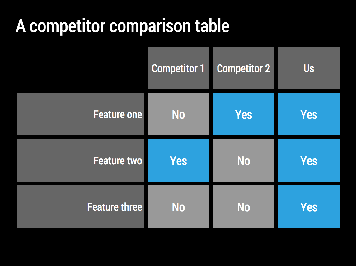
Typical slides are dense tables, diagrams, Gantt charts, and data charts. Data charts could highlight multiple messages and trends. They are clear, but require a bit of time to understand. Over time, the audience group acquires a common language, where cryptical names for scenarios or strategies ("green field", "organic", "frontal attack") become meaningful abbreviations for complex ideas.

Note that including powerful/stunning/amazing visuals does not add much to an audience who more or less understands what you are talking about and is worried with deciding how much budget to allocate for marketing next year

Where do things go wrong?

The most important error: use the wrong slides for the wrong occasion. Decision document slides won't work for a stage show. Stage show slides will not get your 2015 budget approved. Sending stage show slides without explanation will have people wondering what it is you want.

Another mistake: go in between. Your bullet points are too dense to create a nice stage show slide, but too vague to explain exactly what decision you want from your Board of Directors.

* * *

Be aware what sort of presentation you are designing.

P.S. The artwork (Between Rounds, Thomas Eakins, 1898) reflects how many designers of decision documents will feel after three rounds of comments.

Click here to subscribe to the blog

SlideMagic: a platform for magical presentations. Free student plan available. LEARN MORE
Going back in time, some popular posts

Going back in time, some popular posts

I have spent a lot of time over the past day redirecting URLs, mapping deep links, moving Disqus comments, rerouting RSS feeds. I noticed that some very old posts (going back to 2008) still get a lot of traffic, and most of them are about PowerPoint tricks, rather than philosophical posts about the future of pitching ideas in business.

Here are some popular links:

P.S. In case you wonder about the 4:05 background image, it was taken from the 24-hour movie "The Clock" by Christian Marclay.

In order to respect the concept of Christian Marclay's work, spectators are kindly requested to play this video a 0.04 pm, local time. If time is passed, please wait for tomorrow or another day same time. Thank you.

SlideMagic: a platform for magical presentations. Free student plan available. LEARN MORE
Design is detail

Design is detail

In management, being detail-oriented is not the behaviour that is considered good. Detail-oriented people get lost in tangents, loose track of the big picture, cannot focus to make decisions. Saying that you are not afraid of detail in a job interview will cost you points.

I think it all depends. Yes, staying stuck in unimportant tangents is not helpful, but when it comes to design, it is all about the detail.

You see this now best in mobile application user interface design. The screen is so small that you need to worry about every button or item you put in front of the user. I personally went through this experience when designing SlideMagic.

But slide design is the same. It is actually helpful to think of your slide as a visual on the screen of a mobile phone. This is sort of the perspective of an audience member who sits in the back row. Everything you put on the slide, everything, should be thought through:

  • What words to use in the text box, can you cut more without losing the meaning, do you need to add more because it is too vague?
  • The rounding of the data
  • The order of the bars in the bar chart
  • The order of the columns and rows in a table
  • Are there duplicate messages? Does a text box say the same thing as the title?
  • Do we need icons, or shall we call customers, well, customers?

All the detail will add up to a great slide that gives the big picture.

In case you wonder about the close up of Vermeer's painting "The Music Lesson", find out more here about Tim Jenison's attempt to recreate the Vermeer master piece using a lens, "accusing" Vermeer of being a very early photographer, rather than a painter.

SlideMagic: a platform for magical presentations. Free student plan available. LEARN MORE
Should you use an attachment when emailing an investor?

Should you use an attachment when emailing an investor?

The answer: yes, I think investors love to double-click an attachment, but they should not be doing it because they gave up on reading the uninspiring cover letter.

Many cold investor emails make a couple of mistakes:

  1. Non-descriptive subject line
  2. A cover letter in the body text that is far to long, full of buzzwords, and vague about what next step you actually want
  3. As an attachment, the full investor presentation, or maybe even the full business plan

Remember what your objective of a cold investor email is: not landing the investment, but creating the opening for the next interaction (probably a phone call). So:

  1. Use the space you have in the subject line to make sure your email gets opened ([x] suggested I contact you
  2. Write a very short and to the point "cover letter" (a few sentences) in which you explain what you and hint at why it is a great business opportunity. Ask what you want to achieve (a phone call?)
  3. Attach a few highly visual slides that focus on what would normally be the opening of your full investor presentation: a rough description what you do, a reminder of the pain you are trying to solve, and the brilliant solution.

Click here to subscribe to the blog

SlideMagic: a platform for magical presentations. Free student plan available. LEARN MORE
Brand juggling

Brand juggling

Over the past years I have changed my brand and blog look and feel many times over. Axiom One was the legal name for the management consulting firm I set up (found it by browsing a dictionary, hence the letter "A", I liked the meaning of axiom, which is a mathematical foundation that cannot be proven but a required building block to build entire theories about the universe. 

Then came the blog with "Slides that stick", and moving to "sticky slides", designing slides that would not instantly be forgotten but stick in the mind of the audience. Slowly I focussed less on my strategy consulting business (I would always be a low cost alternative to a larger firm), and started building a reputation in business presentation design, an area where I could aspire to be one of the best in the world.

Idea Transplant was a name that covered my work (doing serious, often highly confidential presentations) better than "sticky" which has some negative connotations. The honey was replaced by artwork (I love the Dutch masters and the impressionists). Idea Transplant will continue to be the brand for my bespoke presentation design service offering. 

Idea Transplant is not the right name for my business presentation design app which I named SlideMagic. It is a functional name that people can remember, recreate when they hear/read it. I am not totally convinced that it is the best name for the concept but I focus all my investment in building the product right now and save splurging on marketing later (SlideMagic is 100% self-funded at the moment).

The blog and my presentation design book Pitch It! (now free to read online), will move to the SlideMagic side to build as much traffic as possible to support the new app. 

Apologies for the brand confusion and thank you for joining the journey with me.

Click here to subscribe to the blog

SlideMagic: a platform for magical presentations. Free student plan available. LEARN MORE
Introverts and fear of public speaking

Introverts and fear of public speaking

Being an introvert and being afraid of public speaking are 2 different things.

Introverts find it hard to engage in small talk, introverts think before they speak, introverts do not enjoy loud crowds, let alone trying to make yourself heard in them.

But, introverts can be great public speakers. On stage, there is no small talk, but the real substance of your presentation. People are quiet and listening to you. The perfect spot for an introvert to shine.

Click here to subscribe to the blog

SlideMagic: a platform for magical presentations. Free student plan available. LEARN MORE
Rows or columns?

Rows or columns?

When designing a table there is always the question: which dimension to put in rows, and which in columns. Personally, I do what looks best, without applying any specific rules.

  • If one dimension has labels that are very long, I prefer to put them in rows
  • If one dimension has lots of data points, I tend to put them in rows (16:9 screens give more flexibility for wide designs though)
  • Years usually go in columns
  • Big options (1, 2, or 3) usually go in columns
  • Ranking different values usually is better vertically, it is easier to compare a column of numbers than have your eyes move across a row of numbers.

Art: Lyubov Popova, Air, Man, Space, 1912

Click here to subscribe to the blog

SlideMagic: a platform for magical presentations. Free student plan available. LEARN MORE
The truly new idea

The truly new idea

When I was a still a junior consultant at McKinsey, one of the senior partners on a team I was working on said that most consulting projects really generate only one truly original new idea/insight. The rest of the hard work is not really that original (1% inspiration, 99% perspiration as Thomas Edison put it)). Still, that one insight usually drives the entire recommendation.

At McKinsey, these truly new ideas were often the result of a novel way of combining facts/data sources for the first time and/or being able to quantify/compare things that nobody thought could be quantified.

Looking back at presentations and pitches I have worked on, the on truly new idea concept probably holds. Use it in your presentation design. Facts, and logic flows that everyone is already used to/knows are not interesting. It might be better to go quickly to that unexplored territory that you discovered.

SlideMagic: a platform for magical presentations. Free student plan available. LEARN MORE

Text on 16:9

Many people think that the wide screen 16:9 format looks modern for presentations, a slide fills the entire LCD screen, rather than being framed by 2 black bars or worse: stretched/distorted while you cannot find the screen remote in the conference room.

There is a problem though. Widescreen was designed with movies in mind. For text it is a disaster. Even at a decent font size, there are too many words on a single line, it is hard to follow for the eye.

Solutions:
  1. Even bigger fonts
  2. Rather than list things vertically, try putting them in boxes that are horizontally spaced out
  3. Stick to 4:3 and find that sticky, dusty, old, remote control in the conference room (look for the ASP button)

SlideMagic: a platform for magical presentations. Free student plan available. LEARN MORE
My book can now be accessed free on the web

My book can now be accessed free on the web

To support the launch of the SlideMagic presentation design app I have started to remove the paywall for my book Pitch It!, you can read it here.

I am making slow progress because it requires a rewriting and reformatting of the content. First there was the iBooks version written in iBooks Author, then the PDF version written in InDesign, and now I am converting the content to HTML using squarespace.

Web templates have moved a long way over the past 2 years. The squarespace version looks as good, if not better, than the iBook version. I have all the freedom to design interactive content, and the adjustments between wide screen, iPad, and mobile phone are phenomenal. No app stores, no pass words, just click the link and you are in on any device.

This says something about the blurring of visual communication formats beyond the slides used in a stand up presentation. Scrolling down on a tablet is much more intuitive than clicking through slides (part of the reason why in SlideMagic things are fluid). Like reading a magazine or a newspaper, there is value for big picture, wow visuals, and a 12 point story here and there. A big bold chart and a detailed diagram. Maybe a nice magazine-style website behind a password is a better to present your idea than a PowerPoint attachment?

I can now also take the opportunity to update the content of the book, some of which has become a bit stale since December 2012 (and the biggest missing piece of information is SlideMagic as a credible alternative to PowerPoint and Keynote of course!).

SlideMagic: a platform for magical presentations. Free student plan available. LEARN MORE

Let's eradicate PowerPoint 2003

PowerPoint 2003 still uses the old MS Graph chart engine, and while PowerPoint 2003 probably does not run on any computer anymore, the slides created with it continue to live on. In many corporates, the same slides keep on getting updated with new numbers, sometimes for more than 10 years in a row.

So, in today's PPTX files we still see leftovers of MS Graph charts, almost like virus infections. Depending on the computer and software you are running, some of the following can happen:

  • Random resizing of charts
  • Random re-coloring of charts
  • But worst: a total crash of PowerPoint and loss of data

Here is the instinct I developed and I encourage you to do the same upon noticing an MS Graph chart:

  1. Hit save in PowerPoint
  2. Copy the slide with the virus
  3. (Shivrrrrr), right click and open the MS Graph in the duplicate
  4. Go to the data tab and copy the data in a blank excel sheet
  5. Hit save in PowerPoint
  6. (Pfffew) recreate the chart from scratch
  7. Hit save in PowerPoint
  8. Delete the MS Graph slides
  9. Hit save in PowerPoint

With a bit of help from all of you, PPT 2003/MS Graph charts should be eradicated in 5 years or so.

SlideMagic: a platform for magical presentations. Free student plan available. LEARN MORE

3 things with 3 things each

Management consulting stories are always divided in 3 or 5 components (optimally starting with the same letter), and each of these is then divided into 3 sub components as well.

Connect, communicate, control. And to achieve connect we need to aggregate, accumulate, and accelerate. This works reasonably well in documents for reading (if the verbs are chosen meaningfully and not using a dictionary looking for words starting with C).

Verbal pitches are a bit different though. A human, person-to-person story is flatter, more linear. It is hard to go up one level, down to the second point if we do not have the hierarchical structure in front of us. Also, using too many words that start with a C make you sound like a consulting report, not like a genuine speaker.

Listen to yourself: if it sounds wrong it probably is wrong.

SlideMagic: a platform for magical presentations. Free student plan available. LEARN MORE