The future of the PC

The future of the PC

Technology analyst Ben Evans was pondering the next possible revolution in computing platforms: the PC, the smartphone. This triggered me to give my thoughts about the future of the desktop or laptop computer (I will call them PC). I posted a quick comment, but will elaborate here a bit more.

It is important to separate device from the usage setting. There will always be a need for a creative, focussed work environment to capture your ideas. I do not think that we will ever witness the moment where we can do serious design work on the go on a small device. Creative means, focus, concentration, and an organised clutter free spacious environment.

No, smartphones and tables (current screen sizes) are not going to be the dominant platform for design work (that is why I am launching SlideMagic for bigger screens first).

Having said that, the PC as we know it could totally change. Design work requires some form of big visual interface, and some form of human-machine interaction. What is in between can be completely different from the form factor that we know today.

Technology might advance to such a level that all PC-type processing power, storage requirements, and power supply can easily fit in a smart phone-sized device. And I think that is the future. Everyone carries one piece of hardware with them that contains these functions, but also serves as a wrapper for our security credentials.

Screens could evolve drastically (remember that touch screens were the big driver behind the smartphone revolution). We could see very large tablet style devices for design work. But maybe e-ink technology will enable the creating of super thin, super light, paper-like foldable screens The same is true for keyboards and mouse controllers. Maybe that same screen can spread out in front of you and creates a combined input device and visual screen for your work?

Screen innovation should go along software user interface innovation. Many of today's productivity tools are still based on old working practices. Mouse-based drawing, type writer-style keyboards. 

SlideMagic is already working to innovate the user interface. Now the screens need to follow suit.


Art: Georges de la Tour, The Cheat, 1630

Click here to subscribe to this blog

SlideMagic: a platform for magical presentations. Free student plan available. LEARN MORE
The difference between presenting and showing

The difference between presenting and showing

Sometimes, I still put slides in a presentation despite the fact that they are far too busy to be presented. Rather, these slides are there to be shown. 

  • A busy Gantt chart shows that we are completely on top of things and know exactly what we need to do the next 3 months
  • An endless list of filed patents shows that our IP is rock solid
  • Positive customer comment after positive customer comment makes that point that we are doing something right in customer service
  • A really complex IT architecture that shows how clever the technology is

It is important though to spoon feed the audience what you want them to take away from the chart that is shown to them. You need to write the correct headline, or put the right emphasis with a big circle and/or arrow on what they should be looking at.

Another approach is to design the chart in 2 levels. Level 1 is the level for presenting. Colour coding and grouping elements together gives the big picture message of the slide that can be picked up by a keynote audience. The detail inside the dots (level 2) is interesting for a viewer who reads the presentation on a screen at her desk. Level 1 is the keynote slide, level 2 is the ponder slide.


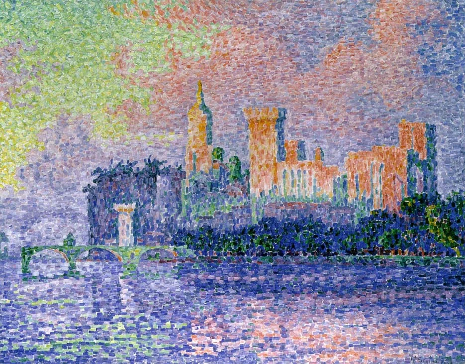
Art: Paul Signac, The Papal Palace, Avignon, oil on canvas, 1909, Musée d'Orsay

Click here to subscribe to this blog

SlideMagic: a platform for magical presentations. Free student plan available. LEARN MORE
Transitioning in and out of a movie

Transitioning in and out of a movie

The chance is high that when you are using a movie in your presentation, it is a fragment of a longer feature film that you cut out using iMovie or another movie editing software. Make sure to create a seamless transition between the movie fragment and the presentation.

The start. Someone who is watching the full length movie has gone through the process of transitioning into the movie story. Usually the director will take you there slowly, step by step. The presentation audience lacks that context. Landing them straight into that massive shootout scene at minute 14:49 will create confusion, and requires 30 seconds or so to grasp what is going on, and during that time they are probably not paying attention to that critical punch line that you want them to hear.

What can you do? Carefully select your cover image of the movie. It does not have to be the first scene, it can be a frame that comes later in the movie, or even a frame that is not part of the scene you selected. Do not set the movie to autoplay, but take a few seconds to tell the audience "where they are going next".

The end. A cut out movie fragment often has an abrupt ending. Again, dampen the transition by putting another image at the end of the sequence that gives you the opportunity to lead the audience back into the story of your slides.


Art: David Hockney, A Bigger Splash, 1967. Image: Ian Burt.

Click here to subscribe to this blog

SlideMagic: a platform for magical presentations. Free student plan available. LEARN MORE
Not every presentation slide needs an image

Not every presentation slide needs an image

Yes, visual slides with stunning images are more powerful than boring lists of long bullet points. But that does not mean that designing good presentations is the equivalent of finding a stunning image for every page (sorry).

  • A powerful quote can look beautiful on its own, in naked typography. The image of the person might distract the audience, especially if it is a relatively unknown author of an airport book best seller.
  • A simple information slide (here are the 3 priorities for next year), but just be best visualised with a simple list of 3 priorities. 
  • Section breaks can be done in 2 ways: a dramatic visual to show the transition, or an almost blank page that brings the attention of the audience back to you
  • It is very hard to find dozens of images that are more or less similar in style or look and feel. As a result, presentations with lots of images look inconsistent.

It does require though that you find a way to make a typography-only slide look good. A nice full colour plain background, and some elegant stealing from the Swiss graphics design masters in the 1960s is a good way to start.


SlideMagic: a platform for magical presentations. Free student plan available. LEARN MORE
Another free stock image site

Another free stock image site

I only now discovered startupstockphotos.com, a site with creative commons images of workplaces with a startup feel to it (aero chairs, lofts, Apple laptops, wooden tables). They look great! I added this source to my list of sources of free stock images.

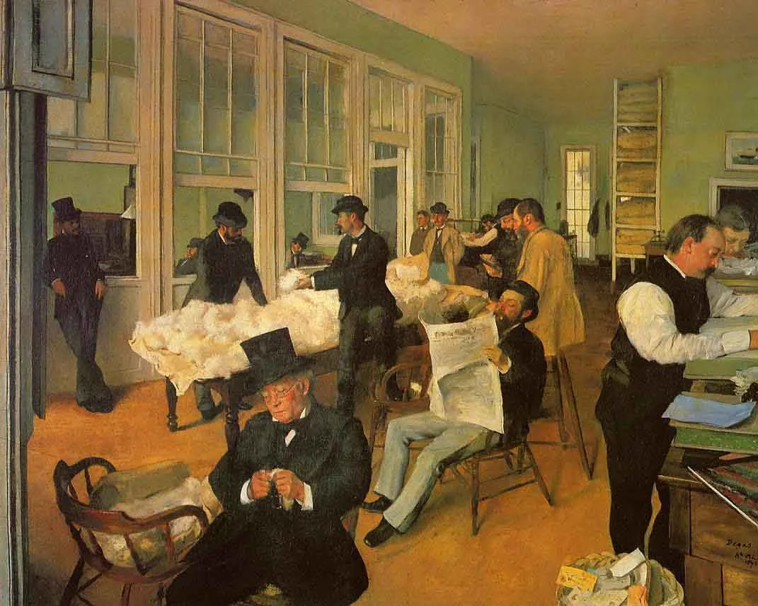
Art: Degas, The Cotton Exchange, 1873

Click here to subscribe to this blog


SlideMagic: a platform for magical presentations. Free student plan available. LEARN MORE
When to use tracker icons on presentation slides

When to use tracker icons on presentation slides

Consulting presentations often use a little icon on the top right corner that is a miniaturised version of some framework. As you click through different sections of the presentations, another part of the icons gets highlighted. The "tracker".

When to use, and when not to use a tracker?

  • Your short 20 minute pitch should be such an exciting naturally flowing story, that trackers should not be necessary, at least not on every page. If you feel that you need to remind the audience of where they are in the story, use full-page repeats of the framework, with different sections highlighted
  • In very long presentations, and especially presentations that are intended for reading, a tracker can be useful. The tracker has more of a reference function. Keep your finger on page down and stop when the right part of the icon gets highlighted. In these cases, keep the tracker really, really, small to minimise the damage to screen real estate.

Often you might find that early on in the design process you feel a need to use trackers (because you do not understand the story structure very well yourself), and as you progress, your confidence to take the trackers of increases.


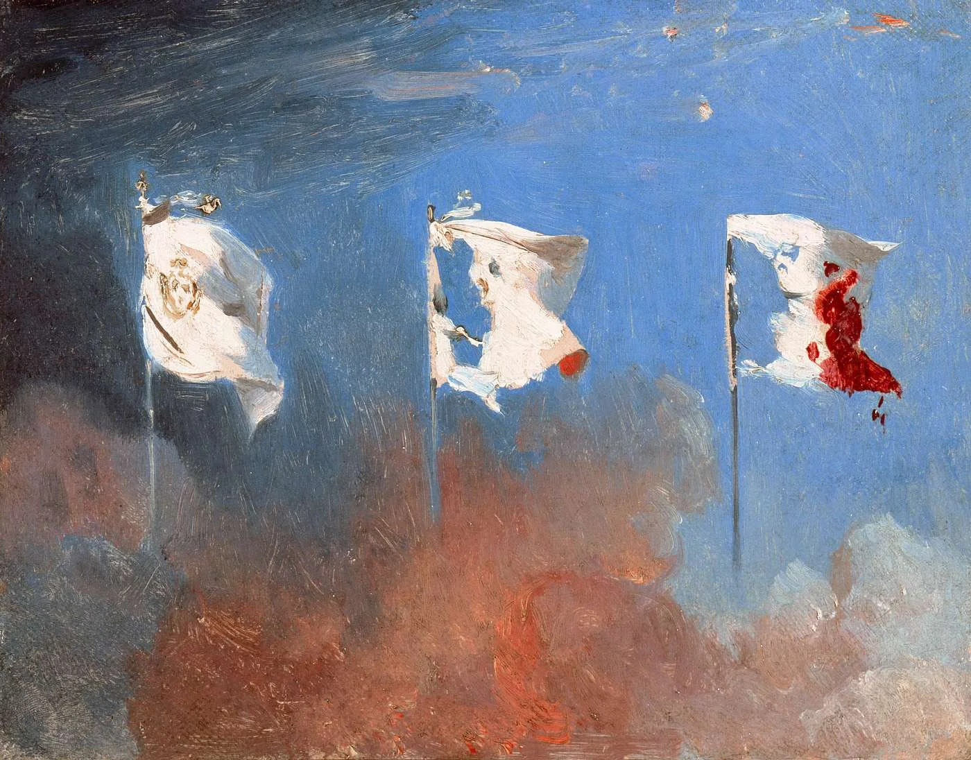
Art: Léon Cogniet, oil sketch for details of Scenes of July 1830

Click here to subscribe to this blog

SlideMagic: a platform for magical presentations. Free student plan available. LEARN MORE
Adding a bit of humour to annual kick off presentations

Adding a bit of humour to annual kick off presentations

January is the month of sales kick off events in companies (I see it in the Idea Transplant client inquiries). These presentations are usually for a very large audience, and are pretty important because they set the tone what the company will be doing for the next year. The good thing is that the audience is internal to the company, so you can encourage the speakers to take a bit more risk with the content than they would be doing for an external audience.

One challenge is to add a bit of humour and inspiration to all the sales target data. What used to be innovative a couple of years back (I am guilty myself as well) has become outdated and cliche:

  • (Random) inspirational quotes from famous people
  • (Random) inspirational quotes from business best seller authors
  • (Random) inspirational quotes from social media experts
  • Low res pictures of slap stick-type scenes that are forcefully linked to one of the concepts in the presentation
  • Cheesy stock images of people in suits (usually men) staring into the future, pondering whether to take the left or the right turn, pictures of applause, well, you have all seen them.

What to do differently? It is hard to say, but here are some pointers of what you can do.

I love it when presentations have an overall visual theme to it. It can be a movie, it can be an era (the 1950s), it can be a place, it can be an inside joke, something that happened in your company over the past year, it can be sport you enjoy, it can be a central analogy you are using in your presentation, it can be art (pssst, see my blog).

The advantage of the a theme is that all of a sudden all visuals can have some sort of consistent look. They appear to be similar and related. You all of a sudden have an infinite supply of visual material available to you. And also, it all of a sudden becomes a lot easier to put quotes and statements against a comic background. A bone-dry 2015 strategic goal repeated on a slide with an unexpected background image on the next page gives a nice opportunity for the audience to relax a bit. And all of this does not look or sound forced.

Try it!


Art: Frans Hals, The Lute Player, 1623

Click here to subscribe to this blog

SlideMagic: a platform for magical presentations. Free student plan available. LEARN MORE
"Here is where I always stop..."

"Here is where I always stop..."

If you find yourself interrupting your story flow repeatedly at a certain point in your presentation, it is probably time to review the story line. Why not create visuals that support that important breaking point in the presentation?

Most story flows start with a logical sequence/structure, but sometimes we find out in the dialogue with the audience that they are missing an important piece of data or background early on in the story. After 10 runs of the presentation, and 10 questions, we pre-empt the question the 11th time.

Break the logic to build the story.


SlideMagic: a platform for magical presentations. Free student plan available. LEARN MORE
Does your presentation need video?

Does your presentation need video?

Should you include a video in your investor presentation or sales presentation? "Video" is a very generic term for different types of videos. Whether you need them depends on your specific situation.

  • An quick capture of a spontaneous 1-2 minute pitch can be a great way to convey your idea in a conversational style. In front of the camera, people are much more focussed and to the point than in a regular presentation setting. In case of an investor pitch, a short video can give a potential investor a good first impression of the management team without the need to schedule a face-to-face meeting
  • A 1-2 minute cartoon or product commercial is a lot more expensive and time consuming to make. If you use talented cartoonists and/or actors, a video can be a much more effective way to get your message across than via slides. Consider it when you can use the video for multiple occasions, your presentations, but also online to share it with a very large audience. Unlike slides, videos are very hard to change, so you need to have your messages completely nailed before you commit your investment. Some videos however make a point that could easily have been made in 2 simple slides. These types of videos give the best ROI when there is an unexpected twist or slightly or a slightly more complicated story to tell.
  • Costumer feedback is great to capture on camera. A "live" reaction of a real person is so much more impactful than a boring quote full of buzzwords on a slide. Customer interviews are not very expensive to make.
  • Some technologies require complicated 3 dimensional visualisations, very hard to do in presentation slides, very easy to do in a video. In many startups, these videos get used over a long period of time. To protect your investment, make the video as clean as possible without audio, or text and typography. You can still use your video when the story changes a bit. I use these clean videos a lot as sources of high resolution screenshots. Instead of showing the full clip, I take 3-5 screen shots and add comment boxes on slides.
  • Videos can be great to explain a problem and the corresponding solution if the props are a bit hard to bring to a meeting (nuclear reactor cleaning material for example). 

I have not mentioned in this summary the spectacularly animated product introduction video. A lot of noise, a lot of moving effects. Movie trailers are good to promote movies, but might not be the best investment when it comes to pitching business ideas.


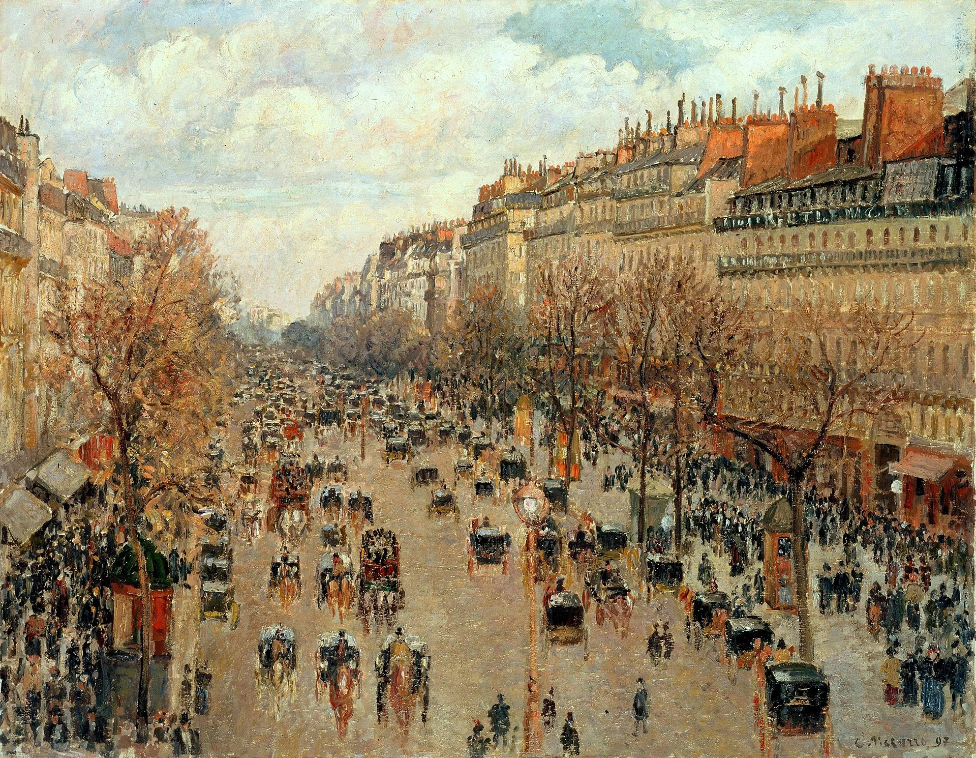
Art: Camille Pissarro, Boulevard Montmartre, 1897, the Hermitage

Click here to subscribe to this blog

SlideMagic: a platform for magical presentations. Free student plan available. LEARN MORE
SlideMagic is not Software

SlideMagic is not Software

I tend to look at it as a new business communication design language. When you give people simple building blocks they end up doing great things with it. Look at Lego. Look at Twitter. Constraints actually drive creativity.

I can see the confirmation that it works in the behaviour beta users. Advanced designers who are looking for the most advanced features miss certain functionality (but hey, check out that automatic light to dark background conversion). Some people are confused by the user interface which is radically different (read much more simple) than PowerPoint. But the user who makes a first effort to go through the dip and actually makes a presentation for real is hooked.

I could have written a book, created a training program, but I thought I would never get the reach that a web based tool could give. Hence the presentation design app SlideMagic.

So the ambition is not to remove PowerPoint from corporate desktops, it is bigger than that. The ambition is to change the way people talk to each other in business.


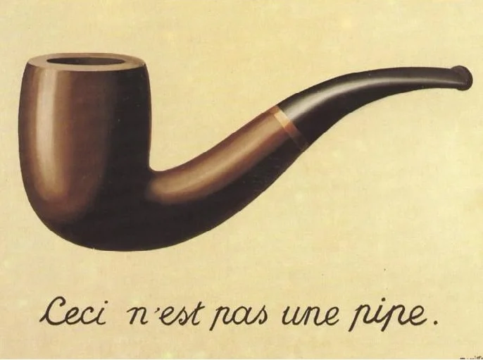
Art: Rene Magritte, La trahison des images, 1928–29, Image credit: Nad Renrel on Flickr.

Click here to subscribe to the blog

SlideMagic: a platform for magical presentations. Free student plan available. LEARN MORE
Over compensating

Over compensating

When a small startup wants to sell to a giant corporate, the startup's financial stability (or rather, lack of it) is often a big stumbling block. Spending slide after slide in your sales presentation about how financially stable and well-funded you are might just give the opposite impression. Maybe it is better to act and behave like a grown up company and the big corporate might just believe you (or "forget" that they are working with a fragile company).


SlideMagic: a platform for magical presentations. Free student plan available. LEARN MORE
Slide distraction

Slide distraction

The moment you click to a new slide, you will lose the connection with your audience for a moment.

  • Reading bullet point 1, 2, 3, and 4
  • Whoo, that is a pretty girl there in that picture, the colour of her sweater does not match her bag though.
  • Is that graph sales in billions? No, growth in percentages. OK
  • Why are these boxes not aligned? On purpose?

For a well-designed slide, this disconnect only lasts a few seconds. You glance at the visual, get the point, and move your attention back to the speaker.

But even for well-designed charts, I have heard the speaker going off track. The slide gets put up, and the speaker starts with an anecdote or a story (as every presentation expert is preaching to you to do), but there is a disconnect between the story and the visual. The audience is trying to make the connection between the blue square on the slide, and your anecdote involving 2 swans you saw when you were a child.

The solution is simple: quickly explain the big point of your slide (that blue square), and then feel free to wander of with your personal story.


SlideMagic: a platform for magical presentations. Free student plan available. LEARN MORE
The end of folder organization

The end of folder organization

The way I work with files is changing:

  • I stop organising downloads in carefully structured folder trees. If I need that bit of information again, I will find it again through search, or simply by sorting things chronologically. A time-based filing methods works actually pretty good over the course of 1 month
  • I use screen shots to move images between applications, rather than finding the image, importing, converting, resizing it.
  • For projects I am currently working on I create a folder that I pin to the left hand bar of the Finder (Apple's file manager), once the project is done the folder gets unpinned and disappears in the hard drive somewhere, only to be found via search.

Dropbox and Apple are trying to get me to give up version management by enabling file history. I do not use these features and use "save as" to create a new restore point for files, very 1990s.


SlideMagic: a platform for magical presentations. Free student plan available. LEARN MORE
Designing presentations for retina displays

Designing presentations for retina displays

Typographers had big debates when Apple launched the first iPads and iPhones with retina displays ("Retina" is the marketing name for a screen with such a high pixel density that your eyes cannot see individual pixels anymore). Retina displays are obviously different from low resolution screens, but - as the typographers discovered - are also different from paper/print.

I now see similar issues with large retina monitors. A traditional PowerPoint presentation with an Arial or Calibri font looks somehow off. You need lighter, thinner, crisper fonts. Macs have Helvetica light installed, but Windows machines not. Drop shadows look "dirty". Outlines around boxes look too heavy.

My guess is that Microsoft will fix the font issue in upcoming releases of Windows and Office products. But, if we fix the issue for computer screens, we are still left with this huge install base of crappy VGA overhead projectors in corporate conference rooms that never get replaced...

If you are working on a really important, one off, presentation find out about the screen you are going to present on and test your design. 


SlideMagic: a platform for magical presentations. Free student plan available. LEARN MORE
Presenting at a pitch competition: audience versus professional jury

Presenting at a pitch competition: audience versus professional jury

They are different. The audience will put more value on:

  • Entertainment value ("stunning" slides, unusual props, presentation style)
  • Emotional connection to your business idea (not-for-profit ideas do well)
  • Emotional connection to the speaker (is she sympathetic, an underdog taking on big bad forces in the world)
  • Whether they actually remember you after a long morning of pitches (most of the audience will not take notes)

The professional audience will put more value on the business potential of your idea.

Focus on the objective: winning the pitch competition, which is different than receiving a cheque.


SlideMagic: a platform for magical presentations. Free student plan available. LEARN MORE
The cover image that needs to say it all

The cover image that needs to say it all

The cover page of a presentation is an important page. It sits on the projector as the audience walks in the room. It is featured in the thumbnail of an email attachment. It sets the look and feel of your presentation.

Many clients want to have a cover page that says it all. A perfect image that reflects the entire story. In the absence of this image (99% of the cases), they want to do the next best thing: make a collage of smaller images that together tell the story.

I think it is better to pick just one, imperfect, image as a cover page. A collage of tiny images without explanation does not mean anything to the audience, and looks very cluttered. If people could get your message by just looking at a picture collage for 15 seconds, there would be no need for your presentation? 


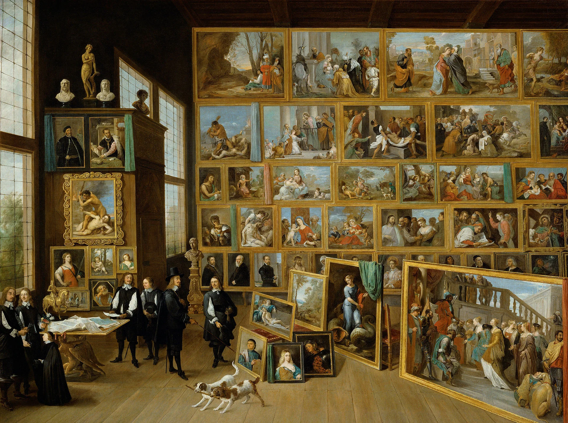
Art: David Teniers, The art collection of Leopold, 1651

Click here to subscribe to the blog

SlideMagic: a platform for magical presentations. Free student plan available. LEARN MORE
Missing: presentation skill teaching in schools

Missing: presentation skill teaching in schools

Presentations have become incredibly important in business:

  • It is harder to stand out to sell stuff. Fifty years ago, people would buy products from local, familiar suppliers. Now companies buy from suppliers across the globe.
  • The amount of new ideas is proliferating. Fifty years ago, you learned how your industry works and then spent 40 years working in it. Now, technology and creatively linking multiple disciplines give an endless flow of new business concepts that need explaining.
  • Good presenters get promoted in big corporates, good presenters manage to get funding fro their startups. Presenting is a key career skill.

Presentation design needs to be incorporated in the curriculum and include elements from traditional courses:

  1. Art, drawing, photography, typography
  2. Data visualisation (mathematics, economics, science)
  3. Psychology
  4. Literature, (story) writing
  5. Computer skills
  6. Acting

I can see that it is hard to implement drastic changes in the curriculum of schools. One solutions is to give students one big presentation project throughout the year, and have them work on it during lessons of existing classes (mathematics, economics, art, etc.).

I have worked with 15-16 year olds (as part of the MEET program here in Israel) and discovered that these kids - free of historical baggage of bullet points - are actually pretty good at designing bold visual slides. What needs work is the basics of pitching a business idea, and presentation delivery skills. 


SlideMagic: a platform for magical presentations. Free student plan available. LEARN MORE
The excitement sapper on the last page

The excitement sapper on the last page

A good pitch should be a crescendo of energy and excitement. Ideally it goes up all the way through the story. But it is hard to avoid even for the best story tellers that in the middle of the presentation the audience attention drops a bit. Make sure to bring everyone back to the tip of their chairs at the end tough.

A sure energy sapper is a last presentation slide full of bullet points that recap the entire presentation. "Oh no, he is going to read out the entire thing!" When the presenter is at bullet 2, the audience has finished reading the entire page full of things they already heard over the past 20 minutes.

A better approach is to repeat one crucial visual, diagram, image on the last page that reflects a key point in your presentation. It will be visual memory anchor point for your entire presentation. 


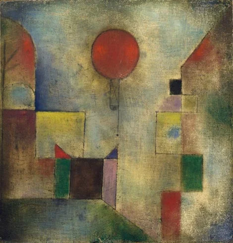
Art: Paul Klee, The Red Balloon, 1922

Click here to subscribe to the blog

SlideMagic: a platform for magical presentations. Free student plan available. LEARN MORE
No, online collaboration has not been solved yet

No, online collaboration has not been solved yet

SlideMagic is moving into the polishing phase, after which we can take off the invite-only beta sign up form the app. So far I have mainly focused on the slide design engine. Sloppy design is one big problem of modern business communication.

The other one is collaboration, version management, and sharing, which I am starting to think about more and more now. Email attachments are big. You are always looking for slides in old presentations. You can never keep track on how has access to your files in Dropbox. You are never sure that when you delete a file because of space constraints somewhere, it will also be deleted somewhere else. "Did I just share that file with the entire internet?" Where is that file in iCloud? Who remembers shared Lotus Notes databases from the 1990s? Mass multi-editor collaboration creates to the too-many-captains-on-ship problem.  Companies find it impossible to maintain clean slide templates, or up to date versions of slides. Full project management environments feel like corporate prisons where every action/edit has to go through an application.

There must be a smarter, much simpler, way to do this.


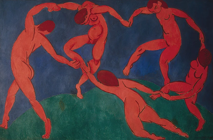
Art: Henri Matisse, Dance, 1910

Click here to subscribe to the blog

SlideMagic: a platform for magical presentations. Free student plan available. LEARN MORE
Speaker versus explanation notes on SlideMagic

Speaker versus explanation notes on SlideMagic

SlideMagic now has 2 types of notes for each slide:

  • Explanation notes can be added to the right of the slide (optionally) and are meant for explaining the content of the visual is nice fluid full sentences. In case the presenter cannot be there to explain things in person. They are nicely formatted.
  • Speaker notes are messy, huge bullets that serve as a reminder for the speaker during a live presentation. The bullets are visible to the speaker on the presenter window (not to the audience).


Art: George Jakobides, Two children playing peekaboo, 1895

Click here to subscribe to the blog

SlideMagic: a platform for magical presentations. Free student plan available. LEARN MORE