One story

One story

There are two ways that a presentation that originally had one story can get diluted with a second one.

  • Old slides are not replaced. As soon as you say, "this is an old slide, I still like to use it, but now things are a bit different, let me explain". It is time to chuck it and design a slide that does represent what you want to say
  • Not deciding on a clear story/audience. Most startups do not have a clear market positioning yet. It can be this, it can be that. This doubt gets reflected in the slides. The result a confusing story with 2 messages that are diluted. Best solution: pick one. Second best option: explain the basic idea and/or underlying platform, and tell 2 stories one after the other and be honest about the fact that you have not decided yet.

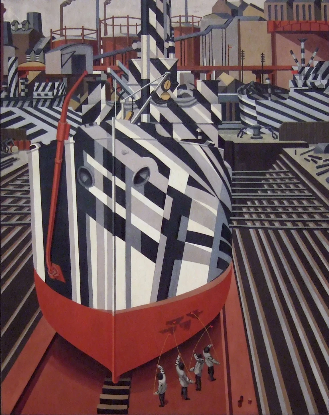
Art: Painting of Dazzle-ships in Drydock at Liverpool, by Edward Wadsworth, 1919
Subcribe to this blog, follow me on Twitter

SlideMagic: a platform for magical presentations. Free student plan available. LEARN MORE
Benefits versus features: the cart before the horse?

Benefits versus features: the cart before the horse?

Benefits of enterprise high tech products are usually pretty similar: you save cost, time, increase productivity, security, scalability, flexibility. Starting your presentation with these benefits will not really make them stick. Everyone is saying exactly the same thing on their page 1 of the their presentation.

You have to reveal a bit of what it is you do before plunging into the benefits. "We automate all manual processes in order picking". Right, now I can see where all these benefits come from and tell me how big they are.

In business and marketing seminars we are always told to talk benefits, not features. Talking product gets you boxed in as too detailed, too middle management, too engineering, too much missing the big picture.

I disagree, people who have a story with real substance have an edge here. There is too much hollow marketing speak out there.


Art: Edgar Degas, Aux courses en province (At the Races in the Country) c. 1872; Museum of Fine Arts, Boston 
Subscribe to this blog, follow me on Twitter

SlideMagic: a platform for magical presentations. Free student plan available. LEARN MORE
Convincing the center

Convincing the center

Here in Israel the election campaign is in full swing with mud slinging and charged advertising campaigns everywhere. The surprising thing is that very little effort is targeted at convincing the voter at the political centrum, because she will decide the election.

Targeting your existing supporters with messages they already have bought in to will get you lots of likes and support, but will make little impact on new potential voters. Think about those voters that sit on the edge, how can you tip the balance in your favour?

The same is true for almost any presentation. Your followers are already on your side. The haters will never agree. You need to target the ones that have not decided yet. 


Art:  Annibale Carracci, The Choice Of Hercules, 1596
Subscribe to this blog, follow me on Twitter

SlideMagic: a platform for magical presentations. Free student plan available. LEARN MORE
Rediscovering Evernote

Rediscovering Evernote

I was an early user of Evernote on a PC (a couple of years ago) and used it to organise bookmarks for reading later. Then I stopped using it for some reason until recently. Not as a bookmarking service, but to organise life across multiple devices. It has specific advantages over bookmarking sites, Dropbox/Box/iCloud/Google Drive, online presentation apps

  • My demo presentations. It is easy to maintain and access a folder with all my demo decks ready and up to date on all my devices. This is the folder that I set to sync/download to my devices so it is available without internet connectivity. I have run pitches on my iPhone to potential clients.
  • On the go note taking. Away from the office it is hard to capture stuff and not lose it. I use the Penultimate hand writing app for iPad that gets synced into Evernote. Evernote itself has notes screen where you can jot down quick thoughts (an idea for a blog post for example). The Evernote scan app (Scannable) is perfect for capturing receipts, doodles, and white boards. It is actually faster to search through hand written notes than typed ones.
  • Screenshots have become a big part of my design workflow. I just can't be bothered to convert between different image file formats. Skitch, the Evernote screen shot app has a very used cross hair few that the standard Mac function is missing.

I did not get paid a single $ for writing this (unfortunately).


Art: The Elephant Celebes by Max Ernst. Oil on canvas. 125.4 x 107.9 cm. Tate Gallery, London
Subscribe to this blog, follow me on Twitter

SlideMagic: a platform for magical presentations. Free student plan available. LEARN MORE
The catch up slide

The catch up slide

Here is a concept that you can use in many investor and/or sales pitches for technology:

While [a] and [b] have moved on, [c] is still pretty much stuck in the 1950s despite a lot of technological development. Our company is going to fix that.

I have added a slide to the SlideMagic startup pitch template library that reflects this idea, Two "arrows" moving to the right, and a third one which is catching up. Look at the simplicity of the graphics which exactly fits the philosophy of SlideMagic. It looks pretty, it gets the message across, is easy to design. A new business language that does not need arrows, drop shadows, and gradients. It is almost a Lego-like abstractification (is that a word?) of a complex visual.


Art: Le derby d'Epsom, painting by Théodore Géricault, 1821
Subscribe to this blog, follow me on Twitter

SlideMagic: a platform for magical presentations. Free student plan available. LEARN MORE
Smaller screen, better presentations

Smaller screen, better presentations

There is a nice side effect of people ditching their laptop and carrying a small tablet device instead: presentations get better. But it has nothing to do with technology, it is the setting of the presentation that has changed.

In the absence of a big projector screen or LCD monitor, that small conference room just changed from a mini cinema theater to a discussion table. The attentions is shifting back from the screen to the presenter. The presenter vaguely points at the device and continues "what this chart wants to say is [and out comes the story]". Only when you have to, the iPad gets passed around the table to show that important piece of data on page 37.

Good stuff until Airplay-enabled projects are hooking up our mobile devices to projectors again.


Art: Roy Lichtenstein, The whole room, 1961
Subscribe to this blog, follow me on Twitter

SlideMagic: a platform for magical presentations. Free student plan available. LEARN MORE
Your requests for SlideMagic templates

Your requests for SlideMagic templates

I am keen to make the templates in presentation software SlideMagic as useful as possible. Let me know if you have specific requests for templates and/or story flows that I should include. Two conditions for this free presentation design help:

  • You do not get angry with me when I could not find the time to work on your request and prioritised another template 
  • The result of your request will be publicly available for everyone to use, so strip it of any specific/confidential information

Send your requests to jan at slidemagic dot com, start with TEMPLATE PLEASE in the subject line.


Art: Henri Matisse, The Open Window, 1905
Subscribe to this blog, follow me on Twitter

SlideMagic: a platform for magical presentations. Free student plan available. LEARN MORE
Learning from Swiss graphic designers

Learning from Swiss graphic designers

Most presentation design software today is the result of someone in the 1980s thinking: "hey, this mouse is cool, you can use it to draw things!". We can move, drag, stretch, place things freely across our drawing canvas.

Presentation software SlideMagic aims to close this tangent and go back 20 years earlier to the 1960s when graphics designers in Switzerland developed a clean and crisp style of communication and design that does in many cases the exact opposite of the freedom the mouse offers: tight grids, limited font choices, limited colours. simple shapes.

Eyeball the posters on this Pinterest board by Misswyss and see what you can learn form them for your own designs. Which one do you like? Which one does a better job at communicating than others? Why is it that some of these very simple designs look very pretty?

Examples of posters designed in the Swiss style

Examples of posters designed in the Swiss style

Some of the features they have in common:

  • Limited number of colours
  • Sans serif font (only one)
  • A strict grid alignment throughout the page
  • Relatively small headlines
  • De-emphasising (making things grey) rather than emphasising (making things bold) text
  • Flat shapes, no gradients, drop shadows, textures
  • Big silhouettes, simple shapes

Why not steal some of these ideas in your slide designs?


Art: Albert Anker, The walk to school, 1872, 90 x 150 cm
Subscribe to this blog, follow me on Twitter

SlideMagic: a platform for magical presentations. Free student plan available. LEARN MORE
Working with data charts in SlideMagic

Working with data charts in SlideMagic

Data charts in SlideMagic work a bit different than in other presentation software:

  • Charts come in a beautiful, simple, formatting without the clutter of value (y) axes, tick marks. Charts are automatically adjusted to your own branding (the right colours, the right font). 
  • SlideMagic only supports those data charts that I regularly use in my own presentation design project. No pie charts for example (sorry)
  • Best of all: SlideMagic data charts line up with the grid of the slide. In most business presentations, data charts are part of a broader slide design. There is an extra column on growth percentage bubbles next to the bar chart. There is more than 1 bar chart on a page. In PowerPoint it is very tricky to get these things to line up properly. In SlideMagic, it is not possible, not to line them up

Click through the slide sequence below to get an idea of how you can work with data charts in SlideMagic. Feedback and comments are welcome (comment below, or email me at support @ slidemagic dot com).


Art: Melencolia I. Print by Albrecht Dürer, 1514
Subscribe to this blog, follow me on Twitter

SlideMagic: a platform for magical presentations. Free student plan available. LEARN MORE
Alcohol against stage fright?

Alcohol against stage fright?

The supply of liquor in this tweet below probably was more symbolic than functional, but I have heard other stories about people getting offered a drink back stage before appearing in a major TV broadcast.

A bit of alcohol relaxes nervousness, but it is actually not the sort of relaxing you want on stage. You need to be sharp and switched on to remember your story and react to audience feedback. Some other things you can do to deal with nervousness:

  • Know your story inside out, rehearse, rehearse, rehearse. Seth Godin suggests that you can even start with dogs as your risk free audience. Work especially hard on the opening of your presentation, since these are the most difficult moments. Once you are on a roll, the rest will follow much easier.
  • Remember that everyone (including the pros) is a little nervous before going on stage, remember that a bit of nervousness gives you the right alertness to deliver a good performance (alcohol does the opposite), remember that the audience wants you to succeed there, remember that for most people stage fright is like that first chill when jumping into a pool, it is over in 2 seconds once you get going.

Art: Edgar Degas, L'Absynthe, 1876
Subscribe to this blog, follow me on Twitter

SlideMagic: a platform for magical presentations. Free student plan available. LEARN MORE
Investors, it is your track record

Investors, it is your track record

Many of my clients are venture capitalists themselves who need to go out and raise money from big pension funds or wealthy individuals.

There are usually two big components in their own investor presentations:

  1. The concept of the fund (where/what/how much it invests)
  2. The investor track record of the team.

Investors tend to spend a lot of time on number 1, but the thing that really matters is number 2. Unfortunately, most investors cannot say that they were seed investors in Facebook, Google, Twitter, and Uber. So the challenge of the presentation is to convince institutional investors that you can be trusted with their money.


SlideMagic: a platform for magical presentations. Free student plan available. LEARN MORE
Working with templates in SlideMagic

Working with templates in SlideMagic

Many beta testers ask me how to use templates in presentation software SlideMagic. The series of screen shots below explain how you can access and use them. You can:

  • Clone an entire template presentation into a new presentation
  • Import selected template slides into your presentation

SlideMagic stores all presentations in one big database which created the opportunity for a really cool feature: the ability to search through ALL your slides like a Google web search. And not only with keywords, you can also ask SlideMagic to return all slides that use a specific image.


SlideMagic: a platform for magical presentations. Free student plan available. LEARN MORE
Overpolishing

Overpolishing

Some stories are best served raw. The other day, a client pitches a wonderful startup idea to me. The company solves two broken issues (sorry for the cryptical language), and has a solution that changes something that has not been changed since the 1950s.

During the design process I felt somehow that we made it too polished, adding too many "and also, and also, and also" points. It is the full story, the full picture, but the additions kill the energy of the pitch. I think we should go back to the raw version and accept that in a 20 minute pitch we do not have time to cover everything.


Art: Vertumnus, a portrait depicting Rudolf II, Holy Roman Emperor painted as Vertumnus, the Roman God of the seasons, c. 1590

Click here to subscribe to this blog

SlideMagic: a platform for magical presentations. Free student plan available. LEARN MORE
To answer or not to answer?

To answer or not to answer?

What do you do when your presentation gets interrupted by a question from the audience and you were planning to answer the point a few slides down? Answering it will disrupt your carefully designed story flow. Not answering it might upset the audience. My suggested approach differs by presentation setting.

  • For huge audiences (a big TED talk for example), you are unlikely to be interrupted.
  • For slightly smaller audiences, you can say that people should hold of questions until the end of the presentation. After that, only hacklers can still decide to interrupt you.
  • If you get a question in a presentation for a big group of people, I would answer it really briefly (yes, good point, we do have a blue colour option) and say that you will get to it in more detail later on, look a way from the asker to stop the dialogue.
  • In smaller meetings, you can sometimes completely go off script and let the audience guide your presentation. A good example would be a pitch to partners in a VC firm, where they read the material beforehand and have a number of very specific questions they want to see answered. Being stubborn here and sticking to your script will upset the meeting.
  • In one on one meetings you need to read the body language of the person sitting in front of you. When someone keeps on asking what it is that your product actually does, it is better to kill off the issue rather than have the person sitting and guessing with a frown on her face until you get to the right point in your presentation. A person who is guessing, is not listening to what you say.

In short, the smaller the audience, and the better prepared they are, the more story flow disruption you can allow. 


SlideMagic: a platform for magical presentations. Free student plan available. LEARN MORE
A summary presentation should not just summarise

A summary presentation should not just summarise

You have finished this huge strategic or business plan and you need to present it to the top management team of your company. You sent the deck before the meeting and they probably page-downed the slides. How to create a good summary presentation for the meeting?

Just summarising the big document (and then we did this and then we did that and then we went on to do this), is not going to get you a decision. The opposite, a super high-level presentation with generic buzzwords is also not going to cut it.

Your presentation should be a deck specifically for the meeting, not one for reading later (you sent that one already). It can be based on your big document, but it will be different.

  • Make it very clear what you actually want (more budget, more people, permission to explore M&A opportunities, etc.)
  • If your project involves some decision (maybe even with a controversial recommendation), make the trade off very clear. Some sort of pro and con overview.
  • Your manager is not a complete outsider who comes in cold to the subject. So you can cut the emotional, stunning visuals, and focus on those elements of the trade off that she might not know about yet. Show the new and original analysis you did that support conclusions that are new. Leave out the obvious analysis that confirm things everyone already knows.
  • Feel free to deviate from the structure of your big document. The big document is reference material, the presentation is your tool to get an important decision approved.

Do not summarise a document, get a decision approved.


SlideMagic: a platform for magical presentations. Free student plan available. LEARN MORE
Your audience is not ignorant

Your audience is not ignorant

In education, teachers start most of the times with a completely ignorant audience. In mathematics we start with the basics and slowly, slowly, build our story from the ground up towards higher algebra and advanced geometry.

Many presenters use this mindset when pitching a business idea and/or investment. Their presentations resemble a 101 text book on the market.

But in most cases, your audience will know quite a lot. Venture capitalists see dozens of pitches of internet-related businesses every day. Surgeons get pitched everyday with new drugs and medical devices.

Think about that when designing your pitch. What thought process would an intelligent, knowledgeable person go through when confronted with my idea? First she needs to understand what it actually is. In her mind she probably tries to compare it to a concept she already knows. Then she probably starts asking herself the big obvious questions. Does the world need this? Why is this so special / has no one else done this before? Can these guys pull it of?

Do not try to educate your audience, instead try to answer the obvious questions she cannot answer herself.


SlideMagic: a platform for magical presentations. Free student plan available. LEARN MORE
Common laymen mistakes in SlideMagic

Common laymen mistakes in SlideMagic

By now I have seen a number of real presentations that beta testers of my presentation software SlideMagic have produced. The results are very encouraging! Without exception, all presentations look "pretty decent" to "very good". All of these decks were designed by complete laymen designers. 

Even more interestingly, it is possible for someone like me (a pro), to upgrade these "pretty decent" to "very good" presentations to something really good in just 15 minutes of polishing. (The user base of SlideMagic is still small, so beta testers can benefit from the luxury of my input here and there).

Here are the common mistakes I usually fix:

  • Cutting / re-editing text. Taking out unnecessary tangents, side comments, indirect sentences saves space and allows you to make text bigger
  • Making text in similar boxes the same font size. I considered freezing font sizes in the app but that would take too much design freedom away from you guys. A simple rule, if text boxes are part of a group (a list, a diagram) try to give them the same font size
  • Fixing left alignment and centred alignment. It is hard to give a rule, but in some cases one looks better, and other cases the other (yes, that is vague).
  • Fixing inconsistent header formatting across slides (font size, colours). I gave you guys the freedom to play with this and make them different across slides, but I am considering freezing it (sorry).
  • The biggest one, fixing poor grid compositions. In many cases users select axis definitions that leave a large number cells empty. (One row, criterion, product, has a lot of attributes that are irrelevant for the others). White space in a slide is good, but if that means that all the other cells in your chart are tiny/unreadable we have to be pragmatic.

Keep up the good work! I have temporarily stopped the intake of new beta testers as I am fixing some UI issues. Hopefully I can soon go from a private beta to a public beta where the invite-only wall can be taken down.


SlideMagic: a platform for magical presentations. Free student plan available. LEARN MORE
The impossible stock image

The impossible stock image

The other day, a client requested a very specific image: someone handing over a box with envelopes, paper files, a bunch of DVDs and some memory sticks. An image this specific cannot be found in stock image databases. And even if you could, the audience would not recognise these specific items on the photograph.

Your options:

  • Take your own picture and get it exactly right
  • A generic guy-with-box image blurred out in the background and use text to describe to the audience what's in it.
  • A collage of stock images of the individual items that are required on white backgrounds

Art: Balthasar van der Arst, Fruit still life with shells, 1620

Click here to subscribe to this blog

SlideMagic: a platform for magical presentations. Free student plan available. LEARN MORE
Do they care how you are organised?

Do they care how you are organised?

Many corporate presentations include organisation charts, what are the main business units, and who are the people running them, and who reports to whom.

For some presentations, this relevant. If you are trying to sell a company or a business unit, it is important to see the people assets that an acquirer is getting. If you are presenting to a financial analyst it is important that she knows what financial data belongs to what business unit.

If you are trying to explain what your company does however, the organisation chart might not be the best way to do that. Most of the times, there is not a 1-1 match between business units and products. There are far more exciting ways to present what your company does than organisation chart boxes.

To you, the structure of your organisation is really important. The audience is likely to have another view.


Art: "Puppet Show", a painting by Chinese artist Liu Songnian (1174-1224 AD)

Click here to subscribe to this blog

SlideMagic: a platform for magical presentations. Free student plan available. LEARN MORE
One case study throughout

One case study throughout

Case studies or examples are a great way to explain your idea or technology. And by case study I mean something different than the empty, generic, meaningless quotes you find in many technology white papers. We need real stories.

Wherever possible, I try to stick to one big case study throughout the presentation, avoiding many smaller case studies. I can use this one case study to highlight different aspects of the technology.

  • It saves time, I do not have to introduce a new story setting all the time
  • It saves time, because I can re-use visual concepts. (For example, the red stars are the dangerous computer viruses)
  • I can afford to take a really detailed deep dive if needed
  • In case of complex science (healthcare technology for example) I can afford to take the time to introduce a few advanced scientific concepts and use them throughout my presentation
  • Images and visuals will look consistent throughout the presentation

The key challenge in these type of presentations is not so much the visual design, it is finding that case study that says it all. And once you are thinking about that, you are actually trying to find your story,


SlideMagic: a platform for magical presentations. Free student plan available. LEARN MORE