Graph screen shots

Graph screen shots

If you do not have access to the source data of a graph you have two approaches to getting the data into your presentation:

1. Use a screen shot

How to get the best looking chart from a screen shot:

  • Make the chart as big as possible on your screen. Sometimes you can click the graphic which opens in a new tab in your browser. In PDF, you can zoom in without losing quality. Take the screen shot of this big graph and paste it big in your slide.
  • Crop out all items of the graph that you can easily recreate in PowerPoint or Keynote: axis labels, chart titles, even the values on the X and Y axes. Next, recreate these items by hand in PowerPoint
  • Cover as many elements on the chart as possible with a white box. Legends for example hardly ever look good. Cover it and create your own.
  • Select the chart and pick "format picture" to see whether it looks better in black and white. Alternatively, use the colour picker to get your legend use the exact colour used in the chart.

2. Measure and recreate

When you do not use data labels in a chart (bar, column, line) but rely on a value axis instead, you can get a way with a lower of level of accuracy. You can literally print a chart out (the larger the better), measure the position of the data points and recreate the chart from scratch in PowerPoint or Keynote.


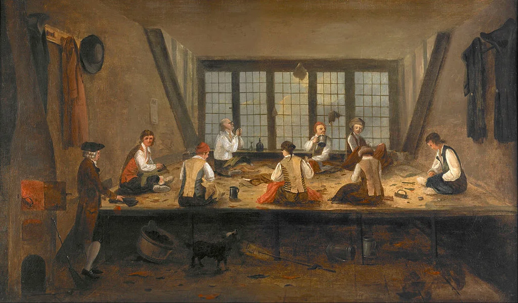
Art: Interior of a tailor workshop, artist unknown, 1780.

SlideMagic: a platform for magical presentations. Free student plan available. LEARN MORE
SlideMagic example

SlideMagic example

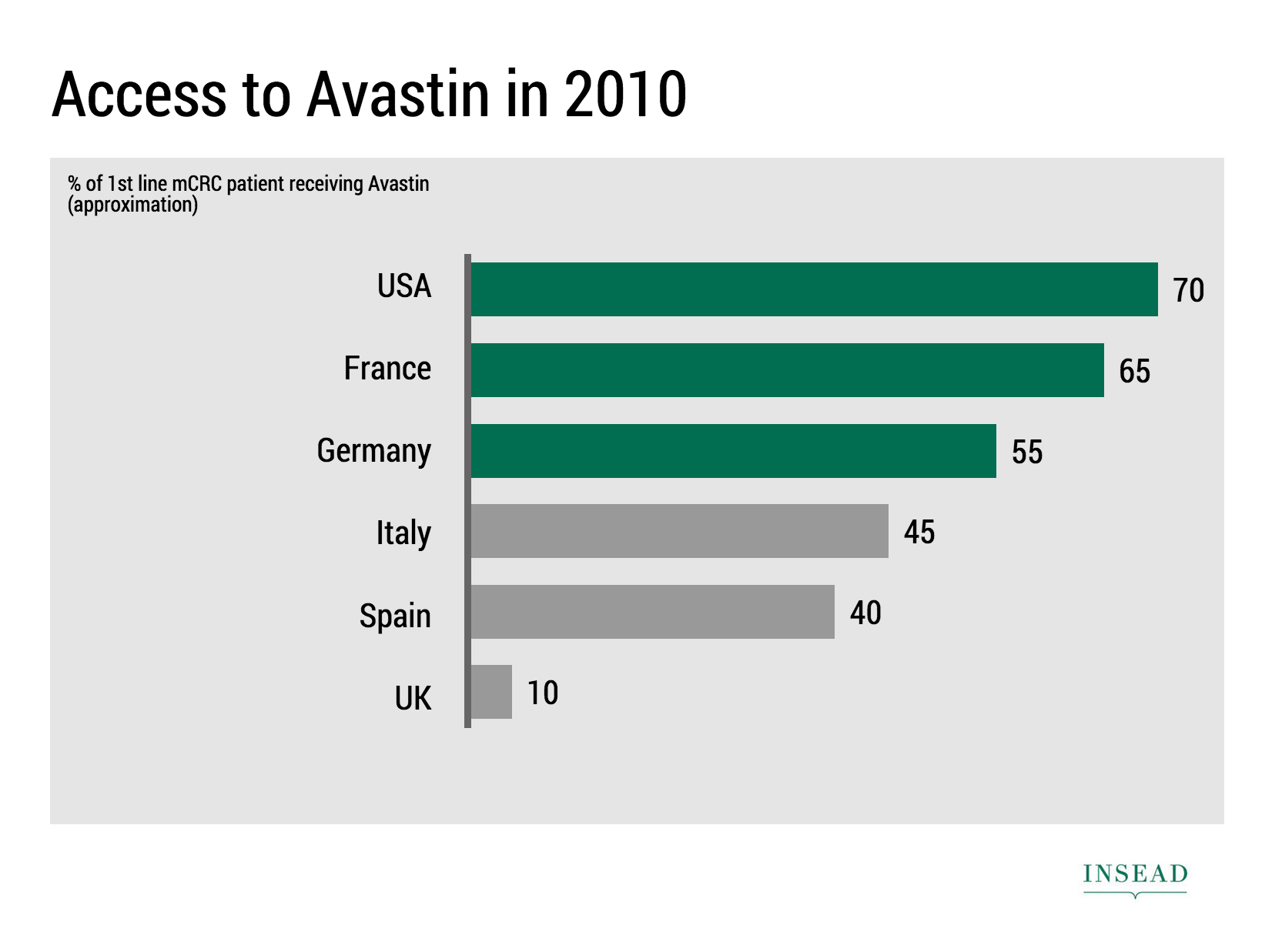
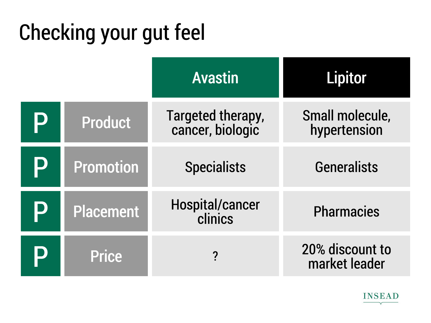
Ramzi Mrad is entrepreneur in residence at INSEAD and used SlideMagic prepare his presentation of business case: how Roche Pharmaceuticals set the price for its Avastin cancer drug in Europe. This type of presentation is exactly how I envisioned SlideMagic being used. Without any professional support, a layman designer can come up with something pretty decent. You can see his presentation here.


Art: Pierre-Denis Martin (1663–1742), Vue du Château de Fontainebleau (1718-1723)


SlideMagic: a platform for magical presentations. Free student plan available. LEARN MORE
Take that conference tag of

Take that conference tag of

Name tags are a necessary evil when visiting a conference. The security guard can see you paid, and people can read your name, company, and role casually. It is also a great way to store the day program and your lunch coupons.

But when on stage, it looks a bit weird. When presenting right that moment, when someone watches the online video of the talk 6 months later, when the entire panel consists of 12 people with the 12 white dots on their shirts.

Oh, and also ask people to take of their tags when posing for a group photo.


Art: Albrecht Drurer, Portrait of a young Venetian woman, 1505

SlideMagic: a platform for magical presentations. Free student plan available. LEARN MORE
A brief review of Think with Paper by 53

A brief review of Think with Paper by 53

I have been following Paper by 53 from the early days. It is a sketching and drawing app for iPad. The initial revenue model consisted of premium add ons (virtual pencils, pens, etc.), later they moved to hardware sales (a styles that is seamlessly integrated with the app).

Recently, they have extended/repositioned the app to corporate "white boarding": designing, prototyping, brainstorming, mind mapping, problem solving, via a new release called Think.

Here is what I like:

  • Absolutely beautiful and gorgeous user interface. The pen strokes are the best I have seen on any iPad drawing/sketching app.
  • Brilliant user interface functionality. They really thought about what functionality you actually need, and then they put in the absolute minimal amount of features. You draw a box, the app cleans it up. Resizing, moving things around, perfect. Very short help videos are embedded to unstuck you if needed. Fantastic, I am jealous that I had to retain more functionality in my SlideMagic app.

Now, here is the problem that I see to get Think adopted broadly in the corporate world. And I share the pain, as I am trying to convince people in enterprises to change the presentation tools they are using.

  • White boarding is a group activity, and the current iPads are simply too small to work comfortably with multiple people. It is even a challenge for just one user. I suspect that we will see very large tablets and tablet/laptop hybrid touch screens in the near future which would solve this problem. My guess is that the huge "Minority Report"-style whiteboard that combines user input and rendering is still far away.
  • Dealing with text (important in corporate communications) is still a bit fiddly: you need to zoom in on an object, write with decent hand writing, then shrink it down again. I agree that introducing a character-based keyboard function would kill the UI and flow of the app. Still.
  • You still need some sort of artistic talent to create cute diagrams. Yes, the app does some work for you, but in the end you are confronted with an empty canvas that needs filling.
  • The app is completely anti-columns-and-rows (180 degrees difference with SlideMagic), but in the corporate world, that is how a lot of things need to be evaluated. Not every problem is a flowing diagram of interactions.

You can export a Paper journal to PDF and PowerPoint/Keynote. The PowerPoint file contains slides for each of the pages in your journal. The objects on the page are your drawings on a transparent background. You can ungroup the fills and the outlines, but not the individual diagram elements. You could use PowerPoint and Keynote to enhance the Paper app in a number of ways:

  • Use PPT purely as a presentation engine to present your creations on a big screen (note that the app itself also allows you to do this from your iPad, but technical interfaces might not work in every corporate conference room).
  • Create your presentation in paper without any text labels, port the whole thing into PPT and finish it there with text and images. The result will be an original looking presentation, but the file will be hard to maintain edit.
  • Create a number of design elements in Paper, one on each page of your journal, then copy this file into PowerPoint and create a presentation with these building blocks.

I think 53 is on a journey to change the way we interact with productivity apps. For certain sub segments of the corporate world (designers, architects, other early adopters), it will work already. Certain consultants might have a specific methodology/tool they sell that they could fit perfectly with Think already. I am not sure wether Think is ready to break to the mainstream corporate world yet. As hardware improves though (especially canvas size) that might change very soon though.


Henri Matisse, Icarus (Jazz), 1946, image by Gautier Poupeau.

SlideMagic: a platform for magical presentations. Free student plan available. LEARN MORE
Design DNA

Design DNA

Design DNA is engrained in a company. It shows in presentations, in the web site, in the way the office is laid out. When a visitor/user/viewer gets in touch with a company, she makes up her mind in the first millisecond about the design DNA of the company, by comparing it to all other presentations, web sites, and offices she has seen. We have all seen these stereotypes:

  • The bare bullet point presentation in the standard Microsoft Office 2007 format
  • The over-designed PowerPoint template with gradients, images with faded edges and huge logos at the top of the page
  • The social media expert website full of call to actions to buy her $5 ebook on being a social media expert
  • The traditional, hierarchal office with too many big leather board seats crammed around a too small board table in a board room that doubles as a storage room for exhibition displays
  • The hipster I-don't-really-say-anything web site
  • The girly office full of plants and cute natural-material furniture
  • The macho office with an impressive collection of booz in the lunch room
  • The 1990s tech company web site: takes 40% of your screen and has detailed product hierarchies that get to pages that don't really say much about that specific product
  • The startup web site where "tour", "about us", "benefits", and "product" tabs pretty much say the same thing

At every point you come in contact with a client, user, investor, make sure you look the way you want to look. Even if your investor presentation looks right, that impression can be undone in one second when someone opens your web site.

One strategy is to change and align everything to make sure it is consistent. Another one is to recognise who you are, and change the 1920s cute art deco look of your presentation if you are in the business of selling 4x4 car suspension systems.


Art: Henri Rousseau, The Dream

SlideMagic: a platform for magical presentations. Free student plan available. LEARN MORE
Dumbing down

Dumbing down

Seth Godin believes that:

I have been thinking about this a lot, since it applies to the core idea behind SlideMagic: making a simpler presentation design tool. Usually, Seth is right, and he urges people not to avoid the inevitable critical feedback.

So, I am a dumbing down PowerPoint? I do not think so. These are two different things:

  1. Get people to adopt a different approach to presentation design
  2. Get people to use a different tool, but continue to follow their current presentation design habits

I try to do 1, and the SlideMagic tool supports the approach.

  • SlideMagic is a new corporate visual presentation language
  • It always looks aesthetically pleasing
  • 90% of your time can be spend on your idea, 10% on jotting it down at a computer

So I think I am "smarting down" business presentation design. But hey, maybe I am biased and do not see things as they really are... 


Art: British war time propaganda poster

SlideMagic: a platform for magical presentations. Free student plan available. LEARN MORE
How to make frosted glass in PowerPoint

How to make frosted glass in PowerPoint

Follow these simple steps:

  1. Apply the "blur" photo filter to your background image
  2. Create a very light grey box
  3. Add 45% transparency


SlideMagic: a platform for magical presentations. Free student plan available. LEARN MORE
Diagrams that bring it all together

Diagrams that bring it all together

Strategy consultants or IT architects love the diagram-that-brings-it-all-together. Customer needs, key capabilities, competitive differentiations, routes to market, all glued together in harmony to describe that perfect concept. It makes perfect sense to you.

The problem: it is too much to digest for the person who sees the diagram for the first time.

One better approach is to start with stories for the individual bits of the concept, and only in the end stitch everything together. If you feel it hard to part with that diagram early in the presentation, you can put it up and jokingly brush it aside/apologise and say you are taking it a bit slower. After you have explained a component of the diagram you can slowly build the picture up step-by-step.


Art: Portrait of a Philosopher (Artist's brother, Pavel Sergeyevich Popov), 1915

SlideMagic: a platform for magical presentations. Free student plan available. LEARN MORE
Startup pitches are changing

Startup pitches are changing

A few things are going on in startup land, especially for consumer facing apps:

  • It takes less and less money to launch a product (who could have thought 10 years ago that 1 person could self-finance and launch a PowerPoint alternative)
  • Startup ideas and pitches are fragmenting and are everywhere around us. Most ideas are variations on existing concepts that everyone is using. "Uber for gardeners", got it.
  • Business communication gets more efficient. Phone calls, coffee chats, Hangouts: the big, formal standup presentation where everyone patiently and politely let's you finish your bullet points is on its way out.

What does all this mean for investor pitches?

  • Do not feel worried if you can explain what your idea is in just 2 slides. If you are done, there is no need to add padding.
  • Since it is so easy to get an app up and running, the actual beta/prototype web site/app is a large part of the product pitch. Does it look polished? Does it work? Do you feel like signing up?
  • Related: market size analysis is increasingly replaced with "what % of your user base are willing to pay the $10 per month for this, and how fast you growing?" 
  • The big, big, big, question is: do users like it. User growth, traction, user behaviour analytics. Numbers, data. All this matters a lot. The qualitative upfront part of the presentation (emotional pictures that show the problem) gets smaller, and the quantitative what is your LTV, CAC, churn, etc. gets bigger. Pitches start to look like consulting decks again.
  • Success/failure will be evident in a shorter period of time, so you need to be sure what you are doing with the money you are raising. (You are no biotech startup that raises a lot of money to "continue doing clever R&D"). Know where you spend things on shows that you are mature to investors, but is also protecting you. If you do not have good customer conversion rates, it is a waste of money to raise capital to spend on marketing and attract lots of people at the beginning of the funnel, who will then leave.

In biotech, enterprise IT, I continue to see the traditional startup pitch (pain, market, etc.). In consumer, things are different.


Art: The Rainbow Landscape or is a c.1636 landscape painting by Peter Paul Rubens

SlideMagic: a platform for magical presentations. Free student plan available. LEARN MORE
Is Microsoft cool again?

Is Microsoft cool again?

Things are changing over at Microsoft: Microsoft interfaces on new apps look great, and it is getting rid of old dogmas, opening up software to a wide range of platforms. At the same time, Apple (while still great) is taking the foot of the gas here and there. 

Personally I am still a big Apple fan and will continue using their products. (Although I am one of the unlucky people who bought a Mac Book where the screen is completely peeling of, visit www.staingate.com to sign up for the petition if you suffer from this as well). But it is good to see that Microsoft is trying to compete.


Nicholas Chevallier, Race to the Market, 1880

SlideMagic: a platform for magical presentations. Free student plan available. LEARN MORE
The empty Board Room

The empty Board Room

Millions of web pages and PowerPoint presentations contain images of an empty Board room with plush leather seats. While this room might be the prettiest and most tidy one in your office, the image has appeared so frequently that lots of leather Board seats no longer radiate power.

Image credit: the FAEF Board Room

Image credit: the FAEF Board Room

News media usually go for the next alternative, the name tag at the front door. I think better images are those of the company in action, a truck delivering goods, a plane taking of on the runway, a store interior, an assembly line in action, a nice group photo of employees at work.

You can do better than the empty Board Room


Art: Vincent van Gogh, Bed room in Arles, 1888

SlideMagic: a platform for magical presentations. Free student plan available. LEARN MORE
"All presentations will look the same"

"All presentations will look the same"

I get this feedback from early SlideMagic beta testers. SlideMagic supports one accent colour, one font, and encourages you to work in a strict slide layout grid. For certain presentations, this feedback is valid. I think we will not see any Apple product launch presentations designed in SlideMagic (yet).

For 99% of presentations though, it is actually precisely what I tried to achieve:

  • When the software tool you use for presentations is incredibly simple, you spend most of your time worrying about the content rather than searching support web sites how to align the second line of a bullet point paragraph. I want 90% of SlideMagic users to master 100% of its features.
  • If all presentations use more or less the same visual concepts to show trade offs, contrasts, sales over time, etc. then people will be able to read and understand them quicker

Today, I would argue that PowerPoint presentations look more similar to each other than the SlideMagic decks: lists of bullet points on a white background using the standard Microsoft Office (olive, blue, red, green) colour scheme.

Below are examples how the same SlideMagic chart would look when used in different companies. You see the impact of consistent use of colours. All SlideMagic charts will be updated instantly after a colour and logo change.

Screenshot 2015-04-30 11.25.00.png

If you want to try SlideMagic for yourself, you can sign up here as a beta user.


Art: Salomon de Bray, The Twins Clara and Aelbert de Bray, 1646

SlideMagic: a platform for magical presentations. Free student plan available. LEARN MORE
Send me your template requests

Send me your template requests

Presentation templates in SlideMagic have 3 big advantages:

  1. They are very easy to customise: adding rows, columns, boxes can be done without destroying the slide layout. Colours and fonts are adjusted instantly, so templates look never out of place with the rest of your slides
  2. You get them straight from a professional presentation designer
  3. New templates and updates get pushed instantly to all SlideMagic users

I want to add more templates.

Let me know what templates, concepts, you need. Put requests in the comments are send them to me at [email protected]. You can even send me PowerPoint slides if you want. If you have not done so, I will strip the slides of company specific information before publishing them in the SlideMagic template library.


Art: Henri Toulouse-Lautrec, Sescau photographe, 1896

SlideMagic: a platform for magical presentations. Free student plan available. LEARN MORE
What to put in a short-term budget

What to put in a short-term budget

In investor pitches there are usually 2 types of financial forecasts:

  • Short-term: super precise, usually mostly cost
  • Long-term: ball park, usually mostly revenue

Why do investors want to see some sort of short-term budget?

  • While the long-term revenue outlook of a startup is highly uncertain, the near term cost drain is pretty much set in stone. Investors want to know where her money goes: in development, in an expensive, all-or-nothing/bet-the-company Super Bowl ad?
  • Investors want to check the consistency of your story. You say that you are not focused on getting customers right now, so you should not be spending anything on marketing. On the other hand, you plan 25 new features in your product, where are the developers (and their salaries) who are going to make it happen

A short term cost budget does not need to contain 25 lines of Excel, by month. A simple x% of revenues number is a bit too simple though.


Art: Marinus van Reymerswaele, The moneychanger and his wife (1539), Museo del Prado, Madrid

SlideMagic: a platform for magical presentations. Free student plan available. LEARN MORE
Slide icons

Slide icons

Repeating the whole story of your presentation on the last slide is boring. You want to end with a "boom" and quickly remind people of the most important message in the presentation. I usually do that with repeating a key visual (just one). Using (the cliche) that a picture says more than a 1,000 words, the repeated image brings back the full richness of the discussion you had in one millisecond. Much more efficient than writing a bullet point.

If you have to repeat multiple messages, here is another trick: use small screen shots of slides. At the end, the audience does not need to be able to read the entire slide anymore. The thumbnail is a quick visual reminder of the content. Below an example that I created in SlideMagic.

I have added this slide design to the template file of all slides I created for the blog. You can open it in the SlideMagic app here and use it for your own designs. Just change the images.


Art: The Flute Concert of Sanssouci by Adolph Menzel, 1852, depicts Frederick playing the flute in his music room at SanssouciC. P. E. Bach accompanies him on the harpsichord.

SlideMagic: a platform for magical presentations. Free student plan available. LEARN MORE
Comcast pitching lessons

Comcast pitching lessons

The Comcast-Time Warner Cable merger fell through. Fred Wilson makes the case that this is probably a good thing, not so much because of consumer choice, but on the other side of the business: content providers trying to get through to consumers with their offering (Netflix, etc.).

This article in the NYT provides some interesting background on the failed $25m lobbying and pitching effort. Some quotes:

"He was smothering us with attention but he was not answering our questions"

"And I could not help but think that this is a $140 billion company with 130 lobbyists — and they are using all of that to the best of their ability to get us to go along"

1) If there are elephants in the room, huge obvious issues that need to be addressed, you have to deal with them, somehow. Avoiding the issue will not make the issue go away.

2) Beyond a certain point, "slick" is actually working against you, when you try to convince a human. (The same point I made with respect to highly sophisticated videos).


Art: The colossus, Francisco de Goya, 1808–1812

SlideMagic: a platform for magical presentations. Free student plan available. LEARN MORE
Let's dive straight into the numbers

Let's dive straight into the numbers

The economics of most Internet startups are sort of the same. You invest CAC (customer acquisition cost per user), you convert the free user to a paying user (conversion rate), and you hope she sticks around long enough (churn rate) to get a decent LTV (customer life time value). With a decent growth rate, you have a good business.

Seasoned venture capitalists are tempted to dive straight into these figures and skip the bit what your business is all about. I would encourage you not to give in. It is important to establish that emotional connection with the problem you are trying to solve, how great your product is.

In the end, they will be investing in a business that consists of people and users, not just a spreadsheet that delivers LTV-CAC.


Art: Jean Honore Fragonard, The Love Letter, 1770.

SlideMagic: a platform for magical presentations. Free student plan available. LEARN MORE
Bend the truth?

Bend the truth?

Should you bend the truth to make your investor pitch more attractive? Answer: no.

  • Some investors will find out in the meeting, they might have seen a lot of companies similar to yours and spot an inconsistency quickly by asking a few smart questions
  • Most investors will find out in meeting #2 when you open up the books of the company
  • The biggest reason not to: your personal brand. Integrity issues is an absolute no-go for investors (they are evaluating you as a trusted long-term business partner). And word of a tarnished personal brand is likely to stick with you beyond this fund raising round.

Should you put out all your weaknesses for everyone to see? Of course not. Tell when asked. Think about how to visualise data. Leave facts that require an elaborate explanation out of the cold email deck, you should be in the room with the investor when it comes up.

Trust is a big asset, don't waste it.


Art: Gerrit Adriaensz. Berckheyde The bend in the Herengracht, Amsterdam, 1685

SlideMagic: a platform for magical presentations. Free student plan available. LEARN MORE
Not all feedback is useful feedback

Not all feedback is useful feedback

You show your deck to 10 people, you get 10 different sets of feedback. Feedback is useful, but you have to make the call to whom to listen, and whom to ignore. People have different backgrounds. Experts, colleagues, and insiders give different feedback than your close family. Listen more carefully to feedback from people that resemble your target audience before putting all your fundamental charts in the appendix.

The more often you give a presentation, the more you start developing your own flow. When you reach a stage where you can deliver a pitch without going back and forth between slides, and are not getting audience questions you were about to answer 3 slides later, you probably got it right. Even if people walk up to you afterwards and suggest to collapse a few slides into one to reduce the slide count.


Art: Escaping Criticism by Pere Borrell del Caso, 1874

SlideMagic: a platform for magical presentations. Free student plan available. LEARN MORE