Presenting the recommendations

Presenting the recommendations

After 3 months of hard work, your project is finished and you have been invited by the CEO to present the results. What to do?

  • Wrong: present the project process. This is the team, this is when we kicked off, then we did this, then we did that, then we involved this, then we did that.
  • Wrong: put the entire document in PowerPoint and present the full detail of all the analysis, wait with the conclusion until the very last slide
  • Wrong: give a very high level fluffy summary full of buzzwords

So what is right?

  • A very short background of the project and who was involved
  • A clear articulation of the decisions you want approved
  • Detailed backup/rationales for decisions that are not "no brainers" (a complicated trade off of multiple factors, an analysis with surprising/counter-intuitive results)

Not presenting all the work does not mean it was a waste of time. It was necessary work to get you to suggest the decisions.


Art: 1965/1 - ∞: Detail 2.289.862 - 2.307.403, Roman Opalka, Neue Nationalgalerie, Berlin, image by Esther Westerveld

SlideMagic: a platform for magical presentations. Free student plan available. LEARN MORE
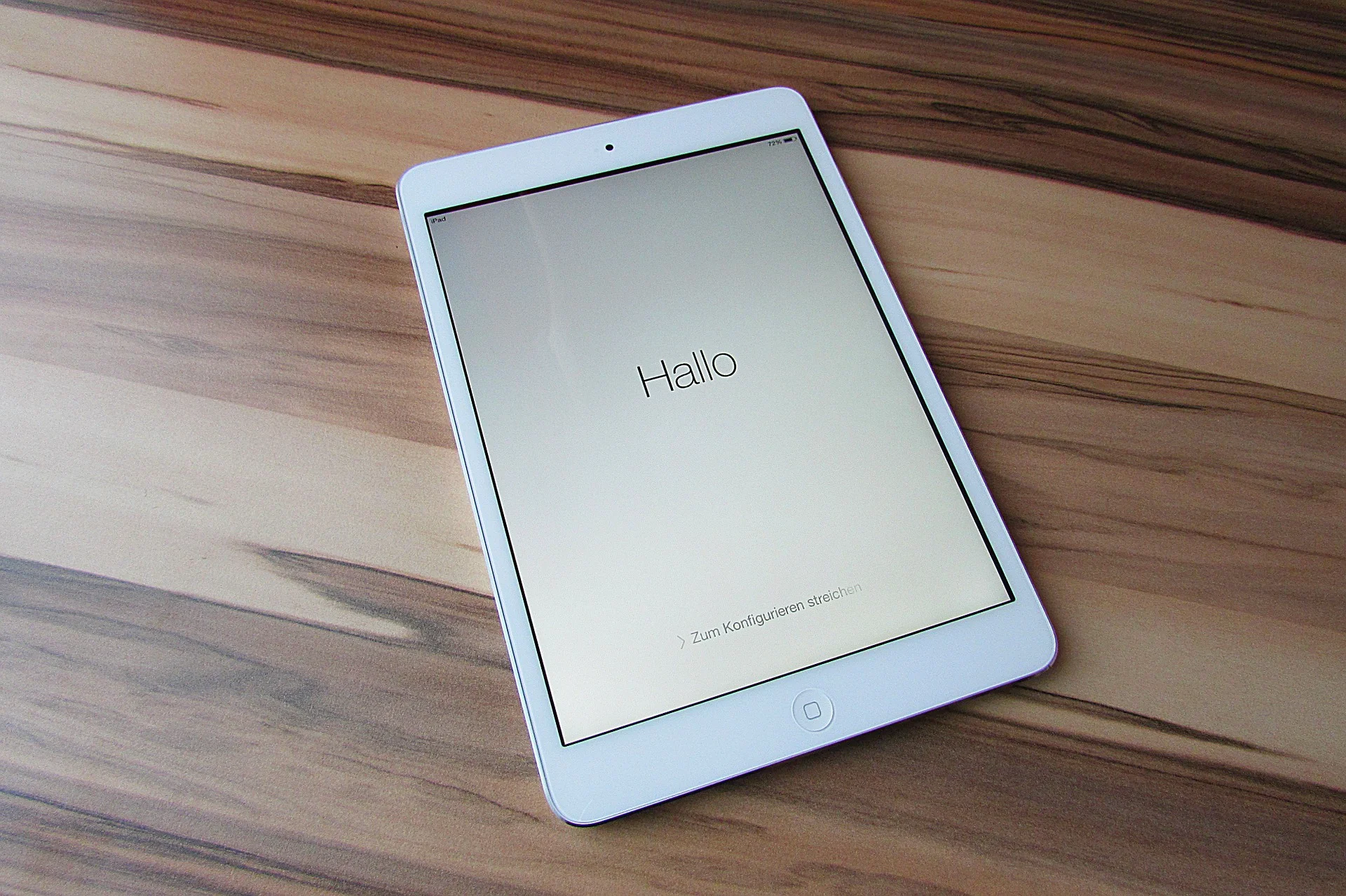
SlideMagic on iPad

SlideMagic on iPad

I have never been a big believer in focussed and productive presentation design on tablets, but presenting documents (mostly in 1-on-1 meetings) and making last minutes edits are important on mobile devices.

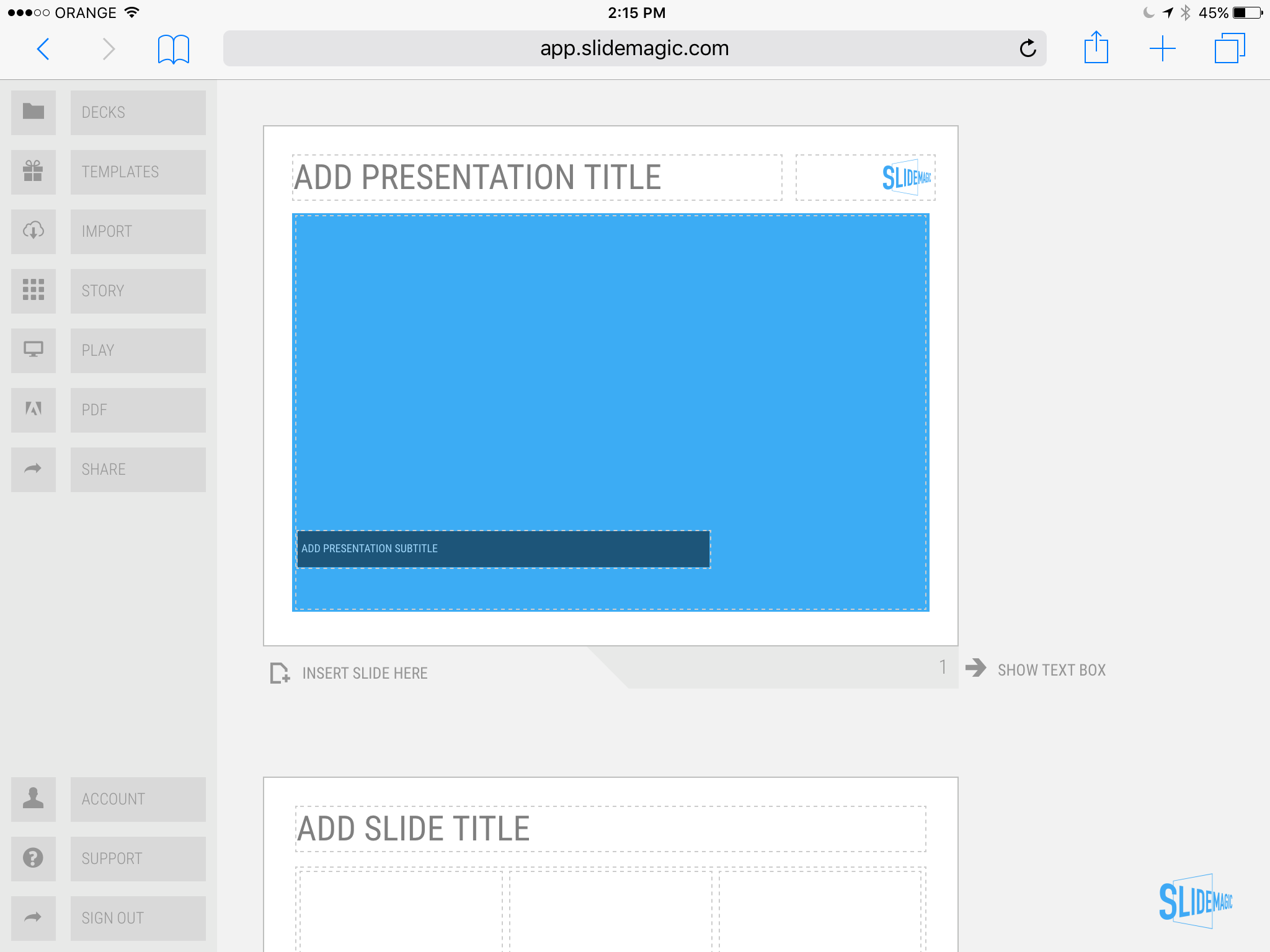
We are not making tablets a design priority, but have deployed some changes to the code that makes SlideMagic run pretty smoothly on an iPad (iPhone is still not optimal). Try it out and report back any bugs. Android tablet users, let me know what happens (I have not tried things out there yet).

With the large iPad Pro coming out later this year, there could be a brighter future for SlideMagic on iPad given the very simple menu structure we use.

Screen shot of SlideMagic on my iPad Mini 2

Screen shot of SlideMagic on my iPad Mini 2

SlideMagic: a platform for magical presentations. Free student plan available. LEARN MORE
McKinsey exhibit make-over with SlideMagic

McKinsey exhibit make-over with SlideMagic

See the McKinsey exhibit below. (I found it in a LinkedIn stream, so I cannot source it to the original article.)

This table is an example of a pros/cons trade off or feature comparison matrix. I find them very useful to visualise the impact of multiple trends, or to trade off complex issues. Still there are a few things that can be improved:

  • The finance sectors are not ranked, it is better to sort them based on the total profit impact
  • There are too many steps in the scale, resulting in too many colours. And, the colours are not chosen according to a consistent colour scale. Especially the greens, they are different types of green
  • The title of the chart is woolly
  • The row labels are too long and complex
  • Column headings are not centred, they look weird
  • The foot notes are too prominent

I have tried to recreate the chart in my presentation design tool SlideMagic. Manipulating tables in SlideMagic is especially easy since it uses a very strict grid system. I collapsed a number of categories into one. The result is that I lost some precision, but I gained a much better visual representation of the effects. If you want, you can add a second layer of data to this chart, by inserting numbers (on a scale from 1 to 7, or on a scale of -3 to +3) to show more granular data.

If you want to use this chart as a template for your own presentation, follow this link and clone the chart in your own SlideMagic decks.

SlideMagic: a platform for magical presentations. Free student plan available. LEARN MORE
3 steps to a good slide

3 steps to a good slide

Here are the basic 3 steps to come to a good presentation slide. And for 2, you do not have to be a stellar designer to get them right. For step 3, you can use my presentation design app SlideMagic)

  1. Decide on one message, one message only. Here is where most people go wrong: they try to put more than one idea on a slide. Too many things to grasp at once, too much content/clutter on the slide. Only if your message is: "There are 15 reasons why you should stop smoking") might you consider a list of 15 small bullet points.
  2. Decide on a basic slide structure. The only structure most people use is the list. But there are other (simple) ones that you should consider. A contrast (box on the left, box on the right), a ranking (bar chart), an overlap (Venn diagram), pros and cons (table), cause effect. They are not that hard to put on a slide.
  3. Get the design right. Now, here it might be trickier for the layman. Fixing alignment, proportions, grids, colours, white space, etc. etc. SlideMagic users won't have to worry much about this, for everyone else, here are some of the guidelines I have implemented in SlideMagic:
    1. Everything lines up 
    2. Everything lines up according to a grid
    3. Calm colours: one accent, lots of shades of grey
    4. Safe (sans serif) font
    5. Slides look similar in one presentation (positioning of titles, margins, etc.)

There is no reason to get 1. or 2. wrong, and you can learn 3. over time.


Art: Silver Landscape, Photocollage by Gordon Rice

SlideMagic: a platform for magical presentations. Free student plan available. LEARN MORE
Contract editing versus presentation editing

Contract editing versus presentation editing

In business, legal documents are edited in great detail. Exceptions here, clauses there, footnotes. It goes back and forth between parties. In this process that can take weeks, both sides get to know the text inside out. The dense text is actually a pretty useful format to communicate and avoid ambiguities.

Presentations are different. Most of the time, the audience sees the slides for the first time. Most of the time, they will see/internalise only part of the visual. Most of the time, the slide is a not a final legal document that will be signed right there and then. 

So editing/designing slides can be a bit different. Distracting tangents, bubbles with exceptions, tiny footnotes. These details will not really register, and worse: confuse the audience. Editing a presentation is different from editing a contract.


Art: Pieter Brueghel the Younger, The Village Lawyer or The Tax Collector's Office, 1626

SlideMagic: a platform for magical presentations. Free student plan available. LEARN MORE
NASA Apollo photo archive

NASA Apollo photo archive

NASA has uploaded a ton of public domain images of its Apollo missions online. Free to use in presentations. You can find them here. You can find more sources of free images here.


SlideMagic: a platform for magical presentations. Free student plan available. LEARN MORE
Big pompous marketing slogans

Big pompous marketing slogans

Twenty years ago in business school we were taught that you should be able to express the customer benefit in one (and only one) sentence. Many have picked up on this habit. The mistake they make is to use that sentence directly for customer audiences. These statements are intended for the marketing strategists. Writing the sentence forces you to think who you are, and who you are not. Springing that marketing jargon directly to the consumer will lead to confusion.

  • The customer might not understand what it means: it is too vague / general
  • The customer might not understand what it means: it contains technical jargon
  • The customer might not believe it: it uses language that is overused by other products that have disappointed in the past
  • The customer might not believe it: it makes promises that seem too good to be true

Good marketing slogans / texts usually have 2 components:

  1. A very clear description of what it actually is you offer
  2. Some humorous, interesting twist that makes you remember what it is all about (after you understood number 1.)

AirBNB is a nice example. It does not talk about the ever changing world, increasingly busy life styles, premium relaxation, cross cultural enriching experiences, discerning travellers, price comparison versus hotels. 

Screenshot 2015-10-07 09.36.02.png

Art: detail of "Blah, blah, blah" by studio Louise Campbell 

SlideMagic: a platform for magical presentations. Free student plan available. LEARN MORE
More than one captain on the ship

More than one captain on the ship

Writing presentations with multiple people can be challenging. Everyone has their own perspectives. Here are some ideas to stay productive:

  1. Quickly hack together a preliminary story flow as a check list that you have all required content on the radar screen. Resist the temptation to argue.
  2. Separate the work on the content charts, and the final story flow. Whatever the story flow ends up being, you need to those competitive positioning charts, P&L forecasts, team bios. Allocate responsibilities and get this work done.
  3. Once the building blocks are completed, sequence and stitch the flow of the presentation together. This is the point where you can argue and debate. Charts that summarise the flow can be designed after you have agreed what that flow is.
  4. The person who actually has to stand up and give the presentation has the decisive vote. If not, chances are that she will deviate from the group story flow while on the stage anyway. "What we really wanted to say is this" [click to page 15].

Art: James Tissot, Captain Frederick Gustavus Burnaby, 1870

SlideMagic: a platform for magical presentations. Free student plan available. LEARN MORE
Presentation designers vs. other designers

Presentation designers vs. other designers

Every other project, I encounter other designers (web, print) at clients, and sometimes we end up having discussions about my project. Feedback I often get:

  • I use very basic fonts
  • I use old fashioned shapes, I do not use icons
  • I frame images on slides rather than letting them "bleed" of the page

Part of this is personal taste, part of this has to do with the world of presentations, which is different than other design disciplines

  • Fonts:
    • Presentations get edited by many people, on many different operating systems, all the time. These machines are unlikely to have the required custom fonts installed. Brochures are designed once and sent to print, presentations are live documents edited by groups of people.
    • Presentations are business documents that need a calm and professional look. Cute fonts might look nice on one page, but 40 pages in (once you got down to next year's budget data), you get tired of tehm
  • Shapes and icons
    • Icons work in UI design, or on small mobile phone screens. Icons work if the user can remember them, see them often, repeatedly (the floppy disk to save a file for example). Icons that are less clear (a factory to visualise business), or cliche (dollar signs to show revenue). These icons take up space and do not add much value
    • Basic shapes without sophisticated borders and straight angles are calm, easy on the eye, and are very efficient to hold text and can be edited by non-designers
  • Framing images: there are a few types of presentations slides. Big images is one. But there are also tables, graphs, text pages, and girds of images/text boxes. While big images might look good bleeding of the page, it makes the design look less consistent with the other pages in the deck. Hence that I frame them most of the time, to make the title pop out of the slide without the need for semi transparent text backgrounds. Have a look of some of the classic graphic designers from the 1960s, they often frame images as well in white space.

Art: Jan Steen, Argument over a card game, 1625

SlideMagic: a platform for magical presentations. Free student plan available. LEARN MORE
Line breaks deserve your attention

Line breaks deserve your attention

When you write a block of text, the editor will insert line breaks without you noticing. Fonts are relatively small and the resulting text blocks look always good.

Designing presentation slides is different though. The position of every word and every line break counts. You face similar problems as the headline writer of a newspaper, or the designer of a poster.

  • Make sure important words that need to be seen together, stay together: "blue [break] ocean strategy" breaks the connection between critical words
  • Make sure the text is balanced across the page, without weird right paragraph endings. If required, change the font size to make words just fit, or drop to the next line. Add line breaks manually if you have to
  • And if it still does look weird, rewrite that headline into one that does look good

Yes, contradicting myself: my blog engine sometimes makes a mess of blog titles on certain screen sizes. I cannot control line breaks here...


Art: The Cliff Walk at Pourville, an 1882 painting by Claude Monet.

SlideMagic: a platform for magical presentations. Free student plan available. LEARN MORE
The new stack chart UI

The new stack chart UI

I have recently deployed a new user interface for the stack chart in my presentation app SlideMagic. You can now edit things live on the screen rather than in a separate spreadsheet.

Stack charts are the biggest UI challenge of SlideMagic. How to keep them simple... It is getting there but not perfect yet, I still need to fix the suggested rounding algorithm and make it easier to create a legend. Let me know your thoughts.


SlideMagic: a platform for magical presentations. Free student plan available. LEARN MORE
Do you need a 101 section?

Do you need a 101 section?

Some presentations are highly technical, and are mostly designed for highly technical audiences, investor presentations for advanced biotech products for example. The question is, should you include a "101" section in the presentation that explains the technology to the layman?

My answer: yes.

One, it is useful for non-technical investors, but even for the die hard pro, it is good to frame the overall story in the right context. For these specialist audiences, this part of the presentation will only take 10 seconds, for novice audiences you will have to spend a lot more than that.

An added benefit is that the 101 analogy, freed of scientific detail, is often a better way to describe/visualise what the problem is you are actually solving, and why - until now - it has been so hard to crack by others.


SlideMagic: a platform for magical presentations. Free student plan available. LEARN MORE
Colour schemes that work in PowerPoint

Colour schemes that work in PowerPoint

I am still breaking my head on this, but some colour schemes look great when you see them presented in a brand guideline, but look dull/boring in PowerPoint. More and more I think that this is because what PowerPoint is: basic slide compositions and boring/neutral Arial/Calibri fonts (especially to keep things readable on mobile devices).

  • Colours that come out poorly: earthy tones: brown, olive, curry, faded red, faded blue
  • Colours that come out great: bright and fresh purple/red, pink/blue, mint green, used as accent colours in compositions that are dominated by grey shades and big black contrasting typography.

One of the nice things about design is that you cannot always explain/rationalise why something "just is not right".


Art: Peter Paul Rubens, Rainbow Landscape, 1636

SlideMagic: a platform for magical presentations. Free student plan available. LEARN MORE
Most VCs are reasonably smart people

Most VCs are reasonably smart people

Here is an excellent post about 16 startup metrics on the Andreessen Horrowitz blog. The content of the post is interesting, but what is even more interesting is the tone in which it is written. The tale of a sober, reasonable person having to undo reality distortion fields in investor pitch decks. Investors try to understand what is going on.

Here is what you should do:

  1. Understand what is going on yourself. Pick the relevant metrics for your business. See what is happening.
  2. Present what is going on reasonably honestly. There is no need to emphasise a poor statistic with highly effective data visualisation. But pulling a totally obvious trick (like a broken axis) will have zapped all your credibility before the VC is even trying to understand what the chart means.


SlideMagic: a platform for magical presentations. Free student plan available. LEARN MORE
Should you add financial projections in a startup pitch presentation?

Should you add financial projections in a startup pitch presentation?

Everyone knows that you made them up, nobody knows the future, all startup pitches predict hundreds of millions of revenues at some stage in the future. Why bother putting these shaky financials in?

Yes, there is no point in including your highly precise 10 year financial forecast model, exactly for these reasons, but, there is still a place for financials in your pitch. Here is what I usually do.

  • A reasonably detailed and precise "forecast" of the short term financials. In most startups, this usually involves only costs. And unlike the revenues, you can be pretty certain about where you are going to spend that investment on in the near future. The benefit: 1) investors know where their money goes, and 2) investors see that they are talking to a CEO who seems to know what she is doing, has things organised.
  • A very high level annual revenue outlook for the next 5 years. Nobody will pay much attention to this hockey stick chart.
  • But - and this is the useful bit - add another slide that shows in a few simple calculations what you would have to believe in order for that year 5 revenue and profit number to be true. The best is a multiplication of 5-10 simple numbers: # countries, people / country, market share, price / user, gross margin, fixed $ million cost. You teach the investor how your business model works (what factors are important) and provide a way to evaluate whether your forecast is highly optimistic, or totally insane. The underlying Excel model can still be very detailed (it should be), but the 5-10 numbers should be very simple. I have had design projects where the company went back and revisit the Excel model because of an inconsistency in these high level numbers. 

Art: Albert Anker, The Fortune Teller, 1880

SlideMagic: a platform for magical presentations. Free student plan available. LEARN MORE
Table or bar chart?

Table or bar chart?

Back in the good old days at McKinsey, we tend to put any range of data in a column or bar chart, even if that meant a chart with just one column, or one chart.

A nice clean bar/column chart works beautifully to visualise a data range. Especially if there are big differences between the values of the chart. If the differences between the numbers is not that big (I do not like broken axes), or you have lots and lots of data to present (the data labels just become too small), I resort back to a simple table. 

Stick all the data in, round things up nicely, and use accent/shading background colour to make your messages pop.

I must admit, I start using tables more and more. (And that is why they are so easy to make in SlideMagic)


Art: Louis-Philippe opening the Galerie des Batailles, 10 June 1837 (painted by François-Joseph Heim)

SlideMagic: a platform for magical presentations. Free student plan available. LEARN MORE
Confusing ranges

Confusing ranges

A large of the data presented in business presentations is uncertain: future forecasts, market (share) estimates, competitive comparisons. Many people express that uncertainty by presenting numbers as ranges: cost per bottle as between $1.50 and $2.00.

While working with ranges might be required in a spreadsheet calculation, I don't like to use them in presentations:

  • It clutters the slides with double the amount of data labels, and/or double the amount of text in tables
  • It becomes hard to work with totals, add things up. Five of these 1.5 to 2 becomes 7.5 to 10. Adding negative numbers into the equation will give totals that nobody can work out from the top of their head.

So what to do? I would stick the mid point of the ranges as a point estimate in the presentation, and makes sure it is a nice, rounded number (7.49544 looks to certain). Much simpler and much clearer.


Art: a painting depicting women inspecting silk, early 12th century, ink and colour on silk, by Emperor Huizong of Song.

SlideMagic: a platform for magical presentations. Free student plan available. LEARN MORE
Stock image sites come second

Stock image sites come second

My use of images has changed a lot over the past year. I have now reached a point where stock image sites come in as a last resort. And when I do, clients often push back and ask me to look for something different than that cheesy, cliche, polished stock image.

So, most of my image search starts with Google Images, with the option "labelled for re-use". or I browse through some of these excellent sources of free presentation images. (Although I must say that the latter now become so popular that you start recognising images instantly because of over-use).

SlideMagic: a platform for magical presentations. Free student plan available. LEARN MORE
Thoughts on user interfaces

Thoughts on user interfaces

As I am making progress with my presentation design app SlideMagic, I spend a lot of time thinking about user interfaces (UI) for office applications.

Part of the reason that it is so hard to wean people of Microsoft Office applications is that they have gotten used to the mouse/click/dropdown user interface. Spreadsheets, word processors (who uses them still?) and presentation design software all basically have that same UI.

The drop down UI started out pretty simple. File, edit, help menus. Over the years ribbons and tool bars have complicated things. Most people now use a fraction of the functionality that is available to them. As soon as a program does not have that familiar dropdown UI, people are in trouble. I had a hard time understanding the new Adobe Acrobat UI. It is beautifully simple, but it takes time to figure out how to do very basic operations (zooming in and out, combining multiple files into one, rotating mixed up pages of a scan).

Over the past years, user have gotten to know a second UI: the mobile device. The solution for office apps is super simple functionality that draws heavily on icons, UI elements that we have learned from mobile devices.

See how it can work in SlideMagic.

SlideMagic: a platform for magical presentations. Free student plan available. LEARN MORE
Sales presentations can be technical presentations, and vice versa

Sales presentations can be technical presentations, and vice versa

Often, clients tell me that they have to present to an audience of engineers, so the presentation should not be a "marketing" presentation.

The bad interpretation of this is: we are engineers presenting to engineers, so we can get away with text-heavy slides and diagrams full of numbers. We engineers understand each other. As soon as we add pictures or try to make the presentation more visual in other ways, we lose credibility.

What is really going on is this: if you are selling a high tech product there is no way you can avoid well, talking about the technology. But the high tech world is full of presentations written by people who do not really understand the technology, for an audience who does not really understand the technology. These presentations lack substance but are rich in marketing buzzwords. Engineers will recognise them in a second, and don't want you bring "one of those".

We need to eliminate two misconceptions:

  • Technical presentation content cannot sell
  • A senior (and/or) sales presentation audience does not understand technology

Here are some of the things I do to create technical sales presentations:

  • Insist on explaining how it works in human language without "black boxes" or "secret sauces". The Einstein quote about a 6 year old who can understand everything if told in the right way applies here.
  • Very focussed data visualisation. Technology advantages are often beautifully simple: things are faster, cheaper, smaller. Rather than writing a bullet point "we are 33% smaller", put in that very complicated data chart that shows the full richness of your research, but add 2 big bold lines that are 33% apart. 


SlideMagic: a platform for magical presentations. Free student plan available. LEARN MORE