What if things did not change that much?

What if things did not change that much?

Many large companies grow only a few % points per year. They are large and mature businesses. And many quarterly investor presentations have charts like this in them:

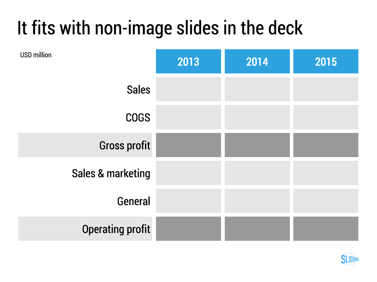
When things don't change that much, a stacked column chart like this one might not be the best way to show the data, maybe a good old table is better. Stacked column chart show the relative proportion of values at the expense of legibility, especially for small categories that can be hard to read. If nothing changes in the proportions, a table will be easier to digest.

For these big companies, analysts do not focus that much on the absolute numbers, it is the differences in growth percentages that matter. To give the growth numbers more visual power, a combination of a table and a bar chart can be a powerful visual tool.

You can clone this chart and others that I used on the blog into your own SlideMagic account buy clicking this link.


SlideMagic: a platform for magical presentations. Free student plan available. LEARN MORE
PowerPoint conversion is now live

PowerPoint conversion is now live

PowerPoint conversion is now live in the SlideMagic app. The back office workflow is still a bit improvised, but it works.

I see many users requesting PowerPoint conversions of the SlideMagic templates, in the hope that they can use the simple SlideMagic slide manipulation functionality in good old PowerPoint. That will not work in most cases. All elements of a SlideMagic chart line up beautifully in a grid, and when converted to PowerPoint, all these blocks become individual PowerPoint shapes. If you do not touch them, they look great, but try to make changes to a slide layout, and you have to go through tricky resizing and re-alignment exercises. It is this type of work that probably makes up 50% of my bespoke presentation design work and which was the main driver to try to automate it.

Before committing to developing SlideMagic, I have tried extensively to program a smart PowerPoint template that could do similar things, but I could not get it to a level that was simple enough for a layman designer to use it. Believe me, I tried (really hard).

I hope that SlideMagic users will feel increased confidence to give the app a try now that they know that there is always a way back to PowerPoint, if they want. But at the same time, I think users that have given the app a real opportunity to show itself (create one presentation start to finish), will see the limitations of PowerPoint and make the switch.

Whether there will be a PowerPoint import feature as well? The answer is a definitive "no". Because of the fundamental differences in design approach SlideMagic takes, it is not possible to convert PowerPoint into SlideMagic presentations.

Let me know your feedback here in the comments or via jan at slidemagic dot com. Not yet a SlideMagic user? Sign up here.

SlideMagic: a platform for magical presentations. Free student plan available. LEARN MORE
Two related product stories

Two related product stories

Sometimes, your company has 2 products with similar, but different stories. Pitch the products in full detail sequentially duplicates some of the common parts of the story (and bores the audience) A generic pitch followed by example 1 and example 2 makes the product pitches too weak.

A possible solution that I recently applied to a medical technology startup:

  • Layout the basic idea behind the innovation that is shared between the products, not necessarily as a pitch, but more to educate the audience
  • Set up the company as a combination of 2 parts
  • Do a full pitch for product 1 (without repeating the basic concept that was explained in the introduction)
  • Do a slightly shorter pitch for product 2, just highlighting the differences in the technology for product 2 compared to product 1.

Art: John Everett Millais: Twins, Kate Hoare and Grace Hoare, 1876

SlideMagic: a platform for magical presentations. Free student plan available. LEARN MORE
Citrix slide make over

Citrix slide make over

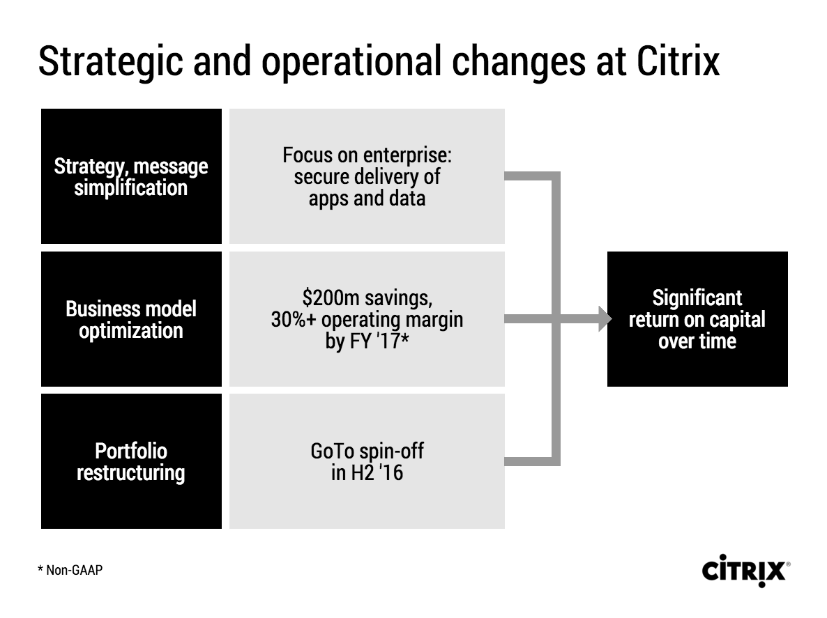
Citrix announced a corporate restructuring recently. The slides that were used are typical of many corporate PowerPoint presentations. Here is an example:

This slide looks like it came straight out of the consulting report that preceded the decision to make the changes. There are a number of things that can be improved:

  • The look & feel does not match Citrix' clean black and white corporate identity
  • The slide uses a standard Microsoft PowerPoint smart object, with "dirty" gradients
  • No attention has been given to typography: "H2'16" is orphaned on a 2nd line, the light boxes are too narrow to contain 3 lines of text
  • Messages are repeated on the left and right side of the chart
  • There is a cause and effect relationship in the chart (we do this and get ROC in return) that is not reflected in the way it is laid out.
  • The headline is a but woolly.

I tried to fix these issues in this quick makeover in my presentation app SlideMagic. I kept the 30% margin and $200 cost cut info in the business model optimisation box, although you could argue that that is an outcome of the strategy as well. A true business model optimisation would be "price increases" or something.

If you want you can copy and clone this slide to your own SlideMagic account by clicking this link. Not yet a SlideMagic user? Sign up here to try it out.

SlideMagic: a platform for magical presentations. Free student plan available. LEARN MORE
iPad Pro and presentation design

iPad Pro and presentation design

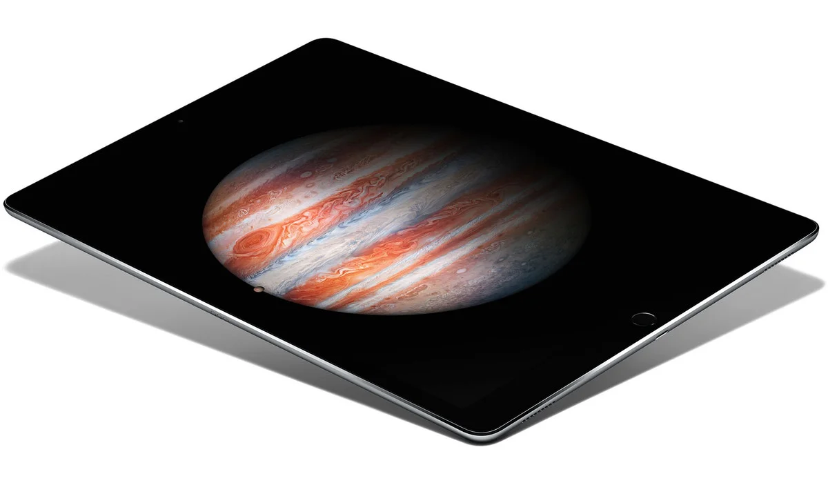
I have been reading the reviews of the Apple iPad Pro and the Microsoft Surface Pro with great interest. Analyst Benedict Evans and many others claim that iOS/Android powered devices will replace OSX/Windows computers as the main computing tools we use.

Illustrators and designers seem to love the devices. Big surfaces with a precise pencil signal the end of the expensive Cintiq devices.

Writers (bloggers, journalists) complain that they miss the mouse/track pad on these devices. It is hard to go back and forth from keyboard to screen to move quickly through text and cut/paste sentences.

Presentation design might actually be a good fit for a bigger tablet, if you can make things run smoothly without the need for the attached physical keyboard. It would require a redesign of the user interface though, the mouse-based UI is too complicated, and the current mobile UIs are too counter-intuitive, many functions are hidden. SlideMagic might fit the bill, I am going to find out soon.

Still, there is the difference between "it works great" and mass adoption in big enterprises...


SlideMagic: a platform for magical presentations. Free student plan available. LEARN MORE
Convert SlideMagic presentations to PowerPoint

Convert SlideMagic presentations to PowerPoint

Many people have asked for this feature. I might have found a partially automated solution for this. Partially means, slides are converted automatically, but the overall workflow is still manual.

Before I start investing a lot of resources (time and money) in developing a fully automated solution, I want to test demand. Soon, I will be adding a "PowerPoint" button to SlideMagic, but in the interim, you can email to (ppt at slidemagic dot com) an editable link of your presentation (generate it via the SHARE menu in SlideMagic) and we will send you back a PowerPoint file.

It is important to send the link using the SHARE function, nobody but you can open the links in your browser for privacy/security reasons.

Make sure that you have the Roboto Condensed font installed on your machine. It is a free font provided by Google

  1. Exit PowerPoint
  2. Go to the Roboto Condensed download page
  3. Tick the 400 and 700 boxes
  4. Download using the "arrow down" icon at the top right
  5. Double click the downloaded files to install the fonts
  6. Re-open PowerPoint

Roboto Condensed cannot be installed on iOS devices. If you want to edit your converted SlideMagic presentation in PowerPoint for iOS consider replacing the Roboto Condensed font for Helvetica Neue Condensed. Here is how to swap fonts across an entire presentation on a Mac. But hey, SlideMagic runs pretty well in Safari on iPad, no need to convert to PowerPoint for this.

Some disclaimers:

  • It is a partially manual solution, please be patient, delivery can be instant or take some time.
  • A human will open your presentation, we are nice people and unlikely to read it all in detail and/or post things on the Internet though. Still some corporate compliance regulations might have an issue with this
  • There might be glitches in the quality of the conversion, if so, we would like to hear about them.

You will see that the end result looks pretty decent and small text edits work great, but - and this is the reason I created SlideMagic - if you want to make fundamental edits to a SlideMagic slide in PowerPoint you will hit the limitations of PowerPoint. For example, adding a row or column to your grid and getting everything to line up nicely is a small operation. I suspect you will quickly go back into SlideMagic, do the edit there, and convert again. Hopefully, in the end you will just forget about the conversion and stay inside SlideMagic.

So, hopefully the option of converting your SlideMagic presentation to PowerPoint will give you increased confidence to try it out, there is nothing to lose, you can always fall back to good old PowerPoint.

Not a SlideMagic user yet? Sign up here.


SlideMagic: a platform for magical presentations. Free student plan available. LEARN MORE
"This is my usual introduction"

"This is my usual introduction"

"When I put up the first [incredibly busy bullet point] I start of with this introduction before I take people through the slide"

Usually, these introductions are great. They come out naturally, in a conversational style. Next time:

  1. Use that introduction as the opening of your presentation, add a visual slide here and there to support the story. And don't stop there, finish the entire presentation in that style
  2. Second best option. Put in a black slide before your busy opening slide and tell that introduction without encouraging people to start reading your bullet points.

SlideMagic: a platform for magical presentations. Free student plan available. LEARN MORE
I like to frame images

I like to frame images

Big, confident images look better on a presentation slide. The maximum size of your image is achieved when you let it "bleed" of the page (the term comes from the age of print, where the ink would drip of the corner).

These full size images look great if your presentation is just images. In most cases, my client work is not. Hence, I prefer to frame my images within a box of white (or black). Some people say it is bad practice, I disagree:

  • You do not have to worry about legibility of slide titles
  • Photo slides look consistent with other slides in the presentation
  • I think, it actually looks very distinguised

My presentation app SlideMagic caters for both formats, so don't worry if you disagree with me. You can clone the slides below (and all other slides I have used on the blog) into your own SlideMagic presentation via this link.


The image was found on unsplash, free images under a do-whatever-you-want license

SlideMagic: a platform for magical presentations. Free student plan available. LEARN MORE
Pitch to self versus pitch to customer

Pitch to self versus pitch to customer

Many marketing documents are written to pitch to the author, not the potential customer. When pitching to yourself:

  • You do not have to explain what your solution actually does, you know it already
  • You can boil down critical aspects of the pitch in just a few "place holder words". Reading them will trigger your memory to pull up 15 pages of value proposition in a nano second
  • You have a lot of different customer segments to worry about, so you dilute the story a bit to appeal to as many different customers there are, emphasising a few extra benefits here and there
  • You do not have to explain technical marketing jargon, as an expert you know it all

Think about this.


Image: Hollywood actress Constance Talmadge, head-and-shoulders portrait, facing right, looking into mirror.

SlideMagic: a platform for magical presentations. Free student plan available. LEARN MORE
Lining up logos with tag lines

Lining up logos with tag lines

Often, graphics design is about details. It is difficult to pin down why something just does not look right. The answer: small little things. See the bottom of a magazine ad below. The logos on the left and right have tag lines/sub brands: above on the left, and below on the right. The graphics designer simply centred the image files, but our eyes wants to centre not the entire image, but the main text of the logo. It looks like the logo on the right is positioned too high.

If you cannot get excited by this you should not become a graphics designer...


Illustration: Gemini constellation

SlideMagic: a platform for magical presentations. Free student plan available. LEARN MORE
No, also presentations cannot be designed by committee

No, also presentations cannot be designed by committee

Marketing, Investor relations, corporate communications, business development, everyone likes to have a say in the design of the next keynote address of the CEO at that important industry conference.

When the team "works" on a presentation, you usually get the following pattern:

  • Long meetings in a conference room, with a few people dialing in by phone (people who cannot see the slides), discussing the key messages on each slide
  • Long email exchanges without an organised discussion thread to log changes

Design by committee also does not work for presentations. Here is why it goes wrong:

  • In the end, you need to pick a consistent approach to the story. Mixing and matching parts of approach A and parts of approach B is not going to give you a "best of both worlds" result. The only way to get something consistent is to have one person write it.
  • A committee focuses on the slides, adding footnotes, changing headlines, shuffling the order. And while doing that, they feel like they are "programming" the verbatim of the CEO (who is not in the room). Wrong, in the end the CEO will pick his own story, sometimes despite the slides.
  • In a committee there is no one doing the real work, at the end of the meeting, the most junior person at the table probably gets tasked with "incorporate all comments into a new version and email it around by 9AM". That junior person might have dropped / not understood a few comments, and probably lacks the spine to push back against more senior executive in the company (who made a point that does not make sense).
  • You will for sure miss the contribution of introverts
  • The casual observer in a committee meeting often does not have the in-depth understanding of how the presentation is built, and what is written on which slide. As a result, noticing that important elements are missing, she will suggest to add comments, bubbles, and footnotes on random slides to make sure that the key messages are "at least written down somewhere".
  • Committees under time pressure like to give drastic input. After a 3 hour discussion: "oh yeah, the deck is too long, collapse 35 slides into 10", leaving the junior team member confused what to do.

A better approach:

  • Interview the CEO/the person who is actually going to give the talk
  • Get the committee together and "shake the tree" for all messages and issues that need to be included
  • Now, design the whole deck start to finish
  • Then ask input from the committee and be tough with accepting comments

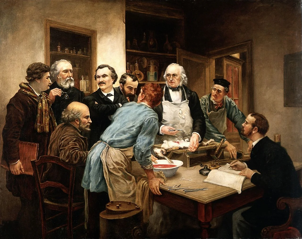
Art: Claude Bernard and his pupils. Oil painting after Léon-Augus Wellcome

SlideMagic: a platform for magical presentations. Free student plan available. LEARN MORE
Multiple weak signals make a strong one

Multiple weak signals make a strong one

I played around with the new "connectors" in my presentation app SlideMagic and used them to create a chart that visualises how multiple weak signals can come together into a strong one. I have added this chart to the SlideMagic template with charts that I discussed on the blog, you can clone it to your SlideMagic account here.


SlideMagic: a platform for magical presentations. Free student plan available. LEARN MORE
The slides from my talk at Microsoft TLV

The slides from my talk at Microsoft TLV

The accelerator of Microsoft Ventures Tel Aviv invited me to speak this week. I used my presentation app SlideMagic for the design and presentation of the slides (in the lion's den of PowerPoint). You can view and clone the slides to your own SlideMagic account here. If you do not have an account yet, the app will let you create one.

Some of these slides are hard to understand without verbal explanation. But, this presentation pretty much follows the narrative of my book about presentation design. Check it out, it is free to read.

SlideMagic: a platform for magical presentations. Free student plan available. LEARN MORE
Where to put the team page?

Where to put the team page?

This is the dilemma in many investor presentations, in the front, in the back? Usually, I put the team slide in the second half of the presentation, after you tackled the pitch of the problem/solution. The slide sits in the "about" section, alongside financials, organisation, milestones, etc.

There are exceptions, here are some reasons to put your team slide in the front:

  • The team is actually the key story of the pitch: if your company consists of unusual people (the former this, the former that), than better start with it right
  • The majority of your team is sitting in the room, physically. A team slide upfront is a great background for the introduction of your people
  • Your company is all about combining different disciplines, which have never been combined before. A time slide (specifically designed to show the cross-functional expertise) might help support this point.

I usually design 2 versions of the team slide:

  • A summary slide that highlights the main message about team that you want to emphasise (we worked together for 5 years before, we worked for very important companies before, each of us has 5 patents, etc.)
  • In the appendix of the document a more elaborate, traditional CV description of the backgrounds, you can use font size 8 here.

Art: Scotland Forever! by Elizabeth Thompson, 1881

SlideMagic: a platform for magical presentations. Free student plan available. LEARN MORE
Don't fill the time because you can

Don't fill the time because you can

"How much time do I have?" is the first question many speakers ask when getting invited to speak at an event. It is an important question: a 5 minute presentation is dramatically different from a 20 minute one. Beyond 20 minutes though, it does not make that much of a difference. These presentations are "long". I very much doubt that you will do a better job in convincing your audience in 60 minutes than in 20. In fact the opposite might be true.

If you get offered a 60 minute slot, ask yourself whether you really need it, or you should cut it to 20-30 minutes instead.


Image taken from WikiPedia

SlideMagic: a platform for magical presentations. Free student plan available. LEARN MORE
Breathe

Breathe

If you answer a question with lots and lots and lots and lots of information, and can indicate a number of things:

  • You know a lot about the substance
  • You are insecure
  • You don't really know the answer and try to talk around it
  • You will be difficult to work with because it is hard to interrupt you and engage in a dialogue
  • You did not understand the question fully and try to make sure to answer any related question

Better to answer that question short and to the point.


Art: Joseph Ducreux, Self Portrait, 1783

SlideMagic: a platform for magical presentations. Free student plan available. LEARN MORE
Watch out with "super slick"

Watch out with "super slick"

Many of my clients start our conversation with a request for a "super slick" presentation. I think "slick" is not the most important requirement of a business presentation. I usually go for a restrained, professional look. Here is why too much slickness might backfire:

  • Nobody trusts a smooth talking politician or car salesman. Super slick graphics might just give the impression that there is something to hide.
  • Spectacular moving visual effects might just make the audience giggle, because it sort seems out of place for the setting of a small conference room presentation
  • Complex graphics create technical and practical problems. They take a lot of space making it harder to share documents, videos often go wrong in live presentations, breaking the flow/momentum of a pitch, custom-made graphics are hard to edit and change (presentations are living creations that change all the time), fonts always create problems when they are not installed properly
  • "The cliff": often I see incredibly sophisticated presentation starts (slide, 1, 2, 3), but pages 4 to 50 look incredibly boring with standard bullet point slides.
  • Often the key to a pitch is not a dramatic trend, but a small, clever innovation that makes you stand out. Investing a lot of time (and money) in visualising a mega trend that is already pretty obvious to everyone ("facebook is big" for example) is a waste of effort and takes the attention away from the really important point in your presentation

"Slick" does not always help to make your message clear.


Image taken from WikiPedia

SlideMagic: a platform for magical presentations. Free student plan available. LEARN MORE
Free presentation design resources

Free presentation design resources

This may sound like a link bait title, but there is a lot of useful stuff buried in the archives of my blog that is there free for you to use. Click the "3 dots" at the top right of the site to access a drop down menu with more options. Among them: 

And of course there is the full version of my book about presentation design that can be accessed free of charge.


Art: Jan Davidsz. de Heem, Still-Life of Books, 1628

SlideMagic: a platform for magical presentations. Free student plan available. LEARN MORE
What makes a presentation look professional?

What makes a presentation look professional?

It is hard to nail down why good design looks good, and poor design does not. We see it, but articulating why, it is hard. A good designer has an "eye" for design (a combination of talent and experience) to make things just look right.

Having said that, here are some of the things to pay attention to. 

  • Layout along a grid, everything is spaced out, lines up
  • Restraint:
    • Colours, not too many
    • White space, have the courage to leave things blank
    • Font sizes, maybe smaller is better than screaming big, if it adds white space to the page
  • Limited number of words per line (10 points text on a 16:9 slide spanning the entire width does not read very well) and carefully selected line breaks
  • Nice images that set the right mood (avoid cliche stock images)
  • Use vertical positioning as well as horizontal ones (a different way of saying there are more slide compositions than lists)
  • People thought about every word, sentence, shape on the page. Changed it, repositioned it. Changed it again. Good slides very rarely come out right in the first iteration.

All the above can be found in any design book. We read it, we understand it, and still when opening a PowerPoint template when we are back at work, we ignore pretty much all the rules.

A good exercise could be to make one slide (just one), look exactly like a poster designed by a Swiss graphic designer from the 1960s that you like, or maybe like a slide that Steve Jobs used once. Push yourself really hard until the style is identical. You will be surprised by the amount of changes you need to apply to your design.

And hey, my presentation design app SlideMagic makes sure you stay on the right path. Try it out.


Art: Georges Croegaert - The Philatelist

SlideMagic: a platform for magical presentations. Free student plan available. LEARN MORE
"The technology is not important"

"The technology is not important"

Founders tend to cut out slides about the technology of a startup in an investor presentation. Too detailed, too difficult, they (potential investors) won't understand.

But I usually push back. In early stage startups, the technology is actually almost the only asset the company has. And, every technology, yes every technology can be explained and understood (it is a presenter problem, not an audience problem). Believing that you can't might also cause huge offense with your potential investor.

And there is the opportunity to show how clever your platform is. Here are some steps that I usually take when presenting technology to investors:

  • Find out what bits are interesting, innovative, and what bits are not. In IT for example, there is usually some process: we load the data, we do this to it, then store it there, sync it here. But usually, one of these steps is the clever one. An approach to an algorithm nobody has taken before for example.
  • Dive really deep into the interesting bits, and leave everything else at a higher level. Invent, show a case example where your technology comes up wit something counter intuitive, unexpected.
  • Quantify, make it tangible where possible. If this is big data, show how much data you need to process.
  • Clean up diagrams (architectures, process flows), re size boxes, align them on a grid, group things that belong together, use colours. You will notice that even the most complicated architectures can be visualised in a simple way. Listen to how the "technical guy" talks you through his diagrams. Often it will be completely different from what is on the slide. Ditch the existing visual diagram and visualise the verbal one. 

Art: In England, artist Francis Barraud (1856-1924) painted his brother's dog Nipper listening to the horn of an early phonograph during the winter of 1898. Victor Talking Machine Company began using the symbol in 1900, and Nipper joined the RCA family in 1929.

SlideMagic: a platform for magical presentations. Free student plan available. LEARN MORE