Editing the bullets in a cafe

Editing the bullets in a cafe

I have seen it many times in coffee shops. Two people at a laptop. One doing the typing. The other stretching back, looking at the ceiling, and rephrasing that sentence until it is just perfect and encapsulates everything: "With flexible automation, value delivery is now ensured throughout the customer journey". "No, I think that should be "value creation". "Yes, you are right, change it". "Make "automation" bold, italic, underline", that is the key message here". "Red color as well?" "Yes, this starts to look perfect".

  • Noisy coffee shops are not the best environments to do design work
  • When you really get into the story you are touching on highly confidential issues (weaknesses, strengths, competitive positioning, development pipeline) that you do not want to discuss in public places
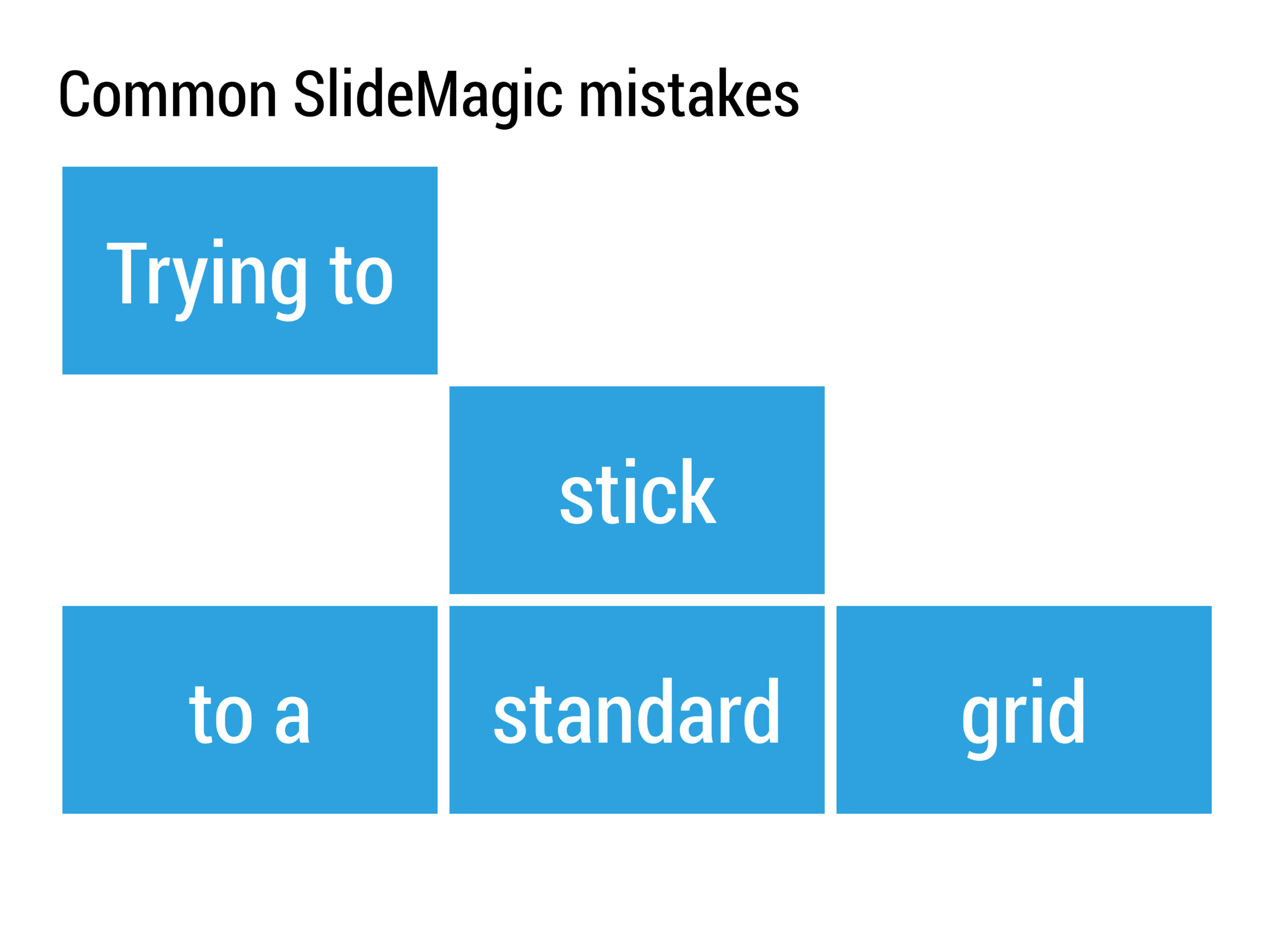
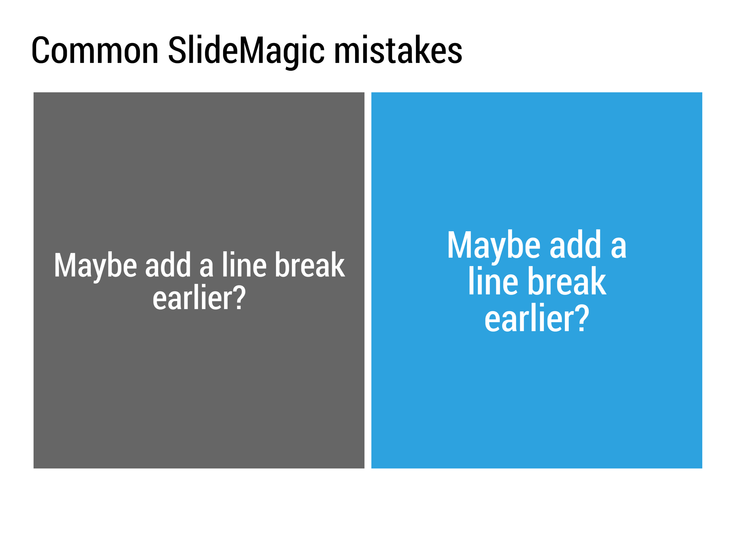
  • Bullet point phrasing does not equal visual slide design

Image by Gavin St. Ours on Flickr

SlideMagic: a platform for magical presentations. Free student plan available. LEARN MORE
Clean that keyboard

Clean that keyboard

Clean crisp design work is unlikely to happen in a messy working environment. No, most employees have little influence over the interior design of an office, but your own desk? You can do it. Apple keyboards look horrible after a year of use, but are easy to wipe clean. Buy a nice pen/mechanical pencil, invest in a beautiful notebook (buy it yourself if it is against corporate purchasing policy), peel off the Intel inside sticker from your corporate laptop. Clean up the outdated post it notes on the whiteboard. Wipe the whiteboard. Open the blinds.


Art via WikiPedia

SlideMagic: a platform for magical presentations. Free student plan available. LEARN MORE
Back from Japan

Back from Japan

I just returned from a wonderful holiday in Japan. What a great country with such a rich culture. Having been there before in the early 1990s, I was preparing my kids (10 and 12 years old) for a small "culture shock", but Japan has opened up a lot in the last 25 years and has become very open to visitors from the west.

Anyway, i will pick up my blogging routine soon. Apologies for violating the social media rules and dropping my blog for 2 weeks, but for me holiday = holiday, which means minimizing the opportunities for my mind to start thinking about presentations.

SlideMagic: a platform for magical presentations. Free student plan available. LEARN MORE
Lower posting frequency

Lower posting frequency

I am taking a short spring break with my family, so posts might appear less frequently over the next weeks. Apologies! Image via WikiPedia

SlideMagic: a platform for magical presentations. Free student plan available. LEARN MORE
Videos that make presentations too heavy

Videos that make presentations too heavy

Videos can make presentation files too big for email. Many corporate email server are still set to a maximum of 10MB for attachments. Some thoughts.

  • Yes, there are many alternatives for email attachments, Box, Dropbox, WeTransfer, etc., and sending email attachments might look like a thing of the past. But, if you are fundraising or on a sales campaign, you want to take all possible friction out of your funnel. One in 50 recipients might be working in a company that does not support Dropbox for security reasons, another might be a 65 year old angel investor who does not know how to use box. Your document has to fit all possible audiences.
  • Think about that video in documents that you sent. When you are there in the room, presenting, you can make take action when people do not connect to it (switch it of, explain, etc.). When someone is watching your video and does not have the patience for that spectacular opening animation scene, you cannot prevent her from abandoning your pitch all together. Some videos are useful or even essential (product demos, real estate project walk through), others might simply try to add some sparkle to the deck. Make the call whether they are essential.
  • If you decide to take the video out and it contains essential information, don't simply paste a YouTube link (again, think of the impatient investor watching the deck on a mobile phone, or the 65 year old angel investor), or even worse, nothing. This will take an essential element out of your story. Instead think of alternatives for a video: add a series of screen shots with explanation bubbles, or pack the message of the video in a more traditional slide.

SlideMagic: a platform for magical presentations. Free student plan available. LEARN MORE
"Why should people invest in my company?"

"Why should people invest in my company?"

Google is full of free investor presentation advice and presentation layouts. The problem with all of these is that they are generic and not specific to your situation. So blindly filling out a presentation template is unlikely going to give you the best pitch.

Here is another way to craft your pitch. Think of an investor you respect, and even better, an investor whose reasoning you sort of understand resulting from conversations and or blog posts. Now, jot down an imaginary conversation that could have taken place if you find yourself next to her in the check in line for a flight. The most important part of the exercise is to anticipate the likely questions are face expressions you are going to encounter: "Really, what is it about?" "Hmm, that is a sort of [x] for [y] right?" "But are any of your users actually sticking around?" "What do people pay today for this?" "But you have no machine learning expert on your team" "Yes, I know that online video consumes a lot of bandwidth, but what does it have to do with you"

 Now take you notes from this conversation and use it to craft the flow of your investor pitch. Then, go back to the standard investor presentation templates and use them as a check list to see whether you haven't forgotten anything important.

Why is the business school, standard, investor presentation structure not always the right one?

  • Investors might already know a lot about a market, a technical vertical segment, so there is no need to do the 101
  • Investors might actually know nothing about a particular market, and you will have educate them before getting to the actual pitch
  • There are "elephant in the room" questions screaming to be answered first, even if they allow show up on page 25 of your template
  • Visual or verbal analogies might require a story sequencing that clashes completely with a standard investor pitch template
  • If you have 500 pages and/or 3 hours of material there is no alternative but to structure things orderly. ("Hey, where were we again?")  In 10 to 20 minutes, you have a bit more creative freedom to shuffle things around
  • Standard presentation structures might not work in a conversational pitch style, if you start rattling down your Harvard-approved pitch the investor already gets worried: "Huh oh, we are going to get this one for the next 10 minutes" and you are likely to be interrupted with a question that invites a dialogue.

Art: Leonid Pasternak, The Passion of creation

SlideMagic: a platform for magical presentations. Free student plan available. LEARN MORE
The secrets of making system diagrams

The secrets of making system diagrams

System architecture charts can be incredibly complex, and I need to include them sales/investor presentation for almost every client that I work with. They serve an important purpose: 1) demonstrate that you know what you are doing on an emotional level, 2) ability to answer detailed technology questions on a factual level.

As I dig into these puzzles, I discover that in most cases the diagram is very complex, but the underlying system architecture is not. Most diagrams are created with some kind of drawing tool. Their main purpose is system specification, make sure that people are designing the right system. They are not meant at all for communication. (In that respect things are similar to Excel: a great tool for analysis, a poor tool for communication).

The solution is to disconnect from the diagramming app and start sketching your system architecture again, purely for the purpose of communication.

  • Grid, grid, grid. Line up all the boxes properly, space things out. Keep boxes the same size/shape as much as possible 
  • Eliminate as many overlapping connectors as you can. Try again, again, again, again, and one more time. Overlap spaghetti is a sign that you have not really understood how to explain your architecture.
  • After you eliminated your overlaps, you should be left with a grouping of boxes that is more or less logical. If there is a sequential process, there is a high chance that your boxes line up according to it. If things are related, they are probably located next to each other. In the previous steps, you looked purely for overlapping connectors, now go over your diagram again and think about function.
  • Next, use color to group things together. The great thing about color is that it can make a connection between objects which are not necessarily sitting next to each other on the page
  • Omit, collapse boxes that are not that important (this would have disastrous consequences if we did this in the system design diagram)
  • Think hard about what text, titles to use in the boxes, cut words where you can, use rectangular instead of circular shapes to fit more text if needed. Go for a smaller font size, but don't fill the entire box with text to make your composition look calmer.

SlideMagic: a platform for magical presentations. Free student plan available. LEARN MORE

Medium hick ups

I started importing my blog into Medium a few months ago, but the process is not going smoothly. I keep up with my blog in a "write it and forget it" way, without the elaborate SEO/social media follower strategy, so reformatting and editing the same post on multiple platforms is not the best way to spend my time. I will see how it goes, but might stop the conversion all together. It is best to keep following this site.

SlideMagic: a platform for magical presentations. Free student plan available. LEARN MORE
"Do you do web sites as well"?

"Do you do web sites as well"?

New startups are in need of all kinds of marketing collateral: pitch decks for investors and/or potential customers, product brochures, and a web site. I think that in the beginning, people are aiming too high with the web site: super effects, video backgrounds, sparkle, and glitter.

But the experienced investor or corporate purchaser sees through the facade immediately, this is a brand new startup with hardly any customers and 6 months of VC funding left. Instead, you can build a web presence that show yes, that you are young, but that you are serious and know what you are doing.

  • There is actually some sort of web page on your URL, not an "under construction"
  • Use squarespace, Wix, or another template engine for a modern look and feel, with at least a premium enough version that it does not say "proudly built with Wix" at the bottom.
  • Make sure your branding is consistent: accent color (you don't need a lot of it), and a simple logo (does not have to be a master piece) 
  • No gmail or hotmail email addresses
  • Your LinkedIn profile actually says that you are the CEO of this company, and not a marketing consultant from 2004 to present
  • The company has an address that when entered in Google street view does not point to a residential street
  • When the site has a "news" section, or a blog, it should contain fresh articles, if not, just don't put it on.
  • The web site should actually describe what the company is doing, without buzzword overload

In the early phases, especially for enterprise sales, Google will land you a lot of customer inquiries, but rather people will visit your web site after a meeting as a form of due diligence.


SlideMagic: a platform for magical presentations. Free student plan available. LEARN MORE
Trends in presentation and pitch design

Trends in presentation and pitch design

I opened some old presentations on my hard drive and started thinking about how my work has evolved over the past years. Here are some observations:

  • Starting points of presentations (the briefing decks I see) have gotten a lot better. Garr Reynolds, Apple product launches, TED talks, etc. etc., and maybe most importantly a younger post-overhead project generation is joining the workforce, raising the bar in presentation design
  • The audience has evolved as well. People know the general drill of a startup pitch, the Internet or a smartphone is not as strange as it was in the early 2000s. People have the courage to cut a bad presentation short. 
  • Back in 2003, I was probably one of the very presentation designers in the world, now there are thousands. 
  • Given the above, my work is moving on a bit. While I still do the proper upgrading of the look & feel of a presentation, it is completely not the most important thing I do anymore. Actually, my graphics and visual concepts are getting simpler, and simpler, maybe even regressing to what I did a few years back.
  • Orchestrating the flow of a pitch is still important, but as pitches get shorter and shorter, and everyone has pretty much settled on a classical investment pitch are start to focus more and more and the pacing of the story. People skip over important things too quickly, while spending far too much time on the obvious, and finally sometimes they do not even touch on a very fundamental missing step in their arguments. 
  • My favorite design work are the "puzzles": diagrams that need to show very complex trade-offs, technology infrastructures, or relationships of multiple factors impacting each other. In the end, these diagrams look very simple, but they can take a relatively long time to construct, burning through endless amount of scrap paper in the process.

Here it all comes back to my presentation app SlideMagic: the final technical slide design is increasingly a very, very simple diagram. The tricky bit is 1) get the pacing right, 2) find that simple composition that summarizes that complex relationship.


Painting by Max Lieberman

SlideMagic: a platform for magical presentations. Free student plan available. LEARN MORE
Nice arrows

Nice arrows

See below how you can shape arrows in PowerPoint. Most people don't really pay attention to the way their arrows look, but it can make a huge difference to the professional look of a chart. This is even more important when you need multiple arrows on a chart, make sure their proportions are all the same.

You can change the shape of an arrow in PowerPoint by dragging the little yellow dots that I have circled in the image.

SlideMagic: a platform for magical presentations. Free student plan available. LEARN MORE
Pitch one liners

Pitch one liners

TechCrunch posted a list of contestants at the latest  Y Combinator demo day, and you can learn from the one-liners that describe the company. A few words capture the essence of a pitch and instantly makes it clear what the company does, and even more importantly, teases you to find out more about a potentially interesting idea. 

No buzzwords, filler words, no hype. See how the headlines use concepts that we already know, often brands of established companies. This is a quick memory short cut for a story that would have taken 30 minutes to explain to someone in 1995 who never heard of Palantir.

Voodoo Manufacturing – A robotic 3D printing factory
Volt Health – An electrical stimulation medical device
Terark – Making databases faster
Wright Electric – Boeing for electric airplanes
Speak – AI english tutor
NanoNets – A machine learning API
Scribe – Automating sales development representatives
Breaker – Making podcasts a real business
Bitrise – Automated build/test/deploy for mobile apps
Fibo – Mobile work tracking for construction teams
Paragon One – Career coaching from real professionals
Tress – A social community for black women’s hairstyles
Bicycle AI – Automated AI customer support
Vize Software – Self-Serve Palantir
Simple Habit – Netflix for meditation
Snappr – On-demand pro photographers
IQBoxy – Software that replaces human bookkeepers
Beek – Book review site for Latin America
Bulk MRO – Industrial supplies for India
Soomgo – Thumbtack for South Korea
Cartcam – Shopping app for the Snapchat generation
Peer5 – P2P Serverless CDN
Pit.ai – Automatically mining trading strategies
SmartAlto – Software suite for commercial real estate
XIX.ai – Predictive assistant that anticipates your needs
Zestful – Employee activities as a subscription service
Arthena – Art investing for everyone
Mednet – Stack Overflow for oncologists
Penny – A mobile personal finance coach
Moneytis – The cheapest way to send money abroad
Hogaru – Cleaning for SMBs in Latin America
Bulletin – WeWork for retail space
Sycamore – Onboarding drivers for on-demand jobs
Aella Credit – Consumer and low-income lending platform
Tolemi – Software to help cities find distressed properties
Niles – Conversational wiki for business
Upcall – Outbound calls as a service
KidPass – One pass for “amazing activities for kids”
Lively – Modern healthcare savings account (HSA)
Indigo Fair – Amazon for local retailers
Collectly – Stripe for medical debt collection
Tetra – Automatic notes for business meetings
FloydHub – Heroku for deep learning
ACLU – A non-profit you might know


Image via WikiPedia

SlideMagic: a platform for magical presentations. Free student plan available. LEARN MORE
"Do something basic, it does not have to be great"

"Do something basic, it does not have to be great"

"I know you are busy, but this is really urgent, I we are on a very tight budget: do something really quick, it does not have to be great, pretty, beautiful"

A warning to all freelance designers don't fall into this trap.:

  • Your client says it does not want quality, but will for sure be disappointed when she receives the work. Secretly she hoped that you would not stick to the bargain and put in the extra hours to come up with a decent product
  • Your basic, not so good, quick work, will still go out there, it will be passed on, other people will see it, and the poor quality will boomerang back to you.
  • You have crossed the "I am a quick fixer for hire" mental threshold. The mindset of the freelancer should always be, how can I be more valuable, and as a result charge more for my work, rather than less. It should be a one-way door, never go back.
  • If you accept this short term work,  you might have to drop a potentially interesting client a few days later because of it. Opportunity cost of time.
  • Clients who are willing to compromise quality are probably not the best clients to work for.

Another often used argument is "we will do the design, you just focus on the story". Things go quiet when you actually send over a deck full of boxes and placeholders that is ready to go into the design process.

The only real reason I find it hard to say "no" is not cash, it is admitting that I cannot help everyone with raising money or getting that crucial client. But I learned from the few times when I said "yes" and should not have.


Image via WikiPedia

SlideMagic: a platform for magical presentations. Free student plan available. LEARN MORE
Presentation half life

Presentation half life

Presentations go stale over time. Watch your slides. You might not see it, the audience will. 

  • PowerPoint 2010 fonts, colors
  • Out of date logos (of your company, but also customers, competitors, partners)
  • Inconsistent formatting between pages
  • Analogies to over-used, old, example companies ($1 dollar shave club, MySpace, etc. etc.)
  • Growing slides: company history, company events, customer logo overviews, every year another column gets added and the others get squeezed

But what I most often see is that the founder still pitches her deck the same way she got her seed funding (with success). A few years on, the company has moved on, and the investor concerns have moved on. Yes, the technology is still great, but you don't need to convince anyone that that is the case. But what about that traction with customers?

SlideMagic: a platform for magical presentations. Free student plan available. LEARN MORE
Designer state of mind

Designer state of mind

Creative jobs are different from managerial jobs. I started noticing the difference when transitioning from being a management consultant to a presentation designer. It especially obvious with being sick. As a consultant, I could usually function pretty much normal with the help of some coffee until drastic body feedback such as fever or a splitting headache prevented you from going any further.

With design work it is different. You notice that something is "not right" in your head 1-2 days before the onset of other symptoms. You can't come up with any good ideas, or you can't focus on your creative work and decide to do the monthly accounting. So, sometimes after these 1-2 days, I do actually develop symptoms, or things disappear while others in close proximity do get sick. 


Image from WikiPedia

SlideMagic: a platform for magical presentations. Free student plan available. LEARN MORE
A quick call with SlideMagic feedback?

A quick call with SlideMagic feedback?

I am crunching the stats in the SlideMagic user database and singling out individuals with whom I would like to have a short call to talk about their experience with SlideMagic. At this stage, qualitative input is what I value most, quantitative surveys are being ignored and hide what is really going on. I have many options and ideas to take the app further, but I realize that dazzling technology is probably not what it takes to change the presentation culture in corporates. Input welcome!

If I did not approach you and have a clear opinion, feel free to reach out via contact at slidemagic dot com.

SlideMagic: a platform for magical presentations. Free student plan available. LEARN MORE
Design in Tech Report 2017

Design in Tech Report 2017

I participated in the survey for the 2017 Design in Tech Report by John Maeda. It is full of interesting facts and figures about the state of design.

One insight that resonated with my is the design education gap. Aspiring designers get zero education in business or engineering when studying for their degree. My presentation design business is the direct result of this.


As I blogged, earlier, the design itself of the document is also interesting. It is a consulting-style deck with lots of information and facts, meant more for reading than a stand up presentation. This is a document format that is probably the most common in business today.

  • Some elements are similar to the ones you can use in my presentation app SlideMagic. Grey colors with only one strong accent color. The use of 16:9 to extend slides with a full-text "explanation box"
  • Good use of typography: titles, subtitles, text, quotes (the latter surrounded with lots of white space)
  • The font is nice and elegant, but will make the document not very readable on old VGA projects and/or monitors. You see in the SlideShare rendering that things start to go wrong. This is the reason I went for a heavier font in SlideMagic.

Anyway, this document is a good reminder to look at when you look at your own PowerPoint doc. Why does yours look bad, and John's look good?

SlideMagic: a platform for magical presentations. Free student plan available. LEARN MORE
Common SlideMagic mistakes

Common SlideMagic mistakes

My presentation app SlideMagic will make life easier for every amateur designer. Still a few common mistakes sneak in that are hard to prevent with software. Most of them are related to the balance of typography on a page. Making sure that boxes contain roughly the same amount of text, and that signs are nicely balanced. See the examples below.

SlideMagic: a platform for magical presentations. Free student plan available. LEARN MORE
OK, some more thoughts on the BBC interview video

OK, some more thoughts on the BBC interview video

You have probably seen the video of the interrupted BBC expert interview. More and more meetings, interviews, and even regular calls now involve video. It can be a planned webinar, or a Skype call whether the other side all of a sudden, hey, let's switch on the video.

First of all the handling of the situation. If your toddler marches in there is basically no point in keeping a straight face, trying to push the distraction away like it is an annoying insect. Apologize, pick the child up, and close the door. But it is best to prevent getting into these situations beforehand...

You see how distracting backgrounds can be. The way you positioned your work desk is almost never the best position for a camera. The best background for video calls are completely blank ones (a white wall), or completely cluttered ones a full book shelf for example. As soon as there are individual items (loose books, a gadget, other objects, the mind of the audience starts to wander of.

Adjust your attire to the environment you are in. Being fully suited up in a home office at night does not look natural. No, pajamas or sweat pants does not work either, but something in between would work better. 

IMG_2664.jpg


In short, be prepared for everything. In my case, it is my canine office friend who always comes up with a surprise...

SlideMagic: a platform for magical presentations. Free student plan available. LEARN MORE