Lower post frequency

Lower post frequency

I will be taking some time of over the next week with my family and some good friends, and blog posts will be less frequent than usual. Most of my blog posts are almost live, and as a result I don't have a long post buffer that I can use to pretend that I am writing 365 days in the year.


Cover image by Vesela Vaclavikova on Unsplash

SlideMagic: a platform for magical presentations. Free student plan available. LEARN MORE
My presentation training in 1996

My presentation training in 1996

In the middle of the house and office declutter exercise, I found my credit card-sized reminder of things I should work on which I wrote after a communication training at McKinsey, back in 1996 when I just returned from INSEAD:

presentation-training-tips.jpg
  1. Avoid the "Napoleon hand", I seemed to have difficulty finding a natural position for my right hand
  2. Finish a point completely before jumping into the next slide / topic
  3. Introduce a slide before putting it up (McKinsey data slides can be overwhelming)
  4. Maintain eye contact with the audience
  5. Use a loud (maybe confident?) voice

I think I had a few strengths as well, but did not bother to write them down (I hope :-) ).

That little card might survive the declutter tornado.


Cover image by Margarida CSilva on Unsplash

SlideMagic: a platform for magical presentations. Free student plan available. LEARN MORE
Cartoons in presentations

Cartoons in presentations

Want to use a cartoon in your presentation? Here are some things to consider:

  • Humor in a presentation can work, but be careful what sort of jokes you pick. A cartoon that was very funny late last night when you prepared the slides, could not fit the meeting context the next morning after that earlier remark that did not go down well. If you hardwired the wrong cartoon in your slide deck, make sure to click-skip really quickly.
  • Do you have the copyright for the cartoon you just found on Google Image search?
  • Does the cartoon actually add something to the presentation, or is it a business cartoon cliche?
  • Can the audience actually read what is written on the cartoon from the back row?
  • And finally, do you give the audience enough time to read it? As soon as you put a cartoon on the screen, everyone will start squinting to read what Dilbert has to say, and no one is listening anymore what you say at the same time. It might be best to pause your presentation until the first giggles start emerging from the audience. And remember the audience reads the cartoon for the first time, and needs more time than you to understand it. If you have to, you might have to read out the cartoon to the audience.

Cover image by Samantha Lorette on Unsplash

SlideMagic: a platform for magical presentations. Free student plan available. LEARN MORE
All over the place

All over the place

A debate about a contentious complex issue with lots of people in a room is unlikely to go anywhere. If you are asked to make a presentation to run such a meeting, here is what you need:

  • Data slides with one issue per slide that clearly state how data (or logic) supports your point. One issue per slide is important, you want people to really understand what you did, and more importantly, you don't want other debates about other issues when getting people to buy into your analysis.
  • A logic flow that chains all these data slides together into a coherent argument. This is your typical stand up presentation: clear visuals, that deliver a compelling presentation
  • Then, when the fireworks start, a slide that actually groups all the issues and arguments on one page, even if this means cramming in more information than you usually would on one slide. Don't try to put all the data on this slide, but give each issue a physical location on the slide. Maybe project it on a whiteboard so  you can write on it, and spot when people making the same point again, discuss a completely unrelated issue, disagree about the validity of the source data, dispute the validity of the analysis, etc. etc. Collapse the issues people agree about to create more space for the contentious arguments.

Good luck!


Cover image by Peter Nguyen on Unsplash

SlideMagic: a platform for magical presentations. Free student plan available. LEARN MORE
Decluttering

Decluttering

We are going through a small refurbishment of our home at the moment, it was badly needed after our kids spent the first decade of their lives in our place. This all causes some disruption, but also has some upside: I need to pack up every single item in the house (and office), and make a conscious decision whether to put it back or not.

I tried doing a (minor) clean up 3 years ago, and can now see the exact items I decided to keep sitting at exactly the same spot where I left them. This was a great encouragement to do things properly this time. 

Highly recommended, even if you do not need to repaint your home and office.


Cover image by Ashim D’Silva on Unsplash

SlideMagic: a platform for magical presentations. Free student plan available. LEARN MORE
Creating your own presentation style

Creating your own presentation style

SlideMagic is all about cutting the time that people spend on creating and sitting through presentations. Most presentation decks are decision documents where people need to agree on a deal, budget, or plan. Things need to look decent, but most of all, they should be effective and simple to put together.

What can help a lot is developing your own visual language. A very limited set of slide layouts that look good, and you know how to manipulate and customise to the specific situation. You will be surprised how few templates you need to build a business presentation. Most slides show an image of something, make 3 points, compare 2 options across 4 dimensions. It only takes a few layouts to cover these.

So with your own (small) slide template library:

  • You work faster
  • You can invest time to make them look good, it will pay of when you use them again
  • You create presentations that are very recognisable "you"

The standard slides in the SlideMagic template store are pretty much my personal template library. (By standard I mean the tables and text grids, not the slide with the herd of sheep for example). As a professional presentation designer, my required library is probably far bigger than the one you need. 


SlideMagic: a platform for magical presentations. Free student plan available. LEARN MORE
Years in columns, which way?

Years in columns, which way?

In financial statements, the most recent financial period is put first, and next to it is the previous period for comparison: 2017 - 2016. To the frustration of some accountants and CFOs, I insist on putting the years the other way around: 2016 - 2017.

  • The eye is used to moving left to right when looking at time series data
  • It makes tables match line or column graphs that are in the presentation
  • It makes it easer to compare data across 3 years or more

I am not trying to change the reporting practices for financial statements. In the annual accounts, the current year is the most important one. It needs to be accurate and is usually shown with far more digits (precision) than I would use in a presentation. A comparison to last year's numbers is almost an extra, not the main purpose of the page.

Every financial document has its own purpose and own audience: spreadsheets, financial statements and presentation decks. And among presentation decks you can distinguish between quick and dirty documents to discuss (early results), detailed financial information for the investor community, and more generic financial slides for a general company presentation. Different purpose, different slides.

If you want you can check out financial slides in PowerPoint in my template store. Subscribers can download them free of charge.

SlideMagic: a platform for magical presentations. Free student plan available. LEARN MORE
Trees!

Trees!

A tree visualises the composition (or decomposition) of a number into a number of factors. They are what I call ponder charts, not to be presented during a TED talk, but rather they are useful for  (complex) studying relationships between different factors.

Below are two examples of these analysis trees. The first is a summary profit and loss account for a company. I often use these a tree like this to visualise the business model of a startup by forcing a forecast year 5 P&L of a success scenario into this format. It is impossible to forecast the future accurately, and investors and founders will always disagree on the numbers, but the tree teaches you how to think about this company. What drives its economics? What would you have to believe for the year 5 scenario to be true? A tree always has to add up and multiply, this often leads to insights when it forces you to fill in boxes that you did not originally take into account (i.e., you forecast your sales, you assume market size, and right in the middle sits your implied market share).

A second example is this return on invested capital tree. It explains how (and more importantly, why) company performance is changing over the years. In this version I added miniature line diagrams to make the annual trends clearer. PowerPoint cuts the vertical axes of these graphs automatically, amplifying the trends in the line graph. Normally, I would object to this form of lying with statistics, but in this case with the very small diagrams, it is actually useful.

Both these trees go from left to right, sticking to the McKinsey style of going from big picture to detail. 

Clicking the images takes you to store where you can download the finished slides, subscribers can do so free of charge.

SlideMagic: a platform for magical presentations. Free student plan available. LEARN MORE
Starting to use the store myself

Starting to use the store myself

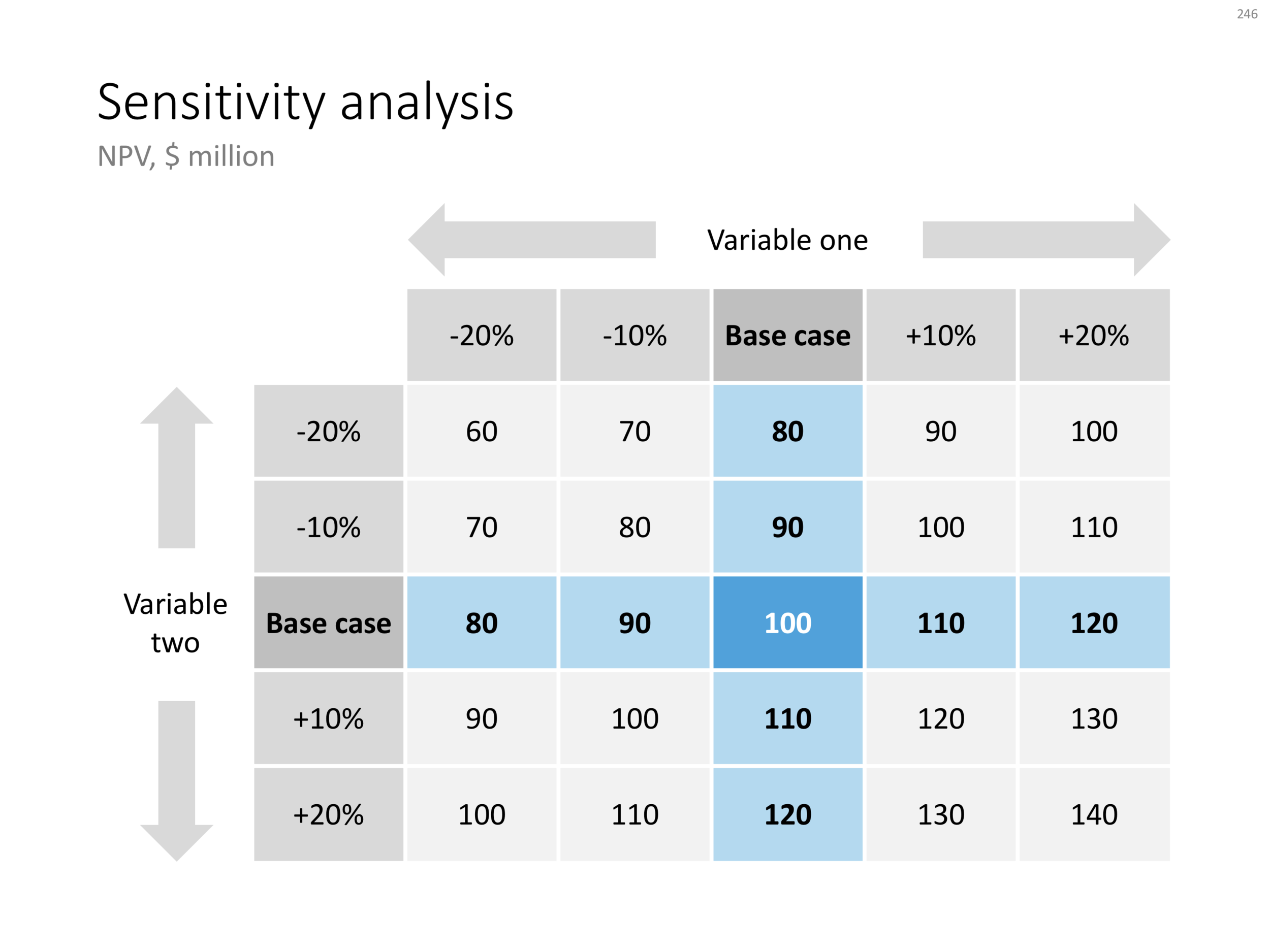
Recently, I have started to use the template store myself for the few bespoke design projects I still do for long standing clients (SlideMagic gave me a really attractive rate :-)). My hard drive is filled with 1000s of slides and still it is difficult to find a nice clean layout to use as a basis for slide number 1001.

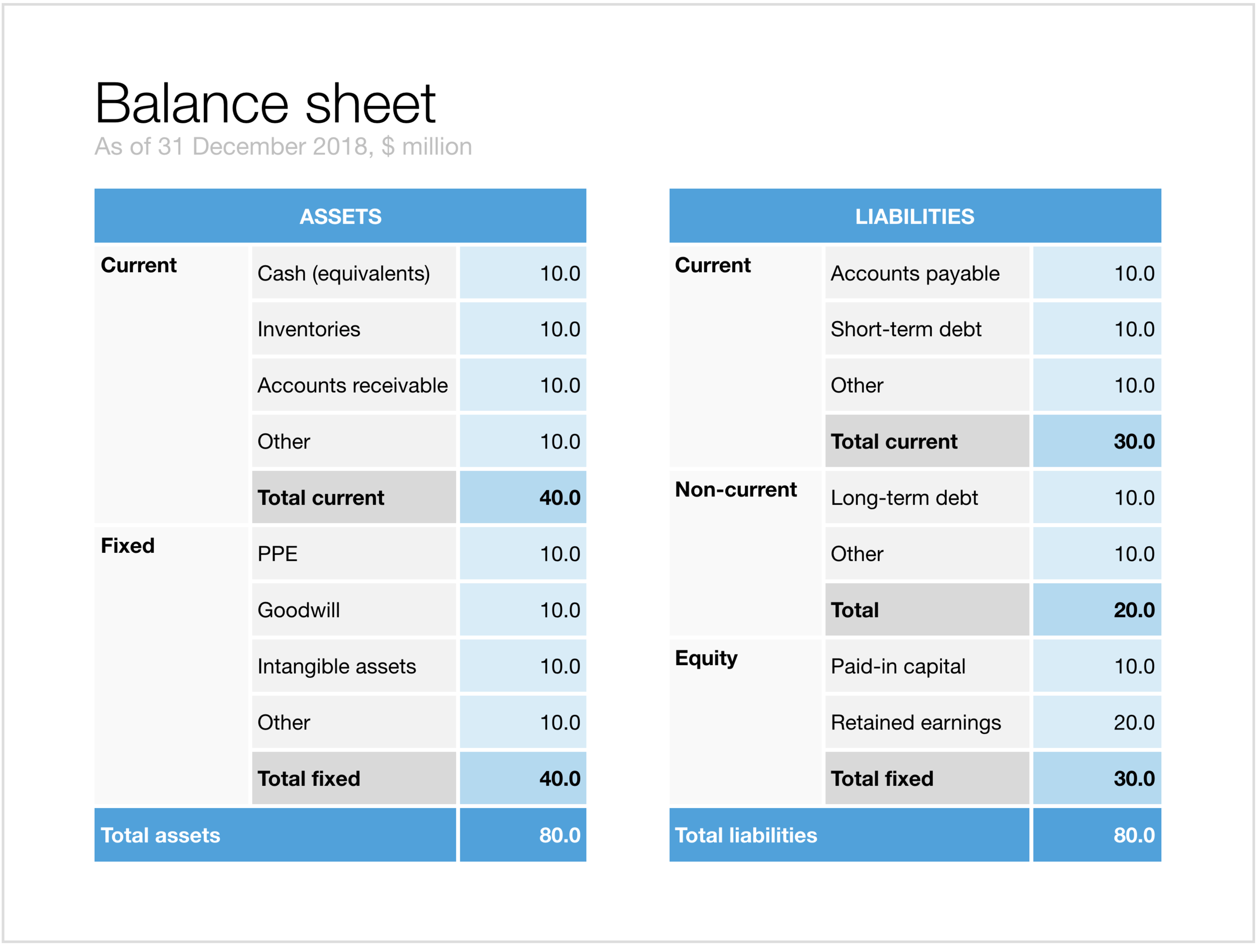
Up until a few weeks ago, I started every slide pretty much from scratch, I have gotten pretty fast in setting up yet another 4x5 table grid. But even I can't beat search the store for "table" and re-download that slide again and hit the ground running.

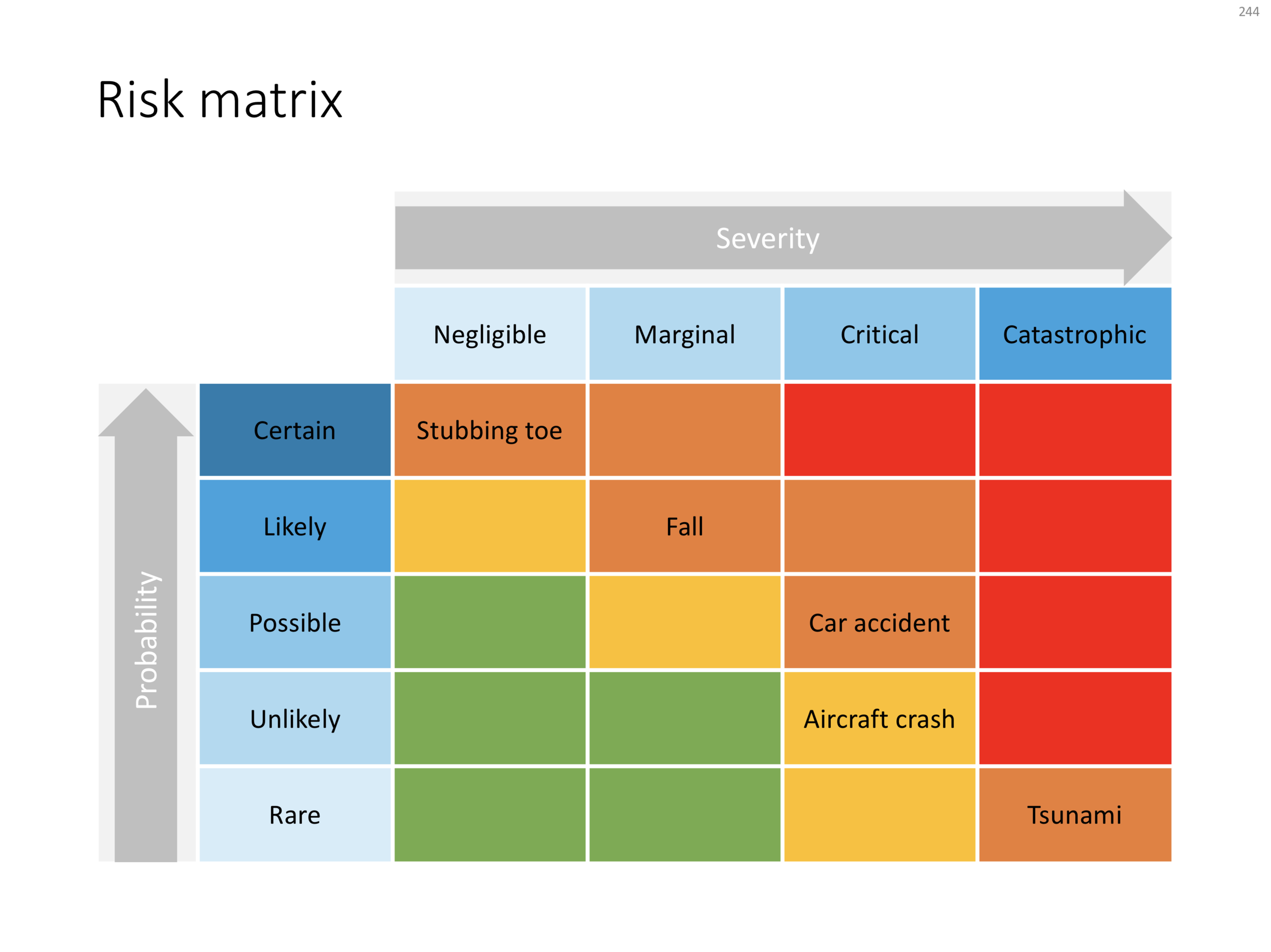
I am continue to monitor which slides people decide to buy, and which slides are downloaded by subscribers. Many subscribers download a lot of slides right after they made the purchase, and then don't return for a couple of weeks. Initial downloads include slides that you can only use in very specific situations, like these sheep. They hardly ever download the same slide 2x. There could be 2 possible explanations:

  • Less likely: after that $99 annual subscription, you better make sure you get what you paid for, maybe the store will stop running somehow before the 12 months are up.
  • More likely: we have built up the habit of mining through old decks, and recycling slides into a new presentation.

As a designer who now uses its own store, I would encourage you to think Netflix, iStock, Spotify: your slides will always be there, and search is there to help you find the slide you need at the moment (and nothing else). Change your design process:

  • From: open your consolidated SlideMagic deck (which took time to assemble from all the individual slides you had to download), pick 20 designs you think you are going to need, see how you can tell your story with these 20 designs
  • To: scribble your story flow on a piece of paper, create a deck of empty slides with just titles, search the appropriate slide template on SlideMagic

It will take you less time, and you get better presentations. And remember: I am constantly adding new slides so your first burst download will run out of date soon.

Having said that, I am willing to look into a technical solution to combine multiple slide downloads in one deck, my commerce platform cannot handle that (yet).


Cover image by Henrik Dønnestad on Unsplash

SlideMagic: a platform for magical presentations. Free student plan available. LEARN MORE
Stock photo celebrities - 2018

Stock photo celebrities - 2018

Unsplash has become a fantastic resource of images: the quality of the photos is better than stock photo sites, and all of them are completely free of charge. I have been seen it growing from a static page with 1 free image a week which took forever to download into what it is today.

My stock photo use has dropped dramatically over the past years: I use fewer images (increasingly preferring simply bold typography), and if I use them, I either select "real" images of an actual product, store, city, or, I use Unsplash.

Stock photo celebrity from the past

Stock photo celebrity from the past

I am not the only one who has discovered this, and we now see the same thing happening as with stock photo sites 5 years ago: next to stock photo celebrities (this call centre rep for example), we now get Unsplash celebrities.


rawpixel-com-340972-unsplash.jpg
rawpixel-com-411169-unsplash unsplash cliche.jpg
rawpixel-com-358746-unsplash.jpg
rawpixel-com-569602-unsplash.jpg

The 4 image above are contributed by rawpixel.com, which added many other images as well which are not (yet) as recognisable as these 2 "business people".

SlideMagic: a platform for magical presentations. Free student plan available. LEARN MORE
Sensitivity analysis in PowerPoint

Sensitivity analysis in PowerPoint

Today, I am adding a simple table to the store to show the sensitivity of an analysis. Each cell in the table shows an outcome of an analysis with a slight variation on 2 critical input variables. I used this type of a slide a lot in discounted cash flow valuation models, where assumptions about discount rates and assumed perpetual growth could make a significant impact on the outcome of your analysis.

The base case scenario is put very prominently in the centre of the table, it is the anchor for the viewer from which to start studying the other scenarios. I prefer making these type of charts manually, and not via a blanket copy-paste out of an Excel sheet. In that way, you have to think about whether each cell in the table is meaningful, and you can make sure that the data is formatted and rounded in the best way.

You can download this sensitivity analysis from the store, subscribers can do so free of charge.


Cover image by Markus Spiske on Unsplash

SlideMagic: a platform for magical presentations. Free student plan available. LEARN MORE
Quick reformat of the YCombinator Seed Deck Template (free)

Quick reformat of the YCombinator Seed Deck Template (free)

The application deadline for the next YCombinator is coming up and the incubator posted a suggested seed-stage investor pitch deck template. I quickly ran the template through a make over process using templates available in my store. The resulting pitch deck template can be downloaded free of charge.

Some comments:

  • This is a seed stage pitch deck for an investor which has very specific opinions/requirements about sourcing investments: early stage, seed stage businesses are extremely fluid and change/pivot so many times that there is little point in long-winded elaborations, given the volatility of these extremely early stage businesses, the team is the biggest indicator whether there is a chance that the company will be successful.
  • YCombinator is proud that they can see through fancy-looking decks, you probably even get points for not wasting time on PowerPoint slides, and instead focusing your efforts on the company (pretty much the philosophy behind SlideMagic). This might not work with all investors (hence the slide upgrade in look & feel in my remake).
  • The big selling point in this deck is obviously the placeholder for traction and growth, not many early stage companies will be able to produce the numbers for that "hockey stick" (yet).

All in all, these are good guidelines for crafting a pitch deck for a highly knowledgeable investor. I would up the graphical finish just a notch to make it look more pleasing, without overdoing it. That's what my template tried to do. 


Cover image by Evan Kirby on Unsplash

SlideMagic: a platform for magical presentations. Free student plan available. LEARN MORE
Legal presentation arguments

Legal presentation arguments

Sometimes I work on presentations that border on legal or regulatory disputes. Two parties need to convince some independent party or regulator that they are right, often with the help of independent experts.

The briefing presentation at the start of a project usually is a left over of the original project presentation, it makes the case for the project in general but buries the actual smaller issue that is being discussed now, for example environmental impact.

What follows is a verbal discussion with the old slides as a background: then we did this, then we hired her, then we installed this technology, then they disputed the data, then we did a test (but changed it a bit), they came up with these counter arguments, that do not really apply to this situation. To the outsider who has not been part of the process it is completely impossible to understand the arguments. 

In a situation like this:

  • Start from scratch and build a presentation in which 95% of the time is spent on the issue at hand
  • Make sure that your flow of logic is clear
  • Separate the arguments that are undisputed, from more contentious issues
  • If the other party has a major counter argument, there is no point in hiding it, you might as well put it in your presentation prominently, and with your solid argument why it is not a valid point
  • Pick your battles, if the other side has a point that is pretty much true and hard to disprove, don't spend energy trying to make an impossible case against it. You will loose credibility when making other points that really count

Cover image by Chris Brignola on Unsplash

SlideMagic: a platform for magical presentations. Free student plan available. LEARN MORE
Risk matrix in PowerPoint

Risk matrix in PowerPoint

I am continuing to tick off the standard presentation frameworks in the store, yesterday I added a PowerPoint template for a risk matrix. The matrix has 2 axes: one for the probability that a disaster happens, the other one how severe it would be if it were to happen.

The matrix is designed in true SlideMagic style: not very fancy, but highly symmetrical, usable, and adaptable to your everyday presentations. You can download the slide here, subscribers can do so free of charge. Feel free to adjust the axis titles, labels, or dim the bright traffic light style colours to your taste and needs.


Cover image by JC Dela Cuesta on Unsplash

SlideMagic: a platform for magical presentations. Free student plan available. LEARN MORE
Mysterious shipping charges

Mysterious shipping charges

It is very hard to tell eCommerce platforms, Google shopping, tax authority and other sites that digital downloads do not require shipping of physical stuff. Deep down in the bowels of my system $20 shipping charges were still present for some countries. I think I cleaned everything up now. Let me know if you see any other irregularities. If it looks wrong to you, it probably is wrong.


Cover image by chuttersnap on Unsplash

SlideMagic: a platform for magical presentations. Free student plan available. LEARN MORE
A prism that shows what's inside

A prism that shows what's inside

I have used the prism visual metaphor a few times in my client's presentations to show how rich, intricate, subtle components are present in a service or product that might not be apparent from the outside. Below is an attempt at a minimalist pyramid in PowerPoint (roughly modelled based on the cover of that Pink Floyd album).

I simplified the laws of physics here and there, the tricky bit was to get the blue shape inside the triangle right. I added the slide to the template store yesterday, you can find it ready for download here, and subscribers can do so free of charge.


Cover image via WikiPedia

SlideMagic: a platform for magical presentations. Free student plan available. LEARN MORE
Hmm, what do you think?

Hmm, what do you think?

The chart below is an attempt to create a comparison matrix that can deal with 4 dimensions. Two dimensions get consolidated into another one, which are put on another matrix. The results is mathematically correct, but does it work as a slide? Maybe it is pushing things too far.

You can download the four dimensional comparison matrix by clicking the image, subscribers can do so free of charge.

Cover image by Amy Reed on Unsplash

SlideMagic: a platform for magical presentations. Free student plan available. LEARN MORE
Pitching your startup

Pitching your startup

Here is a nice post on the Stripe Atlas site about pitching your startup. It is written from the perspective of a very early-stage startup pitching for a seat in an incubator such as Y Combinator. (If the entrepreneur is not yet that experienced, an achievement like having climbed Mount Everest adds a datapoint about persistence).

Here are some quotes that struck me from the post:

  • "Explain assumptions in your pitch like you would to a smart friend in a different field."
  • "The investor is not your user, so pitching users and pitching investors are completely different."
  • "This pitch says nothing, in 18 words: COMPANY will help e-commerce stores sell more products using cutting-edge AI-enabled algorithms and machine learning."
  • "Clarity is particularly important when you’re tackling recently popular ideas, like blockchains or machine learning"
  • 'Your reviewer will read literally thousands of data points today–the average pitch includes more than 10. No one can remember that many arbitrary numbers, so reviewers compress them to “zero”, “non-zero”, and “impressive.”'
  • 'Nobody has ever written in their comments on a company “Wow, their sign-in screen blew me away. I want to invest in that sign-in screen.” '
  • "Risk-taking is encouraged in startups; stupid risks are not. Walking into the office of a person in a position of authority without a meeting scheduled is a risk, but it suggests ambition and sales ability. Describing crimes you’ve committed generally suggests poor judgment."

The people evaluation bit of this Y Combinator screening process seems very similar to the way we were on the lookout for new talent in McKinsey. Especially for young hires with little work experience, you had to comb for indicators of possible future success, fit. In every interview you really wanted the candidate to succeed. And the dialogue with the candidate, the way she responded and thought was very important.


Cover image by Samule Sun on Unsplash

SlideMagic: a platform for magical presentations. Free student plan available. LEARN MORE
"Familiar" investment ideas

"Familiar" investment ideas

Investors keep on insisting on simple and short pitches, cut pages, cut time, simplify. I don't think that there is a problem with the investor's IQ, there is not reason to dumb down your story.

What might be happening is that your business actually is very familiar to the investor. She has heard similar stories a thousand times before. A gig economy idea in a new market segment, a me-too business in a different country, a new Internet security technology, semi conductors that are a factor 10 faster, a new private equity fund that promises to be really hands on with portfolio companies.

While your business is new, the investor has learned 90% of the context in previous presentations. Talking 10 minutes about how successful Uber is and how this idea can be applied to other sectors is a waste of time.

Simplify/shorten your deck means: I understand already a lot, let's go to the interesting bit.


Cover image by Dan Gold on Unsplash

SlideMagic: a platform for magical presentations. Free student plan available. LEARN MORE
Balance sheet in PowerPoint

Balance sheet in PowerPoint

Today, I added 2 slides that show a balance sheet to the template store.

The first is a traditional table format. But this PowerPoint version is a bit different from the a typical balance sheet in an annual report to improve the readability. Usually, the PowerPoint presentation with the financials is not the legally binding one, so we can omit some details that clutter up the page. This table has fewer lines (consolidating multiple entries into one), and the amounts are rounded up.

The second chart is a balance sheet represented as a column chart. Even more details has been taken out and the result is a nice and unusual way to visualise the key balance sheet ratios. Instantly you can see the proportion between current and non-current assets (and liabilities), and you can see the leverage of the company (ratio between debt and equity). This chart is probably easier to follow than the Profit and Loss statement as a column chart which I discussed earlier.

Click on the image to download the slides from the template store. Subscribers can do so at no extra cost.

Cover image by NeONBRAND on Unsplash

SlideMagic: a platform for magical presentations. Free student plan available. LEARN MORE