

Today, I am adding a simple table to the store to show the sensitivity of an analysis. Each cell in the table shows an outcome of an analysis with a slight variation on 2 critical input variables. I used this type of a slide a lot in discounted cash flow valuation models, where assumptions about discount rates and assumed perpetual growth could make a significant impact on the outcome of your analysis.
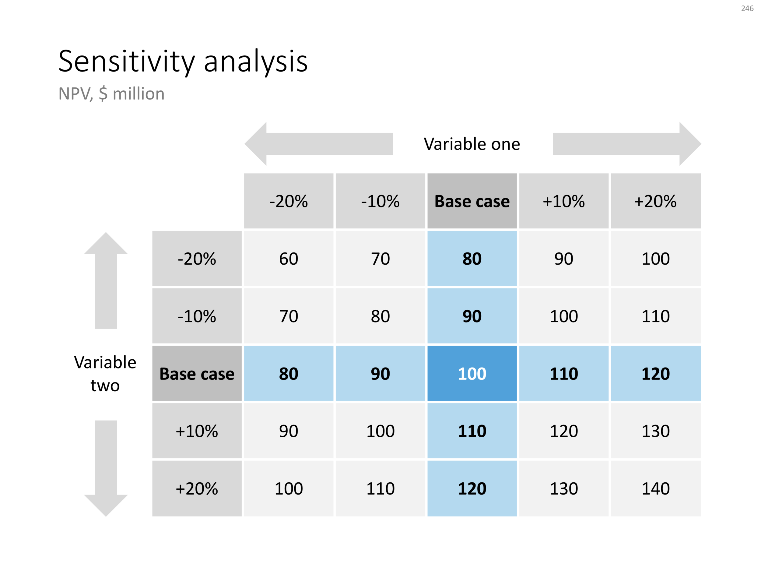
The base case scenario is put very prominently in the centre of the table, it is the anchor for the viewer from which to start studying the other scenarios. I prefer making these type of charts manually, and not via a blanket copy-paste out of an Excel sheet. In that way, you have to think about whether each cell in the table is meaningful, and you can make sure that the data is formatted and rounded in the best way.
You can download this sensitivity analysis from the store, subscribers can do so free of charge.
Cover image by Markus Spiske on Unsplash