Off topic - teaching kids how to code

Off topic - teaching kids how to code

As I went through to the process of refreshing my 1990s computer science degree, I am now trying to help to teach my teenage kids the basics of coding as well. Not as obligatory homework, but something that is fun to do. Some observations.

  1. Unlike in 1986, it is actually very hard today to get a basic environment up and running to write a few lines of code. All the stuff you need to install. The HTML screen rendering complexity that is great to produce web sites on different devices, but an absolute pain to put something basic on the screen. So I actually need to deploy a fair share of my own coding horse power to build some basic functions that my kids can use to do something like plotting an ‘x’ in a coordinate system, reading keyboard inputs, getting code to wait for a few seconds. And there is of course the challenge of getting a small web site you build on your own machine to show up on a real URL.

  2. I don’t believe in special kid programming languages or programming tools. I see the big problem with language for grown-ups as described in point 1, understanding the actual concept such as variables and loops is pretty much the same. And once kids get into it, they can continue to build out their skills that are useful in the real world, and are everywhere around them (inspecting code in web sites they visit for example). So HTML, Javascript, and CSS it is.

  3. Coding is all about doing. Watching videos or in-person lessons is boring. Doing algorithm homework-style problems is boring. You want to get that frog move across the screen, and you try everything to get it to work because you want to, not because you have to.

  4. Learning how to learn from others online is an important skill. Answers posted online can be wrong, outdated, not relevant. Sifting through information overload and tolerating ambiguity is important.

  5. I found that the key to getting kids started is the presence of interesting problems for them to solve. Here are a few:

    • Tools that solve complicated formulas that come in handy for math homework

    • Tools that generate practice questions to prepare for tests

    • Retro games (or game elements) on grids with a small resolution: get things to walk around, eat each other, etc.

    • Doing things with huge datasets. For example you can download all the English words in 5MB on your kid’s. machine, put it in an array, and let them have fun with it. (Scrabble cheating, other apps)

All great fun, especially now that we are pretty much stuck at home during the holidays.

Photo by Alexander Sinn on Unsplash

SlideMagic: a platform for magical presentations. Free student plan available. LEARN MORE
"I forgot how to do PowerPoint..."

"I forgot how to do PowerPoint..."

Overheard in a conversation. “I used to create lots of PowerPoint decks 10 years ago, but would not know how to do this anymore today”.

Graphics designers need to learn how to use Sketch, InDesign, and yes, PowerPoint. Coders need to learn how to work with software development tools.

Twenty years ago, mastering presentation software was a skill. First, dedicated graphics designers and/or secretaries would translate hand-drawn designs into PowerPoint. Then, the junior analysts on teams started to figure it out.

Putting a presentation together is now as normal a task as sending an email: it is a required skill for everyone (from new recruit to CEO) without the need for extensive training. If training (or memory) is required, then it is a software problem. SlideMagic is trying to solve it.

SlideMagic: a platform for magical presentations. Free student plan available. LEARN MORE
Update: V2.5.19

Update: V2.5.19

I have been keeping a low profile here over the past week as I continue to improve the performance and stability of SlideMagic. I feel a bit like a construction contractor: putting up the house is easy with very visible progress, but getting those last tweaks done is time consuming and relatively below the radar work.

Under the hood things improve very well. The tool gets used more intensely now so every corner it will soon be tried and tested. I notice that I am fixing some of issues that are similar to the ones I encountered with PowerPoint’s public software releases (as an industrial user, I hit them first). My software development budget is a bit lower than Microsoft’s but we are getting there.

Photo by Cesar Carlevarino Aragon on Unsplash

SlideMagic: a platform for magical presentations. Free student plan available. LEARN MORE
Stack charts with tighter grid integration

Stack charts with tighter grid integration

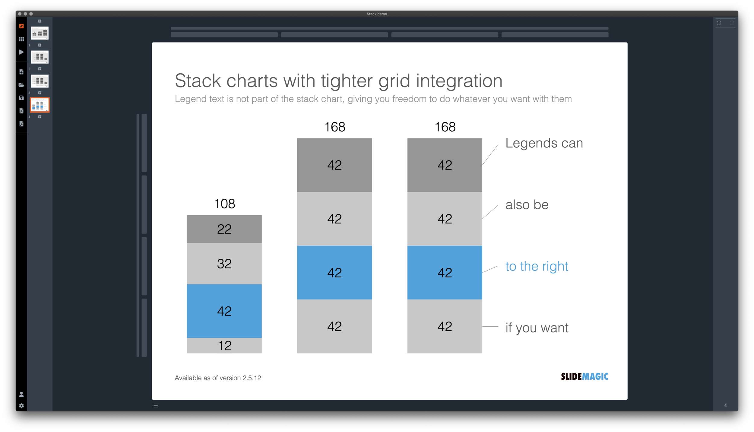
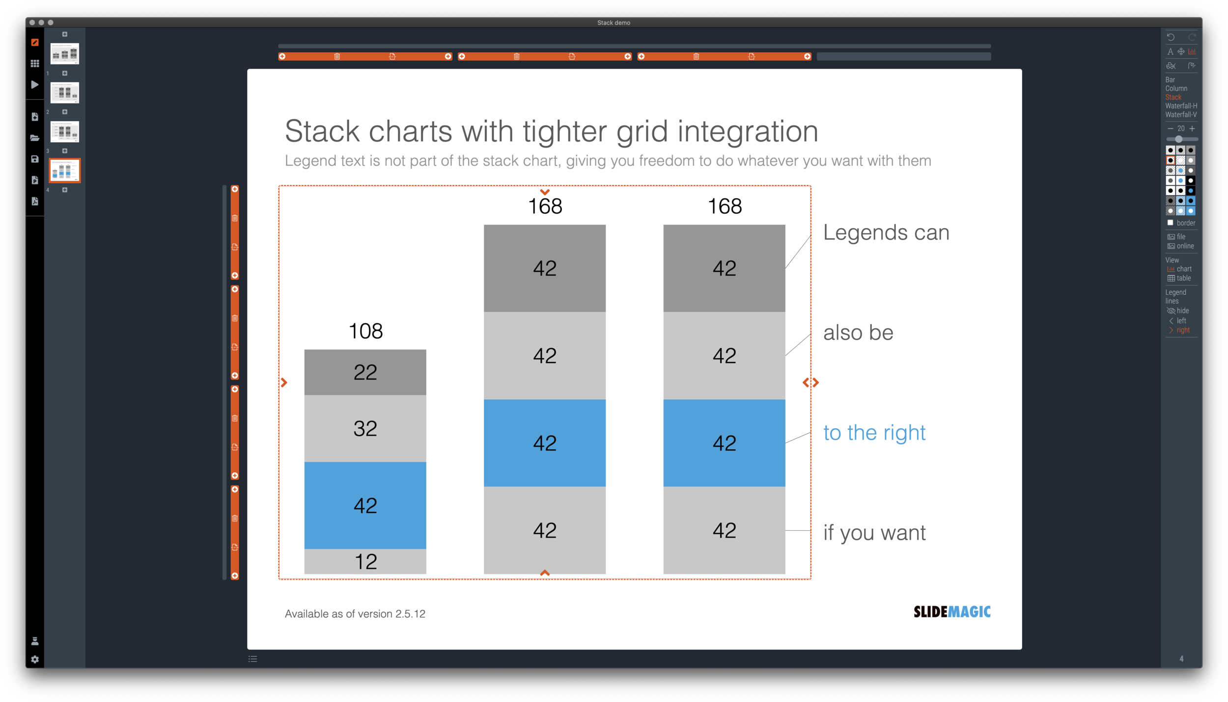
Stack charts are very useful. So useful in fact, that SlideMagic does not support pie charts (by design).

They are very easy to make in Excel, but using them straight in a presentation is tricky. First there is the overall formatting of the chart, then there is the legend which is never connected to the chart itself, and does not leave enough space for text other than ‘new’, ‘old’.

I just overhauled the stack chart in SlideMagic and forced to be tightly integrated with the slide grid. Adding/deleting rows to your slide will add/delete data series to your stack chart. Furthermore I have actually removed the legend from the stack chart shape itself, what is left is only the option to add lines that point to boxes outside the chart. This gives you total freedom to do whatever you want with the chart legend, small, big, or even huge text boxes. Everything lines up, you can even fit stack charts in tables if you want.

The charts below give you a sense of what the new engine does:

Screen Shot 2020-12-02 at 9.44.35.png
Screen Shot 2020-12-02 at 9.49.56.png
Screen Shot 2020-12-02 at 9.51.28.png
Screen Shot 2020-12-02 at 9.51.36.png

The old stack charts will continue to work in SlideMagic for the moment. If your charts have them, you can edit them. If you want to make new ones, click <SHIFT> + <STACK> and you can still make them. An old stack chart can instantly be converted into a new one by selecting it and clicking the <STACK> icon.

Stack charts in the template database are still in the old format, I will convert them over the coming weeks to the new format.

Stack charts convert to native Excel charts when saving your presentation as a PowerPoint file (the connecting legend lines are still missing for the moment). In PDF, you have exactly “what you see is what you get”.

SlideMagic: a platform for magical presentations. Free student plan available. LEARN MORE
A box for each point

A box for each point

It is really easy and quick to add bullet points to a text slide: hit return and start typing away, boom, you found a place for that other thing you want to say. Check.

SlideMagic does not support automatic text bullets, and you need to put each item in a separate box. Bummer.

This is by design. (Let me explain in a number of bullet points).

  • Boxes look a lot better on a slide than a list of sentences. The equal size and background colour compensate for different length of text content. Everything is always lined up and spaced out

  • More importantly: the box hurdle is a little ‘brake’ in your writing process. Do I need 3 or 4 boxes? Should the points be one, or multiple slides? Are the points equal in weight, or is one a sub point of the other?

  • The list is hardly ever the post visual layout for a slide, maybe boxes should be lined up next to each other, centred around some central box, go up, go down? When writing text lines, you are not even considering these layouts.

When designing slides, I spend most of my time thinking about the layout, the amount of rows and columns in the page and how everything fits. Once that is settled, the rest follows. I want you to do the same.

Photo by 🇨🇭 Claudio Schwarz | @purzlbaum on Unsplash

SlideMagic: a platform for magical presentations. Free student plan available. LEARN MORE
Regenerating the PowerPoint slides

Regenerating the PowerPoint slides

For subscribers who are using SlideMagic to download PowerPoint templates only: I have re-run the conversions of the entire database to solve some issues with arrows not being rendered correctly. All should be working fine now, let me know if you still find a slide that does not download correctly.

Pro-tip: try the SlideMagic app, a much more convenient way to work with the template database, convert to PowerPoint (if needed) as the very last step in your workflow.

SlideMagic: a platform for magical presentations. Free student plan available. LEARN MORE
Creative with bar labels

Creative with bar labels

Below a screenshot from an Economist instagram post:

Screen Shot 2020-11-29 at 12.07.13.png

The labels of the first 2 bars have been placed over the bars themselves to save space: there is now more room for the bars themselves. Other labels to the right of the bars.

I am not a fan:

  • The white over red of the top labels is hard to read

  • There is no nice and simple list of the top players, aligned in a consistent way

  • The names inside the chart area makes it harder to relate the bar to the axis

  • (I also prefer to put data labels in the chart rather than having a very imprecise value axis)

Here is a quick illustration of a bar chart in SlideMagic (The Eonomist did not provide the exact values, hence the dummy data).

Screen Shot 2020-11-29 at 12.30.44.png

SlideMagic: a platform for magical presentations. Free student plan available. LEARN MORE
A dedicated browser

A dedicated browser

Many people are surprised that SlideMagic is a desktop app. “Hey, it is 2020, not 1995?” Well, the SlideMagic desktop app is a bit different than the things you would run on your machine in 1995. It updates frequently (sometimes daily), and constantly is in touch with the slide data base server. I would actually call it a “dedicated browser”: a front end for the SlideMagic server with features such as dropdown menus and drag/drop between multiple windows that you cannot find in a regular browser.

People agree that on phones and tables, a dedicated app gives a better experience than a web page. The same is (still) true on a desktop.

Photo by Ilse Orsel on Unsplash

SlideMagic: a platform for magical presentations. Free student plan available. LEARN MORE
Use the whole page

Use the whole page

White space is a good thing in design. It makes text breathe, the whole page looks calmer somehow.

This applies to business presentations as well. Cut text that is not required, make images as big as possible, and your slide starts to look like a well-designed ad on a billboard.

However, in some cases, a business presentation slide is not meant to be a fashion ad. Think of the sales target data for the next quarter, or the new IT system architecture that you need to get approved. What I often see in SlideMagic is a “left over battlefield” with the final product of a complex table or system diagram. After many iterations it finally looks like it should look and everyone agrees to it.

In the process, the designer forgot to clean up, and remove rows and columns that are no longer needed. In SlideMagic, you can get rid of them with a few clicks and your entire diagram or table will scale up instantly, in the right proportions.

Screen Shot 2020-11-18 at 10.08.53.png
Screen Shot 2020-11-18 at 10.09.03.png
Screen Shot 2020-11-18 at 10.28.27.png
Screen Shot 2020-11-18 at 10.28.41.png
Screen Shot 2020-11-18 at 10.28.46.png
Screen Shot 2020-11-18 at 10.09.10.png

Yes, you gave up some white space around the edges, but overall the chart is more practical. To make things calmer, consider cleaning up data and text in the cells of your diagram instead.

SlideMagic: a platform for magical presentations. Free student plan available. LEARN MORE
Final final final final versions

Final final final final versions

Unlike in the case of a printed book, digital documents are never finished or final (despite being called “final version v3 - final”). Instead they have “committed versions” like programmers use when working with git to manage iterations of code. For most presentations these committed versions are documents you deemed good enough to share with someone at some stage in the project. That’s why the email sent box is becoming the new file archiving system. (Where is that document I sent out last week?). Sent it, or it did not happen.

Photo by Ben Wicks on Unsplash

SlideMagic: a platform for magical presentations. Free student plan available. LEARN MORE
Example: COVID chain of infection

Example: COVID chain of infection

A slide came flying by on Twitter:

I might a quick remake of this slide in SlideMagic, in line with the SlideMagic philosophy: quick, clear, nothing too fancy (= time consuming) and added it to the SlideMagic template database since it could be a useful basis for any slide that needs to show some sort of chain of events.

Screen Shot 2020-11-12 at 8.48.34.png
Screen Shot 2020-11-12 at 9.03.42.png

What did I change?

  • Removed the low-contrast red on black colours

  • Took out the simplistic icons and replaced it with no-nonsense clear numbers

  • Rounded up numbers so to avoid cut up people (audience is not hard core scientists)

  • Put in a proper bar chart to show the magnitude of 416 vs 3, instead of an icon count

  • Flipped the design left to right to make the flow in time more clear

This slide demonstrates how easy it is to line up bars of a data chart, arrows, and text cells of a table in the overall slide layout (an absolute pain on other presentation design software).

SlideMagic: a platform for magical presentations. Free student plan available. LEARN MORE
Work flow example

Work flow example

Yesterday’s “plumbing” post triggered me to show you an example of how you would quickly put a slide together to update the management team of your company when you are doing some plumbing. The work flow sequence below took less than a minute:

Screen Shot 2020-11-11 at 6.54.49.png

SlideMagic: a platform for magical presentations. Free student plan available. LEARN MORE
More plumbing...

More plumbing...

An update.

A couple of days ago I released version 2.5 of SlideMagic with lots and lots of small updates that were sitting on the todo list. When designing, I cannot stand it when a small detail is off, and the same applies to software development. And like in design, most users/viewers won’t notice these individual details, but when taken together they add up to something. This slide does looks right for some reason, this app just works for some reason. Opening up SlideMagic should trigger an update to version 2.5.3 (writing this on November 11) after a few minutes, if not, you can visit the SlideMagic download site to install the latest version.

I am making changes to the positioning as well. That download or app landing page is now the home page of SlideMagic and no longer the web site that says that SlideMagic is a template bank, but also an app, and also a place where you can download entire presentations. All confusing, and still a left over of the SlideMagic template store on Shopify. The Shopify store is closed, and (that was quite a moment), the entire V1 version of the SlideMagic web app has been wiped from the server.

So the web site (still WIP) now reflects what SlideMagic is: presentation software with a uniquely clever user interface and a huge built-in template data base.

Photo by Bruce Warrington on Unsplash

SlideMagic: a platform for magical presentations. Free student plan available. LEARN MORE
How to make a source of change waterfall chart (Apple quarterly results)

How to make a source of change waterfall chart (Apple quarterly results)

In between the election news: waterfall charts….

Waterfall charts are a great tool to explain the difference between 2 scenarios. In SlideMagic, they are really easy to create. Below is one I put together quickly with data from Apple’s 2020 Q4 earnings result, and a photo I found using SlideMagic’s built-in Unsplash image search. Notice how I opted for an unusual vertical waterfall, to create more space for the axis labels.

Screen Shot 2020-11-02 at 13.42.33.png

Some people would argue that you could make the chart even clearer by breaking the axes: showing them as ‘5.6’ and ‘4.7’ for example. Yes, it would highlight the deltas better, but in general, I think manipulating axes, well, manipulates the message. The fact that the changes are relatively small to the total is part of the message.

Screen Shot 2020-11-02 at 13.42.27.png

I reshuffled the rows a bit to group the decreases and increases. That makes it more clear in one sense, but less clear in another. Your choice.

\How do you go about making such an analysis? I put my numbers in a Google Sheet that you can view yourself.

  1. Enter the data for the 2 comparable quarters in 2 columns. Add the totals as calculations rather than hard-coded numbers to check that you did not make any typos. (The blue cells are the one that I type in, the white ones are calculations).

  2. Create space between the 2 columns

  3. Pull numbers from the input that you consider drivers. You see that I deviated a bit from the way the input was presented:

    1. Divided billions by thousands to make it more readable

    2. I use % gross margin rather than absolute COGS and profit numbers

    3. R&D: absolute number, SGA, % of sales

  4. Recalculate the operating income with just these drivers (line 37), it is crucial that you get this right, double check with the input.

  5. Now start varying your drivers one at a time, and recalculate the operating income in the scenario that just that one variable would have changed (see the green numbers in the spreadsheet).

  6. Finally, check whether the component variations add up to the total variation you need to explain (in this case, I was lucky). If you are not, you need to allocate the non-explained differences to the factors somehow.

It is important to keep in mind that these spreadsheet figures are just spreadsheet figures. The change in product gross margin for example is probably not independent from the change in product mix (fewer phones, more laptops). Also there is a small rounding issue (the rounded vales do not add up to 14.8). I would solve that by chopping the biggest factor (-1.7 to -1.6). It is always distracting when small rounding errors create inconsistent numbers on your slide.

Users of SlideMagic can access the waterfall charts with a search for ‘apple’ in the desktop app.

SlideMagic: a platform for magical presentations. Free student plan available. LEARN MORE
"Please send us the slides 1 month in advance"

"Please send us the slides 1 month in advance"

This tweet about a habit of conference organisers:

It does not make sense. Nobody prepares slides that long before a presentation, nobody reviews presentations 1 month in advance, and the request is probably not credible.

Why do conference organisers try?

  • To spot potential content disasters early

  • To spot potential time over-runs early

  • To spot potential layout disasters early (bullet points…)

  • To spot potential technical issues early (‘What, no Apple Keynote?”)

These are valid concerns and the solutions is possible somewhere in between.

  • Rather than sending a broadcast request, do some research about your speakers, leaving the pros, and focus on possible weak links with coaching (and hassle)

  • Ask for a draft of a “typical presentation” way in advance to get some sense of what is coming

  • Set a very credible deadline 2-3 days for the event (“we are building the conference hard drive”)

And, if you are a speaker and do not have a story on the shelf (it is the story that matters, not the slides), it is probably a good idea to start getting your head around what you want to say a few weeks in advance. Slides can be made in a couple of hours (try using SlideMagic, it is really easy), crafting a compelling story takes a lot longer. Starting to think about it early means that your brain worries about it, even when you are not actively aware of it and things will fall in place later.

Photo by Tim Gouw on Unsplash

SlideMagic: a platform for magical presentations. Free student plan available. LEARN MORE
Opt in/out for beta versions

Opt in/out for beta versions

I am pushing new updates to the SlideMagic desktop app almost every day. Most of the things I do at the moment are not spectacular new features, but improving the plumbing of the app. I have now created the option to opt in or out of these beta versions (that could have the occasional bug). Users on deadlines for important presentations do not have time to beta test software.

All users are by default opted out of beta versions. You can opt-in by accessing your user account on the SlideMagic web site and tick the appropriate box. Make sure you are logged in to your account in the SlideMagic desktop app as well for the automatic updates to work.

Screen Shot 2020-11-01 at 13.32.48.png

To switch back to stable updates only, untick the box in your user account, and go to the desktop app download page to install the latest regular version of the app.

It is pretty amazing that today’s software development tools enable this juggling of regular and beta versions in just a few lines of code. Soon, beta versions will move again from plumbing to a number of new features I have in mind. Stay tuned.

Photo by Scott Webb on Unsplash

SlideMagic: a platform for magical presentations. Free student plan available. LEARN MORE
A strategy overview slide

A strategy overview slide

Here is a slide from a recent Daimler strategy presentation:

Screen Shot 2020-10-28 at 12.32.24.png

The slide does not look bad, and is definitely an improvement of earlier versions of the same chart:

Screen Shot 2020-10-28 at 12.52.54.png

Still there is room for improvement:

  • The big blue action verbs are highlighted, but these are not the key messages of each box. (Side note: yes it is the most correct way to write things starting with an action verb, but when space is limited, I tend to break this rule).

  • The 16x9 wide screen format invites a horizontal layout, which in turn makes the resulting narrow boxes hard to read, and the layout looks a bit strange because of the line breaks resulting from longer words

  • Wording can be reduced and improved further.

I quickly put something together in SlideMagic. It might look a bit less sophisticated than the heavily designed slide above (exactly in the spirit of SlideMagic), but I think it conveys the message better.

Screen Shot 2020-10-28 at 13.05.31.png

(Disclaimer: the above text is obviously mine and not the Daimler strategy)

I added this slide to the SlideMagic template database, search for ‘strategy’ in the desktop app or download it. (The thumbnail of the slide looks a bit different, as all slides show up in 4x3 format on a light background, you can change those settings instantly in the app).

Screen Shot 2020-10-28 at 13.30.16.png

SlideMagic: a platform for magical presentations. Free student plan available. LEARN MORE
Where did it save my file?

Where did it save my file?

Producers of productivity software are changing the user interfaces of their software:

  • To make things work with (their own preferred) cloud storage service instead of the computer file system

  • To copy user friendly concepts from the world of consumer software to enterprise users. (What if Instagram would have used drop down menus?)

  • To make it even better because they can (“duplicate” is so much clearer than “save as”)

On an app-by-app basis this might be a good decision. The new user interface is definitely better than the one that originated in the 1990s on one of the first releases of Windows.

But there is a problem for the enterprise user: all applications start to look different. Wonder what would happen if car manufacturers start switching around the pedals and other basic inputs of vehicles…

Also, the use settings of a consumer and enterprise application are different. Fixing the numbers or details in an annual report or contract is different from posting your latest story.

SlideMagic has a radically different user interface when it comes to designing slides, but the basic file management controls are pretty traditional.

Photo by Marten Newhall on Unsplash

SlideMagic: a platform for magical presentations. Free student plan available. LEARN MORE
Vague truths

Vague truths

It is a bad idea to bend the truth in investor communications. Alternative reality might get you the attention in the first deck screening (or that initial bump in the share price), but things will come crashing down if you cannot deliver on your “mortgage” towards the future. The value of your business gets reset to where it should be, but also, your own personal credibility just got a big blow, creating a negative impact for your current idea and everything you are planning to do in the rest of your career.

Sometimes the truth bending might not be intentional. A marketing person in a pharma company might say/believe that we have “phase 2 data”, when in fact the company has “phase 2 preliminary data”. It sounds the same, but makes a huge difference in how investors evaluate a pharma business. Pay attention to detail where it matters.

Try keeping your presentation honest without:

  • Actually amplifying your weakness… There is a middle ground between hiding the truth and putting it on the cover page. In the latter scenario you will score a lot of points for honesty, but investors will doubt your ability to communicate with investors and clients

  • Let lawyers take over your slide and fill it with disclaimers, it just becomes background noise (think of the Fortune 500 CFO reading the legal disclaimers while journalists walk into the auditorium for the analyst presentation).

Photo by Toa Heftiba on Unsplash

SlideMagic: a platform for magical presentations. Free student plan available. LEARN MORE
Reminder: V1.0 shutdown October 31...

Reminder: V1.0 shutdown October 31...

A reminder that we will be pulling the plug on SlideMagic 1.0 (long live 2.0!) on October 31. Over the next week you will still be able to download your presentations yourself from the old site, after that, you will need to contact support to ask someone to go down into the basement and find it for you in the archives.

Instructions for V1.0 download are here.

If you stopped using SlideMagic years ago because you did not (yet) like it that much, be sure to check out SlideMagic 2.0 which is in a totally different league. The desktop app can read your V1.0 presentations.

Photo by Tincho Franco on Unsplash

SlideMagic: a platform for magical presentations. Free student plan available. LEARN MORE