Four ways to write a story

Four ways to write a story

My daughter is progressing through high school and is now asked more and more to write essays with her opinion. This got me to think about four levels of writing a story:

  1. Without having a clear idea of the answer/plot, you start jotting down your thoughts with the main objective of reaching the total word count, and buzzword count targets. This gets you a fail on an exam, and you can also compare this to an unprepared presenter “winging it”.

  2. You write a skeleton of the points you want to make, in the right order, with main headings and sub bullets, all in super short grammatically incorrect and incomplete language (because you are the only person who needs to understand it). This is probably what the high school teacher is trying to reverse engineer from the full essay when grading it: did she make the right points.

  3. The skeleton, but now expanded into proper language. It makes the point, it is logical and organised, it is grammatically correct, but also, it is pretty boring. This would be a typical exam submission of a student, or a management consulting report

  4. A convincing story, that abandons some of the logical rigour of the previous level and replaces it with an interesting flow, with some tension that resolves to the conclusion. As opposed to “winging it”, this is a story that a skilled salesperson can pull off on the fly without any slides or skeletons. Very few business documents or high school essays make it to this level.

Photo by Road Trip with Raj on Unsplash

SlideMagic: a platform for magical presentations. Free student plan available. LEARN MORE
Rounded edges

Rounded edges

In the latest version of SlideMagic, all boxes now have slightly rounded edges. You actually need to look carefully to see it, but the impact on the overall slide layout is dramatic, things look more friendly.

Apple is a big believer in round edges in its designs. It claims that sharp edges do not appear in nature and are not natural shapes. (Well there are crystals). But I think Apple is overdoing it. The camera unit on the back of an iPhone for example has too large of a corner radius, and in many of the app screen designs the corner radius of the window, hardware, and icons clash.

In PowerPoint and Keynote the default setting for a corner radius is also too big, and there is no way to adjust them precisely to the same value (you can only drag with a mouse).

The edges in the SlideMagic PowerPoint conversions stay sharp for the moment, I can programmatically tweak regular shapes in PowerPoint (so no more mouse dragging), however for images I still have an issue.

The latest version of SlideMagic is 2.4.45 and you can download it here for free (Windows and Mac).

Photo by Eddy on Unsplash

SlideMagic: a platform for magical presentations. Free student plan available. LEARN MORE
A more precise image zooming engine

A more precise image zooming engine

I just released a new version of the SlideMagic desktop app with an important update: a more precise engine for panning and zooming images. It was a very big update (a completely new image rendering engine) and to most users, there will hardly be any visible difference to the app.

Screen Shot 2020-10-08 at 12.53.19.png

But more advanced users will notice how image fills and fits now exactly, exactly fill the shape boxes, and how to (much bigger) image zoom slider is much more precise.

(For those interested: the old image rendering engine was still based on CSS background images with their obscure placement interface, a left over from the web-centric architecture of SlideMagic v1.0)

Photo by Pedro Monteiro on Unsplash
SlideMagic: a platform for magical presentations. Free student plan available. LEARN MORE
Convincing the center

Convincing the center

The pattern repeats in demonstrations and political debates:

  • The other side is clueless

  • Everything the other side does , does not make sense

  • We are right, they are wrong (always)

  • Etc.

You will never convince people who are deeply attached to their beliefs. The people who can swing the majority are in the center. Questioning the intelligence and making fun of the people just across the line of the center (and their friends) is not going to make it easier for them to switch.

Preaching to the converted with a megaphone won’t help. Listening to, understanding, and engaging with the doubters possibly could.

This is true for political debates, but also for sales and investor pitches.

Photo by Chris Slupski on Unsplash

SlideMagic: a platform for magical presentations. Free student plan available. LEARN MORE
Log scales?

Log scales?

With all the talk about exponential growth of the virus, logarithmic scales are popping up in graphs everywhere.

What is a logarithmic scale? Unlike those on a linear scale, the units on a logarithmic scale change. See the chart below.

Screen Shot 2020-10-04 at 12.54.53.png

The result is that the normally speaking rapidly growing line 10^x now appears as a simple straight line.

Exponential functions can be hard to graph, analyse and compare. Toning down the scale makes things more manageable. I remember in high school, I used log mm paper to plot graphs from physics or chemistry experiments. By measuring the incline of the line, I could estimate exponential coefficients, and compare them.

While logarithmic scales are a great practical tool for scientists, I think they are less useful in presentations to a more general audience. “Look at this straight line, but in order to understand how fast tings are really growing, look at the small numbers that reveal the axis measurements”. People simply don’t grasp the concept of a logarithmic scale. If the virus grows exponentially, well, show an exponential line.

If you need to compare exponential growth, make a bar chart of the growth rates, rather than drawing straight lines on logarithmic scales.

SlideMagic: a platform for magical presentations. Free student plan available. LEARN MORE
Tutorials are ready

Tutorials are ready

I completed the first version of the SlideMagic tutorial, describing the basics of how to get started, and uncovering some hidden features such as keyboard shortcuts for advanced users. The latest version of the desktop app is now also linking to these pages. Let me know if I missed anything.:

Tutorial page 1 - The basics

  • Installing the software

  • The top menu modes: edit, story, play, account, settings

  • Adding slides and searching templates

  • Formatting text, colours

  • Adding images

Tutorial page 2 - Advanced

  • Branding: your own colour and logo

  • Changing the slide aspect ratio

  • Export to PowerPoint and PDF

  • Images and colours in the slide background

  • Shapes: boxes, arrows, data charts

  • Presenter view and speaker notes

  • Keyboard shortcuts

  • Installing updates

Tutorial page 3 - Data charts

  • Adding columns and bars to data charts

  • Formatting data charts

  • Making waterfall charts

Screen Shot 2020-10-04 at 12.56.20.png

SlideMagic: a platform for magical presentations. Free student plan available. LEARN MORE
Starting to work on tutorials

Starting to work on tutorials

Now that SlideMagic 2.0 is nearing completion I have turned my mind to putting together tutorials. For the moment, I am keeping it short and to the point, you can follow my work here: www.slidemagic.com/tutorial. This is all still work in progress.

Screen Shot 2020-09-30 at 15.54.49.png

SlideMagic: a platform for magical presentations. Free student plan available. LEARN MORE
Bullet point alert

Bullet point alert

Bullet point slides are a no-go, they are boring, hard to understand, and look ugly and SlideMagic tries to discourage you from making them.

Still, SlideMagic is not dogmatic and recognises that there will now and then be an occasion where you need to put 3 things on a slide (agenda items, next year’s strategic priorities, the fact that your product is faster, cheaper, and lighter). In the SlideMagic desktop app search for “list” and you are presented with lots and lots of list-style templates (yes, bullet point slide templates).

Screen Shot 2020-09-29 at 7.10.38.png

But in these templates, each list entry is a new shape, a new row, to make the slide visually more appealing. And SlideMagic’s grid engine makes it super easy to add and delete rows. If the message of your slide is “we need to do 3 things”, one of these templates will do the job perfectly to communicate that.

Often though, bullet points creep in when you are not really designing a list-type slide. “Ah, where do I put these points as well?” The points are not important enough (are they?) to merit a new slide, or drastic surgery to the layout of the slide. You end up adding a few quick dashes to a text box.

Screen Shot 2020-09-29 at 7.06.50.png

The moment you have to resort to this emergency bullet point solution, it should trigger an alarm bell. If it looks like I should change the fundamental slide layout, or even create a new slide, maybe you should…

SlideMagic: a platform for magical presentations. Free student plan available. LEARN MORE
Spell checker

Spell checker

I added a spell checker to V2.4.40 of SlideMagic. Incorrectly spelled words get a little underlining, right clicking gives you access to some spelling suggestions, and the option to add a correctly spelled word to the library.

This feature was high on the list of priorities of my daughter, who is using SlideMagic a lot for school projects.

Screen Shot 2020-09-27 at 11.17.40.png

SlideMagic: a platform for magical presentations. Free student plan available. LEARN MORE
Architecture diagrams

Architecture diagrams

I am starting to experiment with different chart types in SlideMagic. One experiment: IT architectures that consist of users, servers, databases, clouds and lots of lines.

The built-in icon search, combined with the new line drawing feature does a pretty good job actually. And while SlideMagic is not a dedicated tool to design network architectures, it might actually force you to make better architecture diagrams in presentations. Let me explain.

Detailed network diagrams have the same problem as detailed spreadsheets when it comes to presentations. They are project work tools to run analysis and plan work, they are not tools for communication. When I need to make a data chart, I always disconnect from the spreadsheet and resist the temptation to copy-paste. Instead, I pick the 10 numbers that matter, round them up to the relevant precision, and plop them in a very simple bar/column chart that tells the story.

The same is true for IT architectures. If you want to present an architecture overview on a slide, that slide needs to be understood almost immediately when putting it up (like all slides in your deck). If tangled connections, boxes, servers make that hard, then the only thing your slide communicates is that your architecture is complex, not much more.

Again, disconnect from the working papers. Think about your message: ‘my architecture has 3 layers’, ‘my system connects the systems of 15 suppliers’, ‘my system is entirely on premise’, whatever that message is, make a simple chart that supports it.

Remember, presentation slides are usually not project briefings for network installers.

Screen Shot 2020-09-24 at 17.33.35.png

SlideMagic: a platform for magical presentations. Free student plan available. LEARN MORE
Spoon feeding detail

Spoon feeding detail

Different types of audiences, different types of questions, and/or different phases in your interaction with the audience require different types of slides.

  1. In the first meeting, you introduce an idea with a big, bold, minimalist data chart

  2. In a follow-up meeting, you are answered a question about assumptions behind the numbers, or, in a Zoom meeting, your audience sits very close to her screen and has time / visual ability to dig deeper into the visuals than she would be able to when sitting in a big room.

For these occasions, you can make slide variations of the same slide. Seen an example below:

Screen Shot 2020-09-22 at 12.18.47.png
Screen Shot 2020-09-22 at 12.18.58.png
Screen Shot 2020-09-22 at 12.27.45.png

Clicking back and forth between the slides will give the illusion of some sort of animated popup, while in effect the audience is looking at two different visuals. In practice, I would design the busy slide first, then cut things out to create your minimalist slide.

<advertising> Note how easy it is in SlideMagic to toss things around and add (remove) complications to your slide without breaking its visual grid </advertising>

Screen Shot 2020-09-22 at 12.32.42.png

SlideMagic: a platform for magical presentations. Free student plan available. LEARN MORE
"Still struggling with this..."

"Still struggling with this..."

Now and then I get to see the presentations that people make with SlideMagic, often in emails with users that have questions or feedback, bugs, and charts which they are still struggling to get right. Yes, there are certain types of slides that SlideMagic does not really like (pie charts, complex system diagrams, anything with circles), but when I open these presentations in “story” view and see how the other 95% of that presentation looks without any professional help, I know things are starting to work. And these are proper A-B tests, since many SlideMagic users were clients of my bespoke design work, so I have seen many draft presentations by them coming my way that were not made in SlideMagic.

Photo by Jonas Olsen on Unsplash

SlideMagic: a platform for magical presentations. Free student plan available. LEARN MORE
"Muppets"

"Muppets"

A while ago it was discovered that investment bank Goldman Sachs refers to unsophisticated, non-professional, retail investors as “muppets” and was deploying massive computing power to trade against them.

“Muppet” is an example of a business language shortcut: one word that summarises a pretty complex concept or customer segment. Short cuts can make internal communication in a company very efficient. Everyone knows exactly what is being discussed without having to resort to long descriptions that change from presentation to presentation.

To the outsider though, they have a different meaning. Many people complain about “buzzwords”, especially when shortcuts that don’t mean anything leak into external communication. Or worse, as in the case of Goldman Sachs, you end up offending a lot of people.

Young kids also find out that is extremely hard to change back nicknames into a more grown up name when you get older. The same is true for business shortcuts. Better choose them wisely at the beginning, because they might just get a wider audience than that first conference room meeting.

With respect to “muppets”. Yes, amateur investors might not understand the interest rate climate, yield curves, market overhang, and inflation risk. They make mistakes, but they could also have a hunch that that weird flat phone with a touch screen could end up being a really desirable product that will change people’s lives 10 years from now. An algorithm powered by a super computer probably would not make that call. Muppets are a nuanced segment with many sides to take in to consideration. Better pick a better word.

Photo by Crystal Jo on Unsplash

SlideMagic: a platform for magical presentations. Free student plan available. LEARN MORE
Old computers...

Old computers...

My main work machine is in repair, which in Israel, means you lose it for at least a week. So I am back to working on old computers: a 2015 iMac, and a 2016 MacBook. And I must say: things are mostly fine on machines that I abandoned more than a year ago.

The 27” screen of the 2015 iMac somehow feels more comfortable than the LG 5K display that I use with my top of the line MacBook Pro. Processing speed for the work I do (writing code and designing slides) is totally fine. Even on the 2016 MacBook (with minimum spec even for 2016), things are fine. And that light weight is actually a real bonus versus the hot, heavy 15” MacBook Pro. It makes me think of future setups: desktop for the bulk of the work, and an “emergency” lower-spec laptop to enable working outside the office if needed.

The only issue I have is running a Windows machine via bootcamp to build the Windows version of SlideMagic. That software is noticeably slower.

If you are not a gamer, or a movie editor at Pixar, computers probably last a lot longer than you think. Come to think of it, most machine replacements were probably due to hard drive crashes. Now with solid state drives, that might happen for less frequently.

Another upside, I now get to test the SlideMagic app thoroughly on smaller screens and lower-spec graphics cards…

Photo by Nicholas Santoianni on Unsplash

SlideMagic: a platform for magical presentations. Free student plan available. LEARN MORE
Corporate title pages

Corporate title pages

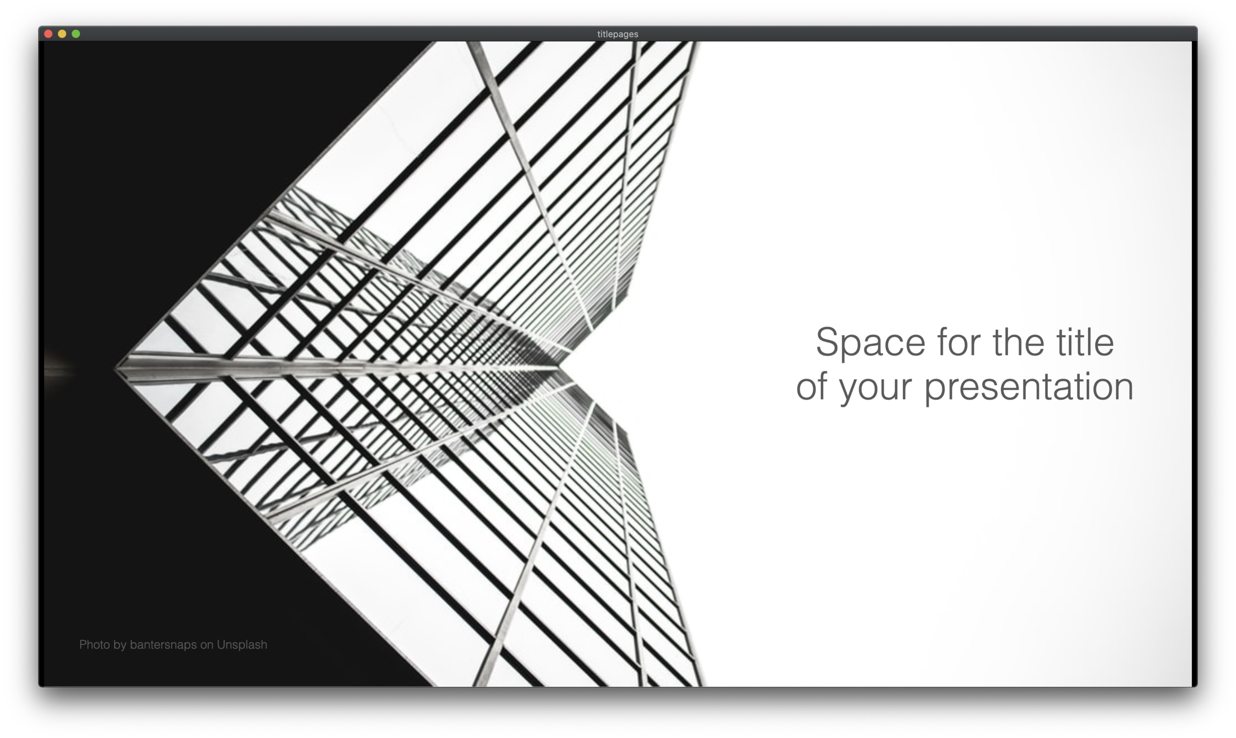
I added a number of new title pages to the SlideMagic slide template database: looking up in the downtown area of a city. The sky in the center of the image is a nice empty background for your text.

Screen Shot 2020-09-12 at 10.00.06.png
Screen Shot 2020-09-12 at 9.44.37.png

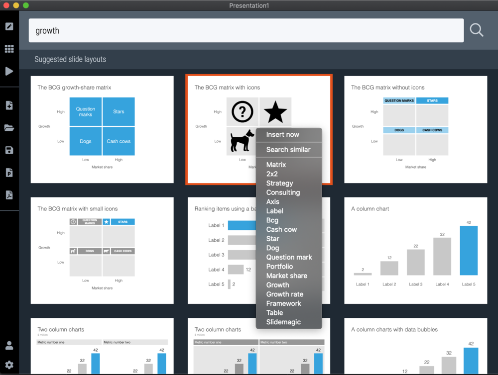
Typing “title” in the search bar of the SlideMagic desktop app now gives a lot of options to get you started with a title page for your presentation

Screen Shot 2020-09-12 at 10.08.45.png

Pick one of these designs (or an empty slide), and use the image search feature to add the image that you prefer

Screen Shot 2020-09-12 at 10.11.53.png

SlideMagic: a platform for magical presentations. Free student plan available. LEARN MORE
Hexagons

Hexagons

The new line drawing feature in SlideMagic was put in to support the connection of boxes in organisation charts and flow diagrams, but you can use it more creatively as well. The attached examples of the use of hexagon shapes shows how you can bypass SlideMagic’s strict limitations on shape types (basically boxes). But do you need to?

Screen Shot 2020-09-10 at 8.23.01.png
Screen Shot 2020-09-10 at 8.23.23.png
Screen Shot 2020-09-10 at 8.30.16.png

Photo by Jonas Svidras on Unsplash

SlideMagic: a platform for magical presentations. Free student plan available. LEARN MORE
How to download your SlideMagic 1.0 presentations

How to download your SlideMagic 1.0 presentations

The reminder email has gone out to all SlideMagic 1.0 subscribers to download your presentations before I shut the service down and migrate the platform completely to SlideMagic 2.0. (I will keep the archived presentations but access won’t be instant).

Some people signed up five years ago, and I got some bounces from people who changed jobs / email address. So, another reminder here if you have an account but did not get your email.

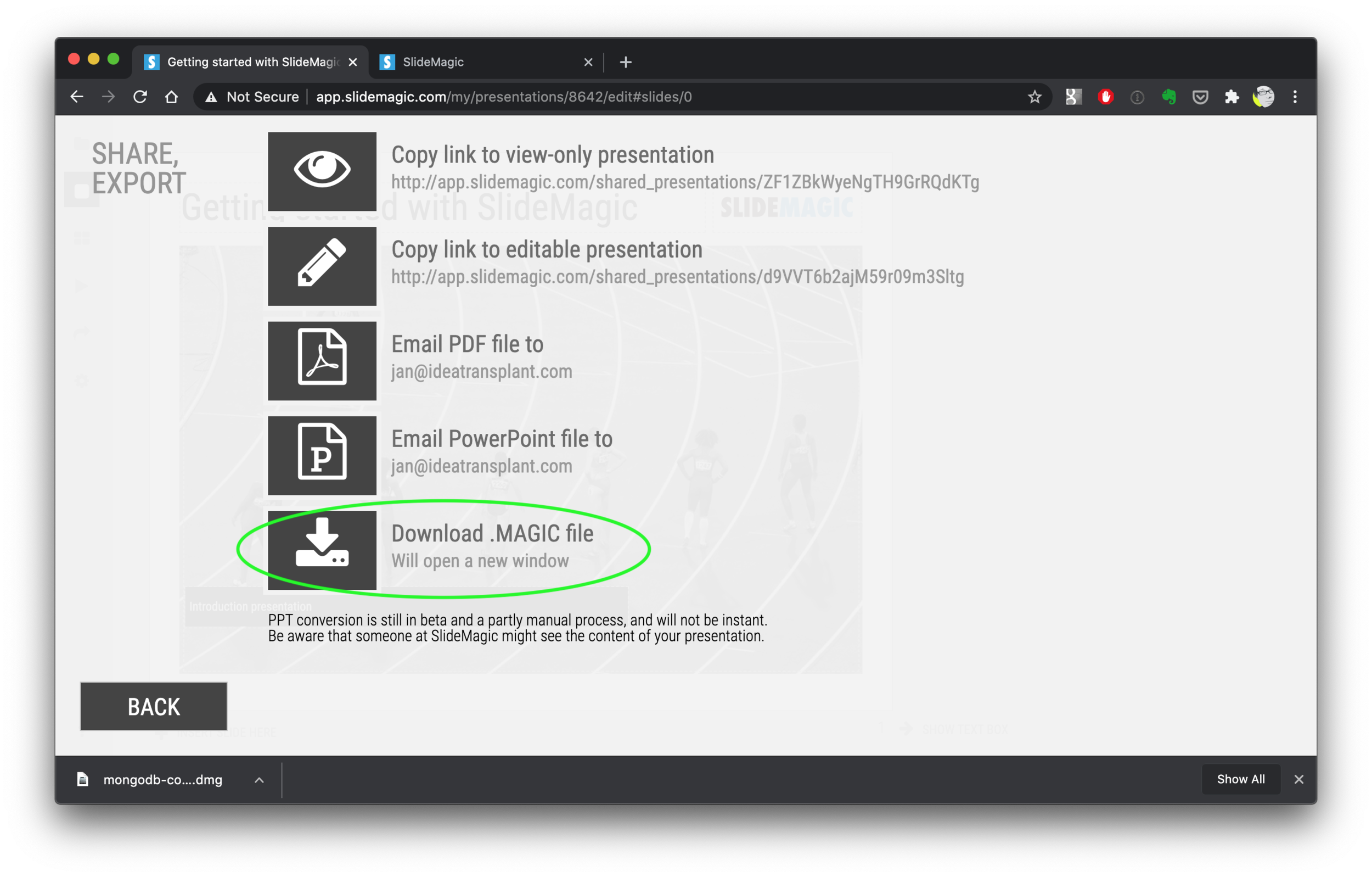
Other people. say that it is not completely clear how to download your presentation(s). Here are the steps:

  1. Log in to SlideMagic 1.0

  2. Open your presentation in SlideMagic 1.0

  3. Select the “export” arrow from the left menu

  4. Pick “download .magic file”

  5. Download and install the SlideMagic 2.0 desktop app

  6. Open the .magic file in the desktop app.

Here are the screen shots of the steps:

Screen Shot 2020-09-10 at 7.06.26.png
Screen Shot 2020-09-10 at 7.06.35.png
Screen Shot 2020-09-10 at 7.06.56.png
Screen Shot 2020-09-10 at 7.48.48.png
Screen Shot 2020-09-10 at 7.52.55.png
Screen Shot 2020-09-10 at 7.58.49.png
Screen Shot 2020-09-10 at 7.55.25.png

(Notice how I removed the hard-wired title page with the black bar from SlideMagic 2.0)

SlideMagic: a platform for magical presentations. Free student plan available. LEARN MORE
SlideMagic 1.0 sunset, long live SlideMagic 2.0

SlideMagic 1.0 sunset, long live SlideMagic 2.0

Towards the end of October, we will be pulling the plug on the SlideMagic 1.0 server. If you are a SlideMagic 1.0 user, you need to download your presentations as .magic files to your local hard drive, after which you will continue to be able to edit them in the SlideMagic 2.0 app.

SlideMagic 2.0 is vastly superior when compared to 1.0, with much more intuitive user interface, instant PowerPoint and PDF conversion, integrated Unsplash and Pixabay image search, waterfall charts, and a huge template database (SlideMagic 1.0 probably had 20 templates or so), just to name a few features. SlideMagic 1.0 was a web app, SlideMagic 2.0 is a desktop app that also works when you are not connected to the Internet, and has deeper access to your computer’s operating system for things like managing files and copying things between windows.

SlideMagic 1.0 users will be getting a reminder email over then next few days. I do plan to keep the SlideMagic 1.0 user presentations somewhere backed up, but access will be on request and no longer instant as of November 2020.

SlideMagic 1.0 was a necessary step to start the journey, it enabled me to get my head around what a modern presentation app should look like. But it has served its purpose.

The SlideMagic 1.0 log in is here: http://app.slidemagic.com, you can try the new app here https://www.slidemagic.com/app .

SlideMagic: a platform for magical presentations. Free student plan available. LEARN MORE
Subscriptions are now live

Subscriptions are now live

I finally deployed the proper subscription backend for SlideMagic. That was a big technical and legal challenge, but everything works now.

When purchasing SlideMagic Pro you are now signing up for an annual subscription, giving you full access to all the features of the platform.

Canceling is transparent: the auto renewals is removed, and you have access to SlideMagic Pro for the remaining days of your subscription. If you decide to renew, you get issued a free “trial” for the days that are left in your plan, after which you get charged when the next subscription cycle starts.

I simplified the complicated license when doing consulting project work clients. No more exceptions, SlideMagic is a simple per seat, per year subscription.

Photo by Vasily Koloda on Unsplash

SlideMagic: a platform for magical presentations. Free student plan available. LEARN MORE
A clearer pricing model: just subscriptions

A clearer pricing model: just subscriptions

As I focused on the user experience of SlideMagic, I kept a temporary payment engine running, it takes a simple payment, but does not yet manage subscriptions. Subscription management is a bit more tricky, you need to keep user payment details on record securely, and manage renewals, cancellations, updates. That will soon all be tightly integrated with the Stripe payments platform.

In the process, I am now taking down the ‘day pass’ pricing option that allowed you to buy a maximum of 10 slide downloads for the duration of 1 day. I think this confusing what SlideMagic is trying to be: a full presentation solution (as opposed to a by-the-slide template business of which there are thousands on the internet).

Now SlideMagic has 2 offerings:

  • A free model with access to all slides (for the moment) in .magic format

  • A pro model that also includes PowerPoint, PDF conversion, and the ability to add your logo on slides, $99 per seat per year.

The free model gives people a change to get to know SlideMagic, offers a workable solution for users on a low budget (students, etc.). The Pro version is useful for people that need to use SlideMagic for real, share presentations in other formats with colleagues and clients, and need to brand slides in their own look and feel.

I will make sure that the payment engine works in a robust way first, then I will have to resort to modifying the web site with a better illustration of the positioning.

Legal disclaimer: all this can change in the future.

Photo by Catherine Heath on Unsplash

SlideMagic: a platform for magical presentations. Free student plan available. LEARN MORE