Grid mismatch...

Grid mismatch...

I like to play some music in my free time, here is a new synthesizer that was released this week. It sounds great, but I would have loved that they spent a bit more time on solving the grid puzzle of the knobs and buttons….

But hey, I am probably the only one worrying about this…

SlideMagic: a platform for magical presentations. Free student plan available. LEARN MORE
Image consistency with AI

Image consistency with AI

A good presentation has images that are consistent in style throughout the deck. Same color palate, same mood, same type of characters. This was very hard to achieve unless you make drastic design decisions: vintage black and white only, pop art cartoons only, impressionist paintings only (remember Ideatransplant ?), or cheesy stock images only.

AI can bring a solution here. Invest time in developing a standard prompt that generates the desired setting for your photo, then apply that same prompt consistently with small variations to get your snaps.

Databases of image prompts are starting to pop up (see a list here, writing this in May 2023) and this trend might well be the beginning of the end of stock image sites and even model agencies.

SlideMagic: a platform for magical presentations. Free student plan available. LEARN MORE
Introduction emails

Introduction emails

People are speed-reading emails. If you got someone willing to introduce you to someone else, and she says “send me an email that I can forward”, she is very likely to do just that, hit forward.

  • Don’t expect much text editing, explaining, or pitching from your contact. Yes, she know your company. Yes, she knows what you want from the introduction. The person to whom it gets forwarded has little idea. Do the hard work for her.

  • Writing the intro line for her (“I had a coffee yesterday with my good friend, and it struck me that the customer segment targeting positioning of their value proposition exactly matches or long-term vision for the business unit”), is likely going to have the line “See below, interested?” above it.

  • You are pitching for the next interaction with the person you get introduced to, not the closing of the deal itself. On the one hand, this will make writing this email a lot simpler, on the other hand, it means that you have make it super personal and relevant, a standard pitch won’t do it.

SlideMagic: a platform for magical presentations. Free student plan available. LEARN MORE
Slides in negotiation

Slides in negotiation

Lawyers love to negotiate (and bill hours) by changing words and lines in linear text. This works perfectly for deals that are standard and very well understood. The price of a product, the distribution commission, the number of shares.

When the business or the business model is a bit unusual, things go wrong. The 2 parties, and their lawyers (that’s 4 entities) can easily get confused. People think they understand, but they do not.

The solution: negotiate based on a sketch or a slide layout and use an imaginative case example with some made up, but realistic numbers. It is easy to refer to the year 3 sales redistribution commission as “those $42k”. Everyone knows what you are talking about.

After all this, the deal can be put in writing.

SlideMagic: a platform for magical presentations. Free student plan available. LEARN MORE
Prompting...

Prompting...

I have been experimenting extensively with prompting ChatGPT for the use in presentations. In a sense, I am glad that I did not raise huge amounts of money a few years ago in order to build features that now more or less come out in a few minutes.

Still there is a difference in “hacking” some quick results in a demo and having a stable product that can be used in the front line of presentation design.

These features have all to do with the automatic generation of layouts and story lines. Further out in the future though, there might be other applications that can replace the slide deck as the central tool to pitch ideas.

SlideMagic: a platform for magical presentations. Free student plan available. LEARN MORE
4 types of slides

4 types of slides

Slides can be grouped in 4 categories:

  1. Visualizations. A layout of data and/or elements with relationships that show something that is very hard to explain in linear text. Reading out all the columns of a data table is boring. Explaining the structure of DNA in words is impossible

  2. Background graphics. A nice picture or a few words that fill up that giant screen on stage and makes the overall picture frame (you + slide) look a lot better

  3. Trackers. A favorite of management consultants: some sort of table of contents that reassures you were we are in the overall story.

  4. Transcripts. Bullet points mapping 1-on-1 what the speaker is saying.

Think about when to use which one for what.

Complex visualizations might not work as a dramatic background image when you reveal your product. Background graphics will not say much in a document that you email without explanation. Trackers don’t say anything. Transcripts are horrible on stage, but might work when emailing to someone (i.e., a text document).

SlideMagic: a platform for magical presentations. Free student plan available. LEARN MORE
The same polarity

The same polarity

You have a choice when naming the labels in a comparison chart. For example: “price: high” is the same as “cheap: no”. Make sure that all highs and lows, or yes’s and no’s are aligned in the same direction, i.e., things that are “good” all have the same word value associated with it. See the simple diagram below.

SlideMagic: a platform for magical presentations. Free student plan available. LEARN MORE
Designer dilemmas

Designer dilemmas

Getting the proportions on a slide right is tricky because it requires an intuition that is very hard to capture in a set of simple rules. An example below. I will have presentations where I center the diagram around the boxes of the 2x2, or other ones where I will center the diagram including its axis titles. Most people probably could not be bothered by this.

It is because of things like this (design is hard to capture in rules) that I think a ChatGPT-like algorithm for page layouts might have a big potential.

SlideMagic: a platform for magical presentations. Free student plan available. LEARN MORE
Honeycomb pitch deck

Honeycomb pitch deck

A reader pointed me to a pitch deck review of Honeycomb’s latest fund raising round. (See the post on TechCrunch). The deck itself can also be found and downloaded on SlideShare (which seems to have undergone a revamp).

The deck obviously worked, because the company managed to raise the $50m round. But I doubt that the slides in the deck were the key driver of this success. They slides look decent, but this is not stellar design. The purple branding seems a bit off from the corporate colors, some slides contain “white paper speak” that is typical in enterprise software, and the graphics between the slides are not completely consistent.

Honeycomb is a later-stage software company which can easily be x-rayed by investors who understand software: growth rates, CACs, etc. etc. It is the numbers (which are not in this deck but were shared in later-round due diligence discussions) that will reveal exactly where the company is going.

The important pitch is probably the “audio track” along side the slides: Honeycomb has managed to carve out a new software category that is/will become a key component of every enterprise’s IT budget. I am sure the CEO nails this in an in person presentation.

Always put other company’s pitch deck design and outlines in the context of your own company.

SlideMagic: a platform for magical presentations. Free student plan available. LEARN MORE
Wide screen <> wide columns

Wide screen <> wide columns

Wide-screen televisions are great for watching movies, but not for reading text. A line that spans across the screen is hard to read and does not look very pretty. There is a reason that print newspapers use columns to limit the number of words on one line.

Think about this when designing slides, switch to a multi-column grid, or simple leave space unused left and right of your text (something that many web pages do), see the examples below.

SlideMagic: a platform for magical presentations. Free student plan available. LEARN MORE
Write the deck from scratch

Write the deck from scratch

It can take months to get the results of your strategy project, or your business plan. And along with it, your pitch deck has evolved as well. You take it out for every meeting.

A refreshing approach: rewrite the pitch deck (not the business plan of course) from scratch for your next meeting. My guess is that it should only take you 3 hours, since you did all the work over the previous months. A fresh story line, and only charts to support your messages, rather than provide backup data. No risk, if it didn’t work you will always have your old one, but my predication is that that one will start to collect dust.

SlideMagic: a platform for magical presentations. Free student plan available. LEARN MORE
Parking allowed?

Parking allowed?

Tel Aviv is trying to improve the clarity of their parking signs, who can park when. The sign below is the new format. (If you do not read Hebrew, you will get tickets…)

I would have gone for a much simpler shape that would make the table easier to read. Here is a sketch (obviously not a final design)

Put all the details (hours of day and night, etc.) in a dense footnote at the bottom. Once you have read the footnote once, you can just glance at the shape anywhere in the city and now what you are up to.

My guess is that the detailed table with explicit instructions was selected to make it easer to deal with law suits of people disputing their tickets.

SlideMagic: a platform for magical presentations. Free student plan available. LEARN MORE
Write for your audience

Write for your audience

Every communications books and marketing strategists says it. Who is your audience? And many presenters would answer I know: the “C-level executive who is eager to get efficiency and transparency benefits for a better price than the current offerings in the market segment in between premium and super premium”.

That does not sound like a real person to me. Maybe it is someone new on the job who wants to impress her boss. Maybe it is someone buried under so many projects that she does not see how she has time to take on another one. Maybe it is someone who does not like that you get back to emails only after 5 days. Maybe it is someone who ia upset that you still keep talking about things she said she was not interested in. Maybe it is someone who needs to convince a colleague to use your product.

If you cannot visualize your target audience as a person, you might not have found it yet.

SlideMagic: a platform for magical presentations. Free student plan available. LEARN MORE
ALL CAPS

ALL CAPS

Some people use ALL CAPS TO MAKE A TEXT STAND OUT. That’s not a good use of all caps. It looks busy/messy, especially when used frequently on the same page. A subtle use of bold is better, and if you find yourself bolding every other word, maybe it is a signal to reconsider the design of the slide.

I like using all caps for labels or tags, especially if the text in these tags has similar length. The consistent height of the characters creates nice and stable elements on the page.

Consider reducing the font size of your all caps tags though, from the font your are using for the rest of the page. All caps look bigger (by design).

SlideMagic: a platform for magical presentations. Free student plan available. LEARN MORE
The song is always too long

The song is always too long

Advice from a music teacher to amateur musicians: “You think the song is too short, the audience (almost always) will perceive the song as too long”. When you are an amateur musician, who sticks her out by performing on stage, you get instant sympathy, even without having heard a single note. If you play decently, people will enjoy your performance as well. But, because you are not (playing like a) famous rock star, patience / novelty might run out after a while. “Ah, she is going for another verse”.

Have the courage to keep it short.

SlideMagic: a platform for magical presentations. Free student plan available. LEARN MORE
Huge audience speeches

Huge audience speeches

The protests against the attempt to weaken the Israeli democracy are continuing. Every weekend there is a 100,000+ demonstration in central Tel Aviv (14 weeks and counting). As a result, I have heard my fair share of speeches made by politicians and activists.

The bar for a good speech gets higher. A politician who tries a very long sequence of cliche sound bites (we will win, it unfair, we won’t let them), is unlikely to excite the audience anymore. What can work?

  • Crowd managment, some people have the charisma, voice, and ability to time sentences to sweep up a crowd.

  • Personal stories. Some speakers, even with weaker voices and/or a smaller stage presence, manage to connect to 100,000 people who listen quietly

  • Original plots. Coming at things from a different angle, drawing possible future scenarios, rather than cliche sound bites / one liners

  • Keeping it short. Most speakers fall in the trap of repeating themselves, and taking too much time. Shorter, even very short, speeches are way more memorable.

SlideMagic: a platform for magical presentations. Free student plan available. LEARN MORE
Selective highlighting

Selective highlighting

This chart in the WSJ shows how you can focus on data points that matter to your story, while literally ignoring other data points that are less relevant.

This slide is obviously super complex, but you can also apply this style with more mondaine, everyday slides.

Instead of complex animations, it is easer to copy a version of your chart in consecutive slides, and adjust the coloring and messaging to highlight the points.

This approach also makes sure that your story is visible in environments without animations (PDF, mobile devices)

SlideMagic: a platform for magical presentations. Free student plan available. LEARN MORE
Student plan applications

Student plan applications

SlideMagic offers free Pro subscriptions to students (sign up here). For many countries there is automated, instant approval if you log in with your university/school credentials. For some countries, reviews are still manual. Make it easy to get approved by filling out the form correctly if you are in the latter box. Use your university email address, and provide a link to a profile (LinkedIn, school/university) so we can verify your status. We see many anonymous gmail addresses, and empty profile links in the applications, and we won’t switch these account on to the student plan.

SlideMagic: a platform for magical presentations. Free student plan available. LEARN MORE
Designing with actual data

Designing with actual data

There is a reason why many presentation templates and data dashboards look so bad: they have been designed without actual data.

Most corporate presentation templates are the result of the work of a designer who has been given a white page to add some stuff to. The resulting white template page might still look OK, but when it is filled up with typical slide content…

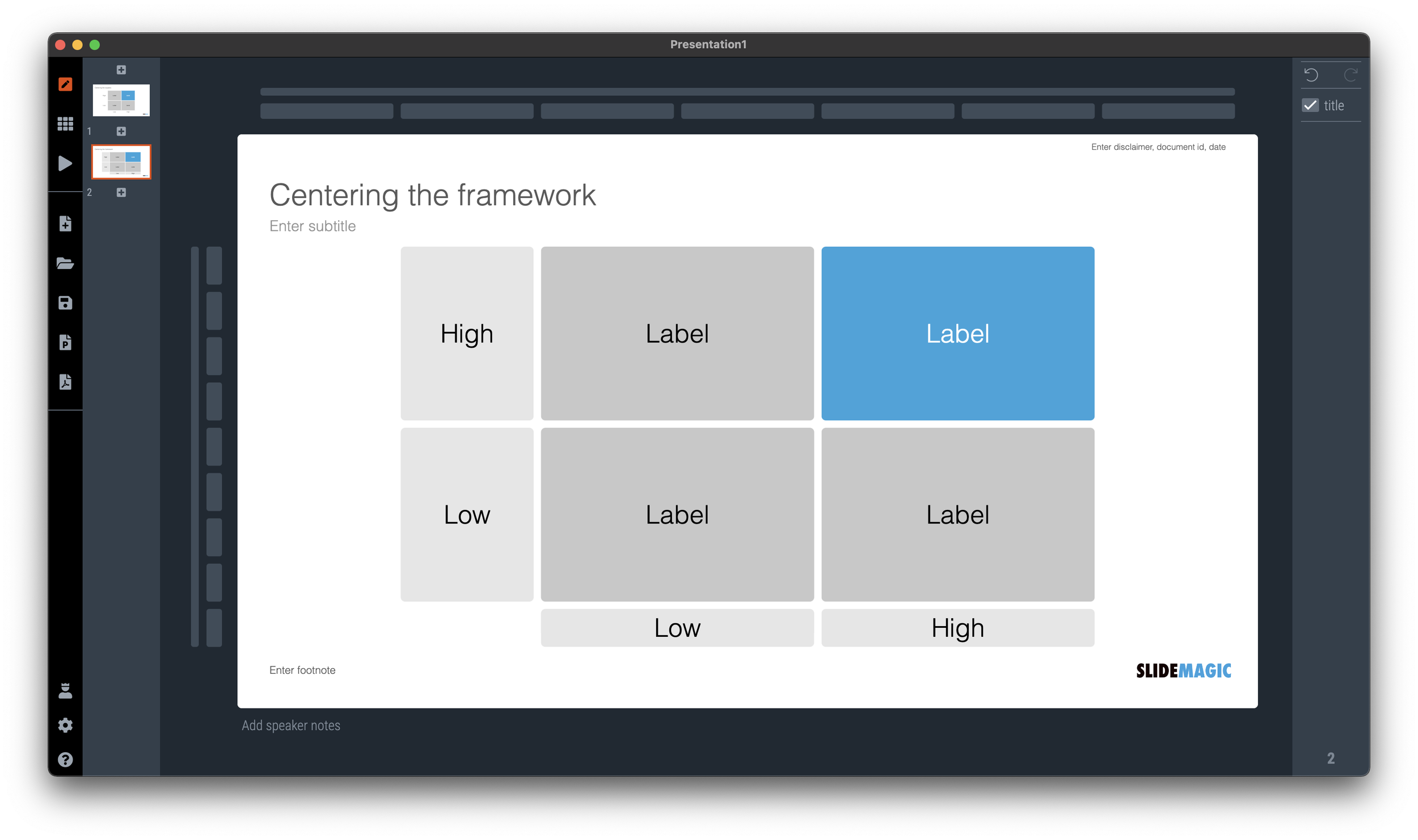
Information dashboards looked great in the mock up screens: dials, tables, buttons, graphs, until they are populated with typical data: text blocks are longer shorter than in the mockup, important data is actually not there, non-important data is, all graphs look flat, and all dials have more or less the same color because the values don’t change that much.

Presentation template designers, ask for an actual deck to start working on. Dashboard UI designers, ask for a real data set.

SlideMagic: a platform for magical presentations. Free student plan available. LEARN MORE
And we are back

And we are back

The past few weeks have been quite a roller coaster here in Israel. I spent a lot of work, and emotional energy on preventing that Israel would loose its democratic foundation. It looks like we are out of the woods for a couple of months and I will try to pick up the blogging effort. From a communications perspective, I learnt some interesting things over the past weeks.

SlideMagic: a platform for magical presentations. Free student plan available. LEARN MORE