Demo story lines

Demo story lines

A live demo of your product is risky in a short standup presentation. Lots of stuff can go wrong (internet connections, etc.) and you might end up spending valuable time on banal things like logging in and out. For short pitches, I would suggest to use screenshots, with the exact messages you want to convey. Point at your lap top with a running demo as evidence that there is indeed a product.

A proper demo of a product can be done in a follow up call. People have understood the basic idea, are interested, and now is the time to dive into the product. And strangely enough, in the era of Zoom product demos are a bit easier since everyone sits very close to a monitor.

Like presentations, it is not recommended to “wing” a product demo. You might end up forgetting to show critical features, hitting bugs, and presenting a rambling user flow. You want to impersonate consistent demo accounts that perform a sequence of actions in a logical way, instead of clicking around randomly to show features.

SlideMagic: a platform for magical presentations. Free student plan available. LEARN MORE
Dashboards and reports

Dashboards and reports

For periodical update meetings, you often can use the same presentation with just the numbers updated. When the audience is internal to the company, many will just use a spreadsheet printout rather than transferring the data to a presentation.

The result, a presentation that looks like, well, a spreadsheet.

  • There is more information presented than needed for the meeting

  • Numbers are highly precise and not rounded up

  • Fonts are tiny, as the spreadsheet tries to show everything on 1 page’s width

  • Colors and fonts are those of Excel, not the company

  • The last 2 rows of the table moved over to the next page

  • Etc.

If you need this report often, it is worth investing some time in setting up your spreadsheet properly.

  • Leave your “engine” untouched and create an entirely new work book that is your “presentation”

  • Get rid of spreadsheet gridlines and show the page cut offs so you get a clear view of the boundaries of your “slides”

  • Set colors and fonts the same way you would do in PowerPoint

  • Now build your slides page by page, by pulling in the data from the engine sheet, round numbers up as you go ( / 1000, show 1 decimal, etc.)

  • With these types of reports, you variability between slides will be in the column widths, not so much in the rows. To keep your “deck” all in one workbook, move horizontally, and add pages to the right rather than below

(Optional) The next level up is to introduce shapes and other graphics in your spreadsheet, and you can get to the same level of finish that you can achieve with regular presentation software.

SlideMagic: a platform for magical presentations. Free student plan available. LEARN MORE
No slides does not mean no presentation

No slides does not mean no presentation

In smaller, informal settings, pulling out your laptop to run through your slide deck can zap the energy of a meeting. For these meetings without slides, it does not mean that this is a meeting with a presentation. In the absence of slides, it can be hard to stay focussed on the story line. You might get lost in tangents, you might miss the important punch line as the waiter asks if you need sugar or milk.

The way you “present” in a slide-less meeting is different from when you are in front of a big audience. But still, you need to rehearse that story, maybe even more.

SlideMagic: a platform for magical presentations. Free student plan available. LEARN MORE
Things ChatGPT is good at (and not)

Things ChatGPT is good at (and not)

ChatGPT can be a useful productivity tool for presentations:

  • Get a basic story line / section outline for. a presentation

  • Improve the language of a text

  • Etc.

When using it, it is important to understand what underlying technology it uses, so you can see understand where it is strong, and where it is not.

  • ChatGPT predicts words based on your prompt and the previous words it has already generated. Therefore, it is really good at “completing” texts that are very common on the Internet. High school essays, business plans, corporate annual reports, product documentations, product reviews, computer code. If your presentation fits one of these, it will work great, if it does not, results are not very reliable.

  • ChatGPT cannot yet do live web searches to enrich its answers. Everything it “knows” is based on its training data set that was cut off in September 2021. Any information that became available after that, is not incorporated in the results.

  • The majority of text available online is in English, so results in other languages will not be as strong.

Back in the early 2000s, Yahoo! was trying to categorize the Internet. Google beat it with a simple approach of tracking to which site other sites point for a certain subject. ChatGPT is a sort of super template: instead of looking for / categorizing text in templates, it simply reads all the templates and predicts what sentence is most likely to come next given the previous ones.

So “generic” presentations are most likely to benefit from ChatGPT. Quarterly budgets, CVs and bios, results from a science project, product launches. But even startup presentations can be pretty generic. Think about a pitch deck of SAAS (software as a service company) that has revenues and can fill pages with data about the typical financial ratios that investors are looking for.

SlideMagic: a platform for magical presentations. Free student plan available. LEARN MORE
Diversity

Diversity

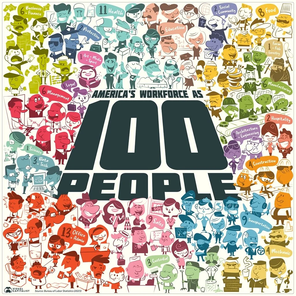
This is an interesting graphical representation of the US workforce:

It is very cute, but does not do a good job at communicating the actual data (percentage breakdown by sector). Also, since this graph tries to make the point of diversity, the characters in the illustration do not represent the gender and race balance of the work force.

One idea to tackle this. Add multiple dimensions of data: sector, gender, etc. to the characters, and then render multiple iterations of the 100 people, each time grouped differently to focus on a specific statistic. The opening slide is a random permutation of the entire group.

SlideMagic: a platform for magical presentations. Free student plan available. LEARN MORE
Shorter or quicker?

Shorter or quicker?

If the time window if your presentation gets cut you have 2 choices: fewer words, or more words per second. Pick fewer words.

SlideMagic: a platform for magical presentations. Free student plan available. LEARN MORE
Good old bars...

Good old bars...

AI is turning the semi conductor industry upside down, and I saw this interesting graphic comparing the market caps of Nvidia and Intel, which look very different from a few years ago.

The circles are cute, but are softening the contrast between the 2 numbers. Two dimensional surfaces look closer together than straight bars, see below.

This is also the reason that I prefer to use stacked columns over pie charts.

SlideMagic: a platform for magical presentations. Free student plan available. LEARN MORE
Prioritize your todo list, the Eisenhower matrix

Prioritize your todo list, the Eisenhower matrix

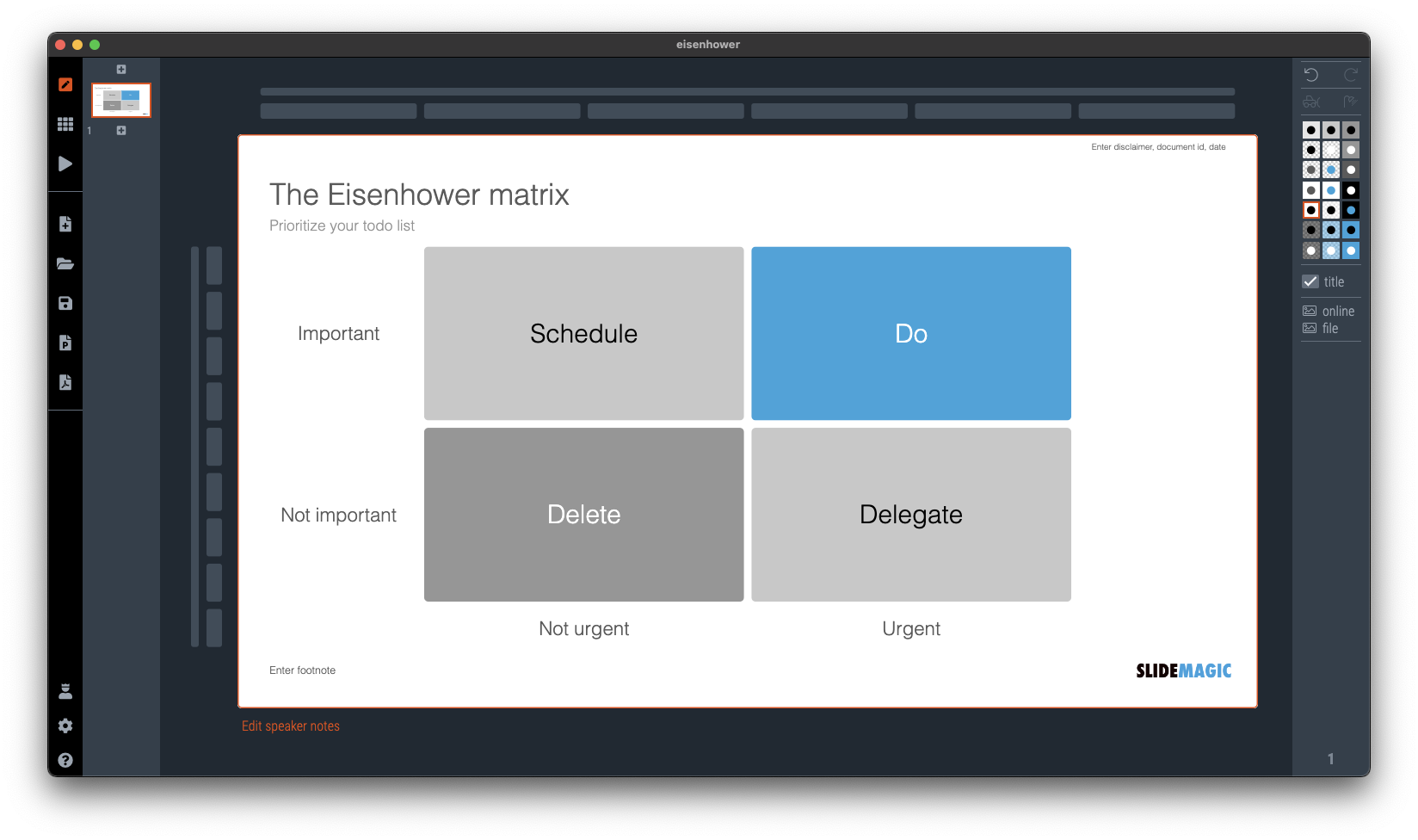
I was talking about prioritizing your time a few days ago and remembered a time prioritization tool that was suggested to me while at McKinsey. It turns out it is called the “Eisenhower Matrix”. I added it as a template to SlideMatic.

They key insight here was to be really rigorous and actually don’t do unimportant, not urgent tasks. The problem though was that all requests added to my desk were important and urgent….

SlideMagic: a platform for magical presentations. Free student plan available. LEARN MORE
Let others do the selling for you

Let others do the selling for you

During our very short (see yesterday’s post) speaking slot to launch a new partnership for 9xchange, we used the slide below. Deal making in healthcare is inefficient because everyone needs to kiss too many frogs in order to uncover their prince.

It got stuck in people’s head, and during the following presentations, presenters kept on referring back to frogs in their own talks. Free publicity.

SlideMagic: a platform for magical presentations. Free student plan available. LEARN MORE
First/short or later/longer?

First/short or later/longer?

When speaking at a conference and you get offered two possible speaking slots: early in the day and very short, and later in the day and a lot longer. Which one to take? Easy, the early/short one.

  • Attendance at conferences drops during the day, your audience is a lot bigger in the morning

  • When people see you speak (early) they are more likely to approach you later, (feedback about) your presentation is an ice breaker

  • In conferences, a really short speech is likely better than a long one. You are not here to close the deal, just to start more conversations. Your short speaker slot is a blessing.

SlideMagic: a platform for magical presentations. Free student plan available. LEARN MORE
Back from a busy week

Back from a busy week

My other venture 9xchange had a a busy week. We announced a partnership with AI-enabled drug discovery company BenevolentAI at the Biomed conference here in Tel Aviv.

On 9xchange, we match buyers and sellers of pharmaceutical drugs that are still in development. Sometimes, a drug no longer fits the strategy of a pharma company, sometimes, a drug fails clinical trials for a specific disease, but might still work for another one.

BenevolentAI has technology to find potential new indications for drugs. Drugs posted on the platform are exposed to its AI engine and results are fed back into 9xchange to broaden the number of matches between buyers and sellers, now taken into account newly discovered indications for which this drug might work.

SlideMagic: a platform for magical presentations. Free student plan available. LEARN MORE
Why does it look like PowerPoint?

Why does it look like PowerPoint?

It is often quick and easy to use PowerPoint to draw a diagram. No need to install and learn new specialized software. A few boxes, lines, a screenshot, and you are done. But why the result totally obvious a PowerPoint slide, even if you are not using the program to present your visual?

Over the past years (decades for some) we have become so used to seeing PowerPoint slides with the built-in fonts, standard color palettes, that most people will recognize it instantly. But when your end product is a screenshot, you don’t have to worry about things like font compatibility and presentation templates.

  • Change colors and fonts to match the document you are working in

  • Let go of the restrictions of the aspect ratios for a slide (4:3, 16:9) and pick something that is appropriate for your diagram.

SlideMagic: a platform for magical presentations. Free student plan available. LEARN MORE
Useful graphics illustrations

Useful graphics illustrations

I am usually not a big fan of illustrations that visualize data. Below is an example (with data from February 2022). The soldiers might as well have been represented by straight bar charts.

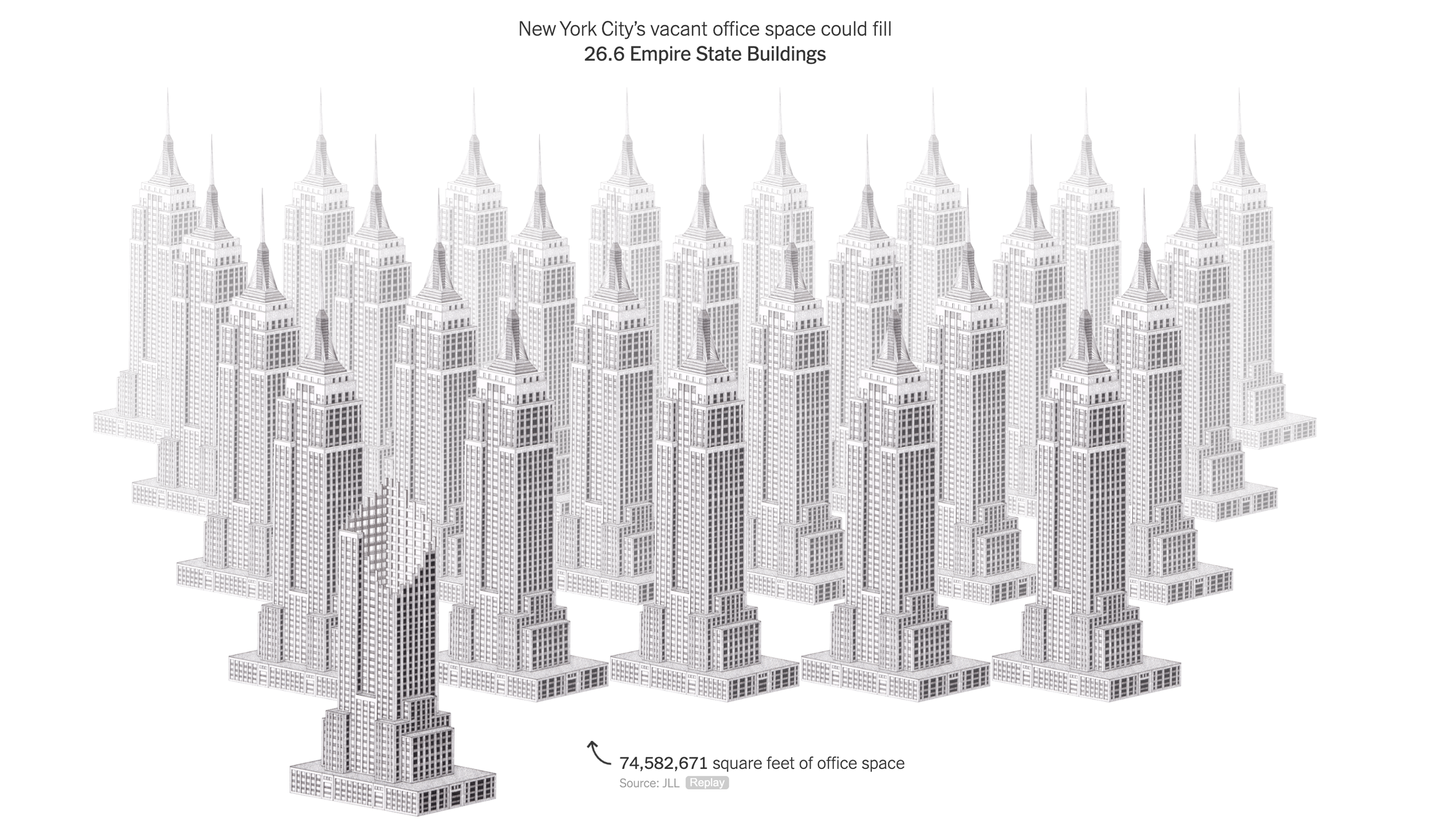
This article in the NYT though, was pretty effective. Representing unused office space with repetitions of well-known landmarks. People can instantly relate to, understand, and internalize the amount of space we are talking about.

(BTW, these illustrations are made by Kaylie Fairclough)

SlideMagic: a platform for magical presentations. Free student plan available. LEARN MORE
Grid mismatch...

Grid mismatch...

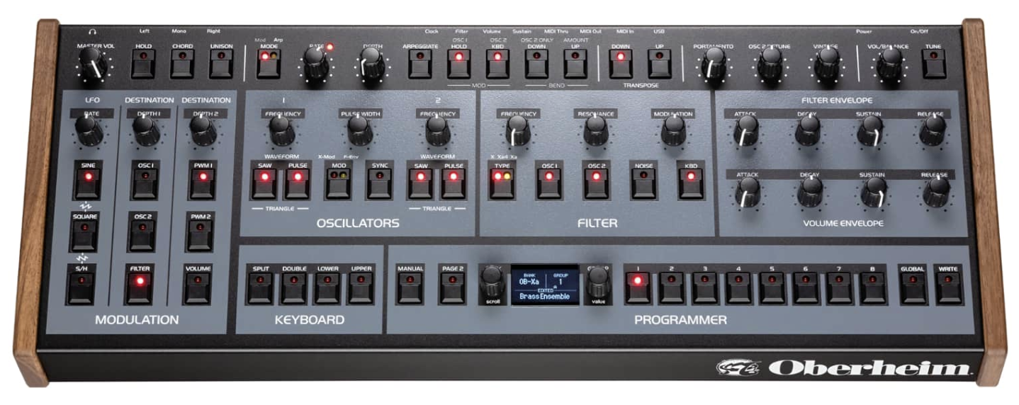
I like to play some music in my free time, here is a new synthesizer that was released this week. It sounds great, but I would have loved that they spent a bit more time on solving the grid puzzle of the knobs and buttons….

But hey, I am probably the only one worrying about this…

SlideMagic: a platform for magical presentations. Free student plan available. LEARN MORE
Image consistency with AI

Image consistency with AI

A good presentation has images that are consistent in style throughout the deck. Same color palate, same mood, same type of characters. This was very hard to achieve unless you make drastic design decisions: vintage black and white only, pop art cartoons only, impressionist paintings only (remember Ideatransplant ?), or cheesy stock images only.

AI can bring a solution here. Invest time in developing a standard prompt that generates the desired setting for your photo, then apply that same prompt consistently with small variations to get your snaps.

Databases of image prompts are starting to pop up (see a list here, writing this in May 2023) and this trend might well be the beginning of the end of stock image sites and even model agencies.

SlideMagic: a platform for magical presentations. Free student plan available. LEARN MORE
Introduction emails

Introduction emails

People are speed-reading emails. If you got someone willing to introduce you to someone else, and she says “send me an email that I can forward”, she is very likely to do just that, hit forward.

  • Don’t expect much text editing, explaining, or pitching from your contact. Yes, she know your company. Yes, she knows what you want from the introduction. The person to whom it gets forwarded has little idea. Do the hard work for her.

  • Writing the intro line for her (“I had a coffee yesterday with my good friend, and it struck me that the customer segment targeting positioning of their value proposition exactly matches or long-term vision for the business unit”), is likely going to have the line “See below, interested?” above it.

  • You are pitching for the next interaction with the person you get introduced to, not the closing of the deal itself. On the one hand, this will make writing this email a lot simpler, on the other hand, it means that you have make it super personal and relevant, a standard pitch won’t do it.

SlideMagic: a platform for magical presentations. Free student plan available. LEARN MORE
Slides in negotiation

Slides in negotiation

Lawyers love to negotiate (and bill hours) by changing words and lines in linear text. This works perfectly for deals that are standard and very well understood. The price of a product, the distribution commission, the number of shares.

When the business or the business model is a bit unusual, things go wrong. The 2 parties, and their lawyers (that’s 4 entities) can easily get confused. People think they understand, but they do not.

The solution: negotiate based on a sketch or a slide layout and use an imaginative case example with some made up, but realistic numbers. It is easy to refer to the year 3 sales redistribution commission as “those $42k”. Everyone knows what you are talking about.

After all this, the deal can be put in writing.

SlideMagic: a platform for magical presentations. Free student plan available. LEARN MORE
Prompting...

Prompting...

I have been experimenting extensively with prompting ChatGPT for the use in presentations. In a sense, I am glad that I did not raise huge amounts of money a few years ago in order to build features that now more or less come out in a few minutes.

Still there is a difference in “hacking” some quick results in a demo and having a stable product that can be used in the front line of presentation design.

These features have all to do with the automatic generation of layouts and story lines. Further out in the future though, there might be other applications that can replace the slide deck as the central tool to pitch ideas.

SlideMagic: a platform for magical presentations. Free student plan available. LEARN MORE
4 types of slides

4 types of slides

Slides can be grouped in 4 categories:

  1. Visualizations. A layout of data and/or elements with relationships that show something that is very hard to explain in linear text. Reading out all the columns of a data table is boring. Explaining the structure of DNA in words is impossible

  2. Background graphics. A nice picture or a few words that fill up that giant screen on stage and makes the overall picture frame (you + slide) look a lot better

  3. Trackers. A favorite of management consultants: some sort of table of contents that reassures you were we are in the overall story.

  4. Transcripts. Bullet points mapping 1-on-1 what the speaker is saying.

Think about when to use which one for what.

Complex visualizations might not work as a dramatic background image when you reveal your product. Background graphics will not say much in a document that you email without explanation. Trackers don’t say anything. Transcripts are horrible on stage, but might work when emailing to someone (i.e., a text document).

SlideMagic: a platform for magical presentations. Free student plan available. LEARN MORE
The same polarity

The same polarity

You have a choice when naming the labels in a comparison chart. For example: “price: high” is the same as “cheap: no”. Make sure that all highs and lows, or yes’s and no’s are aligned in the same direction, i.e., things that are “good” all have the same word value associated with it. See the simple diagram below.

SlideMagic: a platform for magical presentations. Free student plan available. LEARN MORE