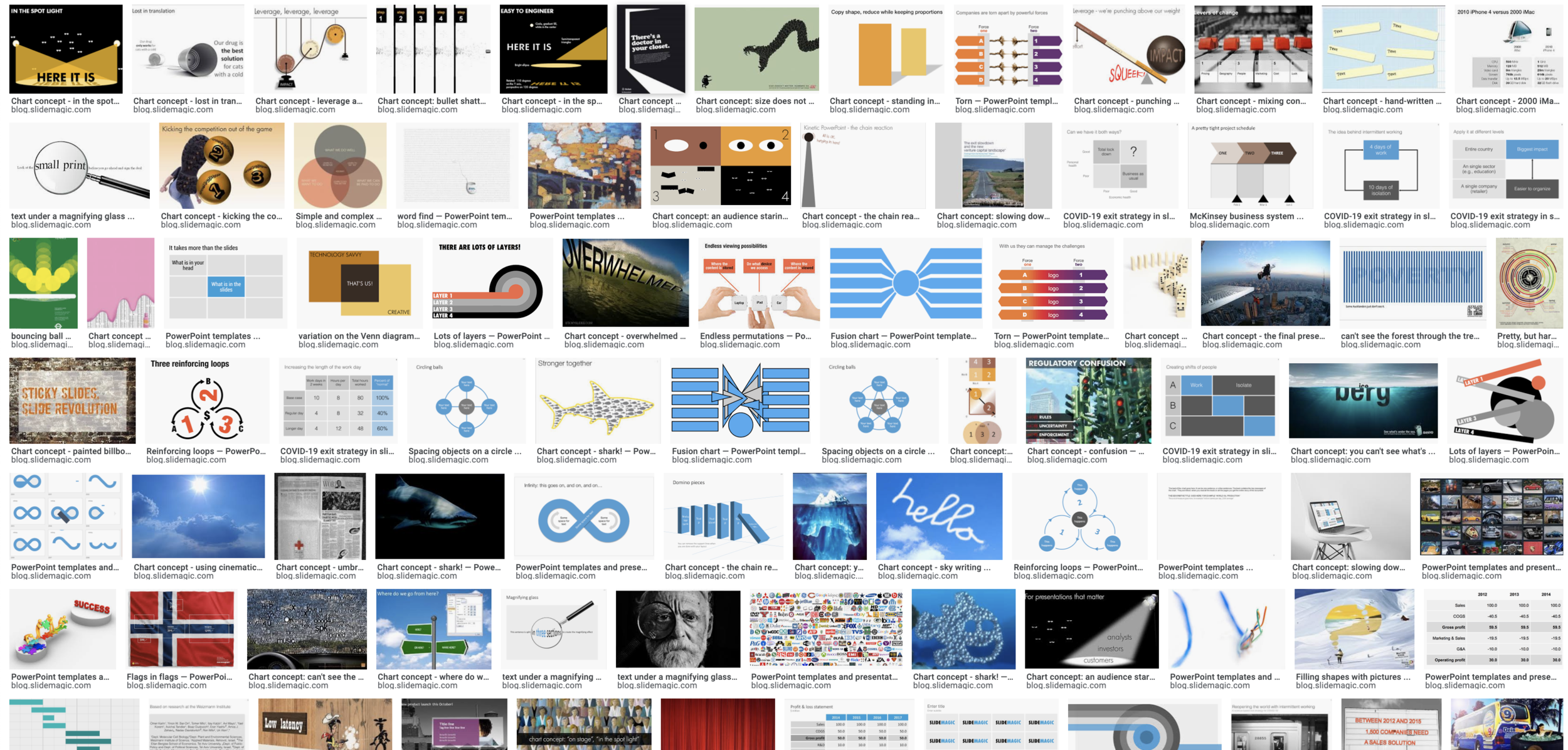
Now and then I dive back into the 12 year archive of my blog and see some or the early slide layouts I made. This Google image search pops up many of them.
While many of these layouts are now still available as templates in SlideMagic, some of them, especially the early ones are a bit different:
“Slides that stick” orange and brown
Lots of hand written fonts
Unusual visual analogies
Most of them are definitely not for the layman designer…
Yes, I made have been a bit more “daring” back then (and remember, most of these designs actually were taken from actual client work), but I still think that I am on the right track with my current sober, simple, easy-to-make layouts. Less artistic, but far less time wasted by smart people that can use their energy to do more useful things that creating presentation slides.


