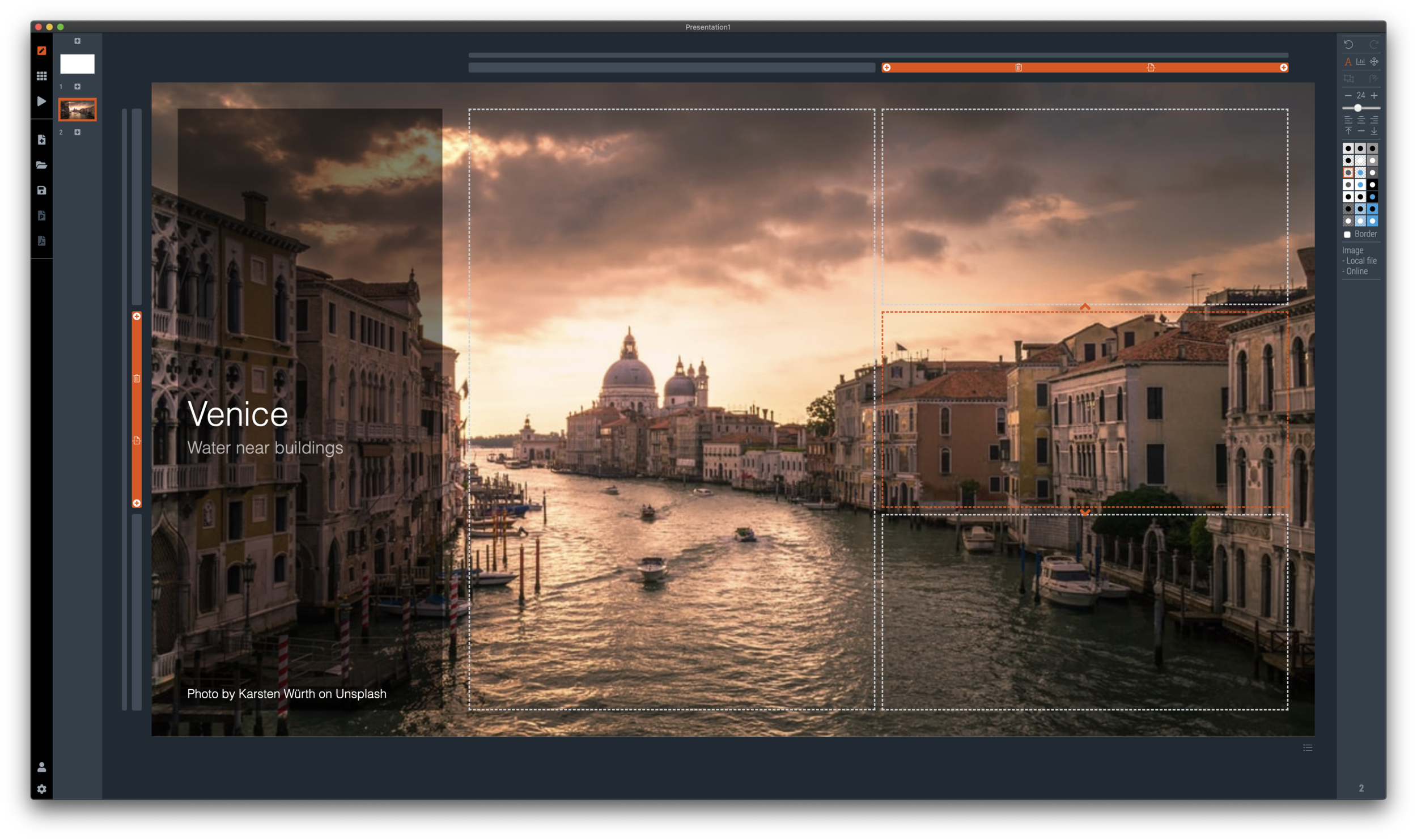
I have entered my usual summer blogger schedule (fewer posts) and am now working really hard to get SlideMagic 2.0 right. The feature list for SlideMagic 2.0 is now almost completely implemented. In software, there are always more things to add, but the product as it stands at the moment is starting to get very useful. Over the last 2 weeks I put in very big changes that might not look big from a user’s perspective, but required huge changes under the hood:
The new '“side title” layout (my preferred)
Slide search previews in your own preferred colour, layout, font style
Horizontal and vertical waterfall charts
Dynamically generated slides with a relevant image (i.e., unlimited slide in the template bank)
Better rendering of slides and images on higher resolution screens
Useful image compression in the background
The only big one that remains outstanding is a better way to make diagrams with lines and arrows, the connector solution is not perfect.
In the background I am now tweaking lots of user interface details: how borders fit around thumbs, mouse behaviour when hovering over things, an “endless scroll” is now working for image search, messages that warn you when things go wrong, or when your app is busy searching, making sure that thumbnails distribute nicely over the screen when zooming, minimising the times when the app needs to re-render a slide or image to make the workflow calmer, etc. etc.
I start to look at app design the way I look at slide design. Things need to be absolutely right, and even tiny deviations, irregularities, small mistakes, can really upset me, while most people won’t even notice them. This is what I think ultimately leads to good design, one by one, these details do not matter, I you add them all though, something works without you having an ability to point your finger at exactly why.
If you tried SlideMagic 3 months ago, you almost won’t recognise it (sort of), today (at the moment of writing, version 2.4.12 is the latest one). Work in progress


