Viewing entries in
Layout

Against the light

Against the light

In the early 1990s at McKinsey, presentation design was actually document production. Hand-written sheets of paper would be entered into a computer by full time graphics designers. Each word, each line, each graph. Then the whole thing would be printed and bound in books.

I remember the final quality check of the Amsterdam office manager: holding the pages against a strong light to see whether the titles, footers, page numbers, and margins of the slides lined up. You were in trouble if they didn’t.

Getting these basics right is very hard in today’s PowerPoint, If you copy and paste slides between masters, the alignment of objects will be off. If you change screen sizes (from narrow to wide screen and back), things go all over the place. Or, if you use/buy other people’s templates, they won’t fit well in your company’s slide layout. This is not PowerPoint’s fault, any software that needs to give total design freedom to its users will have this side effect.

I went through this the hard way myself, as I am making the slides of my “old” template store compatible with the new format of SlideMagic 2.0. Hundreds of slides that require small corrections to get things to line up properly.

With SlideMagic, professional designers might complain about the lack of flexibility in layouts, the rest of us will be extremely happy with how easy it is to tweak templates, screen sizes, and copy slides between presentations.

Photo by Bank Phrom on Unsplash

SlideMagic: a platform for magical presentations. Free student plan available. LEARN MORE
I got the vanishing point wrong all the time...

I got the vanishing point wrong all the time...

They key concept in drawing in perspective is the vanishing point: every line in your slide should disappear in it (see an earlier blog post). It turns out I got the concept slightly wrong all the time. Because of the curve in the Earth’s surface, the real vanishing point for someone standing at sea level is actually below the horizon. A vanishing point that sits on the horizon, would require the radius of the Earth to be 64x as large. (For comparison, the Sun as a radius about 109x that of Earth.

Vanishing point at a planet with a radius 64x that of Earth

Vanishing point at a planet with a radius 64x that of Earth

The accurate vanishing point

The accurate vanishing point

With this new knowledge, will I change my approach to slide design? Not sure.

Based on an article in NRC Handelsblad. Simulation images by Siebren van der Werf.

SlideMagic: a platform for magical presentations. Free student plan available. LEARN MORE
Picking the 2x2 axes

Picking the 2x2 axes

Two by two matrices are a popular tool rank options. Watch out when to use them though:

  1. Do you actually have 4 distinct options that can be grouped according to 2 axes? Many situations have only 3 options, where the 4th option that is suggested by your framework is actually not meaningful in reality.

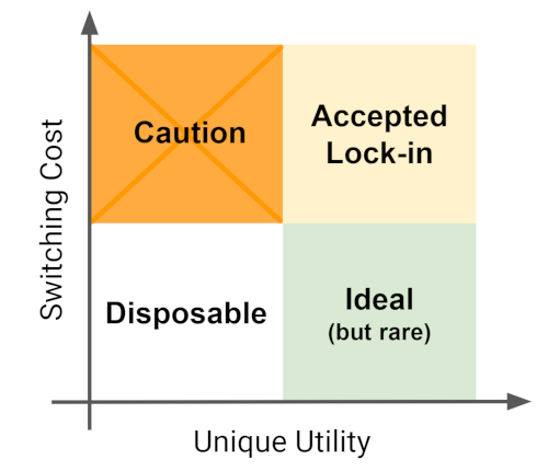
  2. If you pass the first test, make sure you set the axes right: the most favourable scenario in the top right, the least attractive options in the bottom left, the other two the “can’t have the best of both world” scenarios.

Below is an example of a 2x2 used in an article about software lock-in I stumbled across. Flipping the axes makes the diagram a lot clearer.

The original diagram

The original diagram

I quickly created reworked the axes in a SlideMagic 2.0 diagram below:

Screenshot 2019-09-02 18.46.06.png
Screenshot 2019-09-02 18.52.02.png

SlideMagic: a platform for magical presentations. Free student plan available. LEARN MORE
Quantification as a communication tool

Quantification as a communication tool

The backbone of almost any management consulting project (and final presentation) is some sort of quantification of options. In essence, the quantification is the communication.

Strategic options can be hard to compare, evaluate. Uncertainty, risk, lack of information, dependencies, short term, versus long term. Throw these in an average politically charged management meeting and the outcome is almost certain: indecision.

A quantification is convenient: simple rank the "score" and the answer rolls out. Every option can be compared objectively. Well, objectively to a certain extend. With all the wild assumptions and predictions, you can pretty much force an Excel model to go anywhere.

But that might actually be useful. The process of debating assumptions, seeing how much they actually matter, which ones are certain, which ones are a bit uncertain, and which ones are wildly speculative, weighing all the factors, is the communication process a consulting team and client will go through. At the end, the point estimate of "Option 3 wins with $52.3b value creation in 2035" might not be correct, but the thought process that went into the estimate means that option 3 is probably the most sensible option to take.

Why do people need to hire expensive consultants to lead them through this process?

  • Some sort of objectivity, an outside party who has the run the numbers with a credibility at stake
  • Raw horse power: knowledge how to run complex calculations involving risk and options (and an infinite supply of available human capacity in a certain time span)
  • Privileged access to information: data from another country, disguised industry benchmarks, etc.
  • And the guts to make broad "20% of the effort, 80% of the result" assumptions where it is appropriate

The analyst in the basement sees an endless stream of modifications of assumptions in the spreadsheet, but the client is getting the decision she wants.

Presenting the results of such a project can be tricky. The slides themselves can be super simple (a ranking of 5 options by value created in 2035), but the sequence how to take people through is complicated. Discussing your Excel sheet page by page is not going to cut it. 


Cover image by Tobias Fischer on Unsplash

SlideMagic: a platform for magical presentations. Free student plan available. LEARN MORE
How to start a new presentation slide

How to start a new presentation slide

When starting a new slide, most people think of what to write in it, then worry about composition which usually involves moving text boxes around so that everything still fits on one page.

Next time, start with the composition, then do the writing. Think how a few boxes and arrows can visualise common business concepts in a slide:

  • Something is bigger than another
  • Something is growing
  • Torn between opposing forces
  • Reinforcing loops
  • Ideal fit or a mismatch
  • Trade off
  • Dead end
  • A sequence

Put the shapes, align and distribute them, now add some text


Cover image by dylan nolte on Unsplash
SlideMagic: a platform for magical presentations. Free student plan available. LEARN MORE
Years in columns, which way?

Years in columns, which way?

In financial statements, the most recent financial period is put first, and next to it is the previous period for comparison: 2017 - 2016. To the frustration of some accountants and CFOs, I insist on putting the years the other way around: 2016 - 2017.

  • The eye is used to moving left to right when looking at time series data
  • It makes tables match line or column graphs that are in the presentation
  • It makes it easer to compare data across 3 years or more

I am not trying to change the reporting practices for financial statements. In the annual accounts, the current year is the most important one. It needs to be accurate and is usually shown with far more digits (precision) than I would use in a presentation. A comparison to last year's numbers is almost an extra, not the main purpose of the page.

Every financial document has its own purpose and own audience: spreadsheets, financial statements and presentation decks. And among presentation decks you can distinguish between quick and dirty documents to discuss (early results), detailed financial information for the investor community, and more generic financial slides for a general company presentation. Different purpose, different slides.

If you want you can check out financial slides in PowerPoint in my template store. Subscribers can download them free of charge.

SlideMagic: a platform for magical presentations. Free student plan available. LEARN MORE
McKinsey's presentation template

McKinsey's presentation template

I did not know this, but McKinsey has put its entire visual branding guidelines online. Beyond the usual instructions about fonts and colours, there are interesting documents about formatting exhibits and data charts. Most of it seems to be focused on print or web content, but overall it provides an interesting insight into template management of an organisation which basically produces presentations as its main product.

SlideMagic: a platform for magical presentations. Free student plan available. LEARN MORE
How to format tables in PowerPoint

How to format tables in PowerPoint

Tables can carry more data than a data chart and as a result can be less effective in a presentation. For some situations though, there is no point trying to avoid using a table in PowerPoint. For example, when investors want to see the quarterly numbers, they expect to see a table.

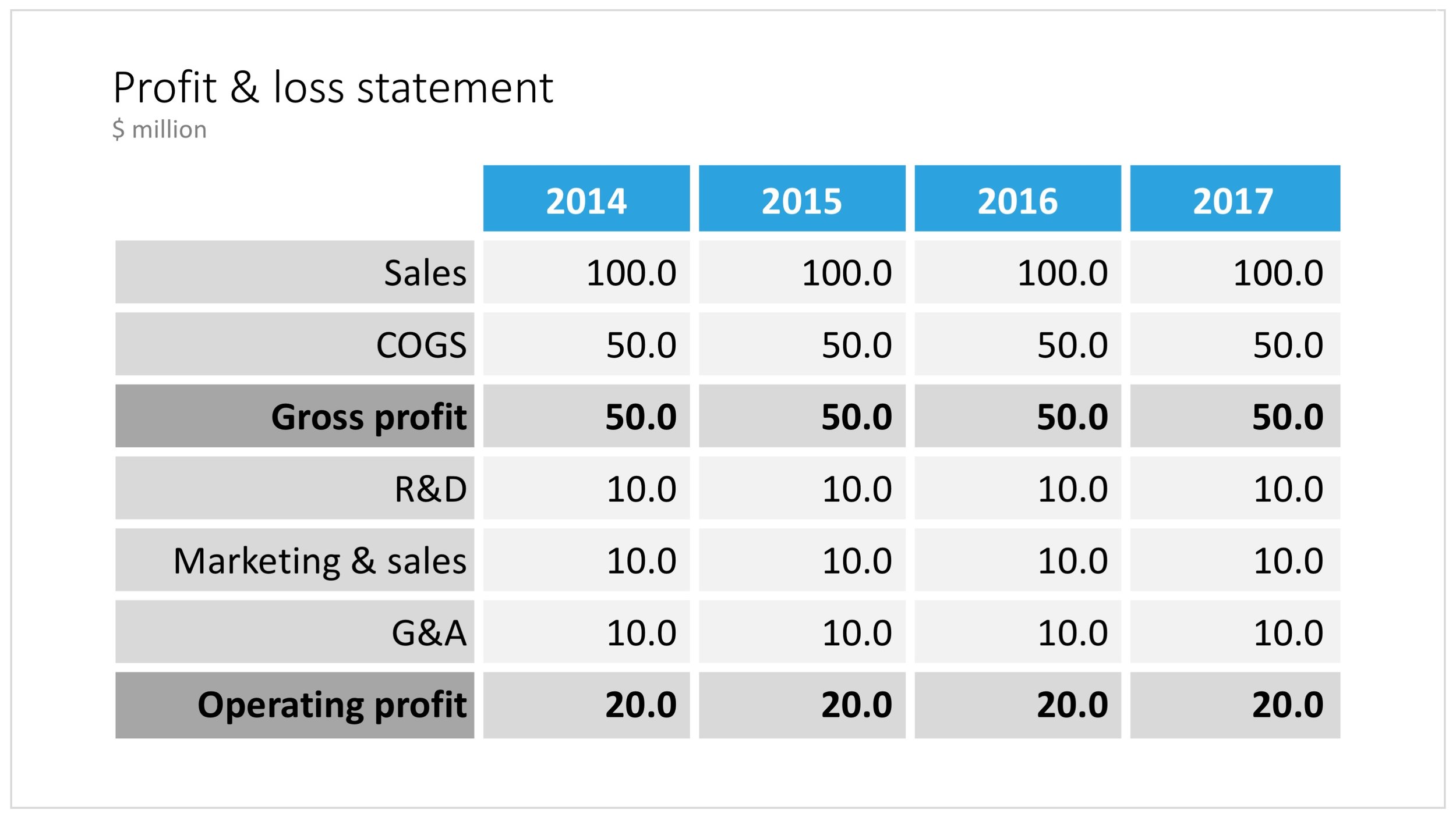
The way you format tables can make a huge difference in how your chart looks. When done well, a table can actually be an effective presentation slide. Have a look at the simple P&L table below.

A PowerPoint table to present a P&L

A PowerPoint table to present a P&L

This might look like a super simple slide design (it is), but a lot of thought and little tweaks have gone into its design. Let's take them one by one:

  • Colours have been adjusted to your own colour template, not the standard PowerPoint colours
  • Fonts have been matched to your current template (table can be stubborn sometimes and stick to Arial)
  • Instead of dark lines around boxes, I used lines that match the background colour, making cells a light colour of grey to stand out (or dark, black if you use that background)
  • Totals are bold, and a bit darker
  • The row labels are right aligned
  • The row labels are a bit darker than the cells
  • The data cells are right aligned
  • Numbers are rounded to the same amount of digits, so the dots line up
  • There are not too many digits in the table, enough to convey the data, but not too much to make it cluttered. If the numbers get too big, switch to thousands or millions.
  • There is a bit of inset in each cell, the text does not touch the edges
  • All the rows have the same height
  • All the data columns have the same width
  • The column headings are centered
  • The unit of measure is put at the top of the chart, not repeated inside the data values
  • The table covers the entire frame of the presentation template
  • Double check by hand/calculator: the numbers add up...

Excel can be an excellent starting point for a table. Pull the data values you want to show with the correct rounding into a new worksheet (tables for presenting are different from tables for analysing). Think hard about what rows you want show, consolidating/combining values that do not add to the overall message of your slide. Then copy-paste the whole thing into PowerPoint where it will show up as an ugly table. Go through the steps above to clean things up. Alternatively, you can apply a lot of similar formatting already in Excel, making your spreadsheet tables good enough to put straight on the projector. This is handy when your numbers update frequently.

Feel free to copy the design, or download this table from the template store. You search for more slides with tables as well.

SlideMagic: a platform for magical presentations. Free student plan available. LEARN MORE
Creating an infinity symbol in PowerPoint

Creating an infinity symbol in PowerPoint

It is tricky to create an infinity symbol (or lemniscate) in PowerPoint, it is a shape that needs to overlap with itself and requires Escher-style (impossible) layering of shapes. The only way to do it is cheat, and construct the final shape of many individual shapes that are grouped together cleverly.

I managed to get it done, and you can see the final result here (hmm, those arrows point the wrong way around though):

An infinity symbol in PowerPoint

An infinity symbol in PowerPoint

I don't have the exact workflow anymore that I used (I made some destructive edits), but below is a screenshot of the PowerPoint file in slide sorter mode that I used to create the shape, starting with 2 circles and a square.

How to create an infinity shape in PowerPoint

How to create an infinity shape in PowerPoint

This shape is useful to show concepts that keep on going, or loops that you can't get out of. You can download the infinity symbol here, or find other slides with loops. There are Apple Keynote versions available as well.

Cover image by Mark Asthoff on Unsplash

SlideMagic: a platform for magical presentations. Free student plan available. LEARN MORE
Puzzle pieces in PowerPoint

Puzzle pieces in PowerPoint

Although you could consider them a presentation cliché, puzzles can work really well in a presentation:

  • Show how things fit beautifully

  • Show how your are missing (hopefully just one) critical piece

  • Show that you finally managed to plug that last gap

Puzzle shapes can also work great when you use them in combination with images. You can go back to this blog post about making Photoshop-like image cut outs in PowerPoint.

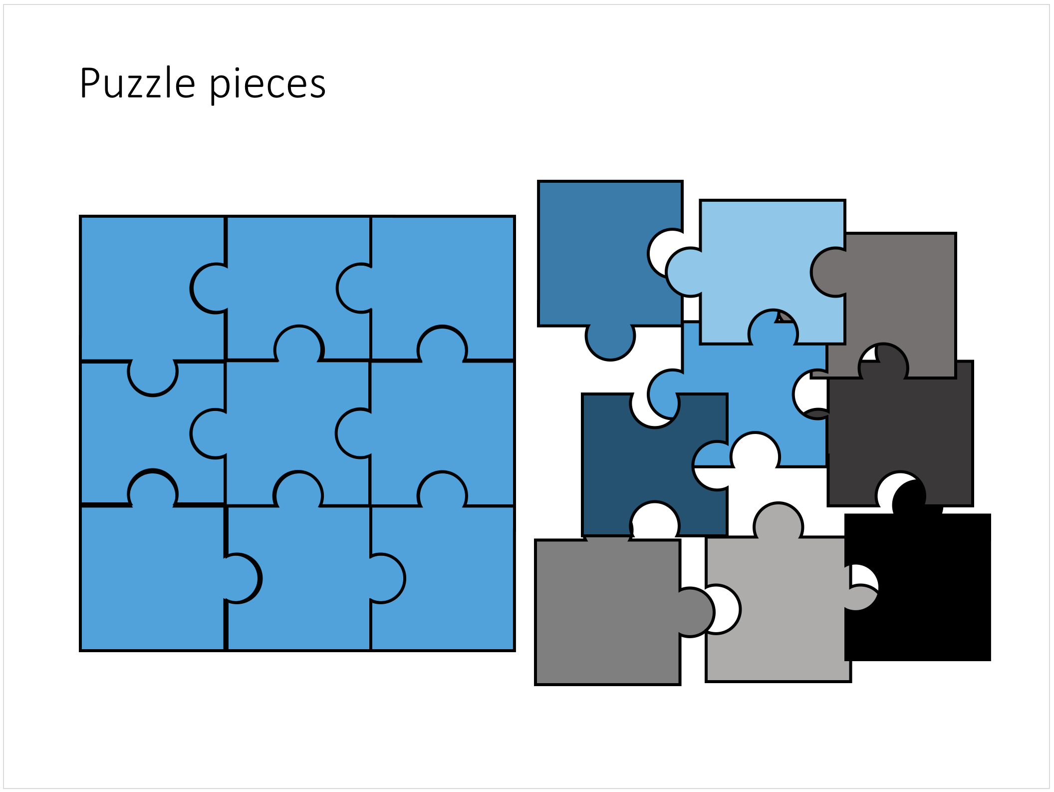
Stock image sites are flooded with millions of puzzle piece designs, but they are not very practical for the average PowerPoint designer (especially late at night working for tomorrow's deadline). Almost all these puzzles pieces are vector objects or images that are impossible to edit in PowerPoint. Moreover, all these puzzle pieces have wildly irregular shapes that make them hard to fit in your slide composition that requires exactly nine of them.

This PowerPoint puzzle slide solves the problem for you. The pieces inside are fully editable PowerPoint shapes, you can change their colour, you can put text in them, you can reconfigure and piece them together as you see fit. Yo'u can download the finished slide by clicking the image (An Apple Keynote version is available as well).

You can try to create the pieces yourself if you want, I used simple square shapes and circles, either joining or subtracting the shapes. Circles and squares might not be the most realistic shapes, but they are very practical when have to piece things together. There is a little bit of math homework to do to determine which type of puzzle shapes you actually need, and which ones you can create by rotating existing pieces.

SlideMagic: a platform for magical presentations. Free student plan available. LEARN MORE
Concentric circles in PowerPoint

Concentric circles in PowerPoint

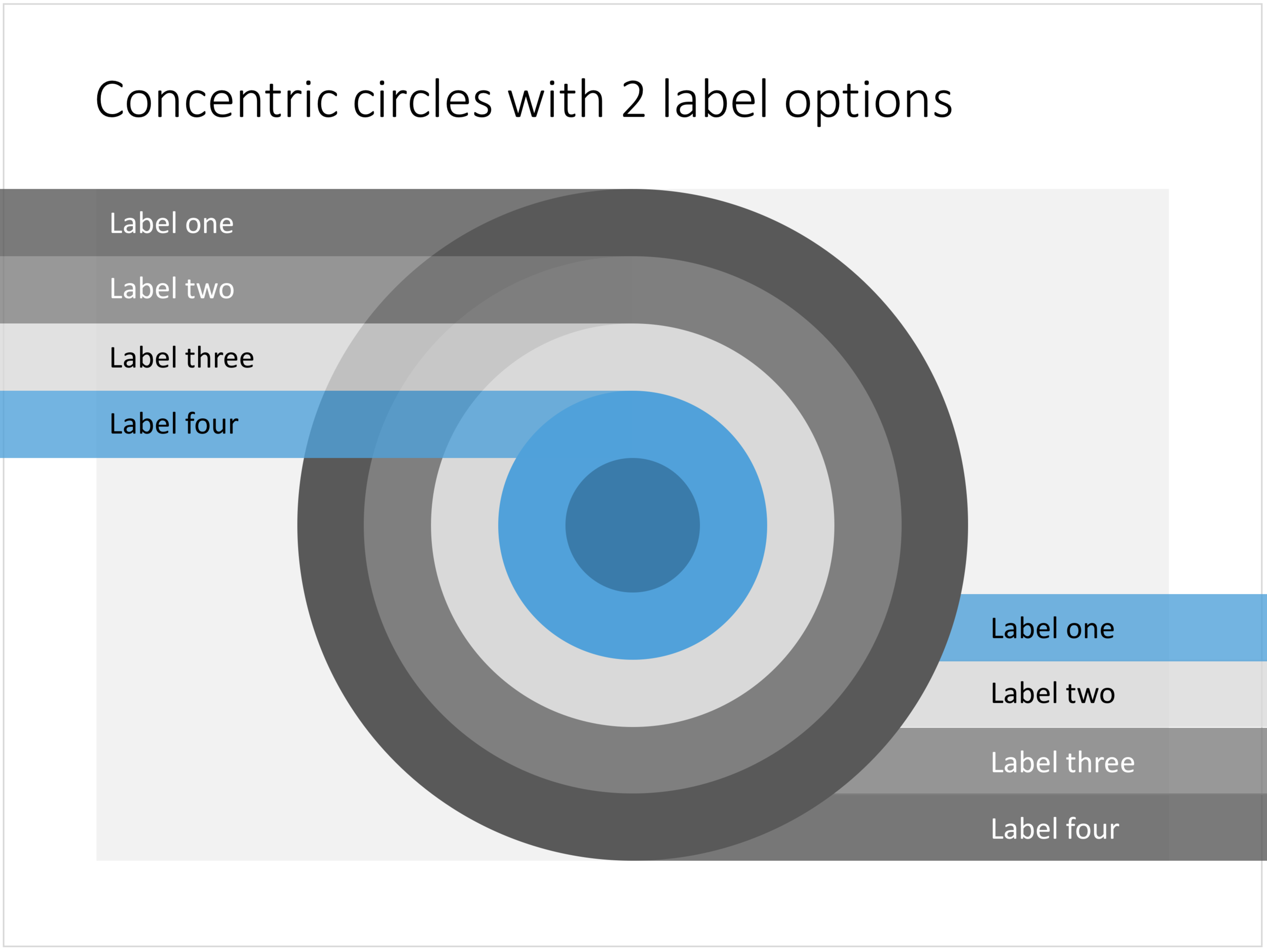
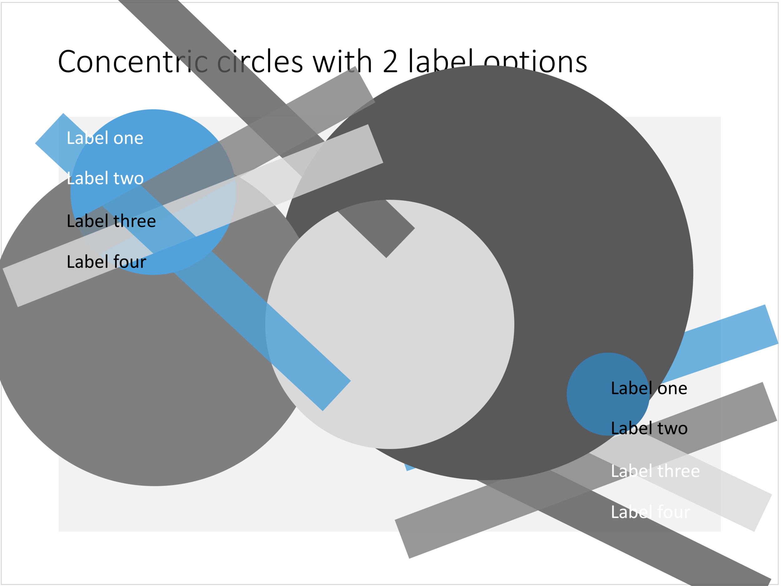
You can create very beautiful compositions by just using basic shapes and a few colours. Below is a presentation slide with concentric circles, and an image that shows how it is constructed. Feel free to borrow the design approach, or you can download the finished slide here.

This technique was often used by the Swiss graphics designers in the 1960s. You can use the slide concept below in a number of ways: show some sort of layering, show multiple layers of security or protection, show a whirl or rolling dynamic. You can take the labels of and just use the circles.

Concentric circles in PowerPoint

Concentric circles in PowerPoint

How to make concentric circles in PowerPoint

How to make concentric circles in PowerPoint

SlideMagic: a platform for magical presentations. Free student plan available. LEARN MORE
Quote slides in presentations

Quote slides in presentations

Quotes can add credibility to your presentation. If experts, celebrities, and/or customers agree with you, you must be right. But, not all quotes have equal weight. They have been overused in many PowerPoint decks. (Anyone can find a picture of a serious-looking person and get her to say what you want her to say in a few mouse clicks).

Here is a check list:

  • The person needs to be relevant and credible (third tier social media "experts" do not carry much weight)
  • The person needs to be identifiable ("Senior marketing executive at major high tech firm" can be anyone and is most likely you)
  • The quote needs to be interesting, cut the buzzwords and marketing language, cut the cliches ("Wow,  these guys really have a targeted value proposition that resonates with my medium-term return on investment objectives")
  • The text needs to be long enough that it is specific, and short enough that it reads like a headline. A full page of verbatim will not come across 
  • The quote needs to be relevant, a generic motivational quote might not help close that enterprise software contract.

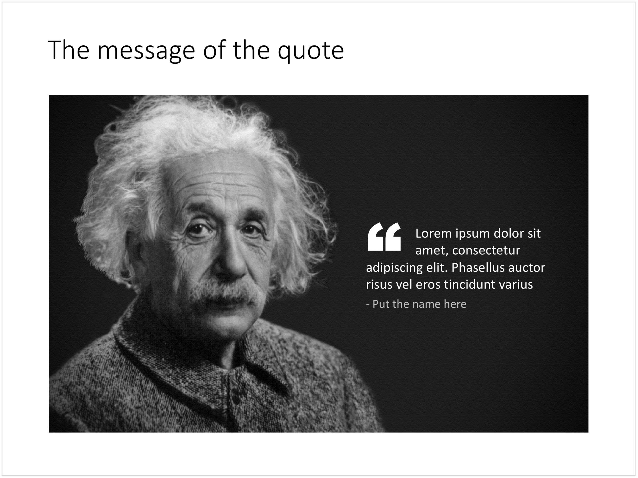
Quote slides are (and should be) pretty simple: a nice big image with a big text overlay. Still there are some things to watch out for. Below is a quote slide that I have added to the SlideMagic template store. Let's go through the design process.

  • The image should have a calm background with enough "white" space for text. You don't need to be a Photoshop guru to extend the background of an image in PowerPoint, it is easy to add a black or white box next to images. You can use the colour picker to match the precise colour, or use semi transparent overlays for the best effects
  • Make the quote symbol stand out. Regular quotes are too small, and the layout does not look good, as the quote pushes the start of the paragraph in. There are endless ways to do it and I settled on this one. One big quote at the beginning of the paragraph with a text indent. Take some time to find a quote in a good font. In the above slide, the text font is the Microsoft Office standard Calibri, but the quotes of this font don't look that "fat", I used Arial.
  • This slide is a framed image slide, which gives me the opportunity to add a big headline at the top of the slide with the main message (the headline can say "Customers are really happy", the quote can say "With product [x], I no longer need to use a pencil".

Feel free to borrow the suggestions above, or you can download the finished slide here. The template store has related designs for quotes, or customers.

SlideMagic: a platform for magical presentations. Free student plan available. LEARN MORE
The iceberg in PowerPoint, presentation cliches

The iceberg in PowerPoint, presentation cliches

I think people are spending way too much time on creating corporate presentation documents for internal company  meetings where the objective is to get your colleagues to agree on something that needs to happen next. Not every meeting is your all company annual sales kick off.

Presentation cliches can be effective visual shortcuts to get your point across. People have seen them before, instantly connect to the concept, and you can move on. The challenge is to make your slide look decent, maybe even referring to the cliche in a tongue-in-cheek way.

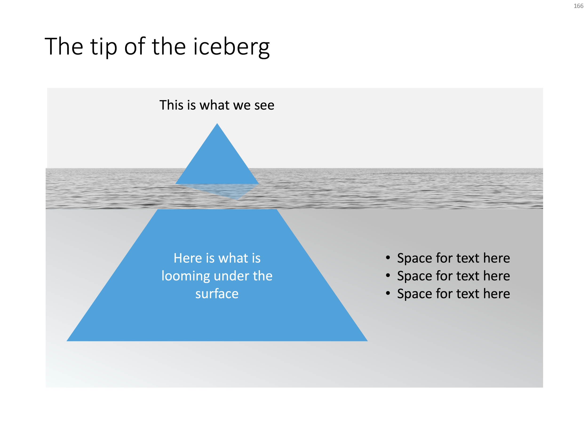
Below is what I tried to do to the infamous tip of the iceberg slide.

The tip of the iceberg presentation "classic" (or cliche?)

The tip of the iceberg presentation "classic" (or cliche?)

  • Don't try to make it look too photo realistic, but rather use an abstract simple geometrical shape, and use the presentation accent color (instead of white against a dark background)
  • Keep the slide very simple, but the depth effect is actually created with clever layering of (partly semitransparent) shapes and image crops, it took me some head scratching to figure out
  • Shift the whole composition to the side to leave some more space for text, if you need it.

All in all, this chart looks better than a boring list of bullet points that describe some looming threat you want to warn your colleagues about. Just resist the temptation to fill that empty piece of arctic ocean on the right or the crisp polar sky with text.

If you want, you can download the tip of the iceberg slide here.

Photo by paul morris on Unsplash
SlideMagic: a platform for magical presentations. Free student plan available. LEARN MORE
The pillars and other PowerPoint cliches

The pillars and other PowerPoint cliches

Some presentation slide layouts have been used so many times that they have become a cliche. You know it, when you see one. In very high profile presentations, it is a good idea to take them out and replace them with a different design, to prevent the audience from thinking "Oops, it's going to be one of those decks again".

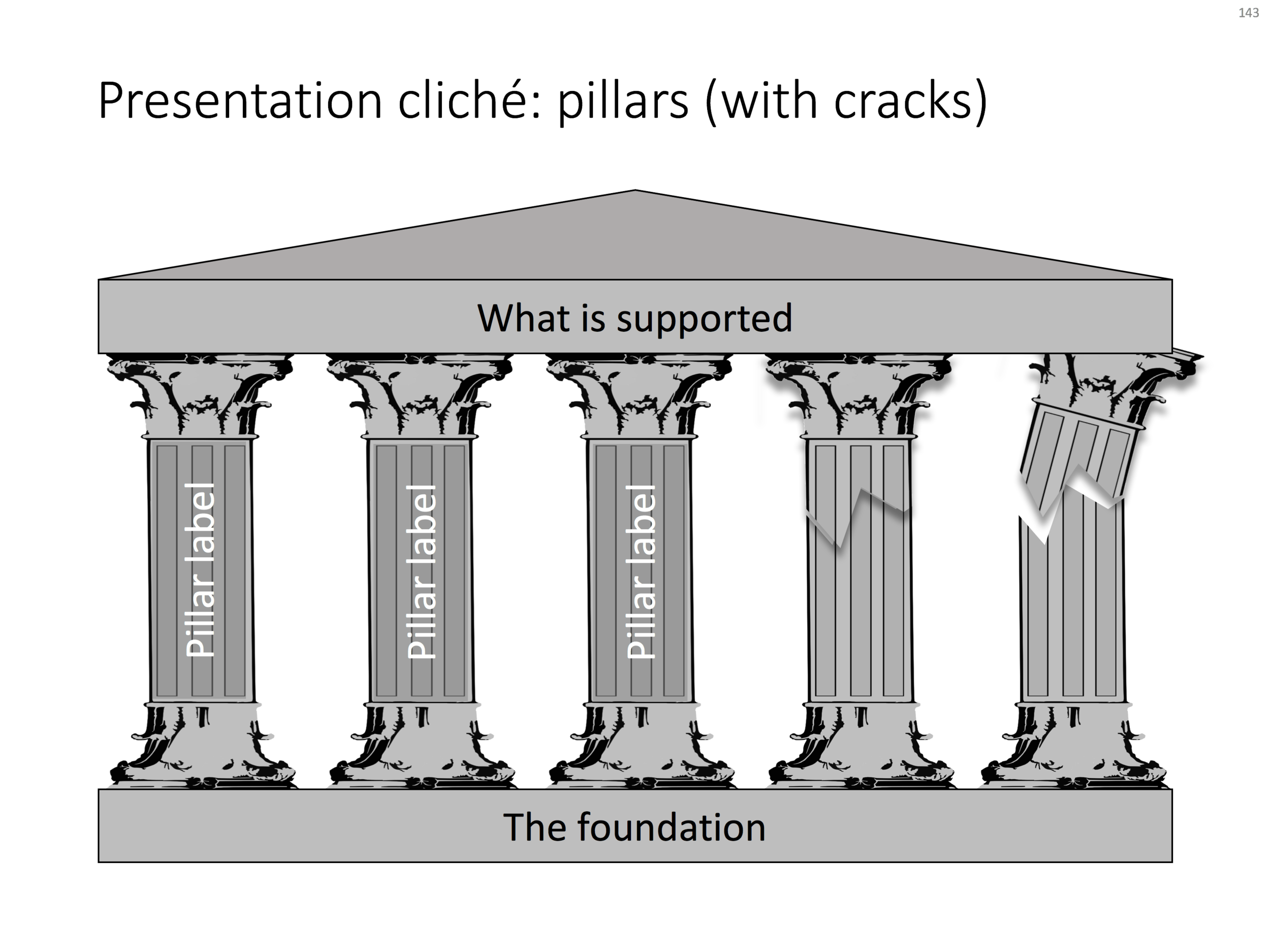
I am pragmatic though, and I you need to stitch together a quick deck for tomorrow's strategy meeting, and yes, you have a case that your strategy depends on 5 pillars, I will forgive you for digging up that temple slide from the archives.

For your convenience, I have created a downloadable pillar/temple slide in the template store. This version can also come in handy when you need to address not totally stable strategies. In case you  are curious, I  have labeled some other slides as "cliche" in the template store, you can a run a search for the keyword "cliche" and see what comes up. Do you agree?

SlideMagic: a platform for magical presentations. Free student plan available. LEARN MORE
How to create Harvey Balls in PowerPoint

How to create Harvey Balls in PowerPoint

Harvey Balls are a repeating pattern of simple pie diagrams to score options among different access. Strategy consultants love them because it allows you to make qualitative assessments quickly. They work great on group discussion whiteboards as well: draw the empty circles and have the meeting participants colour them in.

Apparently they were invented at Booz Allen in the 1970s, which is probably why we at McKinsey referred to them as "moons".

In PowerPoint they are a bit tricky to make, in the template below I tried to make an effort. To change the values, you need to open each pie diagram and change its value, make sure that you are not moving or re-scaling any of the pie diagrams in the process.

At McKinsey, I remember always keeping a "moon" diagram somewhere in my hard drive, so I could easily re-use the various shapes (these were not Excel pie diagrams, but graphic icons that came in the four stages).

Visually, I think they are not perfect. Maybe in the early 1990s, with primitive computer graphics, Harvey balls served a purpose, but now the same effect can equally be achieved by applying different colour shadings in the background colour of the cells in your table.

As always, feel free to copy the design, or download the ready-made slide from the template store.

SlideMagic: a platform for magical presentations. Free student plan available. LEARN MORE
Pop out of the box

Pop out of the box

My slide layouts usually have a white frame around them, even big images I don not let "bleed" of the page. Why? My slide decks are usually a mix of these minimalist big image slides and more traditional, dense, consulting-type slides. The big pictures usually go in the front of the deck to sell the idea, but for financials, roadmaps, etc. I need a different format. Mixing two styles of presentations gives the deck an inconsistent look.

(The exception would be tracker pages, or section separators, which I usually stretch over a full page).

That "box" gives you some new design opportunities though; you can make things pop out by putting them outside the frame on purpose. This is technique that is often used on magazine covers. Below are some slides from the store where I used this technique (clicking them takes you to the store).

SlideMagic: a platform for magical presentations. Free student plan available. LEARN MORE
SWOT analysis

SWOT analysis

You have been searching "SWOT" a lot in my slide template store, and got blank results. So, by popular demand, I added a SWOT slide template.

The slide is a bit too dense to put up in your next TEDTalk, but that is never the purpose of a Strengths-Weaknesses-Threats-Opportunities analysis. A SWOT is an analysis rather than a presentation tool. In my life as a strategy consultant at McKinsey, a SWOT analysis rarely solved a big strategic problem start to finish, but it is usually a great tool to get people started.

It can be especially useful in big group discussions where strategic debates can go all over the place. Putting an empty SWOT framework on a flip chart immediately calms the group down and focuses the meeting.

I expanded a bit on the traditional 2x2 (4 boxes) model: the SW, and OT boxes are now put on the side of the matrix, leaving space for 4 new boxes in the center that enable you to scribble what you are actually going to do about all these internal and external factors.

(I vividly remember that 50% of the group discussions around a SWOT whiteboard were about in which box to throw a particular thought).

Feel free to copy the design, or download the SWOT analysis ready made from the template store. You can find there more examples of strategic frameworks as well.

SlideMagic: a platform for magical presentations. Free student plan available. LEARN MORE
Presenting your team

Presenting your team

Presenting your team. Team slides are tricky: there is so much to tell when you have 3 people with a 20 year career. Where to start?

SlideMagic: a platform for magical presentations. Free student plan available. LEARN MORE
Turning a bar chart into a Gantt diagram

Turning a bar chart into a Gantt diagram

From bar chart to Gantt. Read in this blog post how you can turn a stacked bar chart into a Gantt diagram.

SlideMagic: a platform for magical presentations. Free student plan available. LEARN MORE
Evidence from press clippings

Evidence from press clippings

Here is a slide I often encounter in draft publications: a screen shot of a news web page, with a few words circled in the middle of the article. There are a few problems with this

SlideMagic: a platform for magical presentations. Free student plan available. LEARN MORE