Viewing entries in
Layout

Slide layouts and aspect ratio

Slide layouts and aspect ratio

The aspect ratio of a slide influences the type of layout you come up with. Over the years, presentation slide aspect ratio tend to follow the dimensions of computer screens. The first computers typically had a 4x3 screen ratio (80 x 25 characters of a punch card, sort of resembling an A4/letter format, and probably easier to design when you need to redirect electromagnetic beams in pre-LCD traditional televisions/monitors), while modern machines have wide screens in 16 x 9 ratios (the preferred format in movies).

A 4x3 canvas is very different from a 16x9 canvas when it comes to design (spoiler, I prefer the 4x3).

Most diagrams and frameworks work best when width and height are about the same. When you look at many of the classical management consulting frameworks, you can see that they were originally designed in a 4x3 aspect ratio. Modern interpretations simply stretch them out, making the whole thing look unbalanced.

Screen Shot 2021-04-20 at 7.53.18.png

Process diagrams and tables on the other hand, work great in widescreen format. There is a lot of space for left-to-right steps or columns with information.

What to do?

  • There is nothing wrong with white space. If your diagram needs a 1x1 aspect ratio, put it in the middle of your 16x9 slide and resist the temptation to fill the left and right sides with text or other distracting clutter

  • Alternatively, consider putting the titles of your slide on the side, creating a mover vertical canvas for the body of your slide (SlideMagic can switch seamlessly between different slide title layouts).

Screen Shot 2021-04-20 at 8.02.21.png
Screen Shot 2021-04-20 at 8.04.50.png

SlideMagic: a platform for magical presentations. Free student plan available. LEARN MORE
The five ingredients of a successful startup pitch

The five ingredients of a successful startup pitch

I added the slide used in this tweet to the SlideMagic library. In SlideMagic it is super easy to quickly create a grid with lots of boxes. There is a lot of redundant information on the slide, but the repetition on the other hand serves a purpose here.

Screen Shot 2021-04-11 at 10.17.42.png

Search for “pitch” in the SlideMagic app and it will pop up for you to use (alongside some other investor and musical pitch related slides).

Screen Shot 2021-04-11 at 10.16.00.png

SlideMagic: a platform for magical presentations. Free student plan available. LEARN MORE
Do you need the table headings?

Do you need the table headings?

Spreadsheets and databases need table headings. Humans not always. Look at the two slides below

Screen Shot 2021-03-22 at 11.11.20.png
Screen Shot 2021-03-22 at 11.24.09.png

We know how to recognise car brands, colors. Pretty much every car has 4 wheels. Think of replacing the boring tables with cards or labels, making the slide easier to read, and creating more space for information that is more important to show.

Photo by Valdemaras Januška on Unsplash

SlideMagic: a platform for magical presentations. Free student plan available. LEARN MORE
Dashboard syndrome

Dashboard syndrome

I am following a number of amateur statisticians here in Israel to get insight in how the vaccination campaign is going. This ‘underground’ information sources gives a for better picture of what is going on than the main news media can provide. A better explanation and earlier detection of trends.

Most of these statisticians use the same chart that they update every day. And I noticed that after a few weeks, you actually stop seeing how poorly the chart is designed, your eyes will zoom straight to that one figure that has been updated.

Stock brokers spot the latest share price instantly on a busy ticker board. Mathematicians see the crucial line in the proof on the blackboard.

You , the presentation designer, have become used to your own dashboard. It might be time to take a step back.

Photo by Neil Martin on Unsplash

SlideMagic: a platform for magical presentations. Free student plan available. LEARN MORE
Emphasizing by de-emphasizing

Emphasizing by de-emphasizing

Recently, a SlideMagic user asked for some help with adding “some more color” to a slide. (A table to be included in an internal strategy document).

My response was the opposite, rather than adding color and accents, I took things out. To make things stand out, you can either emphasize these things, or de-emphasize everything else.

Here is the starting point (confidential text removed). Btw., look how neat and organized it already looks, thanks to SlideMagic…

Screen Shot 2021-03-02 at 8.26.36.png

Below my suggestion:

Screen Shot 2021-03-02 at 8.27.22.png

The things I did:

  • Changed color accents

  • Grouped and de-duplicated text boxes that contained the exact same text

  • Changed relative heights of rows

  • Moved title category labels to the top

  • Added the arrows to visualize that the bottom item supports everything else

SlideMagic: a platform for magical presentations. Free student plan available. LEARN MORE
Psychology of young people pondering the COVID vaccine

Psychology of young people pondering the COVID vaccine

I am intrigued by the dynamics surrounding how people make the decision whether to take the COVID vaccine or not. Unlike most other countries, people have the luxury to ponder this decision here in Israel. The government has a real communication challenge here.

We spoke about segments before. If you are a fundamental anti-vaxxer, or have severe doubts about the vaccine safety, you are unlikely to be convinced.

There is a segment of young people though that “can not be bothered”. The personal risk of getting severe COVID is very low. They consider it the same as joining public roads every day. You consciously take this calculated risk, knowing that the probability of getting stuck in a severe accident is very small, especially when you drive safely.

What people forget, is the indirect impact. Big number of people x tiny percentage is still a big number of people at country level. And filled up intensive care units, trigger more lockdowns, more closed restaurants, bars, parties, zoom schools, etc.

I compared the two scenarios in the chart below (search “COVID” in the SlideMagic app to use something like this logic flow in your own presentations for other topics, also put it in the web template bank, download it here).

SlideMagic: a platform for magical presentations. Free student plan available. LEARN MORE
Knowing your audience

Knowing your audience

A follow-up on yesterday’s post about convincing the center when it comes to COVID vaccines.

Most people who create presentations are not marketeers or PR professionals. They hear people (including presentation designers like me), talk about how important it is to think about your audience when crafting slides. And when thinking about the audience, they don’t have much sophisticated data. Insights are likely to be basic: “They do not believe that we can get traction with our search engine that needs to beat Google”.

Global Web Index did research in people’s attitudes towards a COVID vaccine, the results of the findings are put in this visualisation by Visual Capitalist. The main message to me about this pretty but busy graphic is that it is complex, things are not clear cut.

global-attitudes-towards-vaccines.jpg

Here is my summary of the segments, and a possible communication strategy. (You can find this slide in the online template bank, or search for ‘covid’ in the SlideMagic desktop app)

Screen Shot 2021-02-11 at 8.22.16.png

Most business presentations will not have the luxury of a detailed audience analysis, but it is an interesting thought process of running through an imaginary one.

SlideMagic: a platform for magical presentations. Free student plan available. LEARN MORE
"Why are 2x2 so popular in consulting firms?"

"Why are 2x2 so popular in consulting firms?"

I answered a question on Quora:

I can think of a number of reasons:

  1. A 2x2 is a nicer way to present options than a slide with 4 bullet points, a 5 dimensional space can get very complicated

  2. It forces you to think things through thoroughly for holes and overlaps, maybe you start with 2 options, add a third, take a step back and think what actually defines these 3 options, come up with the 2 axis, and then realise you overlooked option number 4 to be complete

  3. A 2 dimensional framework allows you to think about what happens if you move things around, and makes it easy to visualise.

  4. In most cases there are more than 2 dimensions to a problem, but it is hard to visualise (see point 1), and think about. The 2x2 forces you to choose the 2 most important dimensions.

  5. Cultural habit, if you are in a place that uses a lot of 2x2s, you will use it more often, it is a language that people understand easily.

SlideMagic has lots and lots of 2x2, 3x3 and other matrices as slide templates for your to get started. Download the app and get started.

SlideMagic: a platform for magical presentations. Free student plan available. LEARN MORE
A faster way to edit slides

A faster way to edit slides

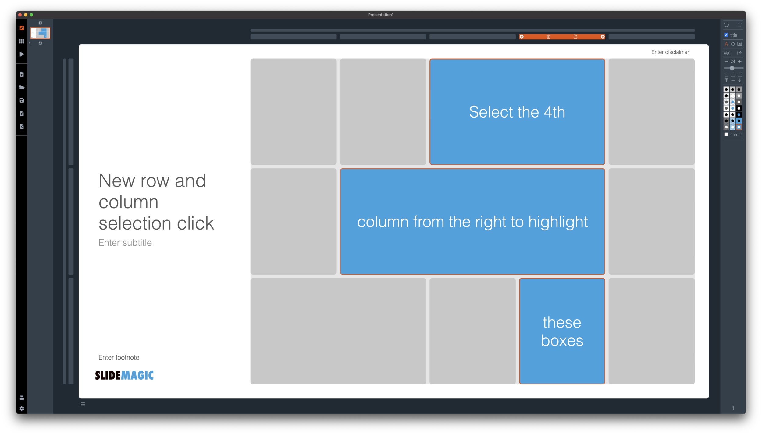
I have made more improvements to the SlideMagic user interface. Is is now easier to select multiple cells, especially in fine grids.

If you select a column marker at the top of the slide, all boxes in your slide that “touch|” the column will be become selected, and you can apply formatting to them in one go (for example, make them all blue).

Screen Shot 2021-01-18 at 17.36.19.png

The same applies for rows, click a row marker, and all relevant boxes in the row line up.

Screen Shot 2021-01-18 at 17.37.58.png

Finally, you can select whole areas of boxes by first clicking a top-left element, then clicking a bottom-right element, and SlideMagic will light up all the boxes that are in between. See the example below.

Screen Shot 2021-01-18 at 17.38.42.png
Screen Shot 2021-01-18 at 17.38.46.png

SlideMagic: a platform for magical presentations. Free student plan available. LEARN MORE
New 'no-title' layout

New 'no-title' layout

SlideMagic works with fixed positions for slide titles, subtitles, footnotes, and logos. Each slide looks organised, consistent, and the same.

Some slides call out for a slightly differently layout. Tracker pages for example. A simple text box that sites right in the middle of the screen. Up until now, SlideMagic would push these text boxes a bit down or to the right because of the required space for the slide title.

With a very simple check mark, I now created the option to remove titles from the slide on a slide-by-slide basis. It is a tiny adjustment to the user interface that can improve the look of layouts significantly. I am still putting a high hurdle when it comes to complicating SlideMagic. This is definitely not a complication!

While the user interface adjustment is easy, behind the scenes, there is a lot going on. Removing the the titles from a slide requires recropping of all the images on a slide. With SlideMagic’s new automatic cropping algorithm, this has now become possible. Imagine doing this for a slide with 40 client logos in a regular presentation design software, after which you come to the conclusion that the slide looked better with a title: re-cutting, re-cropping, re-distributing 40 images again. In SlideMagic, this is a button click.

You can check out the new features as of version 2.6.9

Screen Shot 2021-01-18 at 16.57.04.png
Screen Shot 2021-01-18 at 16.57.31.png
Screen Shot 2021-01-18 at 16.56.44.png
Screen Shot 2021-01-18 at 16.55.56.png

SlideMagic: a platform for magical presentations. Free student plan available. LEARN MORE
It is all about box counting

It is all about box counting

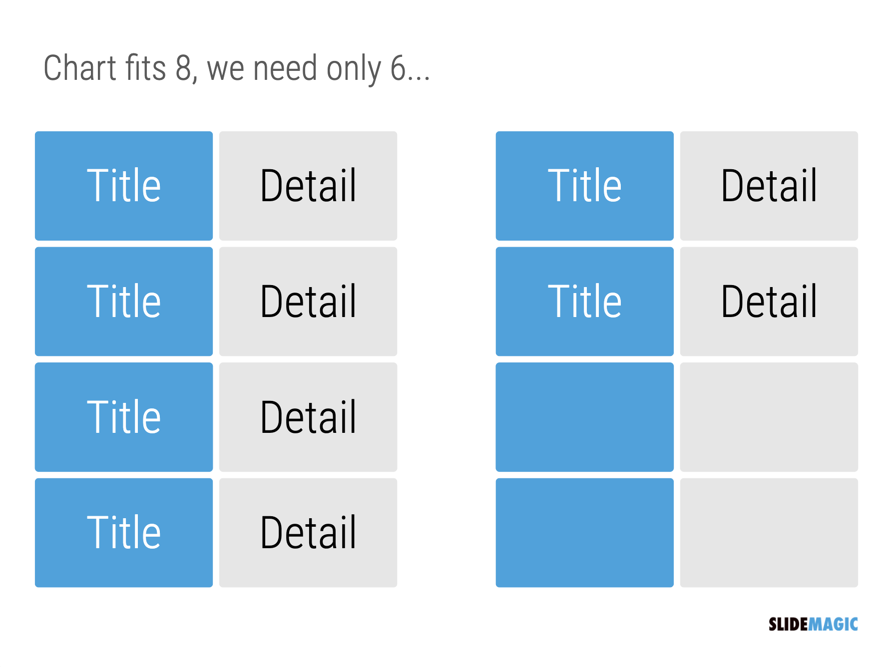
One of the biggest issues in business presentation design is adjusting frameworks to the amount of boxes you need. You had this great slide that fats 8 things, but thing number 5 and number 6 is no longer relevant, so now you need to rehash the whole slide layout…

Screen Shot 2021-01-15 at 10.05.00.png

I think this “bug” in the design process might be one of the biggest reasons for the popularity of bullet point lists: it is super easy to add and subtract things on your slide. And this is also the reason why pre-fab PowerPoint templates are so hard to use. The designer made that super pretty 8-box slide with sophisticated shapes, and 5 minutes before your meeting, you need to get rid of one without destroying the design of the slide…

In SlideMagic things are super easy. Option one: it is easy to adjust the grid layout to match your new box count. Or even better: a new box count might merit an entirely new slide layout. In the latter case, you will have to copy-paste your boxes, but at least SlideMagic takes care of the fiddly task fo lining things up.

Screen Shot 2021-01-15 at 10.05.11.png
Screen Shot 2021-01-15 at 10.05.21.png

Here is a pro tip: box counting is the first thing I do when staring a new slide. How many items, how do they spread across horizontal and vertical dimensions? Can we consolidate points? Should we break them up across multiple slides? Once you have your count, it is easy to find a matching design.

SlideMagic: a platform for magical presentations. Free student plan available. LEARN MORE
How to crop headshots in your presentation

How to crop headshots in your presentation

The ideal design for a slide that shows your team is a group picture, all taken together. Unfortunately, these are almost impossible to produce. Teams change, and people are hardly ever in the same room (especially now with the virus).

The next best thing is a collage of headshots. Professional graphics designers have a specific approach to line these up properly:

  • Make sure that the eye line of all the head shots is more or less the same (at 25-33% of the image height

  • Make sure that the sizes of the heads are more or less the same

In PowerPoint and Keynote, this is an absolute pain to do. Getting different images to have the exact same size is tricky. Cropping images to position eye ines is tricky to do, and might undo part of the work that you did to get them to be all the same size.

In SlideMagic, things are easier, because it works with fixed shapes and smart cropping.

Below I plopped in 3 portrait images from the built-in image search engine of SlideMagic. In 2 of the 3 cases, the “AI” smart cropping algorithm did already a reasonable job, in the last case, totally not. But first things first, all images have the exact same size, and are spaced out absolutely perfect.

Screen Shot 2021-01-10 at 15.12.31.png

Next, we are going to drag the central dot at eye level for each of our team members and drag the images inside their boxes so the eye lines line up.

Screen Shot 2021-01-10 at 15.12.51.png

Now we can zoom the headshots to the right size by dragging the zoom slider at the bottom of the slide. SlideMagic keeps the eye line at exactly the level you set it to when zooming.

Screen Shot 2021-01-10 at 15.13.04.png

SlideMagic remembers the layout and crop of your image, for example if you change the aspect ratio of your slide to 4:3, the image still looks OK

Screen Shot 2021-01-10 at 15.13.11.png

SlideMagic: a platform for magical presentations. Free student plan available. LEARN MORE
Seth Godin chart make-over: Venn vs. 2x2

Seth Godin chart make-over: Venn vs. 2x2

Seth Godin opened the 2021 blog with a post that argues not to put all your eggs in one basket when it comes to picking projects. (You could argue that my own bespoke presentation design projects fit in the “rut” category, and the SlideMagic software is a “lottery”, but on balance the risk of the overall portfolio is small with an option to win the lottery, even if it is modest).

To illustrate his point, he used a 2x2 matrix.

Screen-Shot-2020-12-31-at-9.34.48-PM (1).jpg

The 2x2 works, but when looking for these type of charts consider a Venn diagram as well. In many cases, the low-low option is not really realistic (in this case picking projects with a low probability of succeeding, and with a low potential upside).

Screen Shot 2021-01-05 at 9.57.08.png
Screen Shot 2021-01-05 at 9.57.21.png

I added 2 charts to the SlideMagic database to show the 2 options, in a different colour scheme this time. Download them from the web or search for “seth” inside the desktop app to access them.


SlideMagic: a platform for magical presentations. Free student plan available. LEARN MORE
Weave effect in slides

Weave effect in slides

See the slide below. A weave effect shows how vertical and horizontal things are interconnected (in this case stuff I did back at McKinsey). It is impossible to weave shapes in programs such as PowerPoint or Keynote, they cannot be on top in one spot, and at the bottom in another,.

Screen Shot 2021-01-05 at 6.50.59.png

One way to get around this is the visual trick I applied here. Stick to a flat grid of boxes and colour/connect them to fake the visual effect. Super easy to make, super easy to change (adding, removing rows and columns). Below is the basic grid structure I used for this chart:

Screen Shot 2021-01-05 at 7.02.09.png

In PowerPoint and Keynote it can still be fiddly to line up all the boxes, especially when you want to make changes to a grid. You might have to resort to tables with very fat white margins between cells,. In SlideMagic it is super easy and even fun to create these charts. (Pro tip: SlideMagic converts to PowerPoint and can do the hard work for you).

I have added a variant of the slide to the SlideMagic template database (find it here, or simply search for “weave” in the desktop app)

SlideMagic: a platform for magical presentations. Free student plan available. LEARN MORE
Focal point cropping!

Focal point cropping!

******* UPDATE: The new focal cropping is now out of beta and part of the regular SlideMagic release ********

Happy new year to you all, 2021 has already an important feature update.

I am testing an exciting new feature for SlideMagic: focal point cropping. (I first spoke about this back in August.) For each image in SlideMagic, you can set a focal point, a dot on the most important part of the photo. This can be a face, a feature of your product, a quote on a screen shot for example. If you subsequently change the size or shape or zoom level of the image, SlideMagic will re-crop the image so that your focal point appears in the right spot.

I have seen many examples of focal crops in other applications, but no one did get it completely right. That small house on the mountain you focused still disappears on certain screen sizes, or pictures get completely stretched and distorted when resizing screens or changing the composition of your slide. In SlideMagic, everything stays in place.

A particular design decision in web technology standards made it particularly hard to do (without having to divide by zero). Over the winter break, I rewrote the entire image rendering engine of SlideMagic, which was a bit like replacing the foundations of a house while people continue to live in it.

A lot is going on here, in terms of underlying math and how the user interface works. I won’t spell it out in detail here, the app should respond naturally without you having to think about it. The basics are in place now, but I still see a lot of improvement opportunities to the image cropping algorithm including automatic object detection.

I have released the feature only as a beta version at the moment, it will not update for non-beta users. Before the official release I want to make sure everything works for new presentations, maintain backward compatibility for older presentations, that there are no hiccups when downloading templates from the SlideMagic template database. If you want, you can install the latest beta version via Github here, the next time you start SlideMagic again, the latest current version will install back.

Below some screen shots where you see the feature in action:

Screen Shot 2020-12-30 at 12.51.23.png
Screen Shot 2020-12-30 at 12.51.29.png
Screen Shot 2020-12-30 at 12.51.35.png
Screen Shot 2020-12-30 at 12.51.41.png
Screen Shot 2020-12-30 at 12.51.46.png
Screen Shot 2020-12-30 at 12.51.58.png

This new cropping engine also enables me to take out this “hack” to deal with different image aspect ratios and images


SlideMagic: a platform for magical presentations. Free student plan available. LEARN MORE
A box for each point

A box for each point

It is really easy and quick to add bullet points to a text slide: hit return and start typing away, boom, you found a place for that other thing you want to say. Check.

SlideMagic does not support automatic text bullets, and you need to put each item in a separate box. Bummer.

This is by design. (Let me explain in a number of bullet points).

  • Boxes look a lot better on a slide than a list of sentences. The equal size and background colour compensate for different length of text content. Everything is always lined up and spaced out

  • More importantly: the box hurdle is a little ‘brake’ in your writing process. Do I need 3 or 4 boxes? Should the points be one, or multiple slides? Are the points equal in weight, or is one a sub point of the other?

  • The list is hardly ever the post visual layout for a slide, maybe boxes should be lined up next to each other, centred around some central box, go up, go down? When writing text lines, you are not even considering these layouts.

When designing slides, I spend most of my time thinking about the layout, the amount of rows and columns in the page and how everything fits. Once that is settled, the rest follows. I want you to do the same.

Photo by 🇨🇭 Claudio Schwarz | @purzlbaum on Unsplash

SlideMagic: a platform for magical presentations. Free student plan available. LEARN MORE
Use the whole page

Use the whole page

White space is a good thing in design. It makes text breathe, the whole page looks calmer somehow.

This applies to business presentations as well. Cut text that is not required, make images as big as possible, and your slide starts to look like a well-designed ad on a billboard.

However, in some cases, a business presentation slide is not meant to be a fashion ad. Think of the sales target data for the next quarter, or the new IT system architecture that you need to get approved. What I often see in SlideMagic is a “left over battlefield” with the final product of a complex table or system diagram. After many iterations it finally looks like it should look and everyone agrees to it.

In the process, the designer forgot to clean up, and remove rows and columns that are no longer needed. In SlideMagic, you can get rid of them with a few clicks and your entire diagram or table will scale up instantly, in the right proportions.

Screen Shot 2020-11-18 at 10.08.53.png
Screen Shot 2020-11-18 at 10.09.03.png
Screen Shot 2020-11-18 at 10.28.27.png
Screen Shot 2020-11-18 at 10.28.41.png
Screen Shot 2020-11-18 at 10.28.46.png
Screen Shot 2020-11-18 at 10.09.10.png

Yes, you gave up some white space around the edges, but overall the chart is more practical. To make things calmer, consider cleaning up data and text in the cells of your diagram instead.

SlideMagic: a platform for magical presentations. Free student plan available. LEARN MORE
Example: COVID chain of infection

Example: COVID chain of infection

A slide came flying by on Twitter:

I might a quick remake of this slide in SlideMagic, in line with the SlideMagic philosophy: quick, clear, nothing too fancy (= time consuming) and added it to the SlideMagic template database since it could be a useful basis for any slide that needs to show some sort of chain of events.

Screen Shot 2020-11-12 at 8.48.34.png
Screen Shot 2020-11-12 at 9.03.42.png

What did I change?

  • Removed the low-contrast red on black colours

  • Took out the simplistic icons and replaced it with no-nonsense clear numbers

  • Rounded up numbers so to avoid cut up people (audience is not hard core scientists)

  • Put in a proper bar chart to show the magnitude of 416 vs 3, instead of an icon count

  • Flipped the design left to right to make the flow in time more clear

This slide demonstrates how easy it is to line up bars of a data chart, arrows, and text cells of a table in the overall slide layout (an absolute pain on other presentation design software).

SlideMagic: a platform for magical presentations. Free student plan available. LEARN MORE
Bullet point alert

Bullet point alert

Bullet point slides are a no-go, they are boring, hard to understand, and look ugly and SlideMagic tries to discourage you from making them.

Still, SlideMagic is not dogmatic and recognises that there will now and then be an occasion where you need to put 3 things on a slide (agenda items, next year’s strategic priorities, the fact that your product is faster, cheaper, and lighter). In the SlideMagic desktop app search for “list” and you are presented with lots and lots of list-style templates (yes, bullet point slide templates).

Screen Shot 2020-09-29 at 7.10.38.png

But in these templates, each list entry is a new shape, a new row, to make the slide visually more appealing. And SlideMagic’s grid engine makes it super easy to add and delete rows. If the message of your slide is “we need to do 3 things”, one of these templates will do the job perfectly to communicate that.

Often though, bullet points creep in when you are not really designing a list-type slide. “Ah, where do I put these points as well?” The points are not important enough (are they?) to merit a new slide, or drastic surgery to the layout of the slide. You end up adding a few quick dashes to a text box.

Screen Shot 2020-09-29 at 7.06.50.png

The moment you have to resort to this emergency bullet point solution, it should trigger an alarm bell. If it looks like I should change the fundamental slide layout, or even create a new slide, maybe you should…

SlideMagic: a platform for magical presentations. Free student plan available. LEARN MORE
Architecture diagrams

Architecture diagrams

I am starting to experiment with different chart types in SlideMagic. One experiment: IT architectures that consist of users, servers, databases, clouds and lots of lines.

The built-in icon search, combined with the new line drawing feature does a pretty good job actually. And while SlideMagic is not a dedicated tool to design network architectures, it might actually force you to make better architecture diagrams in presentations. Let me explain.

Detailed network diagrams have the same problem as detailed spreadsheets when it comes to presentations. They are project work tools to run analysis and plan work, they are not tools for communication. When I need to make a data chart, I always disconnect from the spreadsheet and resist the temptation to copy-paste. Instead, I pick the 10 numbers that matter, round them up to the relevant precision, and plop them in a very simple bar/column chart that tells the story.

The same is true for IT architectures. If you want to present an architecture overview on a slide, that slide needs to be understood almost immediately when putting it up (like all slides in your deck). If tangled connections, boxes, servers make that hard, then the only thing your slide communicates is that your architecture is complex, not much more.

Again, disconnect from the working papers. Think about your message: ‘my architecture has 3 layers’, ‘my system connects the systems of 15 suppliers’, ‘my system is entirely on premise’, whatever that message is, make a simple chart that supports it.

Remember, presentation slides are usually not project briefings for network installers.

Screen Shot 2020-09-24 at 17.33.35.png

SlideMagic: a platform for magical presentations. Free student plan available. LEARN MORE