Manually adjusting fonts

Sometimes it is necessary to adjust the characters in a sentence manually. Look at this image (with a deep quote) and see how letters line up vertically. Standard horizontal and vertical spacing in PowerPoint will not get you this effect. Put in the characters as individual text boxes and align them to get it just right...


Image via FFFFound

SlideMagic: a platform for magical presentations. Free student plan available. LEARN MORE

Hand-drawn figures in PowerPoint

Another excellent clip art manipulation on Tom's Rapid e-learning blog: how to create characters with a hand-drawn feel:
  1. Select a cartoon-style clipart
  2. Ungroup and strip out background elements
  3. Copy and paste as PNG
  4. Apply PowerPoint 2010's new pencil sketch filter (or use Photoshop's)
  5. Increase brightness, soften contrast a bit.


SlideMagic: a platform for magical presentations. Free student plan available. LEARN MORE

Clutter-free web site screen dumps

Screen dumps are often used in VC pitch presentations; either to showcase the company itself, or to give examples of competitors in the market. These screen shots are often filled with excess visual details:
  • The Windows title and scroll bars (sometimes with personal information such as instant messaging windows or the names of other web sites that are open on the screen)
  • The menu navigation structure, login windows, banner ads that surround the core web site.
Cut this clutter to create a much calmer slide that allows you to focus on what feature/aspect you would like to highlight.


SlideMagic: a platform for magical presentations. Free student plan available. LEARN MORE

Animated GIFs

Usually, animated GIFs drive me crazy. The more subtle ones like this one could actually work in a presentation. If you copy and paste an animated GIF into your slide it will start to play if you switch to presentation mode. Via this isn't happiness.

SlideMagic: a platform for magical presentations. Free student plan available. LEARN MORE

The PowerPoint blur filter

PowerPoint is slowly adding features that have been standard in Photoshop for years. One useful one is the image blur filter to increase depth of field of your photos (earlier post). It adds some extra realism to this composite image trick (discussed earlier here and here)
  1. Find an image for the foreground and use the PowerPoint format/remove-background function to get rid of the white background
  2. Find a background (nice image of Cafe de Flore by DarkB4Dwan)
  3. Combine the 2 images
  4. Blur the background with (click the image, format, artistic effects, the right one in the 2nd row)
One other application is to repeat a blurred version of a busy chart for additional comments (see post here)


SlideMagic: a platform for magical presentations. Free student plan available. LEARN MORE

Using Adobe Illustator shapes in PowerPoint

PowerPoint 2010 has now incorporated some of the shape manipulation techniques that until now were the domain of Adobe Illustrator: union, combine, subtract, and intersect (read my earlier PowerPoint 2010 review here).

Until now, I never got into understanding Illustrator. Until now, because I (ironically) start to experiment with integrating more hand-drawn shapes into my presentations (I am even thinking of picking up my old highschool habit of drawing cartoons of people). Fonts are no issue (earlier post). The line/curve manipulations capabilities of Illustrator however are still far better than PowerPoint.

Here is how to move an Illustrator shape into PowerPoint, not just as an image, but as an editable vector object.
  1. In Illustrator export your shape in an EMF format
  2. In PowerPoint, select "insert picture" (a bit counter intuitive)
  3. Right-click the object and un-group it. Say "yes" to the question whether you want to convert it
Converting is this simple. Unfortunately, understanding Illustrator is not...

SlideMagic: a platform for magical presentations. Free student plan available. LEARN MORE

Negative thoughts are creativity killers

I stumbled on this image this morning: such a true quote. Whenever I allow myself to get upset in a Tel Aviv traffic jam, or on the phone to the useless support desk of my ISP, I simply cannot get myself to design a good presentation. The rest of the day is best spent doing the monthly accounting.


Via Diego Zambrano.

SlideMagic: a platform for magical presentations. Free student plan available. LEARN MORE

PowerPoint fails as an internal management reporting tool

A situation probably familiar to many of you:

  • Corporate conglomerate needs update from country business units
  • Analyst creates PPT template with just headings: "key successes", "key issues", etc.
  • Template gets sent out, "fill in by next Tuesday (please), our review meeting is Friday"
  • Towards Thursday evening: pages and pages of dense slideuments start popping up in the inbox, (of course) not following the template, but Frankensteined (earlier post) from other presentations
  • Analysts cuts and pastes an overview document together (Friday 3AM) and sends it up the hierarchy as a status update.
If your goals is to provide a 20 minute update on the status in the business units the analyst might as well write the slideument herself. The writing of the slides will not take the time, it's getting the information, and internalizing it. An alternative scenario:
  • Analysts schedules 15 minute interviews with counter parts in the business units
  • In a phone call, the real story comes out.
  • Analysts write the summary slideument and sends it out for comments to the BUs
  • Analyst incorporates the changes and is now ready to answer any question senior management might have on the situation in the business units
This approach works for high level qualitative updates. For detailed financial information, a proper management reporting system needs to be put in place. It is easy to analyse and compare financial data mechanically across business units, hardly any phone calls are needed. To take the finger on what else is going on in the business, the good old human interaction cannot be eliminated.

SlideMagic: a platform for magical presentations. Free student plan available. LEARN MORE

Where good ideas come from

I am joining in the viral marketing campaign of the new book Where good ideas come from by Steven Johnson (affiliate link)

Video of his TED talk published today:


Shorter video highlighting the idea in his book with a good use of cartoon-style drawing:

SlideMagic: a platform for magical presentations. Free student plan available. LEARN MORE

DON'T: Tell 'em what you will tell, tell 'em, tell 'em what you just told 'em

I often hear this advice to make sure something gets stuck in the audience brain: tell it 3 times. I disagree. This is the approach of the (poor) teacher asking a class to recite the alphabet over and over again. Here are some better approaches:
  • Tell a story that stitches the elements of your message together
  • Create a memorable visual to highlight the concept
  • Give them something they will never forget (see Duarte's post)
Everything is better than boring your audience with saying the same thing three times.

SlideMagic: a platform for magical presentations. Free student plan available. LEARN MORE

The presentation designer's responsibility

Today's post on Seth Godin's blog made me think (probably his objective). Bluntly speaking, he argues that the marketer of cigarettes or the lawyer defending a criminal should take responsibility for her actions, or refuse to take on the challenge.

My profession is to help other people tell their stories in a more convincing way:
  • to sell a product,
  • get funding for a company, 
  • close the IPO on the stock market,
  • increase the company's share price,
  • seal an important strategic partnership,
  • secure a distribution franche,
  • etc.
In most cases, I am 100% behind the story that I am writing. In very few cases, I stumble on something that is a "hard sell". Fortunately, I have never encountered an occasion that would trigger the debate Seth is talking about. He just convinced me that it should stay that way.

SlideMagic: a platform for magical presentations. Free student plan available. LEARN MORE

Clearing your head, once a year

Falling in love with an Israeli woman 15 years ago has put me in this slightly unusual situation today: experiencing Yom Kippur as a non-Jew in Tel Aviv. (Read more about Yom Kippur here.) While I do not have the religious tradition of this "holiday" and even think it can be dangerous for people not to drink for 25 hours in a 30C+ climate, there is something special about this day.
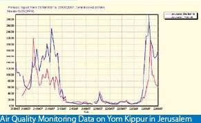
Everything comes to a complete stand still. No cars, no shopping, no noise, no polluting smells (see graph below, air pollution drops by a factor 100), no nothing. I live right on the sea shore just north of Tel Aviv, very close to the busiest highway crossing of Israel. It is magical to see human society grind to a halt, and you can almost feel the energy of a few million people near by reflecting on what contributions they have made over the past year.  The sun setting and the only sounds remaining are those of the sea, the wind, and the birds. This is not your average car-free day, it is really about letting nature taking back over.


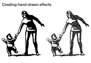
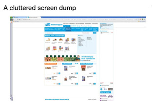
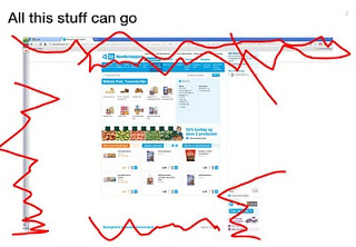
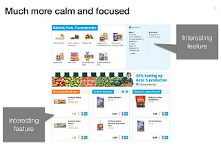
As designers, we need more of these moments that enable us to get rid of the clutter in our minds.

SlideMagic: a platform for magical presentations. Free student plan available. LEARN MORE
Combining stacked and clustered columns

Combining stacked and clustered columns

In PowerPoint, there is no standard option to create a combined stacked and clustered column chart. Here is a work around, taking the stacked column chart as the basis.

  1. Set the gap width to zero (in the format data series menu) to create the white breaks in between the columns
  2. Adjust the data points manually. The first stacked column goes in regularly. The second stacked column (that should have a different color scheme) gets added on top of the first one. But for data points of the second column, you zero out the values of the first one. Sounds a bit complicated, but the visual example below should make it clear.

SlideMagic: a platform for magical presentations. Free student plan available. LEARN MORE

Chart concept - mixing console

Mixing consoles used in recording studios are a good visual metaphor for situations where you carefully need to balance, fine tune, juggle a set of drivers. Image via iStockPhoto.


SlideMagic: a platform for magical presentations. Free student plan available. LEARN MORE

The art of writing a good slideument

The term "slideument" was coined by Garr Reynolds (his post from 2006 here): a PowerPoint file that looks more like a densely written text document than a minimalist, visually powerful sequence of slides for a presentation.

Documents and slides serve a different purpose and should be designed differently. But here is what I have been observing: the document is on its way out, and the slideument will have a bright future. Not as a presentation tool, but meant for on-screen reading, mostly for an internal audience that is very close to a subject matter. Background materials for a strategy discussion for an important board meeting would be an example. Nobody has time to plough through a dense text document anymore.

Some suggestions for creating good slideuments:

  • Create good data charts, using the exact same rules as you would for an on-screen presentation. Focus on the trend you want to show, ignore everything else. Round numbers up.
  • Use overview maps, strategic landscapes, with trends/competitors plotted against 2 axes, or lists of options with qualitative evaluation bubbles or traffic lights. One page that has the entire logic in it. Far too dense to present to a big audience, but really useful to discuss options. See the map to get a vague idea about the logic, digest the subsequent information in the deck, come back to the map to understand the full nuances. 
  • Bullet points are an essential part of a slideument, but make them useful. Make sure they are short, and say something tangible/specific. Don't just rattle down a list of 15 points on a page, but group the bullet points into meaningful categories. Put bullet points inside boxes, and use arrows to highlight the relationships between groups of bullet points.
  • Write a clear page upfront with what you want from the group you are submitting the document to.
Most of the times, you will not have time to convert the slideument into a proper presentation, and you probably do not have to. To discuss it in a group, I would select a few key slideument slides put them up the projector, but instead of discussing the content in detail, highlight the important points. You could do this by creating circles, or hand-drawn-style lines. Another approach is to project the slides on a whiteboard and circle/mark things with a pen as you go along.

SlideMagic: a platform for magical presentations. Free student plan available. LEARN MORE

Leave some room for imagination

Great novels, movies, and painting leave room for the audience to fill in the blank spots. This photo found outside my own is the exact opposite. Ugly graphics worked out in the greatest detail, even providing the dog with a pair of mean red eyes that would fit the hound of the baskervilles. It is possible to say/show less and still convey the message...


Earlier post with a similar observation.

SlideMagic: a platform for magical presentations. Free student plan available. LEARN MORE

A slightly morbid post: gravestone design

The past few weeks have been rough for me as I am dealing with the loss of my brother in law, Ethan Naschitz. After tweets like this one, I got some heart warming comments/questions to see whether I was OK. I can tell you I am (given the circumstances), and the Tweet is actually less morbid than it sounds. Part of daily life in Israel.

Building on this, I had to go through the interesting experience of actually designing a gravestone for Ethan. It is surprising to see that a whole industry is built around the loss of people, including graphics designers that specialize in this type of design. Some guide lines that I hope you will never have to use:

  • Less is more. A stone filled with white space looks much more beautiful. Cut as many details as you can, focusing all the attention to the name and maybe just years of birth and death. It is always tempting to put quotes, descriptions, details, but would your relative have liked them? Would you still like them in 10 years? Would visitors appreciate them in 2,000 years? Cut your font size. If you really would like to put in details, consider adding a "foot note" in small font at the bottom. From a distance the text will blur, when standing close, it can be read.
  • Get rid of symmetry. 99% of stones are centered, why? Why not left centered, bottom aligned? 
  • Very important: pick a good font, the standard fonts available are usually poor. "Can you do Helvetica Neue?" gave a blank stare.
  • Extra features available at a premium (filling letters with black, covering things in plastic) do not necessarily  improve the look.

SlideMagic: a platform for magical presentations. Free student plan available. LEARN MORE

"Would you buy?"-type data from market research

Both of these charts contain the exact same data. The second is a lot easier to read, the spectrum of customer choices is neatly laid out, and the colors are picked in sequential order.


SlideMagic: a platform for magical presentations. Free student plan available. LEARN MORE

Watch out with charged images

Our collective memory has some very powerful images. Photo editing software enables us to manipulate them and use them to communicate a message. "Learn to anticipate" says the ad below with a set of shortened WTC towers and planes happily flying over it. Maybe the ad was meant to be funny. Maybe its intention was to shock people and trigger a discussion of a controversial subject (What Benetton tried to do in the 1990s). A "fail" on both accounts. Be careful with charged visual concepts.


Via Ads of the World.

SlideMagic: a platform for magical presentations. Free student plan available. LEARN MORE