Legal presentation arguments

Legal presentation arguments

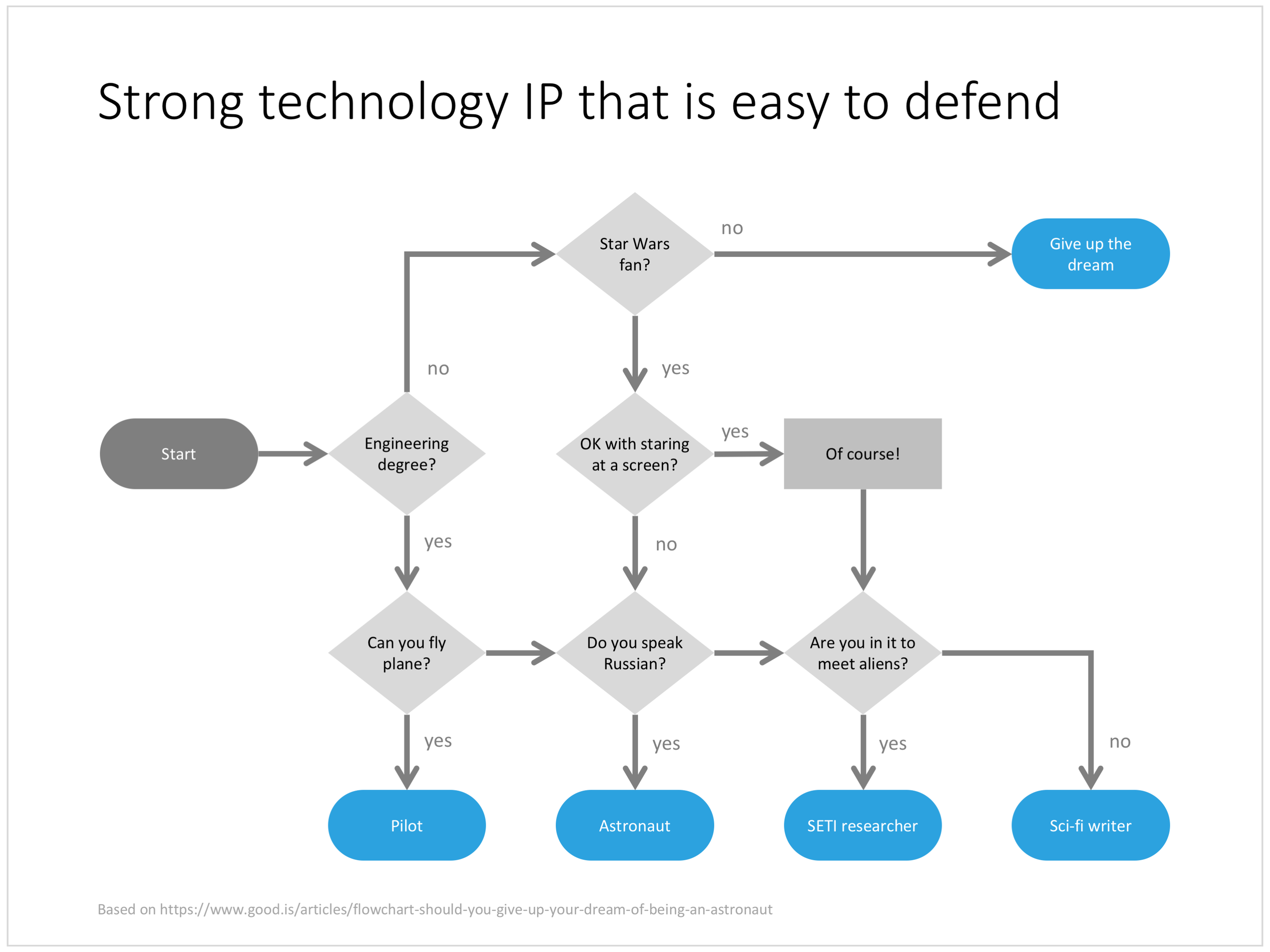
Sometimes I work on presentations that border on legal or regulatory disputes. Two parties need to convince some independent party or regulator that they are right, often with the help of independent experts.

The briefing presentation at the start of a project usually is a left over of the original project presentation, it makes the case for the project in general but buries the actual smaller issue that is being discussed now, for example environmental impact.

What follows is a verbal discussion with the old slides as a background: then we did this, then we hired her, then we installed this technology, then they disputed the data, then we did a test (but changed it a bit), they came up with these counter arguments, that do not really apply to this situation. To the outsider who has not been part of the process it is completely impossible to understand the arguments. 

In a situation like this:

  • Start from scratch and build a presentation in which 95% of the time is spent on the issue at hand
  • Make sure that your flow of logic is clear
  • Separate the arguments that are undisputed, from more contentious issues
  • If the other party has a major counter argument, there is no point in hiding it, you might as well put it in your presentation prominently, and with your solid argument why it is not a valid point
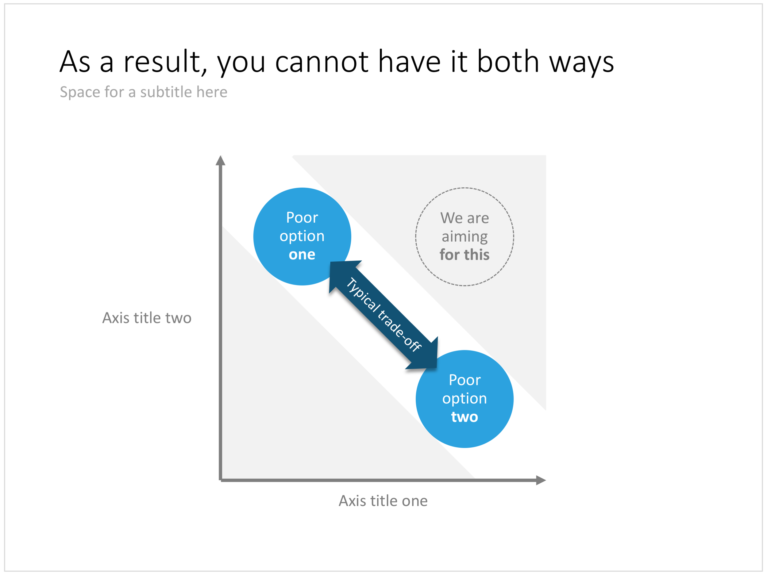
  • Pick your battles, if the other side has a point that is pretty much true and hard to disprove, don't spend energy trying to make an impossible case against it. You will loose credibility when making other points that really count

Cover image by Chris Brignola on Unsplash

SlideMagic: a platform for magical presentations. Free student plan available. LEARN MORE
Risk matrix in PowerPoint

Risk matrix in PowerPoint

I am continuing to tick off the standard presentation frameworks in the store, yesterday I added a PowerPoint template for a risk matrix. The matrix has 2 axes: one for the probability that a disaster happens, the other one how severe it would be if it were to happen.

The matrix is designed in true SlideMagic style: not very fancy, but highly symmetrical, usable, and adaptable to your everyday presentations. You can download the slide here, subscribers can do so free of charge. Feel free to adjust the axis titles, labels, or dim the bright traffic light style colours to your taste and needs.


Cover image by JC Dela Cuesta on Unsplash

SlideMagic: a platform for magical presentations. Free student plan available. LEARN MORE
Mysterious shipping charges

Mysterious shipping charges

It is very hard to tell eCommerce platforms, Google shopping, tax authority and other sites that digital downloads do not require shipping of physical stuff. Deep down in the bowels of my system $20 shipping charges were still present for some countries. I think I cleaned everything up now. Let me know if you see any other irregularities. If it looks wrong to you, it probably is wrong.


Cover image by chuttersnap on Unsplash

SlideMagic: a platform for magical presentations. Free student plan available. LEARN MORE
A prism that shows what's inside

A prism that shows what's inside

I have used the prism visual metaphor a few times in my client's presentations to show how rich, intricate, subtle components are present in a service or product that might not be apparent from the outside. Below is an attempt at a minimalist pyramid in PowerPoint (roughly modelled based on the cover of that Pink Floyd album).

I simplified the laws of physics here and there, the tricky bit was to get the blue shape inside the triangle right. I added the slide to the template store yesterday, you can find it ready for download here, and subscribers can do so free of charge.


Cover image via WikiPedia

SlideMagic: a platform for magical presentations. Free student plan available. LEARN MORE
Hmm, what do you think?

Hmm, what do you think?

The chart below is an attempt to create a comparison matrix that can deal with 4 dimensions. Two dimensions get consolidated into another one, which are put on another matrix. The results is mathematically correct, but does it work as a slide? Maybe it is pushing things too far.

You can download the four dimensional comparison matrix by clicking the image, subscribers can do so free of charge.

Cover image by Amy Reed on Unsplash

SlideMagic: a platform for magical presentations. Free student plan available. LEARN MORE
Pitching your startup

Pitching your startup

Here is a nice post on the Stripe Atlas site about pitching your startup. It is written from the perspective of a very early-stage startup pitching for a seat in an incubator such as Y Combinator. (If the entrepreneur is not yet that experienced, an achievement like having climbed Mount Everest adds a datapoint about persistence).

Here are some quotes that struck me from the post:

  • "Explain assumptions in your pitch like you would to a smart friend in a different field."
  • "The investor is not your user, so pitching users and pitching investors are completely different."
  • "This pitch says nothing, in 18 words: COMPANY will help e-commerce stores sell more products using cutting-edge AI-enabled algorithms and machine learning."
  • "Clarity is particularly important when you’re tackling recently popular ideas, like blockchains or machine learning"
  • 'Your reviewer will read literally thousands of data points today–the average pitch includes more than 10. No one can remember that many arbitrary numbers, so reviewers compress them to “zero”, “non-zero”, and “impressive.”'
  • 'Nobody has ever written in their comments on a company “Wow, their sign-in screen blew me away. I want to invest in that sign-in screen.” '
  • "Risk-taking is encouraged in startups; stupid risks are not. Walking into the office of a person in a position of authority without a meeting scheduled is a risk, but it suggests ambition and sales ability. Describing crimes you’ve committed generally suggests poor judgment."

The people evaluation bit of this Y Combinator screening process seems very similar to the way we were on the lookout for new talent in McKinsey. Especially for young hires with little work experience, you had to comb for indicators of possible future success, fit. In every interview you really wanted the candidate to succeed. And the dialogue with the candidate, the way she responded and thought was very important.


Cover image by Samule Sun on Unsplash

SlideMagic: a platform for magical presentations. Free student plan available. LEARN MORE
"Familiar" investment ideas

"Familiar" investment ideas

Investors keep on insisting on simple and short pitches, cut pages, cut time, simplify. I don't think that there is a problem with the investor's IQ, there is not reason to dumb down your story.

What might be happening is that your business actually is very familiar to the investor. She has heard similar stories a thousand times before. A gig economy idea in a new market segment, a me-too business in a different country, a new Internet security technology, semi conductors that are a factor 10 faster, a new private equity fund that promises to be really hands on with portfolio companies.

While your business is new, the investor has learned 90% of the context in previous presentations. Talking 10 minutes about how successful Uber is and how this idea can be applied to other sectors is a waste of time.

Simplify/shorten your deck means: I understand already a lot, let's go to the interesting bit.


Cover image by Dan Gold on Unsplash

SlideMagic: a platform for magical presentations. Free student plan available. LEARN MORE
Balance sheet in PowerPoint

Balance sheet in PowerPoint

Today, I added 2 slides that show a balance sheet to the template store.

The first is a traditional table format. But this PowerPoint version is a bit different from the a typical balance sheet in an annual report to improve the readability. Usually, the PowerPoint presentation with the financials is not the legally binding one, so we can omit some details that clutter up the page. This table has fewer lines (consolidating multiple entries into one), and the amounts are rounded up.

The second chart is a balance sheet represented as a column chart. Even more details has been taken out and the result is a nice and unusual way to visualise the key balance sheet ratios. Instantly you can see the proportion between current and non-current assets (and liabilities), and you can see the leverage of the company (ratio between debt and equity). This chart is probably easier to follow than the Profit and Loss statement as a column chart which I discussed earlier.

Click on the image to download the slides from the template store. Subscribers can do so at no extra cost.

Cover image by NeONBRAND on Unsplash

SlideMagic: a platform for magical presentations. Free student plan available. LEARN MORE
A Pareto chart

A Pareto chart

Recently, someone searched for a Pareto chart on my site. I must admit, I had to consult WikiPedia about this type of slide. A Pareto chart shows 2 data series, each with their own vertical axis; the first show the absolute frequency count of something, the second one the cumulative occurrence of the data series, adding up to hundred for the last entry. I have added the Pareto chart to the store. 

SlideMagic: a platform for magical presentations. Free student plan available. LEARN MORE
Almost there

Almost there

I love to use this golf-related concept to visualise a situation where something is almost done, it just needs a little push.

Visually, the image is highly recognisable. Similar to resolution in music (the listener is just craving the moment when the unstable note resolves into a stable / root one), here the eye can already mentally see the ball disappearing in the hole. There is tension, anticipation of movement in the chart without any video or animation effects.

The second advantage of this composition is that golf courts by design provide an abundant amount of white space (the grass) on which to put your text.

In my slide, I reconstructed the golf ball using a PowerPoint shape, a circle with a touch of gradient and a shadow constructed from an oval shape. As a result, you can control the size, position, and colour of the ball precisely. Feel free to borrow the design or download the ready slide here. Subscribers can do this free of charge. 

Cover image by Andrew Rice on Unsplash

SlideMagic: a platform for magical presentations. Free student plan available. LEARN MORE
First attempt at a generic startup pitch flow

First attempt at a generic startup pitch flow

Below is an example of how you could stitch (I don't want to call it "Frankenstein") a startup pitch deck together using the slides that are available in the template store. It is tricky to design a generic startup up, the upfront bit of these decks is highly specific to the company and the marketing it is operating in. Towards the back, things get more generic (team, financials, pipeline, roadmap, etc.).

I will give this template a bit more thought, and I will also turn my attention to other standard presentations such as quarterly results presentations, kick off documents, Board meetings, etc.

The deck above can be pieced together from individual slides in the template store, or downloaded in one go here (4:3 PowerPoint only for the bundle). Have a close look before you do to make sure this is the flow that fits your company. Subscribers can download at no extra cost and experiment freely.

Cover image by Jomjakkapat Parrueng on Unsplash

SlideMagic: a platform for magical presentations. Free student plan available. LEARN MORE
Improved search

Improved search

Slowly, slowly, I am moving closer to the goal of creating a searchable slide bank bank that is actually useful. Here are the various steps that I have gone through:

  • Designing a slide template that looks good/professional AND blends in easily with existing corporate PowerPoint templates
  • Creating a "boxy" design language that is easy to manipulate and edit, even for non-designers
  • Cutting down the universe of slides to come to a collection of basic slides that can cover almost every possible common business concept that is out there
  • Anticipate the majority of possible search queries to find layouts for every possible angle
  • And now: find a smart grouping slides that creates a really smart way of suggesting related/similar slides

Below is an example of a product page in the store now:

Now that I have automated subscriptions, plus sorted out the search algorithms it is time to clear the last automation hurdle: VAT management globally for both consumer and enterprise customers (the EU has created a nightmare for small digital content stores as it is going after tech giants such as Apple). After that, all attention will be focussed on adding more slide content.

Cover image by Anthony Martino on Unsplash

SlideMagic: a platform for magical presentations. Free student plan available. LEARN MORE
Between a rock and a hard place

Between a rock and a hard place

This variation on a 2x2 matrix slide can be a good way to visualise being stuck in a choice between two poor alternatives. Two balls move in a corridor and are trapped so they cannot reach that ultimate, best of both world position which sits at the top right of the chart.

In a follow-up chart you could use the exact same design as a basis, but have the corridor break open as you introduce your solution. Other layouts to show a best-of-both worlds situation are Venn diagrams or 2x2 matrices. You can download this trade off chart here, subscribers can do so free of charge.

Cover image by Martin Reisch on Unsplash

SlideMagic: a platform for magical presentations. Free student plan available. LEARN MORE
Good slideocuments versus bad bullet point slides

Good slideocuments versus bad bullet point slides

PowerPoint (and Keynote) can be very useful alternatives to word processors:

  • It is easy to set up a document quickly, using empty pages with headers to organise your ideas
  • It is easy to move things around
  • It is easy to combine text, graphs, images, and data
  • It is easy to collaborate with others in this well-known user interface

As a result, many of my clients use "slideocuments", presentations that are meant for reading, discussing, and decision making, rather than being the backdrop of a stand-up presentation in front of an audience.

A good slideocument slide with dense text is different from a poorly designed bullet point slide (with dense text). It follows the layout principles of print design: white space, text in readable columns. Poor bullet point slides usually have a font size that is too small for a live presentation and too big for reading. Text runs from left to right across the entire screen, which makes it hard to read, especially in wide screen format. The structure of bullet points is not clear. The text of the bullet points is too long to be a headline, and too short to be a clear paragraph.

I added a few slideocuments to the SlideMagic store recently. Feel inspired to copy the design, or click on the images to purchase a ready slide. Of course, subscribers can add the slides to their collection at no cost.

Cover image by Laura Kapfer on Unsplash

SlideMagic: a platform for magical presentations. Free student plan available. LEARN MORE
Should you use "one more thing" in your presentation?

Should you use "one more thing" in your presentation?

Here is the cross post of an answer I gave on Quora:

No, don’t use Steve Job's famous "one more thing" at the very end of your presentation

  • When you are starting out with pitching your venture and you do not have the track record of Steve Jobs (yet), it is not smart to leave your biggest point to the last minute
  • It is very hard to assess whether using humor in a presentations will work given the meeting dynamics. Hard-wiring a “joke” in the sequence of your slides removes the flexibility of playing it safe and pulling the joke when the mood in the room just does not feel right
  • Around most of Apple’s releases there was some sort of anticipation of something big and new that was coming. Often, details of product were leaked in the press. The product had actually already been pitched before the presentation started. The audience was just hungry for the details. In a pitch or interview this is probably never the case.

Cover image by Ben Miller on Flickr

SlideMagic: a platform for magical presentations. Free student plan available. LEARN MORE
"There are people who get it, and people who don't"

"There are people who get it, and people who don't"

The other day, one of my clients simply wanted to give up on explaining his concept to the typical 50% of people who "simply did not get it". 

In life there are many situations where you "give up" on certain people. Students who fail the entrance exam of a university, job applicants that did not make the cut, athletes who miss the qualifying threshold for the Olympics, contestants who did not make it to the next round of American Idol.

When presenting your company, you need to put the blame not on the audience, but on your presentation. Your targeted audience should understand your message. And that audience can differ: a presentation to a general audience, journalists, scientific experts can build on different levels of pre-existing knowledge and background.

Often, as a presenter you suffer from the curse of knowledge, you are so deep into your own story that you cannot possibly imagine how someone who is new to the subject cannot get it. Another reason for the disconnect is different types of reasoning/thinking of people. When people frown in disbelief, it might not be because that they did not understand what you are trying to say, they might have a valid different approach to evaluating your pitch that you have not yet covered in your presentation.

When you leave the room, your chosen audience of high school students or elite academics should understand your message. Whether they agree with it, that is a second challenge, but they understood where you are coming from.


Cover image by Khara Woods on Unsplash

SlideMagic: a platform for magical presentations. Free student plan available. LEARN MORE
Subscriptions are now done properly

Subscriptions are now done properly

That was an interesting effort. The subscription platform for SlideMagic has now been put in place. Given that many payment platforms are not available in Israel (a tiny end user market that is a low priority for most tech companies), I have incorporated in The Netherlands, and integrated a subscription payment platform, a subscription app, and a pricing app into my store platform. The result: you can now subscribe to SlideMagic, after which all prices in the template store drop to zero when you log in (no more discount codes to enter), and you manage all your address details, credit cards, invoices, (and yes cancel your subscription) from a panel that is integrated into my site.

It is incredible that in 2018, a 1-person operation can pull this of, a few years ago this would have required a very substantial development team.  I will continue to focus on developing the content of the SlideMagic store (which makes it unique versus the 1000s of cosmetics-only templates that are out there) while I monitor how the technology is holding up, keeping marketing efforts modest at the moment.

If you want you can still join the beta subscription program for $100 by going to the subscription page


Cover image by rawpixel.com on Unsplash

SlideMagic: a platform for magical presentations. Free student plan available. LEARN MORE
The grass hopper slide

The grass hopper slide

Now and then I use an empty slide with small grasshopper at the bottom to visualise an underwhelming market response to a major announcement. The lonely chirping of a grasshopper is often used in the The Simpsons and other movies to represent an (awkward) silence.

Here is an example of a slide design that might be too simple to buy on my store (you can if you want), you can easily recreate it yourself, subscribers can simply snap it up at no cost. Cover image by Elegance Thika on Unsplash

SlideMagic: a platform for magical presentations. Free student plan available. LEARN MORE
McKinsey's presentation template

McKinsey's presentation template

I did not know this, but McKinsey has put its entire visual branding guidelines online. Beyond the usual instructions about fonts and colours, there are interesting documents about formatting exhibits and data charts. Most of it seems to be focused on print or web content, but overall it provides an interesting insight into template management of an organisation which basically produces presentations as its main product.

SlideMagic: a platform for magical presentations. Free student plan available. LEARN MORE
Using bullet points...

Using bullet points...

Reading out endless slides with endless lists of incoherent bullet points is the ultimate disaster presentation. But bullet points can happen to the best of us, and I admit that I am still designing bullet point slides here and there in my client work. But not all bullet point slides are born equal.

When to use bullet points. Bullet points are a list or a ranking of some sort. When a product has 3 features; it is fast, cheap, and beautiful, or an agenda has 5 discussion points, or a project plan has 4 steps, or you have 3 key priorities for next year, it does not make sense to spread each point out as a different slide. The message of the slide is: we have 3 competitive advantages, which is different from: 1) we are fast, 2) we are cheap, 3) we are beautiful.

A bullet point chart is often a set up for more elaboration to follow. We introduce the 3 points, then immediately click through to the next 3 slides that will take each of these points in turn. 

When you know you should not use them. There are a number of pointers that tell you your bullet point slide does not express a message of a list or ranking, but rather it is a list of speaking points.

  • The points are merely paragraphs in a story. And then this..., but that..., taking into account this..., we tried these...
  • The points are not roughly the same length, bullet 2 is 3 sentences, bullet 5 is 2 words, the bullets are not similar
  • Related to this, the bullet points start to become complicated sentences / stories in their own right, you are not able to understand them in a second.
  • Again, related to this, you are in the wrong territory when your points take a lot of time to explain. Bullet one: "we are fast" followed by a 10 minute elaboration on acceleration times of competing vehicles with the "we are cheap" and "we are beautiful" still on the projector is the wrong slide for the message.
  • Most of my bullet point slides have 3-5 points, with 5 already pushing it. If you need more, you are writing speaker notes, instead of designing a slide.

How to design a bullet point slide. The standard PowerPoint layout for a bullet point is really poor. The key thing is to stop thinking of bullet points as sentences, and instead consider them a grid of text boxes that take an equal share of the screen. Below is a screenshot of a search for "bullet" on my template store, which gives you some pointers on how to make bullet points still beautiful.

How to design bullet points in PowerPoint

How to design bullet points in PowerPoint

The big pain of the designs above (and the pain of PowerPoint templates in general), is adding and subtracting rows and spacing and distributing all the points again. In my template store I solved this by offering multiple designs, but the real solution is in my presentation design app, which makes this process incredibly fast.

Cover image by The Creative Exchange on Unsplash

SlideMagic: a platform for magical presentations. Free student plan available. LEARN MORE