Not a very good Apple slide....

Not a very good Apple slide....

This Apple slide from a recent product launch event looks very non-Apple…

  • Busy, lots of information

  • Font sizes all over the place

  • Big 13x, 11x, 2x, but hard to read what is improved

  • Rounded edges are too rounded

  • The grid is broken

  • Imbalance: some boxes have heavy dark images, bleeding off the edge, others have no images..

  • Look at the font styling used for “thermal”

The people and design budget at Apple can do better than this…

SlideMagic: a platform for magical presentations. Free student plan available. LEARN MORE
A team photo shoot in 2021

A team photo shoot in 2021

My wife and I organised a team photo shoot for the web page of our upcoming business. It had been a while since I did one.

Nice pictures can add greatly to the quality of your web site and/or presentation. Head shots are up to date, all look consistent, and best of all, you have an opportunity to take an image of the entire team together, given you the opportunity to show the energy that you are radiating as a group of people.

We decided to bring the professional photographer into our home rather than venturing out to her studio. Luckily, she was flexible enough to bring the required equipment. A photo shoot at home has the advantage that you feel more comfortable, and that you unlimited access to your wardrobe incase certain outfits/colours do not come across very well.

Ten years ago, many professional photographs were taking in front of the “gradient grey” screen. Fast forward to 2021, with Zoom calls in front of blurred bookcases, these backgrounds look very staged and dated. It makes the photo look like a high school yearbook picture.

They key thing the photographer brings is no longer the camera. It is the ability to engineer a relaxed pose of you, and even more importantly, get the correct light. A was amazed by how a modern “umbrella flasher” can give great image results in pretty much any lighting condition (so no longer the need for the studio).

While a woman can still dress up in a great outfit, I find that for men (me), wearing a full suit looks awkward, you get the “wedding groom” look on your corporate web site. Jacket/no tie, or a turtle neck work great.

Try convincing your photographer to make a number of photos without a composition, zoomed out, with lots and lots of white space around your image. This enables you to make your own crop in the presentation, and add text, or other visual elements such as logos later yourself. A good photographer will hate doing this, since it is very hard for a designer to make a picture without a proper crop.

Think of making some shots in front of a switched off monitor or screen, you can put text / images later on this. Think of making some shots of you delivering a (fake) presentation.

Ask your photographer to make some shots when you are not posing, i.e., in between sessions, when you are probably more relaxed and natural.

In any, we got some good material out of this day, and we are just getting started with sorting through the images. Ask your photographer to give you all the raw material in addition to the 20-30 shots she selected. You might not always agree which image looks best.

SlideMagic: a platform for magical presentations. Free student plan available. LEARN MORE
Prototype design

Prototype design

I am currently working flat out on a new business that my wife and I are putting together in the field of healthcare. With a bit of luck, we can take the covers of at the JP Morgan Healthcare conference in San Francisco next January. (Hopefully after that I can boost the SlideMagic product more, I have a few interesting ideas).

I am becoming better and better at designing web front ends, fusing what I am learning about HTML, CSS, and JavaScript, with what was already in my head when it comes to slide, spreadsheet, and data dashboard design.

I am surprised of the impact the look & feel of a prototype makes on early users. Investing in design can take a lot of time, and can be wasted when you are taking your product into an entirely new direction.

My approach is similar to presentation design. Focus on easy wins that make your product look professional and organised, and skip the “marketing design” for the moment.

  • Minimal effort on the public facing web site

  • No investment in “flashy” animations, videos, and other spectacular effects

  • Instead get the little details right that make a big impact, and fixing them does not take a lot of time:

    • Layouts of screens

    • Lining things up

    • Colour contrasts

    • Font size and emphasis

    • Rounding of numbers

    • Etc., etc.

Having a prototype that looks good makes it also a lot more fun to work on.

SlideMagic: a platform for magical presentations. Free student plan available. LEARN MORE
Different types of language errors

Different types of language errors

Most business presentations in the world are written in English, most people who write them are not native English speakers. Different type of errors pop up:

  1. Typos and grammatical errors that can be caught by a spell checker / other software

  2. Typos and grammatical errors that are hard to spot by software

  3. Mistakes in word choices, a literal translation from another language into English produces a result with a totally different meaning, or double meaning in slang

Number 1 can be avoided, no excuse here.

Number 2 are also made by native English speaker, they look sloppy but are not a deal breaker. To catch all of them, you might need to help of a professional editor.

Number 3 can be a big problem and really damage the credibility of your presentation. Having your presentation read by anyone who is an English speaker will catch these, also no excuses here.

SlideMagic: a platform for magical presentations. Free student plan available. LEARN MORE
"You had me at hello"

"You had me at hello"

The quote from the Jerry Maguire movie. Some pitches go well. Maybe because the other side knows you, trusts you, knows the industry/competition well, and is ready to take things to the next step. No point in trying to pick up the pitch at page 15 with that very optimistic revenue forecast, and/or booting up that demo with potential bugs. That can happen in the next meeting.

SlideMagic: a platform for magical presentations. Free student plan available. LEARN MORE
Startup competitions

Startup competitions

Startup competitions are different from regular investor pitches. Your are on stage to deliver a show to a crowd, not to a VC partner group. The jury members do not have to put their money where their mouth is. I asked a recent jury member for such an event to list feedback on investor presentations from the top of her head, without too much thinking. Here is the raw result:

  • Have someone speak who masters the language. This is a back-to-back show, and if all candidates speak fluently, the one who does not will stand out negatively.

  • Personality, attitude, enthusiasm, passion are far more important than professionally crafted slides.

  • If you have to send a very junior team member to present, because the you, the CEO, has better things to do than to attend the startup competition, it is probably better not to show up at all.

  • Contradicting myself, a presentation by (recorded) video was received remarkably well.

Startup competitions might suit some startups better than others. Things that score points for a big crowd: an unusual, non-typical, entrepreneur; an impact/green/environmental/healthcare-related company objective, a market that a non-technical audience can relate to, etc. etc.

When preparing for a startup pitch event, customize your slides and story and don’t bring your standard investor pitch to the event.

SlideMagic: a platform for magical presentations. Free student plan available. LEARN MORE
Update email versus update speech

Update email versus update speech

Professional communication is getting more efficient, informal, and to the point. Long memos, turn into emails, turn into quick messages. Polite greetings that used to be the protocol in letters are left out.

In certain settings, the formalities of the past are still present. The dinner speech for example. We look back at the past year, summarise our achievements, thank everyone involved. A good speech can be inspiring and a joy to listen to. It can be great to see someone get the thank you she deserves.

A routine speech is boring though: running through a long list of names, waiting for a round of applause for each one of them, becoming softer and softer as the we read down the piece of paper. The audience is polite, but is probably secretly hoping for the thing to be over, and/or, curious to hear what the real news is that is coming at the end of the talk.

When writing an update email (or update-presentation-attachment), the politeness is no longer required, you no longer have a captive audience. People speed read through your paragraphs to the things that really matter.

Keep that in mind when writing it. Make the things that matter stand out. Make that thank you that you really mean stand out.

SlideMagic: a platform for magical presentations. Free student plan available. LEARN MORE
In the briefcase

In the briefcase

Here is a very common presentation scenario. You have a good relationship with a middle manager in a potential client, and she meets the CEO next week and could take “a few slides” with her in her briefcase for a 30 second pitch.

What not to do? Send your full 30 minute pitch deck that you have used in so many successful Zoom meetings before. Especially that slide with just a golf ball on a green lawn always drives your point home.

You are not presenting, your friend does, and you don’t have 30 minutes, you have 30 seconds. But this might be good news. Thirty seconds of your friend with the CEO, is a better shot than 10 minutes with a purchasing officer who you do not know.

What to do?

Take the time to explain to your friend what it is you do, and then make a “placeholder” slide that she can use to give the pitch. It is not possible to go through a slide deck in 30 seconds, so the pitch is basically a verbal one. Your placeholder should look nice, and actually not distract too much so that the CEO can keep her focus on the audio track. (Typos, calculation errors….)

You need to rely on your friend to do the pitch, but you need to compensate for the fact that you are not in the room, nor on the Zoom screen to give the CEO the opportunity to use her intuition to answer the “who are these people?” Question. A CV/bio type slide with a picture could do the trick (again a placeholder) , “hey they also went to INSEAD…”.

Finally think of a very specific next step that can move the process further. You are unlikely to land an investment in 30 seconds, you could get an actual Zoom meeting though…

Good luck.

SlideMagic: a platform for magical presentations. Free student plan available. LEARN MORE
Table layouts

Table layouts

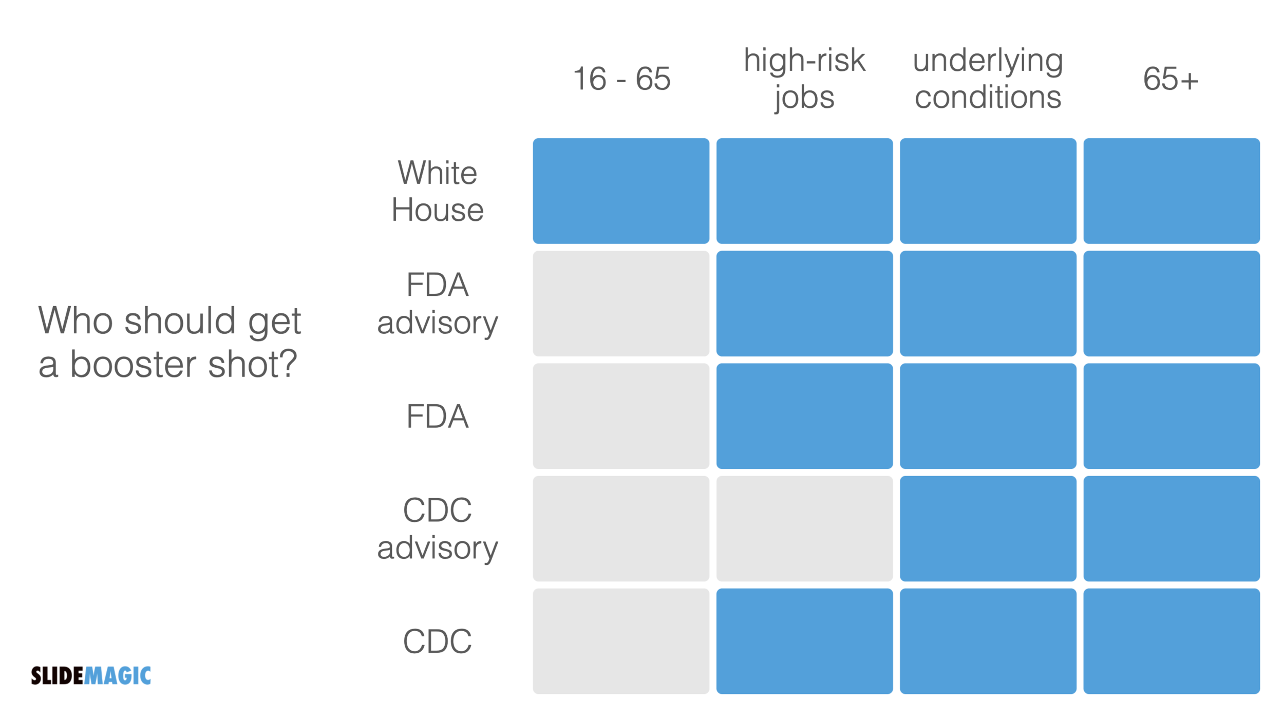
A boxy table caught my eye on Twitter:

Screen Shot 2021-09-30 at 8.48.33.png

The biggest flaw in this table is the White House line, that suggests a separate group of people. Then, you can shift the columns around a bit, until you get this result:

Screen Shot 2021-09-30 at 8.51.44.png

SlideMagic: a platform for magical presentations. Free student plan available. LEARN MORE
Office automation

Office automation

Automation is likely to take out a large share of middle-level jobs in the economy. Gardners, hairdressers, etc. will always be needed. Top scientists, managers, creatives, probably will not be automated anytime soon. In between, it is a different story.

“Automation” has made its inroad in the workplace as well. Most visibly in the area of storage and filing. But also in the way we work. Think of the amount of people that were employed typing up formal documents and memos, planning meetings, arranging phone calls. Back in the 1990s, running analysis on your business required armies of analysts, often sourced from external consulting firms (I was one of them).

The same trend is happening in presentations. Back in the 1990s, we would discuss interim project results using hand drawn charts, that then would be produced by professional graphics designers into a final document. The production of such a document could take weeks, where the sole focus was one communication, and the underlying analysis barely moved.

Bit by bit, the professional designers were replaced by analysts skipping the hand drawn charts and making them directly on their computers. Analysts first, followed by more senior staff. Every meeting now looked like a final presentation.

The trend will continue. “Presentations” will become simpler and quicker to make. In 10 years we will look back and remember the days when we used to spend so much time trying to put a complicated slide deck together for a simple decision.

SlideMagic is here to help.

SlideMagic: a platform for magical presentations. Free student plan available. LEARN MORE
The live test

The live test

It can take a lot of time to get your presentation slide just right. However, once you got to that point, it should be super quick to recreate it. You can call this a ‘live test’. Take pen/paper, or open SlideMagic, and create the chart on the fly while someone is watching and listening. “We have 3 options, each has distinct pros and cons, I think number 2 is the best one”. If you are struggling to do this quickly and in a logical flow, your chart is probably too complex to be understood by a live audience. This is similar to a school teacher using the blackboard in the proper way.

SlideMagic: a platform for magical presentations. Free student plan available. LEARN MORE
Information hierarchy

Information hierarchy

I just returned from a short trip to Paris to show my son around some of the famous sites and restaurants. In 2021, that means a lot of health checks and tests. I was probably the only one in the airline terminal that looked at all the forms with the eye of a typographer.

I am not talking about elegance here, pure functionality. The people at check in desks are looking for “positive” or “negative”, the date the test was given, and whether the passport numbers match. On the test result form, the thing that is printed biggest is the name of the testing laboratory…

All this can be fixed easily with an adjustment of font sizes.

SlideMagic: a platform for magical presentations. Free student plan available. LEARN MORE
What you really want to say

What you really want to say

Very often, after you created that data chart that you thought drives the point home, you change the headline with an even more powerful statement. In those cases, consider changing the entire data chart…

The above can also be show this way:

Screen Shot 2021-09-20 at 7.29.19.png

SlideMagic: a platform for magical presentations. Free student plan available. LEARN MORE
Demo versus manual

Demo versus manual

Giving a demo of your application or web site to an investor or potential partner is different from teaching a new user how to use it by herself.

For the user:

  • Where do all the buttons sit

  • How to log in

  • How to update settings

  • Where to find your account details

  • How to create a project from scratch

  • Etc.

For the investor / partner:

  • What does the app do?

  • Show me a walk through of a “story” or use case

  • Have a project ready to show

  • Look, there is actually a piece of software that is working…

  • Etc.

In presentations, you are most likely to deal with scenario 2. Do all the prep work (logging in etc.), and design a very clear script of what you want to show, cutting out any tangents and other delays. Keep it short and focused. Rehearse your walk through, and as a backup, have a series of consecutive screenshots ready just in case Murphy’s law kicks in.

SlideMagic: a platform for magical presentations. Free student plan available. LEARN MORE
Rounding numbers in data charts

Rounding numbers in data charts

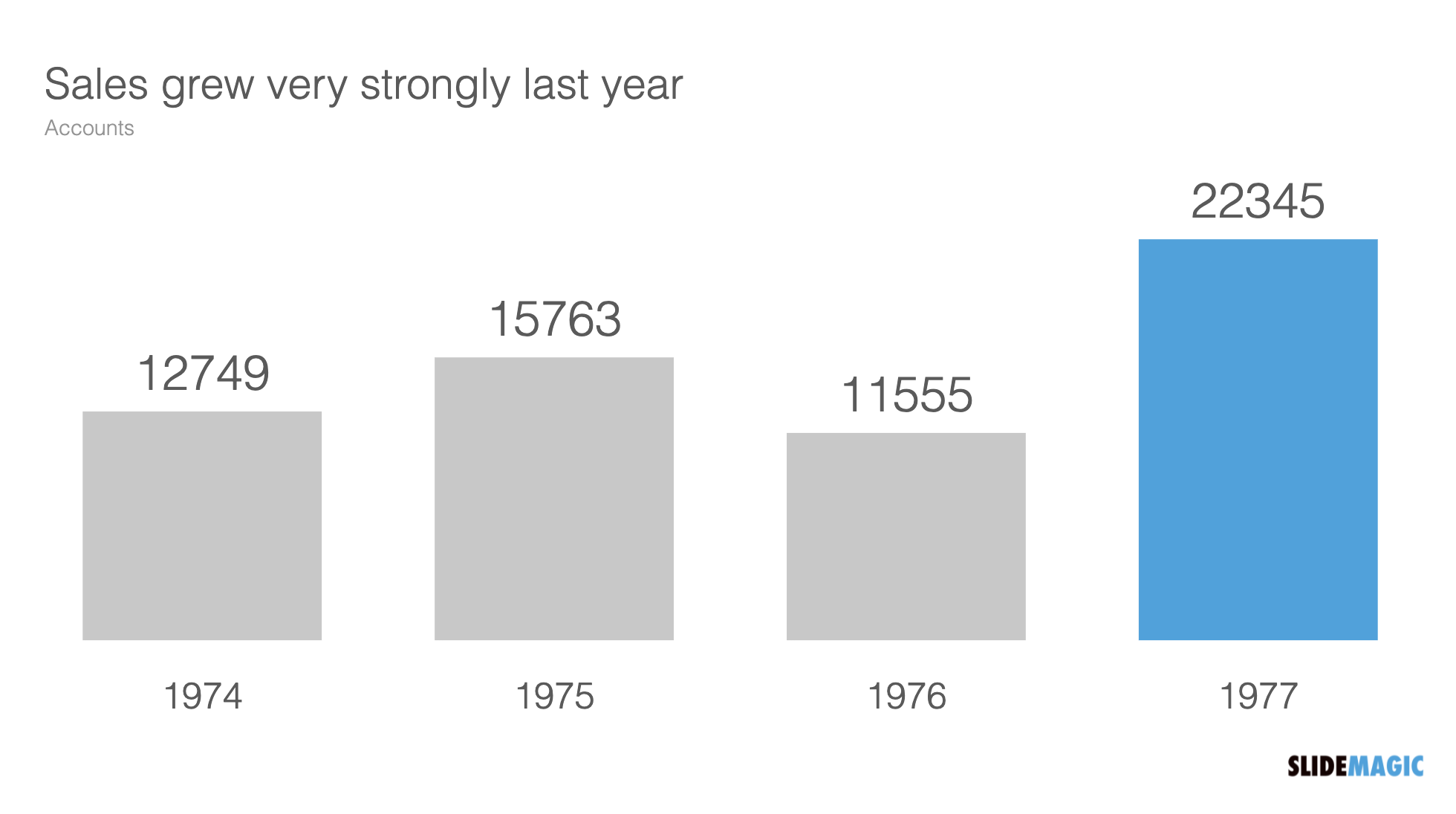
How to round numbers in a data chart? It depends. The chart below does not look very appealing

Screen Shot 2021-09-15 at 10.00.32.png

The numbers are hard to read. This chart can serve 2 purposes. Either show the trend in sales, or show the exact sales figures. To show a trend in sales, simply show the accounts in thousands, and round up to one decimal point:

Screen Shot 2021-09-15 at 10.01.13.png

If you need to provide the actual precise sales data (for accounting or tax purposes), put it in an appendix slide that does not even pretend to show a trend:

SlideMagic: a platform for magical presentations. Free student plan available. LEARN MORE
Overstoryfying

Overstoryfying

Some article titles are click bait, others seem genuinely interesting and I am curious to find out the answer to the question posed. The disappointment is big when the journalist embarks on a very long story where characters are introduced and developed, background stories presented until the punch line comes somewhere halfway the 10 minute article.

A good product or company pitch does not have to be long.

SlideMagic: a platform for magical presentations. Free student plan available. LEARN MORE
Streaming a presentation

Streaming a presentation

Music streaming services such as Spotify change the way musicians make music. With an unlimited amount of songs to listen to, users can now skip through tracks quickly. The result: musicians put the ‘hook’ or chorus of the song really early in the track to convince new listeners to stick around just a few seconds longer. During a live performance of the same song, the build up could be different.

The same applies to your slide decks that you send for someone to read without you being there to explain. The investor or customer is ‘streaming your slides’. Think about how to put that ‘hook’ in your story to keep the viewer interested.

Hooks don’t have to be blunt. A massive drum solo as your song opening might get people to hit the skip button. “We will have $3bn sales in 18 months” sounds impressive but might not be credible. An unusual chord change, or a counterintuitive perspective on the market could do the trick.

SlideMagic: a platform for magical presentations. Free student plan available. LEARN MORE
Visual math

Visual math

Following my post from last week about pi, here is a link to a page full of beautiful visualisations of mathematical concepts. Often, a written formula is not the right way to explain math and proportions….

SlideMagic: a platform for magical presentations. Free student plan available. LEARN MORE
Plugged in

Plugged in

This blog post by Fred Wilson resonated with me.

Surrounding yourself with smart people is not enough to make (investment) decisions. Now that I am knee deep into coding applications myself, I finally start to understand technologies that I have been pitching in dozens of slide decks over the past decades.

I think it goes a bit further than Fred’s blog post. Really smart people (not saying I am) with MBAs (I have one), that work at prestigious companies such as McKinsey (I worked there) are extremely good at telling you why something will not work, and 99% of the time their arguments make perfect sense. It is very hard for these people though to commit to believing in something that will work. Advisors are not entrepreneurs.

SlideMagic: a platform for magical presentations. Free student plan available. LEARN MORE
Winging it

Winging it

“Winging” a presentation, making it up on the spot, is extremely hard, and I would say, impossible. All people that seem to get up on stage and deliver a perfect pitch without any effort have in fact been rehearsing this over and over and over. (The previous instances where they pulled off the same trick). You need to practice really hard to be spontaneous.

When you look at a piece of paper with the scribbles of your thoughts, it seems like you have it all in your head. Everything is there. But standing in front of an audience is different. Your eyes are moving quickly across the piece of paper, going back and forth if relationships are not clear. With speaking, there is no rewind option. You need to build that “visual” in people’s minds step by step.

Many things can go wrong here:

  • You forgot the exact sequence of your points and you realize it too late, now you are stuck without a way to go back

  • You get distracted and are not sure where to pick things up, as you try to get your thoughts together, you repeat a few things you already said

  • You delivered that powerful punch line too early and now your speech ends with a mumbling “well, that’s it, thank you”

Don’t wing your pitch.

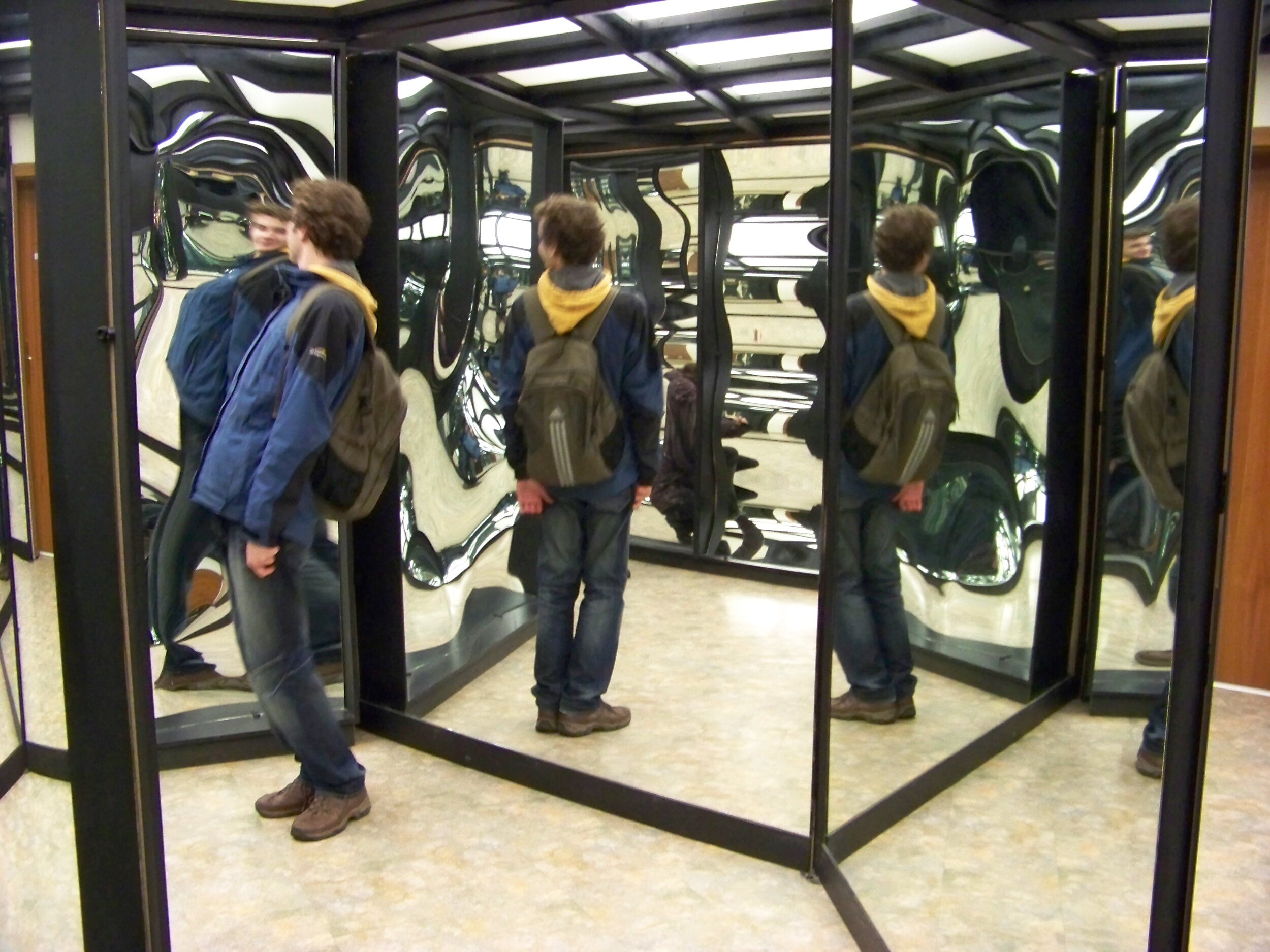
Image by ŠJů, Wikimedia Commons, CC BY-SA 3.0, Link

SlideMagic: a platform for magical presentations. Free student plan available. LEARN MORE