Zelensky's UK speech

Zelensky's UK speech

Zelensky’s speeches will enter the history books as examples of powerful public speaking. Here is a link to the speech to the combined houses of Parliament in London on February 8, 2023. Zelensky starts speaking at around 10:33 (start the video at this time by clicking this link)

Some thoughts:

  • He speaks in English with a very heavy accent. Instead of hurting his talk, it makes it a lot more powerful. It shows courage and effort. And the way he speaks (slowly, determined) makes it actually sound very good and easy to understand. When he (almost) gets stuck, he pauses, looks at his notes, and keeps going confidently

  • Zelensky again drags the audience in. You fought your wars for values you believed in, you won, and now we are in the same position as you.

  • In very news sources, a few sound bites of the speech are summarized, but they do not reflect the whole speech, you need to hear things in context. (Although he has a few powerful one liners, for example the one referring to the UK having a king who is a pilot, while in Ukraine there are pilots who are kings.

  • Zelensky has a very clear agenda, he wants planes. It comes back in the one liners, it comes back in the examples, at the start, in the middle, at the end, all the time. It is very clear what he is asking for. Highlighting the bravery of the UK to be one of the first to support Ukraine, and implying that it should be ready to set the next step as a first as well.

  • He switches skillfully from complimenting the host, creating empathy for his country, referring to very big concepts (the find between Good and Evil) and zapping the tension with humor.

  • He uses props (the pilot helmet and the story with the meaning of the scribbles on it).

I think he will have changed the perspective of many MPs sitting in the audience.

SlideMagic: a platform for magical presentations. Free student plan available. LEARN MORE
Rehearsing the whiteboard

Rehearsing the whiteboard

Adhoc brainstorm meetings are very hard to manage. If you have to discuss a complex issue, it might be worth to prepare and rehearse your white board sketch before entering the room.

On its own, a white board (or a black board at school) is not very meaningful. A bunch of words and drawings out of context. For the person who sat through the meeting, the board is very meaningful. Every scribble on a specific location on the board is a visual anchor for the entire rich discussion that was held about it.

So rather than prepare a big slide deck, maybe you should prepare your white board. Where do you put what. How do you connect elements. The whiteboard gives you the perfect excuse not to make perfect drawings. Try 3, 4, 5, or even more versions until you are left with one you like.

SlideMagic: a platform for magical presentations. Free student plan available. LEARN MORE
Small fix for online image search

Small fix for online image search

The installation of the latest SlideMagic version with AI-powered image generation created an issue for some users where the access to online image search was blocked. It is easy to fix: log out, and back in again in the SlideMagic app and all should work. I deployed version 2.7.3 as well that eliminates this issue all together.

SlideMagic: a platform for magical presentations. Free student plan available. LEARN MORE
Useful OpenAI images

Useful OpenAI images

Most people use AI image generators to create something funny (a cat riding an elephant) or something artsy (a formula 1 car in the style of Van Gogh). This is not the primary motivation why I included OpenAI image generation in SlideMagic.

Image generators can be useful already in presentations, especially for image concepts that are relatively straightforward, but hard to find on stock image sites. The example that came along yesterday with an image of a ‘sleeping bull’ for a economics-related presentation. Perfect for OpenAI, see the result below.

SlideMagic: a platform for magical presentations. Free student plan available. LEARN MORE
Design culture

Design culture

It is tricky to get a big company all aligned behind one consistent approach to design. Twitter is going through a lot changes: changes in strategy, changes in people, etc. You can see it in inconsistencies in the web site. Colors, language, layout, icons,, other design elements, etc..

SlideMagic: a platform for magical presentations. Free student plan available. LEARN MORE
This presentation tool is not a presentation tool

This presentation tool is not a presentation tool

PowerPoint, Google Slides are presentation tools that most of the time are actually not used as presentation tools. Rather people use them as a visual collaboration tool. The organization chart that needs to go into the deck forces the issue: it is time to agree on where the boxes sit and which lines (dotted or straight) go between them. The tiny footnote is essential to agree the strategy for the North America entry strategy etc.

The visual character of these programs makes them more useful to do this than word processors. Online collaboration adds another option to manage multiple pens in one document. Comments give a system to manage todo lists.

SlideMagic on the other hand is a presentation tool.

Image credit: Jay Cross on Flickr

SlideMagic: a platform for magical presentations. Free student plan available. LEARN MORE
PDF glitch fixed

PDF glitch fixed

There was a small glitch in SlideMagic’s PDF converter which has been fixed in version 2.7.2, updates should install automatically, if not, download a fresh version from www.slidemagic.com and you are good to go.

SlideMagic: a platform for magical presentations. Free student plan available. LEARN MORE
Convincing the decision maker

Convincing the decision maker

A big meeting is not the right setting to convince a single decision maker. A lot of her subordinates are around and showing doubt is showing weakness. So the interactions before that all-important presentation is where the real work gets done.

SlideMagic: a platform for magical presentations. Free student plan available. LEARN MORE
OpenAI image generation now live

OpenAI image generation now live

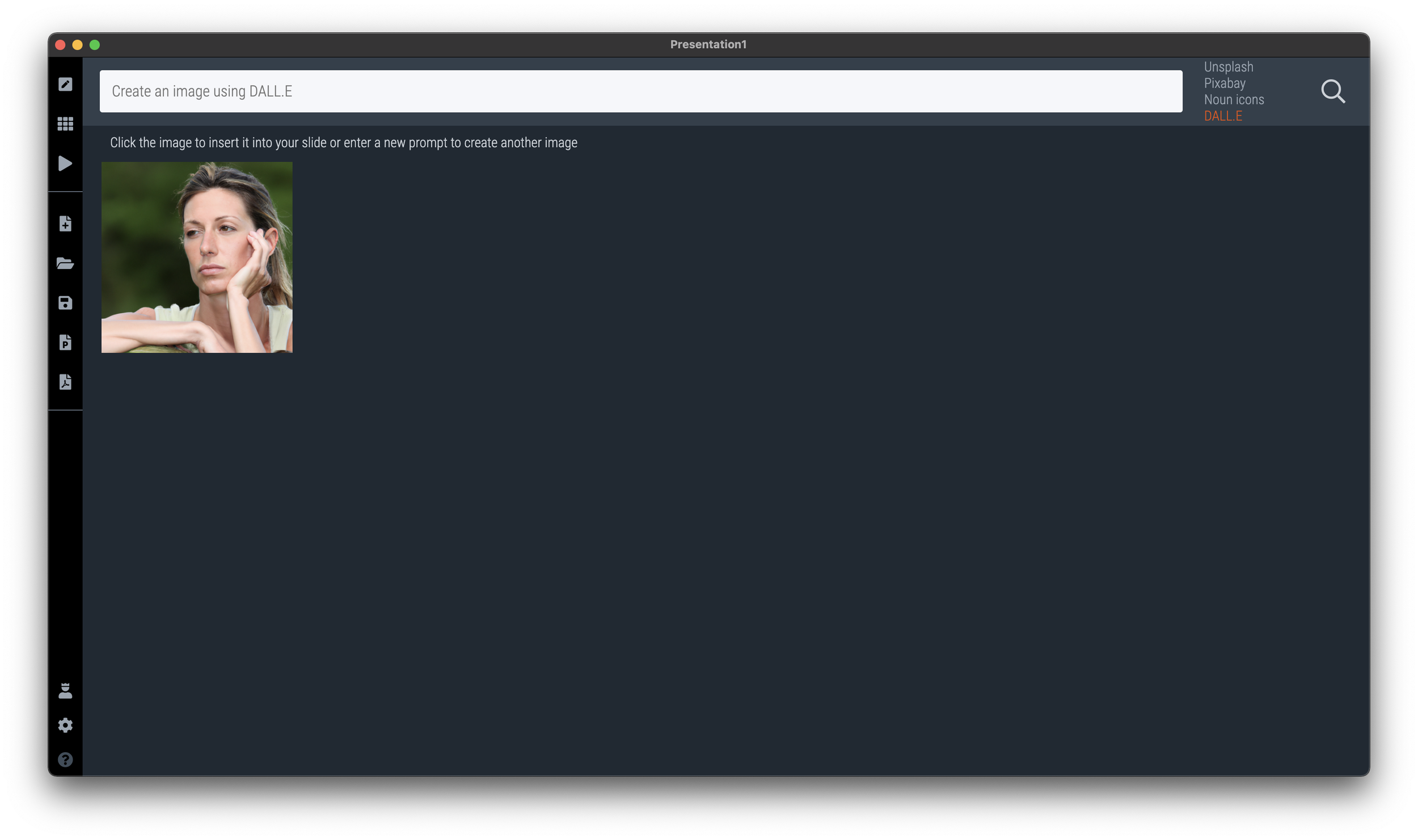
I added Dall.E image generation as a fourth option to insert images in SlideMagic (next to Unsplash, Pixabay, and Noun icons). Maybe SlideMagic is the first presentation app in the world to integrate OpenAI, who knows.

Below you see how it works:

Step 1: select ‘online’ as your image source

Step 2: add your prompt in the search bar of SlideMagic (usually you would enter image search keywords here)

Step 3: preview your image, it will take slightly longer for the result to come back given the amount of pixel processing that is going on

Step 4: click the image to add it in your presentation. The previous “AI” feature in SlideMagic should make sure that if the image is a portrait, cropping is done automatically and sensibly.

There are cost involved with generating these images, hence I switched on the feature for Pro subscribers only. Make sure version 2.7.1 of SlideMagic is installed for this feature to work. Your app should update automatically. If not, download a clean version from the web site and log back in to your account.

This is only the first example of what SlideMagic could do with OpenAI, very exciting!

SlideMagic: a platform for magical presentations. Free student plan available. LEARN MORE
Working on integrating OpenAI

Working on integrating OpenAI

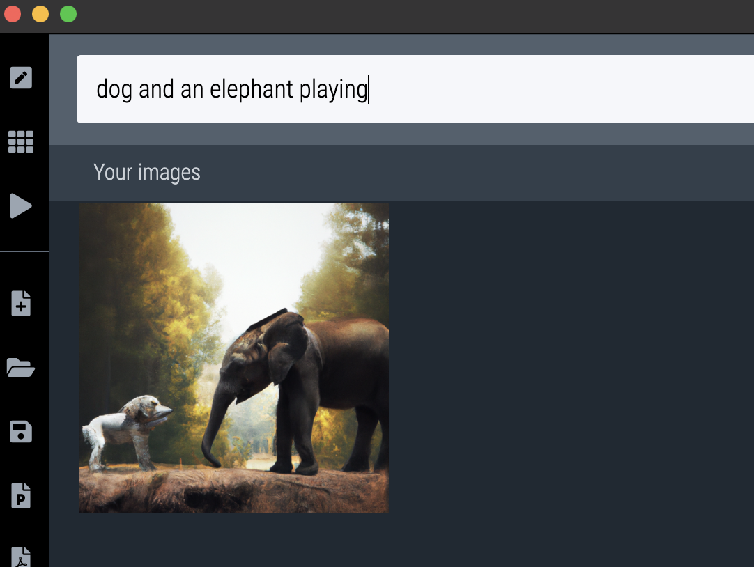
Soon, SlideMagic Pro users will be able to create images using AI (DALL.E) right from within SlideMagic. The prototype is working (see screenshot), I just need to tidy up things a bit before a release to the public.

SlideMagic: a platform for magical presentations. Free student plan available. LEARN MORE
Automated executive summaries

Automated executive summaries

I am starting to think that in the not too distant future, pretty much everyone will toss any piece of business writing into some sort of ChatGPT bot with the question “what does he/she actually want?”, instead of reading the actual text. Too many bullet points, too many long-winded emails, too many lazy writers… Let’s use AI to cut to the chase.

With that, some new sort of SEO (search engine optimization) will emerge. The bots are available to anyone, so you can predict what the bots will say about your text, so people might actually start optimizing/writing text that will trigger the right kind of output by the ChatGPT bot.

But maybe that can be automated as well…

SlideMagic: a platform for magical presentations. Free student plan available. LEARN MORE
The little details

The little details

I was busy doing a chart makeover of the following chart:

To get to this result:

To found out that the columns don’t add up. In case of the left column, it is probably a small rounding error, but on the right, something got lost in translation.

About errors:

  • Don’t blame the spreadsheet, you are presenting a chart, not your backup model. If there is a rounding issue, fix it manually (I usually adjust the biggest category, so 43.1 would become 43.0 in this case). I always argue to disconnect your chart from the spreadsheet for your final document.

  • Even tiny mistakes can make people doubt all the numbers in your entire deck. Number charts should be simple, and it is a 5 minute investment to quickly check them on a calculator. Worth the investment!

In this case, the hidden calculation error shows the flaw in the type of chart chosen. The stacked column is more intuitive and shows how things are related. For the horizontal bar, I had to think for a second to understand what it means, and I did not instantly spot the error.

SlideMagic: a platform for magical presentations. Free student plan available. LEARN MORE
The wrong bucket

The wrong bucket

Last week’s conference is a gold mine for presentation pitch examples.

The receiver of a pitch of a new idea will almost always try to pigeon hole you in a product category they understand well, so it easy to compare the new thing you are offering to the familiar world they are living in.

We were pitching 9xchange that does not really fit very well in anything (yet). One of our audiences was someone in operations and IT. At the very basic level you can think of 9xchange as, well, an IT system. We have a web site, a server, etc. And this triggered all the red flags.

  • We currently have already IT implementation projects running

  • We already have a system that does […]

  • What, we just switched all our employees to system x

  • How do I get buy in from department x, y, and z for this, the previous project was a huge pain to get approved

  • We are behind schedule in rolling out this system

We did not even get to pitch the core idea behind 9xchange and got stuck in the hassle of running major IT integration projects in very large companies.

This prospect was the wrong person to pitch to, we did not even try.

SlideMagic: a platform for magical presentations. Free student plan available. LEARN MORE
The last day of meetings

The last day of meetings

More reflections on last week’s conference. We stayed 6 days, with probably an average of 8 - 10 meetings a day, plus 3 - 5 cocktail receptions each evening. That boils down to hundreds of pitches to hundreds of people, in a time zone that is 10 hours before yours.

Everyone is in the same boat (people who pitch, people at the receiving end of pitches)), and the dynamic of the meetings changes over the course of the conference. Towards the end of the event, people get really tired, and have seen the dance many times. The result: meetings actually get better. The small talk is about the shared experience of the conference. The setting is more informal. People are more flexible to meet outside stuffy hotel rooms, just somewhere in the corner of a hotel lobby. The pitch is much more direct (“ok, what do you want”), feedback is more candid.

But I am not sure there is a way to get to these last days of meetings without having to go through the first ones.

Image by Jeffrey at https://www.flickr.com/photos/48889052497@N01/11342817773

SlideMagic: a platform for magical presentations. Free student plan available. LEARN MORE
Aligning logos in presentations

Aligning logos in presentations

Getting logos to line up properly is one of the hardest things in slide design. I have not been able to come up with a set of rules to do it, every time I need to eye ball things to see whether things somehow look right. Below is an example from the 9xchange web site:

There are a number of (conflicting) inputs:

  • The middle of the image file

  • The typographical baseline of the text

  • The middle of the non-text part of the logo

  • Tag lines above or below the brand name

Always fine tune logo pages because any automated adjustment will for sure not get it right.

SlideMagic: a platform for magical presentations. Free student plan available. LEARN MORE
Connect, understand, agree

Connect, understand, agree

Thinking back at last week’s pitch meetings in San Francisco:

  • Connect. In some meetings there was instant personal connection with the other side, in some meetings completely none of that. Usually, in the first minute of a meeting you know in which category you are.

  • Understand. Most people got our idea, some actually did not. Because of different factors: language, the required background and context, and probably our presentation skills

  • Agree. Even if people understood everything, some people did not actually agree with us. Fair enough.

You don’t always need a connection for people to understand and/or agree. Getting someone to agree without understanding is a challenge though…

SlideMagic: a platform for magical presentations. Free student plan available. LEARN MORE
Table makeover: car emissions

Table makeover: car emissions

SlideMagic is back in 2023 after the holidays, and a very intense, exhausting and drenched JP Morgan Healthcare Conference in San Francisco (I will share some insights about pitching from this event over the coming days).

The starting point is this table:

What I did:

  • Use a stacked column chart instead of a table

  • Simplified the data to boil it down to what matters

  • Some fiddling to get the car images to a comparable scale (I hope I did it right)

The result is below:

I have added this slide to the SlideMagic template database so you can use it in your own presentations. Search for something like ‘BMW” in the app and it will pop up. Pro subscribers can convert slides like these to PowerPoint or PDF. SlideMagic has a free Pro plan available for students.

SlideMagic: a platform for magical presentations. Free student plan available. LEARN MORE
Happy 2023!

Happy 2023!

I am off the grid for a few days (finally had a chance to see the northern lights, see the image below). All the best for 2023!

SlideMagic: a platform for magical presentations. Free student plan available. LEARN MORE
Showing busy bios on a web site

Showing busy bios on a web site

My venture 9xchange is new in the world of healthcare, wo we need to establish credibility by showing that we have significant experience and are backed by significant people. Here is what I came up with (see the 2 screenshots below).

I put up a dense grid with the bios of the people involved. Below this table, are a few recognizable brands from the world of healthcare. When you hover (or click on a tablet) over a person’s bio, a relevant subset of the brands light up.

Alternatively, when you hover over, or click the brands at the bottom, relevant people get highlighted, including the relevant small print in their CV.

You can check out the progress of the work on the 9xchange website.

SlideMagic: a platform for magical presentations. Free student plan available. LEARN MORE
Showing screen shots in a pitch deck

Showing screen shots in a pitch deck

In most cases, it is not worth the time and effort in a short presentation to take the audience through a demo or a series of screenshots of your application. At this stage in the pitch process, understanding the exact flow of your application is not critical.

What can matter though is the simple question of whether you have a decent product or prototype or not. The role of a screen shot here is not to show the exact detail of your app, but more a proof point.

One way to make this point is to use an office background with some screens, and paste a number of screens on the monitors. That’s what I did in a recent deck for my other venture 9xchange. I made the office background black and white, to make the screens pop a bit more.

(Look how I managed to Photoshop the screen shot behind the standing desk light)

SlideMagic: a platform for magical presentations. Free student plan available. LEARN MORE