Viewing entries in
SlideMagic

Update: V2.5.19

Update: V2.5.19

I have been keeping a low profile here over the past week as I continue to improve the performance and stability of SlideMagic. I feel a bit like a construction contractor: putting up the house is easy with very visible progress, but getting those last tweaks done is time consuming and relatively below the radar work.

Under the hood things improve very well. The tool gets used more intensely now so every corner it will soon be tried and tested. I notice that I am fixing some of issues that are similar to the ones I encountered with PowerPoint’s public software releases (as an industrial user, I hit them first). My software development budget is a bit lower than Microsoft’s but we are getting there.

Photo by Cesar Carlevarino Aragon on Unsplash

SlideMagic: a platform for magical presentations. Free student plan available. LEARN MORE
Stack charts with tighter grid integration

Stack charts with tighter grid integration

Stack charts are very useful. So useful in fact, that SlideMagic does not support pie charts (by design).

They are very easy to make in Excel, but using them straight in a presentation is tricky. First there is the overall formatting of the chart, then there is the legend which is never connected to the chart itself, and does not leave enough space for text other than ‘new’, ‘old’.

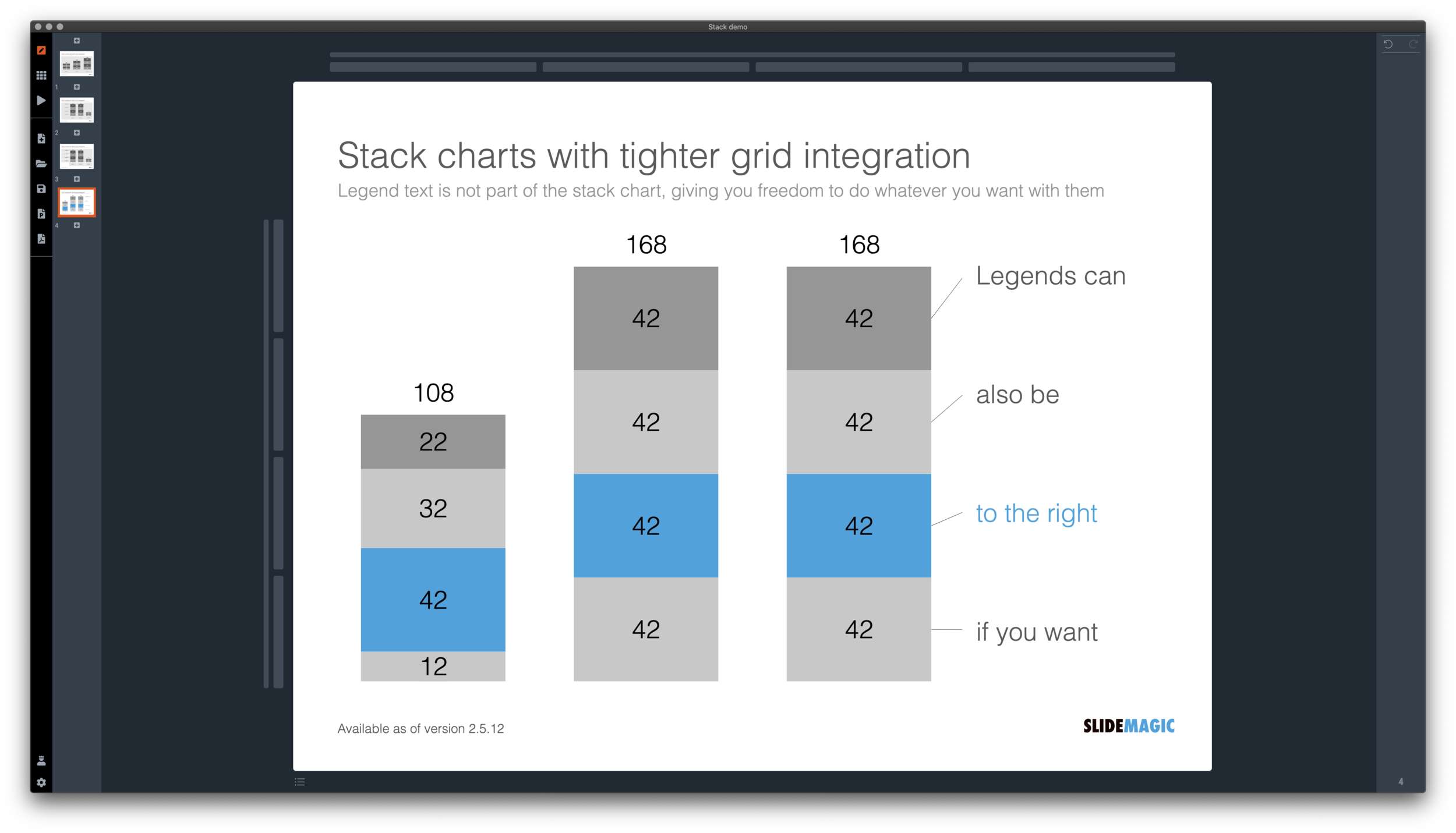
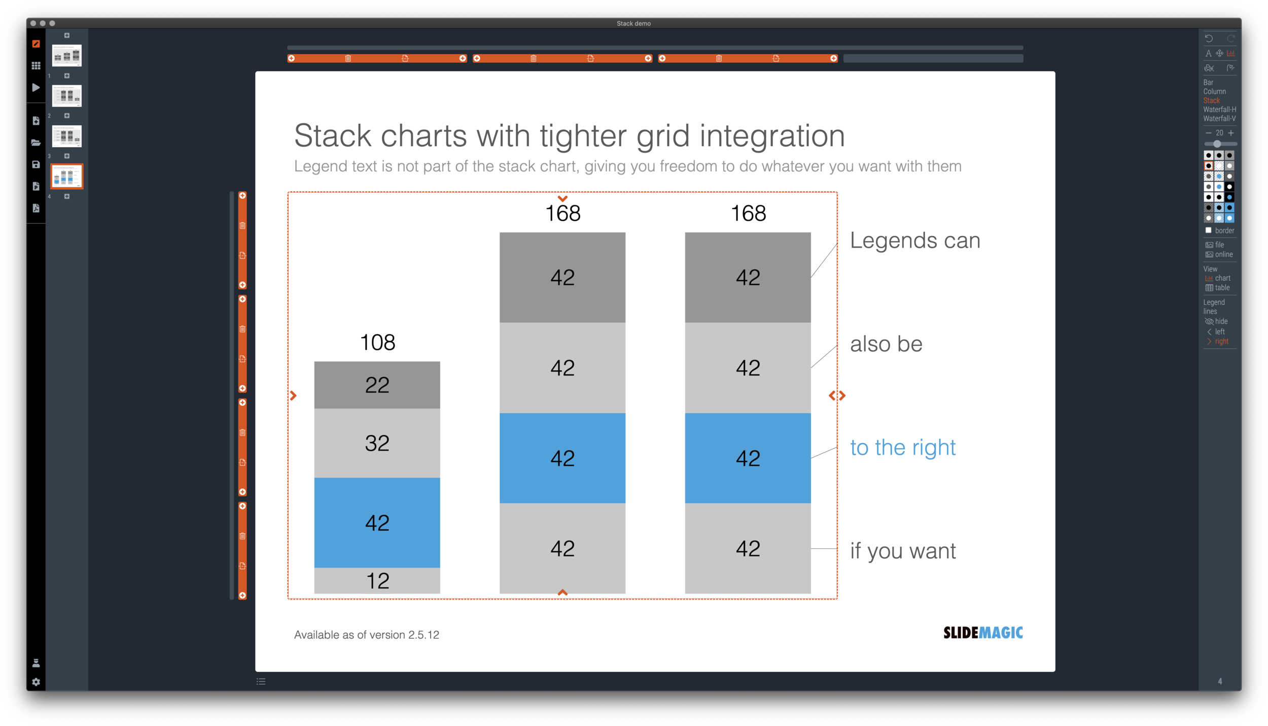
I just overhauled the stack chart in SlideMagic and forced to be tightly integrated with the slide grid. Adding/deleting rows to your slide will add/delete data series to your stack chart. Furthermore I have actually removed the legend from the stack chart shape itself, what is left is only the option to add lines that point to boxes outside the chart. This gives you total freedom to do whatever you want with the chart legend, small, big, or even huge text boxes. Everything lines up, you can even fit stack charts in tables if you want.

The charts below give you a sense of what the new engine does:

Screen Shot 2020-12-02 at 9.44.35.png
Screen Shot 2020-12-02 at 9.49.56.png
Screen Shot 2020-12-02 at 9.51.28.png
Screen Shot 2020-12-02 at 9.51.36.png

The old stack charts will continue to work in SlideMagic for the moment. If your charts have them, you can edit them. If you want to make new ones, click <SHIFT> + <STACK> and you can still make them. An old stack chart can instantly be converted into a new one by selecting it and clicking the <STACK> icon.

Stack charts in the template database are still in the old format, I will convert them over the coming weeks to the new format.

Stack charts convert to native Excel charts when saving your presentation as a PowerPoint file (the connecting legend lines are still missing for the moment). In PDF, you have exactly “what you see is what you get”.

SlideMagic: a platform for magical presentations. Free student plan available. LEARN MORE
Regenerating the PowerPoint slides

Regenerating the PowerPoint slides

For subscribers who are using SlideMagic to download PowerPoint templates only: I have re-run the conversions of the entire database to solve some issues with arrows not being rendered correctly. All should be working fine now, let me know if you still find a slide that does not download correctly.

Pro-tip: try the SlideMagic app, a much more convenient way to work with the template database, convert to PowerPoint (if needed) as the very last step in your workflow.

SlideMagic: a platform for magical presentations. Free student plan available. LEARN MORE
A dedicated browser

A dedicated browser

Many people are surprised that SlideMagic is a desktop app. “Hey, it is 2020, not 1995?” Well, the SlideMagic desktop app is a bit different than the things you would run on your machine in 1995. It updates frequently (sometimes daily), and constantly is in touch with the slide data base server. I would actually call it a “dedicated browser”: a front end for the SlideMagic server with features such as dropdown menus and drag/drop between multiple windows that you cannot find in a regular browser.

People agree that on phones and tables, a dedicated app gives a better experience than a web page. The same is (still) true on a desktop.

Photo by Ilse Orsel on Unsplash

SlideMagic: a platform for magical presentations. Free student plan available. LEARN MORE
Example: COVID chain of infection

Example: COVID chain of infection

A slide came flying by on Twitter:

I might a quick remake of this slide in SlideMagic, in line with the SlideMagic philosophy: quick, clear, nothing too fancy (= time consuming) and added it to the SlideMagic template database since it could be a useful basis for any slide that needs to show some sort of chain of events.

Screen Shot 2020-11-12 at 8.48.34.png
Screen Shot 2020-11-12 at 9.03.42.png

What did I change?

  • Removed the low-contrast red on black colours

  • Took out the simplistic icons and replaced it with no-nonsense clear numbers

  • Rounded up numbers so to avoid cut up people (audience is not hard core scientists)

  • Put in a proper bar chart to show the magnitude of 416 vs 3, instead of an icon count

  • Flipped the design left to right to make the flow in time more clear

This slide demonstrates how easy it is to line up bars of a data chart, arrows, and text cells of a table in the overall slide layout (an absolute pain on other presentation design software).

SlideMagic: a platform for magical presentations. Free student plan available. LEARN MORE
More plumbing...

More plumbing...

An update.

A couple of days ago I released version 2.5 of SlideMagic with lots and lots of small updates that were sitting on the todo list. When designing, I cannot stand it when a small detail is off, and the same applies to software development. And like in design, most users/viewers won’t notice these individual details, but when taken together they add up to something. This slide does looks right for some reason, this app just works for some reason. Opening up SlideMagic should trigger an update to version 2.5.3 (writing this on November 11) after a few minutes, if not, you can visit the SlideMagic download site to install the latest version.

I am making changes to the positioning as well. That download or app landing page is now the home page of SlideMagic and no longer the web site that says that SlideMagic is a template bank, but also an app, and also a place where you can download entire presentations. All confusing, and still a left over of the SlideMagic template store on Shopify. The Shopify store is closed, and (that was quite a moment), the entire V1 version of the SlideMagic web app has been wiped from the server.

So the web site (still WIP) now reflects what SlideMagic is: presentation software with a uniquely clever user interface and a huge built-in template data base.

Photo by Bruce Warrington on Unsplash

SlideMagic: a platform for magical presentations. Free student plan available. LEARN MORE
How to make a source of change waterfall chart (Apple quarterly results)

How to make a source of change waterfall chart (Apple quarterly results)

In between the election news: waterfall charts….

Waterfall charts are a great tool to explain the difference between 2 scenarios. In SlideMagic, they are really easy to create. Below is one I put together quickly with data from Apple’s 2020 Q4 earnings result, and a photo I found using SlideMagic’s built-in Unsplash image search. Notice how I opted for an unusual vertical waterfall, to create more space for the axis labels.

Screen Shot 2020-11-02 at 13.42.33.png

Some people would argue that you could make the chart even clearer by breaking the axes: showing them as ‘5.6’ and ‘4.7’ for example. Yes, it would highlight the deltas better, but in general, I think manipulating axes, well, manipulates the message. The fact that the changes are relatively small to the total is part of the message.

Screen Shot 2020-11-02 at 13.42.27.png

I reshuffled the rows a bit to group the decreases and increases. That makes it more clear in one sense, but less clear in another. Your choice.

\How do you go about making such an analysis? I put my numbers in a Google Sheet that you can view yourself.

  1. Enter the data for the 2 comparable quarters in 2 columns. Add the totals as calculations rather than hard-coded numbers to check that you did not make any typos. (The blue cells are the one that I type in, the white ones are calculations).

  2. Create space between the 2 columns

  3. Pull numbers from the input that you consider drivers. You see that I deviated a bit from the way the input was presented:

    1. Divided billions by thousands to make it more readable

    2. I use % gross margin rather than absolute COGS and profit numbers

    3. R&D: absolute number, SGA, % of sales

  4. Recalculate the operating income with just these drivers (line 37), it is crucial that you get this right, double check with the input.

  5. Now start varying your drivers one at a time, and recalculate the operating income in the scenario that just that one variable would have changed (see the green numbers in the spreadsheet).

  6. Finally, check whether the component variations add up to the total variation you need to explain (in this case, I was lucky). If you are not, you need to allocate the non-explained differences to the factors somehow.

It is important to keep in mind that these spreadsheet figures are just spreadsheet figures. The change in product gross margin for example is probably not independent from the change in product mix (fewer phones, more laptops). Also there is a small rounding issue (the rounded vales do not add up to 14.8). I would solve that by chopping the biggest factor (-1.7 to -1.6). It is always distracting when small rounding errors create inconsistent numbers on your slide.

Users of SlideMagic can access the waterfall charts with a search for ‘apple’ in the desktop app.

SlideMagic: a platform for magical presentations. Free student plan available. LEARN MORE
Opt in/out for beta versions

Opt in/out for beta versions

I am pushing new updates to the SlideMagic desktop app almost every day. Most of the things I do at the moment are not spectacular new features, but improving the plumbing of the app. I have now created the option to opt in or out of these beta versions (that could have the occasional bug). Users on deadlines for important presentations do not have time to beta test software.

All users are by default opted out of beta versions. You can opt-in by accessing your user account on the SlideMagic web site and tick the appropriate box. Make sure you are logged in to your account in the SlideMagic desktop app as well for the automatic updates to work.

Screen Shot 2020-11-01 at 13.32.48.png

To switch back to stable updates only, untick the box in your user account, and go to the desktop app download page to install the latest regular version of the app.

It is pretty amazing that today’s software development tools enable this juggling of regular and beta versions in just a few lines of code. Soon, beta versions will move again from plumbing to a number of new features I have in mind. Stay tuned.

Photo by Scott Webb on Unsplash

SlideMagic: a platform for magical presentations. Free student plan available. LEARN MORE
A more precise image zooming engine

A more precise image zooming engine

I just released a new version of the SlideMagic desktop app with an important update: a more precise engine for panning and zooming images. It was a very big update (a completely new image rendering engine) and to most users, there will hardly be any visible difference to the app.

Screen Shot 2020-10-08 at 12.53.19.png

But more advanced users will notice how image fills and fits now exactly, exactly fill the shape boxes, and how to (much bigger) image zoom slider is much more precise.

(For those interested: the old image rendering engine was still based on CSS background images with their obscure placement interface, a left over from the web-centric architecture of SlideMagic v1.0)

Photo by Pedro Monteiro on Unsplash

SlideMagic: a platform for magical presentations. Free student plan available. LEARN MORE
Starting to work on tutorials

Starting to work on tutorials

Now that SlideMagic 2.0 is nearing completion I have turned my mind to putting together tutorials. For the moment, I am keeping it short and to the point, you can follow my work here: www.slidemagic.com/tutorial. This is all still work in progress.

Screen Shot 2020-09-30 at 15.54.49.png

SlideMagic: a platform for magical presentations. Free student plan available. LEARN MORE
Spell checker

Spell checker

I added a spell checker to V2.4.40 of SlideMagic. Incorrectly spelled words get a little underlining, right clicking gives you access to some spelling suggestions, and the option to add a correctly spelled word to the library.

This feature was high on the list of priorities of my daughter, who is using SlideMagic a lot for school projects.

Screen Shot 2020-09-27 at 11.17.40.png

SlideMagic: a platform for magical presentations. Free student plan available. LEARN MORE
Spoon feeding detail

Spoon feeding detail

Different types of audiences, different types of questions, and/or different phases in your interaction with the audience require different types of slides.

  1. In the first meeting, you introduce an idea with a big, bold, minimalist data chart

  2. In a follow-up meeting, you are answered a question about assumptions behind the numbers, or, in a Zoom meeting, your audience sits very close to her screen and has time / visual ability to dig deeper into the visuals than she would be able to when sitting in a big room.

For these occasions, you can make slide variations of the same slide. Seen an example below:

Screen Shot 2020-09-22 at 12.18.47.png
Screen Shot 2020-09-22 at 12.18.58.png
Screen Shot 2020-09-22 at 12.27.45.png

Clicking back and forth between the slides will give the illusion of some sort of animated popup, while in effect the audience is looking at two different visuals. In practice, I would design the busy slide first, then cut things out to create your minimalist slide.

<advertising> Note how easy it is in SlideMagic to toss things around and add (remove) complications to your slide without breaking its visual grid </advertising>

Screen Shot 2020-09-22 at 12.32.42.png

SlideMagic: a platform for magical presentations. Free student plan available. LEARN MORE
Corporate title pages

Corporate title pages

I added a number of new title pages to the SlideMagic slide template database: looking up in the downtown area of a city. The sky in the center of the image is a nice empty background for your text.

Screen Shot 2020-09-12 at 10.00.06.png
Screen Shot 2020-09-12 at 9.44.37.png

Typing “title” in the search bar of the SlideMagic desktop app now gives a lot of options to get you started with a title page for your presentation

Screen Shot 2020-09-12 at 10.08.45.png

Pick one of these designs (or an empty slide), and use the image search feature to add the image that you prefer

Screen Shot 2020-09-12 at 10.11.53.png

SlideMagic: a platform for magical presentations. Free student plan available. LEARN MORE
How to download your SlideMagic 1.0 presentations

How to download your SlideMagic 1.0 presentations

The reminder email has gone out to all SlideMagic 1.0 subscribers to download your presentations before I shut the service down and migrate the platform completely to SlideMagic 2.0. (I will keep the archived presentations but access won’t be instant).

Some people signed up five years ago, and I got some bounces from people who changed jobs / email address. So, another reminder here if you have an account but did not get your email.

Other people. say that it is not completely clear how to download your presentation(s). Here are the steps:

  1. Log in to SlideMagic 1.0

  2. Open your presentation in SlideMagic 1.0

  3. Select the “export” arrow from the left menu

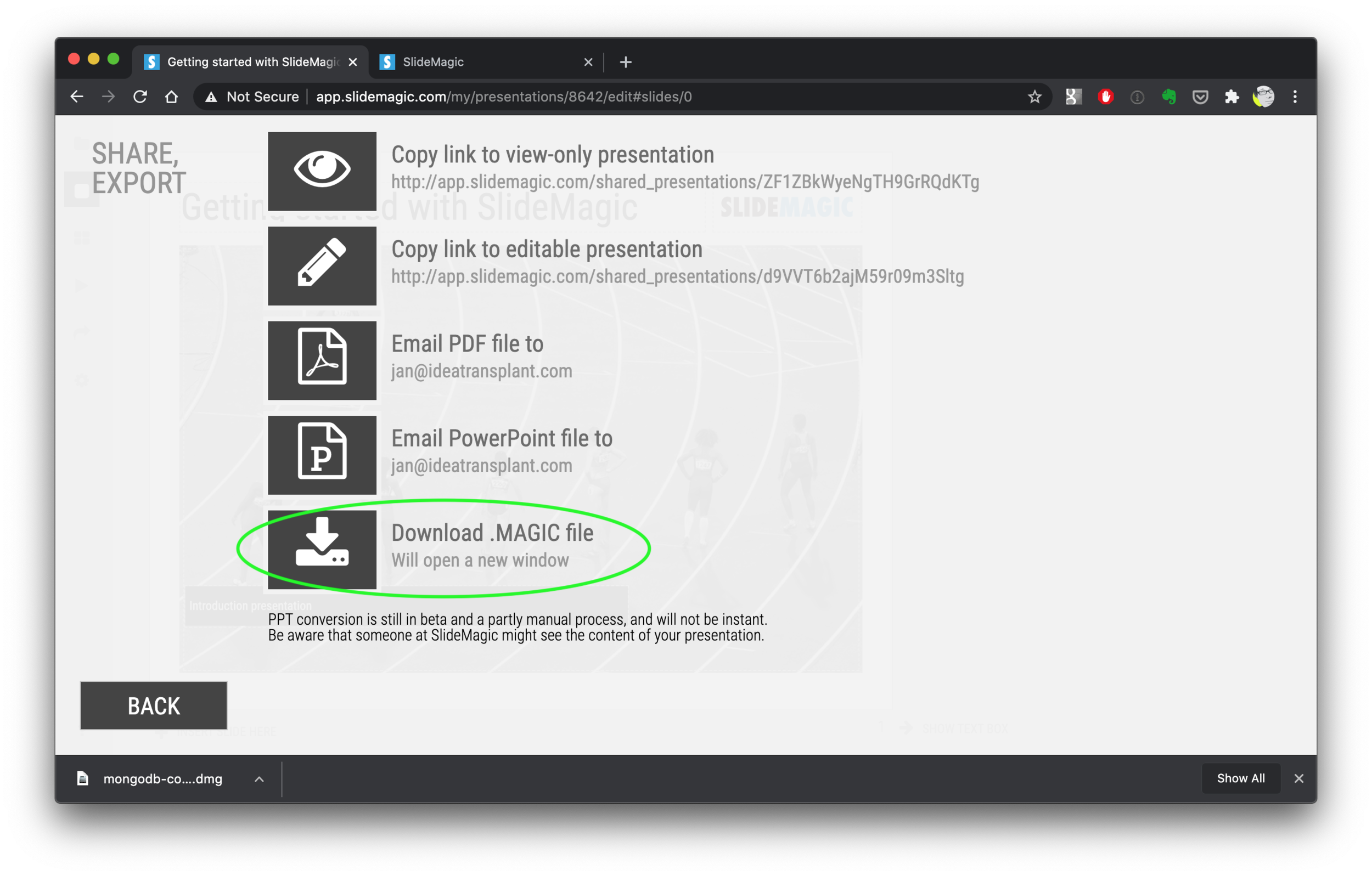
  4. Pick “download .magic file”

  5. Download and install the SlideMagic 2.0 desktop app

  6. Open the .magic file in the desktop app.

Here are the screen shots of the steps:

Screen Shot 2020-09-10 at 7.06.26.png
Screen Shot 2020-09-10 at 7.06.35.png
Screen Shot 2020-09-10 at 7.06.56.png
Screen Shot 2020-09-10 at 7.48.48.png
Screen Shot 2020-09-10 at 7.52.55.png
Screen Shot 2020-09-10 at 7.58.49.png
Screen Shot 2020-09-10 at 7.55.25.png

(Notice how I removed the hard-wired title page with the black bar from SlideMagic 2.0)

SlideMagic: a platform for magical presentations. Free student plan available. LEARN MORE
SlideMagic 1.0 sunset, long live SlideMagic 2.0

SlideMagic 1.0 sunset, long live SlideMagic 2.0

Towards the end of October, we will be pulling the plug on the SlideMagic 1.0 server. If you are a SlideMagic 1.0 user, you need to download your presentations as .magic files to your local hard drive, after which you will continue to be able to edit them in the SlideMagic 2.0 app.

SlideMagic 2.0 is vastly superior when compared to 1.0, with much more intuitive user interface, instant PowerPoint and PDF conversion, integrated Unsplash and Pixabay image search, waterfall charts, and a huge template database (SlideMagic 1.0 probably had 20 templates or so), just to name a few features. SlideMagic 1.0 was a web app, SlideMagic 2.0 is a desktop app that also works when you are not connected to the Internet, and has deeper access to your computer’s operating system for things like managing files and copying things between windows.

SlideMagic 1.0 users will be getting a reminder email over then next few days. I do plan to keep the SlideMagic 1.0 user presentations somewhere backed up, but access will be on request and no longer instant as of November 2020.

SlideMagic 1.0 was a necessary step to start the journey, it enabled me to get my head around what a modern presentation app should look like. But it has served its purpose.

The SlideMagic 1.0 log in is here: http://app.slidemagic.com, you can try the new app here https://www.slidemagic.com/app .

SlideMagic: a platform for magical presentations. Free student plan available. LEARN MORE
A clearer pricing model: just subscriptions

A clearer pricing model: just subscriptions

As I focused on the user experience of SlideMagic, I kept a temporary payment engine running, it takes a simple payment, but does not yet manage subscriptions. Subscription management is a bit more tricky, you need to keep user payment details on record securely, and manage renewals, cancellations, updates. That will soon all be tightly integrated with the Stripe payments platform.

In the process, I am now taking down the ‘day pass’ pricing option that allowed you to buy a maximum of 10 slide downloads for the duration of 1 day. I think this confusing what SlideMagic is trying to be: a full presentation solution (as opposed to a by-the-slide template business of which there are thousands on the internet).

Now SlideMagic has 2 offerings:

  • A free model with access to all slides (for the moment) in .magic format

  • A pro model that also includes PowerPoint, PDF conversion, and the ability to add your logo on slides, $99 per seat per year.

The free model gives people a change to get to know SlideMagic, offers a workable solution for users on a low budget (students, etc.). The Pro version is useful for people that need to use SlideMagic for real, share presentations in other formats with colleagues and clients, and need to brand slides in their own look and feel.

I will make sure that the payment engine works in a robust way first, then I will have to resort to modifying the web site with a better illustration of the positioning.

Legal disclaimer: all this can change in the future.

Photo by Catherine Heath on Unsplash

SlideMagic: a platform for magical presentations. Free student plan available. LEARN MORE
Customer service

Customer service

This tweet exactly applies to SlideMagic:

SlideMagic had a few glitches, but unlike established software products, users that suffered got the CEO himself to add designs to the template bank, recover presentations, gave refunds after people claimed they ‘never intended to make that purchase’, deploy patches within a few hours, and say ‘thank you’ even in the very few cases where feedback was not worded that nicely.

I think SlideMagic is getting close to the finish line as a proper and robust product as I am using it intensely myself now. Thank you all for your patience.

Photo by Alexander Andrews on Unsplash

SlideMagic: a platform for magical presentations. Free student plan available. LEARN MORE
Further cleanups

Further cleanups

Things are a bit quiet here on the blog, as I am using my annual blogging summer holiday to cleanup SlideMagic further. New features are frozen for the moment, as I am 100% focussed on making the app as stable as possible and have been posting regular updates frequently. If you are a frequent user of SlideMagic, you should now be running version 2.4.28.

One visible change I have made in the latest version is a slightly larger image zoom slider, you can see it in the screen shot below. I rotated the slider, it now appears vertically, allowing me to give it more space and make image zooming more precise.

Updates should install automatically eventually but you can force an update by downloading the latest version of SlideMagic manually.

Screen Shot 2020-08-24 at 14.39.41.png

SlideMagic: a platform for magical presentations. Free student plan available. LEARN MORE
Image cropping with a focal point

Image cropping with a focal point

SlideMagic can switch back and forth between multiple layouts, and needs to handle rapid changes in the grid of a slide. As a result, aspect ratios of images get changed all the time, tripping up your carefully selected image composition. At the moment, the app is storing different crop and zoom levels for different aspect ratios, but that solution is not ideal. (You see how Squarespace gets it wrong with the banner image of this blog post).

I want to get to the point where a SlideMagic user can click a focal point of an image, after which the app will do the hard work of re-adjusting the crop automatically. Doing research, I see a lot of “AI” applications that can figure out what the focal point of an image should be, there seems to be nothing that deals with focal point-based cropping itself. The solutions I see, are ones where you can store multiple crops of the same image, after which the most appropriate one gets selected.

I started scribbling a manual algorithm to come up with reasonable compositions. Here are the first (manual but automateable) results applied to some cows on a beach in Africa, the first image is the original.

Screen Shot 2020-08-20 at 13.16.43.png
Screen Shot 2020-08-20 at 13.16.50.png
Screen Shot 2020-08-20 at 13.17.07.png
Screen Shot 2020-08-20 at 13.16.58.png

It works pretty well, on the the extremely horizontal one gets cropped too low, I would have shown a bit more sky on that one. Let’s see if we can get this to work, both in terms of the algorithm, and the user interface.

Photo by Vince Gx on Unsplash

SlideMagic: a platform for magical presentations. Free student plan available. LEARN MORE
An OKR slide template (Objectives and Key Results)

An OKR slide template (Objectives and Key Results)

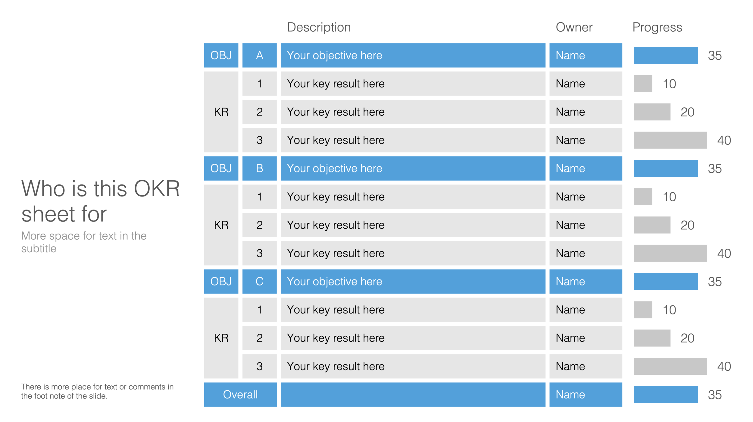
Not enough SlideMagic users have discovered that I try to respond to requests for new or missing templates. Today I added a template for an OKR sheet, Google’s approach to managing Objectives and Key Results.

SlideMagic is particularly useful for slides like this, it is easy to add rows, adjust the layout, and now those boring percentages can be visualised easy with a bar chart that always lines up with your table.

Screen Shot 2020-08-19 at 17.27.43.png

Search for “OKR” in the SlideMagic desktop app and it will pop up and ready to work on for free, alternatively, pro subscribers can download the template (in .magic or .pptx format) from the online template bank.

Let me know if you need more/different types of OKR templates.

SlideMagic: a platform for magical presentations. Free student plan available. LEARN MORE